Stray's CAT REVEAL!!
Stray's CAT REVEAL!!


He's so cute!!
More Posts from Alansohopis-blog and Others

Smile!! all eyes are on you!
speedpaint is on my youtube! https://youtu.be/jkw9Hvqoc7o


Grandfest Plaza stalls
Aimee Wildflower (more information in the future)


Silly cat game my beloved🐚


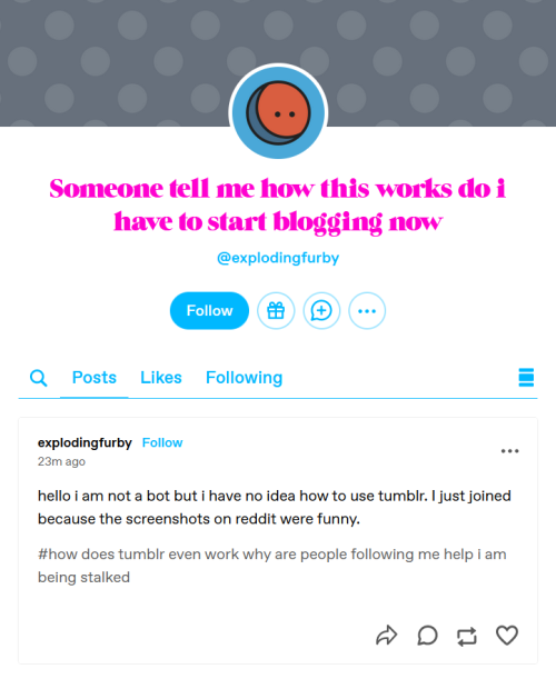
This is the most adorable non-bot blank blog I’ve ever seen. People, this is all you need to do to let us know you’re a human if you’re confused.
Receding objects in perspective.
Have you ever been trying to draw tiles on a wall or on the floor in perspective, but notice that after you’ve drawn them, they don’t look like they’re all the same shape or size? Well here’s a tutorial on how to fix that. Your picture probably looks like this, right?

Well, i’m here to tell you how to fix that…Let’s start out with your basics.

The gray line is the horizon line, and the black dot is your horizon line. These are essential for the first steps of perspective. Without these, your perspective may turn out wonky and just not flattering to the eyes. Right now we’ll work in One point perspective.

Now let’s pretend we’ll be drawing a hallway. Draw a vertical line where the edge of the wall is.

Now, from the tips of the bottom and top of your wall, you’re going to need to draw a line extending all the way to the vanishing point. If you’re working in photoshop you could either use the line tool, or shift+click. If traditional, you’ll need to use a ruler.

Now that we have the wall that’s in perspective, it’s time to draw the rest of the lines. here I’ve drawn the wall facing us that’s closest, the ceiling, the floor line, and the end of the hallway. ASSUMING that you are working in one point perspective, all vertical lines are straight and parallel to each other, and all horizontal lines are straight and parallel to each other.

Now here I have erased the lines that extended beyond the back wall, and found the center point of the edge of the left wall. From there, you draw an extended line just as before towards your vanishing point.

now make a vertical line where your first “tile” is.

now this may be a little hard to explain. Now you’re going to draw a line coming from the corner of the wall, through the corner where your line meets the tile you just drew, and all the way to the ground line.

You see where these two lines meet? you’re going to draw a vertical line to the ceiling from here.

Like so!

Now rinse and repeat! you should have perfectly even spaced tiles now! And if you have tiles on the ceiling

Just draw horizontal lines connecting to the vertical lines!

Now just erase anyhing you don’t need and…viola! Perfect tiles in perspective!! I hope this helps!! :D
Anyone else notice that, at least on certain browsers, tumblr has started generating links to posts like this? (1):

[x]
Instead of the older, more typical way like this (2):

[x]
I get different versions of the link depending where I click on a post:

(If you're on your phone browser, make sure to click and HOLD #2 and select 'copy link'--clicking through on mobile redirects me to the new style.)
I tend to edit urls to do quick tag searches and such and you can't do that with the first url, which is why I noticed, but I've since noticed some other issues.
For example, if I post the new style link in discord it will embed a picture rather than the post's video (forcing people to click through). The second, older url still properly embeds the video on discord.


And of course, the reason the new url wants to make you click through is tumblr is also using it to pressure people to sign up with tumblr.
Which becomes an issue when you're sharing a link with people who don't use tumblr, or, say, on discord, where anyone using the app's native browser is going to appear as not logged in.
Going to the first link when logged out and scrolling down quickly hits this wall:

This blocks the whole blog, does not scroll, and cannot be opted out of. (Also adds this to the url:)

On the other hand, clicking the orginal form of the URL and scrolling down only triggers the older, less intrusive "wanna try the tumblr app" prompt on mobile browser:

And the "wanna sign up" prompt on PC browser:

These appear only on a small part of the screen, still allow scrolling, and have an opt out option that banishes them making them INFINITELY MORE FUNCTIONAL AND LESS ANNOYING
tl;dr I think platforms increasingly gating their content behind log in prompts is extremely sketchy and a bad direction for the internet to go, and also if you're sharing tumblr links it's worth knowing which format will do u better


-
 nethilia liked this · 7 months ago
 -
 kelesaria liked this · 7 months ago
 -
 roymblog reblogged this · 7 months ago
 -
roymblog liked this · 7 months ago
-
 janekestrel liked this · 7 months ago
 -
 mojo-da-jojo reblogged this · 7 months ago
 -
 bunnyiscthulhu reblogged this · 7 months ago
 -
bunnyiscthulhu liked this · 7 months ago
-
 adahlenan reblogged this · 7 months ago
 -
adahlenan liked this · 7 months ago
-
 thefrostflower reblogged this · 7 months ago
 -
 paladinsaredumb reblogged this · 11 months ago
 -
 eiremauve reblogged this · 11 months ago
 -
 khaj-kittie reblogged this · 11 months ago
 -
 cowarddragon liked this · 1 year ago
 -
 loki-wants-an-army liked this · 1 year ago
 -
 oceanblue971 liked this · 1 year ago
 -
 daakureisaiko liked this · 1 year ago
 -
 creepyghostboy reblogged this · 1 year ago
 -
 landruce reblogged this · 1 year ago
 -
 letsstartafamilywellinvitewelove liked this · 1 year ago
 -
 arlyiahshay liked this · 1 year ago
 -
 smol-potato-thing liked this · 1 year ago
 -
 mxscorpio reblogged this · 1 year ago
 -
mxscorpio liked this · 1 year ago
-
 countingstarsforbob reblogged this · 1 year ago
 -
 turtlemagnum liked this · 1 year ago
 -
 very-unoriginal-url reblogged this · 1 year ago
 -
 someguyiguess reblogged this · 1 year ago
 -
 missadelinecatgirl reblogged this · 1 year ago
 -
 braindeaddm liked this · 1 year ago
 -
 invasive-flora liked this · 1 year ago
 -
 salamanderwithstrings reblogged this · 1 year ago
 -
salamanderwithstrings liked this · 1 year ago
-
 justalittlebeanpls liked this · 1 year ago
 -
 mothersoatmilk liked this · 1 year ago
 -
 keep-calm-and-ship-everything reblogged this · 1 year ago
 -
 wateralchemist17 reblogged this · 1 year ago
 -
 yeetus-6942069 reblogged this · 1 year ago
 -
yeetus-6942069 liked this · 1 year ago
-
 anatomyofafool reblogged this · 1 year ago
 -
landruce liked this · 1 year ago
-
 lovecraftian-loverboy liked this · 1 year ago
 -
 tboy-boone liked this · 1 year ago
 -
 reallyverynormal reblogged this · 1 year ago
