Arttuti - Art Tutorials


More Posts from Arttuti and Others


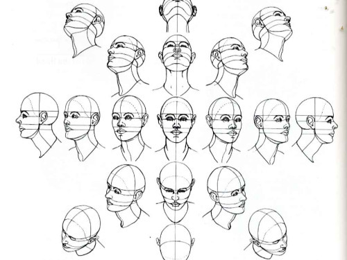
quick proportion tips
- eyeballs are an eyeball width apart - ears align with the top of your brows to the bottom of your nose, and are the center-point of a profile view - lip corners line up to the center of each eye - hands are roughly the size of your face - feet are the same size as your forearm - elbows are aligned with your belly-button - your hands reach down mid-length of your thighs - both upper and lower legs (individually) are roughly the same size as your torso (this is all rough estimates for proportion! feel free to add more to help others)

THE LAYERS CHEAT SHEET PART TWO (PART ONE HERE) Once again, I’m no expert- there are things about these layers I probably haven’t covered, so please try them out for yourself! Layers 1-7 help your contrast. They are usually a pair of the former two groups I went over in my last post. 1. OVERLAY: Helps your contrast by boosting your lights and darks, while the more mid tone pixels aren’t affected as much. It does this based on the layers beneath it. “Screens” the lights, “multiplies” the darks. 2. SOFT LIGHT: Similar to overlay, but a “softer” effect. You can think of soft light as more transparent. 3. HARD LIGHT: You can look at hard light as an intense version of overlay, with much brighter colors and a much less transparent look. 4. VIVID LIGHT: This is the heavy metal version of overlay- think of it similar to color dodge and color burn. Very intense colors, good for finding interesting lighting and color combos. 5. LINEAR LIGHT: Crazy amounts of contrast and color is added here, even more than vivid light. so heavy metal 6. PIN LIGHT: This one is interesting because besides it also being an intense contrast layer, it can add random noise to the active layer. Apparently this is a combo of the lighten blend mode on the light pixels and darken on the dark pixels, but the noise effect is what makes it really interesting imo. 7. HARD MIX: You will turn this mode on and be like “no” but it is actually adjusting its fill will reveal another overlay-ish type layer. It throws the colors on the active layer towards a more primary color such as blue, or magenta. _____ 8. DIFFERENCE: This will invert your colors, taking into account the layers below. If colors are very close, they will be black. 9. EXCLUSION: This also inverts your colors, taking into account the layers below. If colors are very close, they are grey. Exclusion and difference are layers that would be good for graphic pieces, I haven’t really gotten used to incorporating them in my painting workflow. 10. SUBTRACT: Similar to the above layers, but more intense. You will notice that the darker you make your active layer with Difference, exclusion, and subtract, the lighter and more transparent looking the result will be. 11. DIVIDE: Divide, however, usually results in crazy highlights that are pretty opaque unless the layer is fairly light, and then it will begin to go transparent. ___ 12. HUE: Makes the lower layer take on the hue of the active layer. 13. SATURATION: The lower layers take on the saturation of the active layer. 14. COLOR: The lower layers take on the color of the active layer. 15. LUMINOSITY: The lower layers take on the luminosity, or brightness, of the active layer. Once again, I’m no expert, but I hope this helps. Thanks guys! http://drawmaevedraw.tumblr.com/
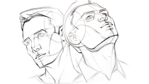
Okay so I followed this video about foreshortening and…


Sycra. I love you so much for making this video.


Hi! I love your tutorial on how to draw a character, it's really useful. However, I can't get the eyes right for Dean Winchester and Castiel. I draw them too elongated. What shape would you advise me?
Something like this probably haha;; Dean’s is rounder/wider and Cas’ is more angular and droopy


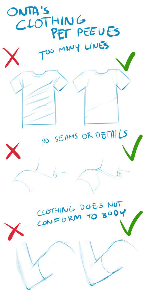
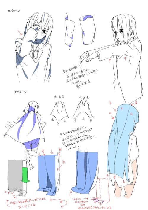
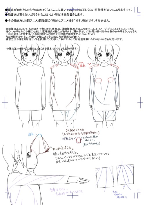
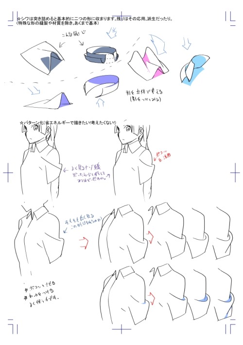
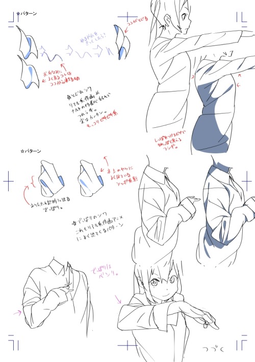
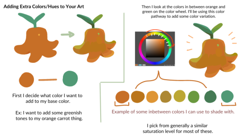
Clothing Tutorials,Tips and Guides
In order to make interesting designs of clothing, look around the web about outfit design, keep your mind with fresh ideas so then you can draw nice outfits on your characters.
Remember to keep in mind color theory when designing an outfit too, keep it balanced unless you are aiming for a sparkledog, then go nuts with the colors.


-
 hiimsuperawkwarddontmindme liked this · 10 months ago
 -
 babylongoggles reblogged this · 1 year ago
 -
 the-knee-thief liked this · 2 years ago
 -
 gayepilepticdog liked this · 3 years ago
 -
 mercury-sulfide liked this · 3 years ago
 -
 owlspirit liked this · 3 years ago
 -
 j0llyb3rnzy liked this · 3 years ago
 -
 someonerandominspaceandtime liked this · 3 years ago
 -
 allaroundtheeworld liked this · 3 years ago
 -
 ultragirl-parsley liked this · 3 years ago
 -
 harrypotter01-blog2 liked this · 3 years ago
 -
 junkroom liked this · 4 years ago
 -
 k0fi liked this · 4 years ago
 -
 qunaribaratiddies liked this · 4 years ago
 -
 justanotherhimbo liked this · 4 years ago
 -
 panopyra liked this · 4 years ago
 -
 coolerman001 liked this · 4 years ago
 -
 jam4lamz liked this · 4 years ago
 -
 noctthebat liked this · 4 years ago
 -
 villentrentenmerththeswanky liked this · 4 years ago
 -
 dracaticus liked this · 4 years ago
 -
 thebeautifulmacabre liked this · 4 years ago
 -
 boneybonebonez liked this · 4 years ago
 -
 melody-love-sketch liked this · 4 years ago
 -
 meyidk liked this · 4 years ago
 -
 azm0nlikes reblogged this · 4 years ago
 -
 azm0n liked this · 4 years ago
 -
 hinataelyontoph liked this · 4 years ago
 -
 cosmoet reblogged this · 4 years ago
 -
 dovesnrosesnreblogs liked this · 4 years ago
 -
 ahmidough liked this · 4 years ago
 -
 liekkihare liked this · 4 years ago
 -
 maintenon liked this · 4 years ago
 -
 therenegadeart liked this · 4 years ago
 -
 tails-of-a-dragon-rider reblogged this · 5 years ago
 -
 starsweater liked this · 5 years ago
 -
 blacklight-diamond liked this · 5 years ago
 -
 blujane liked this · 5 years ago
 -
 awesomevictoriau liked this · 5 years ago
 -
 sircarrot404 liked this · 5 years ago
 -
 epicfartmachine liked this · 5 years ago
