Need A Bigger Serving Of Practice? Check Out The 19-paged Worksheet And .psd Practice File!


Need a bigger serving of practice? Check out the 19-paged worksheet and .psd practice file!
The difference between a beginner’s comic and an experienced artist’s comic comes down to the details, and one of the biggest “invisible” details is proportion.
How does an artist utilize page and panel layout, negative space, word balloons and composition to their best advantage? This Shingworks tutorial covers all of this information, and the 19-page supplement worksheet and comic proportion analysis template .psd takes it a step further and teaches you how to analyze real comics so that you can apply these principles to your own comics :]
My Patreon tutorials are unlocked to the public 6 months after their original publication month. You can find the full high-resolution archive of monthly tutorials at my Patreon! Thanks again to my Patrons for supporting me in the creation of my own comics, The Meek and Mare Internum.
My recent free-to-read tutorials on Tumblr:
Worldbuilding!
Understanding Patreon & Building A Patreon
Grow Your Brand
Acting for Comics
Researching for Comics
Writing for Webcomics
Coloring with Masks
This month’s Patreon tutorial: Webcomics 101
And as usual, thanks very much for not deleting my text~~
More Posts from Arttuti and Others
Do you find drawing environments overwhelming? I did too, for a really long time. I started out drawing characters, and making the switch to painting environments was really hard at first! In my latest patreon tutorial, I break down the process into the most basic and essential steps, so that you don’t get lost in the details and know exactly what to focus on. Find it here for just $5: patreon.com/loish
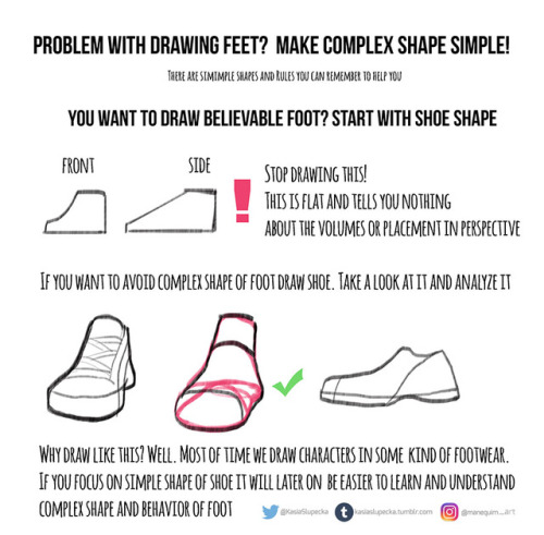
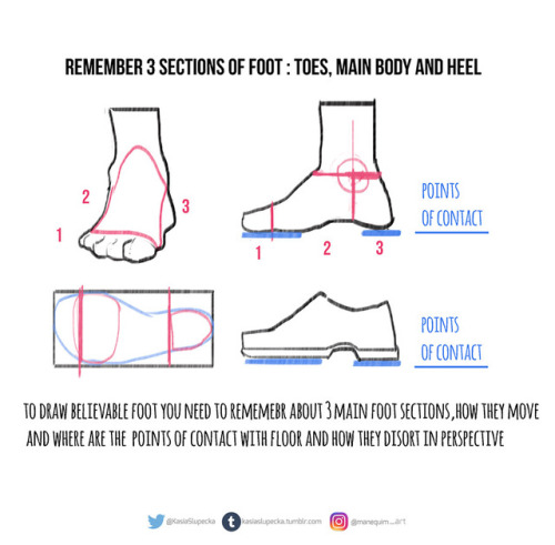
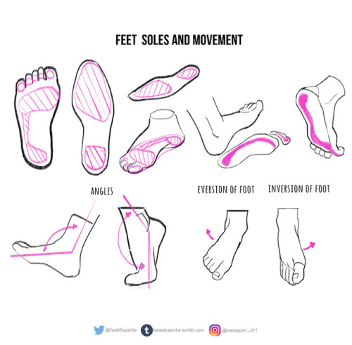
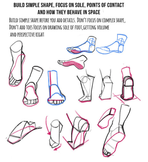
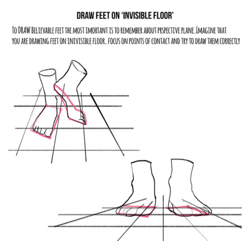
Weekly anatomy tip!
This week I tackle feet. I know how many of you asked for it.
It is hard topic indeed. It’s hard to draw nice looking character with feet that doesn’t look believable.
A lot practice is needed. I just presented few ideas and now you have to put it to practice.
Hope this helps !


Hi. :3 I love your art and you're totally awesome! I just had a quick question. I saw your post about hair tips on Dean and Cas, and I was wondering if you had one for Sam. Thank you, it means a lot. ^.^
Sure no problem! Just part it slightly to the right and have the hair flow down from that line. Don’t forget his killer sideburns lol


THE LAYERS CHEAT SHEET PART TWO (PART ONE HERE) Once again, I’m no expert- there are things about these layers I probably haven’t covered, so please try them out for yourself! Layers 1-7 help your contrast. They are usually a pair of the former two groups I went over in my last post. 1. OVERLAY: Helps your contrast by boosting your lights and darks, while the more mid tone pixels aren’t affected as much. It does this based on the layers beneath it. “Screens” the lights, “multiplies” the darks. 2. SOFT LIGHT: Similar to overlay, but a “softer” effect. You can think of soft light as more transparent. 3. HARD LIGHT: You can look at hard light as an intense version of overlay, with much brighter colors and a much less transparent look. 4. VIVID LIGHT: This is the heavy metal version of overlay- think of it similar to color dodge and color burn. Very intense colors, good for finding interesting lighting and color combos. 5. LINEAR LIGHT: Crazy amounts of contrast and color is added here, even more than vivid light. so heavy metal 6. PIN LIGHT: This one is interesting because besides it also being an intense contrast layer, it can add random noise to the active layer. Apparently this is a combo of the lighten blend mode on the light pixels and darken on the dark pixels, but the noise effect is what makes it really interesting imo. 7. HARD MIX: You will turn this mode on and be like “no” but it is actually adjusting its fill will reveal another overlay-ish type layer. It throws the colors on the active layer towards a more primary color such as blue, or magenta. _____ 8. DIFFERENCE: This will invert your colors, taking into account the layers below. If colors are very close, they will be black. 9. EXCLUSION: This also inverts your colors, taking into account the layers below. If colors are very close, they are grey. Exclusion and difference are layers that would be good for graphic pieces, I haven’t really gotten used to incorporating them in my painting workflow. 10. SUBTRACT: Similar to the above layers, but more intense. You will notice that the darker you make your active layer with Difference, exclusion, and subtract, the lighter and more transparent looking the result will be. 11. DIVIDE: Divide, however, usually results in crazy highlights that are pretty opaque unless the layer is fairly light, and then it will begin to go transparent. ___ 12. HUE: Makes the lower layer take on the hue of the active layer. 13. SATURATION: The lower layers take on the saturation of the active layer. 14. COLOR: The lower layers take on the color of the active layer. 15. LUMINOSITY: The lower layers take on the luminosity, or brightness, of the active layer. Once again, I’m no expert, but I hope this helps. Thanks guys! http://drawmaevedraw.tumblr.com/
-
 nerbull reblogged this · 11 months ago
 -
 soupvy liked this · 1 year ago
 -
 c4rl-5p4h liked this · 1 year ago
 -
 lobstersatan liked this · 1 year ago
 -
 comitivahiperborea liked this · 1 year ago
 -
 breakerhale reblogged this · 1 year ago
 -
 tryvia reblogged this · 1 year ago
 -
 twadi-gurl reblogged this · 1 year ago
 -
 scigirl123 liked this · 1 year ago
 -
twadi-gurl reblogged this · 1 year ago
-
 vitalia15 reblogged this · 1 year ago
 -
vitalia15 liked this · 1 year ago
-
 cephalosaur liked this · 1 year ago
 -
 abatonandouro reblogged this · 1 year ago
 -
 o--qreative reblogged this · 1 year ago
 -
 espacio-temporal reblogged this · 1 year ago
 -
 granniesabode liked this · 1 year ago
 -
 shompu liked this · 2 years ago
 -
 zatsy liked this · 2 years ago
 -
 villiaviper liked this · 2 years ago
 -
 epicfranb reblogged this · 2 years ago
 -
epicfranb liked this · 2 years ago
-
 dreamsequencedanceoff reblogged this · 2 years ago
 -
 meerphanim liked this · 2 years ago
 -
 pearlsandpetticoats liked this · 2 years ago
 -
 plaidwearinglesbian reblogged this · 2 years ago
 -
plaidwearinglesbian liked this · 2 years ago
-
 noodlesoupyy liked this · 2 years ago
 -
 derpykawaiidog reblogged this · 2 years ago
 -
 deathofdelta liked this · 2 years ago
 -
 gracebeth3604 liked this · 2 years ago
 -
 festbug reblogged this · 2 years ago
 -
 ivipl1 reblogged this · 2 years ago
 -
 lycanthian reblogged this · 2 years ago
 -
lycanthian liked this · 2 years ago
-
 somedancingdoodles reblogged this · 2 years ago
 -
somedancingdoodles liked this · 2 years ago
-
 whenpushkincomestoshove reblogged this · 2 years ago
 -
whenpushkincomestoshove liked this · 2 years ago
-
 catboiiii reblogged this · 2 years ago
 -
 wybienova reblogged this · 2 years ago
 -
 hypharie reblogged this · 2 years ago
 -
 karakuuls liked this · 2 years ago
