JEANS!!!CATS!!!😼👖
JEANS!!!CATS!!!😼👖

Sometimes you wonder where your pants went off …
More Posts from Genna-ivanovich and Others

Soviet space poster, 1963.
TOO CUTE
Who says Russians can't be this wholesome smh


Awww… The Soyuz TMA-22 crew before launch.
MUAH
yuri gagarin is such a sweetheart 1 like = 1 hug for yuri gagarin 1 reblog = 1 kiss
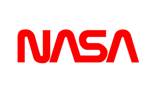
hey! im not that well versed on all things space bc it's a relatively new interest of mine. how come ive seen so many blogs post about not wanting the other nasa logo? you totally don't have to answer, i just saw that you reblogged a post about it :) hope you have a good day!
By the other NASA logo do you mean the worm or the wormball?
And to answer your question, I’m think the logo arguments are pretty much entirely aesthetic. Some people think the worm is dated and ugly, other people love how sleek it looks. Some people think the wormball is a good compromise, others think the aesthetics are clashy (I’m in that boat.)
For reference, here’s some NASA logos. The ones under the cut are a little rare and honestly you don’t have to care about them, they just look cool.

This is the meatball. It’s the original from the 60′s and it’s still in use today. Detailed yet clean. Gorgeous. The swoosh is a tie in with the aero side of NASA and the stars and orbit with space. The serif lettering manages to look classy rather than dated. Even if this isn’t your preferred logo, you have to respect how it’s got the perfect amount of detail to look interesting while also being ca clean design.
This is the worm. It was an attempt to modernize the logo around the start of the Shuttle/Skylab era. If this was for any other agency, I admit the worm styling would be a little dated. But personally, I think this logo brings back some of the enthusiasm of the early Shuttle era, just like the meatball brings back the energy of the Apollo era. It’s striking, it’s recognizable, and it’s one of my favorite worm stylings. (Compare it to SF MUNI’s worm logo, which was so cluttered I, as a local, didn’t notice it said “muni” until I was a teenager.)

This is the wormball. (Wikimedia was giving me trouble so it’s just a transparent background; I actually don’t have this one saved on my laptop for personal aesthetic reasons lmao.) Some people love it, but you will never convince me to. 100% personal preference, though, so if you love it, that’s fine, just keep it away from me. It’s like pineapple on pizza; you either love it or you hate it, but you’ve definitely got a strong enough opinion to argue about it.

This is NASA’s seal. You’ll only ever see it on official documents and things like that. It’s not something that’s displayed very commonly on, say, the wall of a NASA facility, and even less commonly on spacecraft. I believe this has been in use since the creation of the agency.
And, last but not least, I’d like to leave you with how the insignia is displayed on NASA aircraft, because they all. Look. Sick.

When they display the meatball on the rudder of an aircraft, like on SOFIA here, they omit the meatball and stars and display it like this! It looks cool as hell and it looks even better on aircraft where the rudder frames it nicer. (While I was searching around I saw a mockup for a meatballess wormball and it didn’t look awful.) Maybe we should call this the vegan meatball?
It’s also displayed like this on aircraft that were associated with NASA/USAF’s hypersonic research program in the early 60′s. Some pilots from this program went on to become astronauts.

... Including Neil armstrong who flew the X-15 above.
Aircraft from that program also featured a pretty neat rudder: it has this yellow stripe with NASA in a serif font that's unique to this design, as far as I know.
The first photo is Neil's X-15 again, the other is Dick Scobee's X-24B.


Lastly, the worm was plastered unedited onto aircraft during the worm era. It didn't always look good, but it looked too sexy on the X-29 to not include a pic.

(All photos are mine from NMUSAF!)

alignment chart: bookmark edition. tag yourself i’m scrap paper

Finally done with the whole range again! I am thinking this is probably the solid final version. Now I can move on to writing about them!


I think this is the highest-quality version of this photo I’ve seen. Found here, color correction done by me. Really stunning quality—the freckle’s on Ed’s hands and his red hair, Rog’s cowlick, Gus’ upside-down watch (as usual), the freckle on his cheek, and wow, he was going to be completely gray very soon, wasn’t he? Our beautiful boys.
“I think the public has accepted the possibility that there is a risk. We in the program accept this possibility also… It’s going to be exciting, this conquest of space, and full of a lot of wonderful things, things we haven’t even dreamed about yet.” Ed White
“If we die, do not mourn for us. This is a risky business we’re in, and we accept those risks. The space program is too valuable to this country to be halted for too long if a disaster should ever happen.” Gus Grissom
“I don’t like to say anything’s scary about it. There’s a lot of unknowns, of course, and a lot of problems that could develop, or might develop, and they’ll have to be solved, and that’s what we’re there for. This is our business, to find out if this thing will work for us… I definitely think you’re apprehensive and you’re considering what’s involved there, you’re thinking about it. But you know how to handle it and take care of it and do the job.” Roger Chaffee

Summer rain. Photo by Aleksandr Steshanov (1980s).

tonight’s episode: I’VE CAUGHT A LOVELY BUNCH OF COSMONAUTS
-
 sporefanofsomething liked this · 2 months ago
 -
 atomicfailnaught liked this · 2 months ago
 -
 midnite-enjoyer reblogged this · 2 months ago
 -
 britwriter liked this · 2 months ago
 -
 pneoneo2309 liked this · 4 months ago
 -
 holysoldier030 liked this · 7 months ago
 -
 sirio-la-estrella-incognoscible liked this · 10 months ago
 -
 color-ns liked this · 10 months ago
 -
 menofcolorhotspot reblogged this · 11 months ago
 -
 transparentsoulcat liked this · 1 year ago
 -
 aosdatc-s liked this · 1 year ago
 -
 deviledeggi reblogged this · 1 year ago
 -
 knghtlock liked this · 1 year ago
 -
 sezzyz reblogged this · 1 year ago
 -
sezzyz liked this · 1 year ago
-
 maddycatty06 liked this · 1 year ago
 -
 princesadivanasstuff reblogged this · 1 year ago
 -
 driftwood-dweller liked this · 1 year ago
 -
 zacian6 liked this · 1 year ago
 -
 yo-yohoooooo liked this · 1 year ago
 -
 sayosweeti liked this · 1 year ago
 -
 tompy398 liked this · 1 year ago
 -
 baabaawhitesheep liked this · 1 year ago
 -
 greykifa liked this · 1 year ago
 -
 amph8 liked this · 1 year ago
 -
 etherealdisneyvillainness liked this · 1 year ago
 -
 imaginaire-pur reblogged this · 1 year ago
 -
 axlclockworker liked this · 1 year ago
 -
 toxilicious liked this · 1 year ago
 -
 surrealnoctivaga liked this · 1 year ago
 -
 melonkneesimblr liked this · 1 year ago
 -
 kwobii reblogged this · 1 year ago
 -
kwobii liked this · 1 year ago
-
 sincerelyyourrss reblogged this · 1 year ago
 -
 leroicarbure liked this · 1 year ago
 -
 alsoansia liked this · 1 year ago
 -
 anotherhumanperson liked this · 1 year ago
 -
 mythrilwolf liked this · 1 year ago
 -
 ambersugarglass liked this · 1 year ago
 -
 coylthecoyote liked this · 1 year ago
 -
 outer-spec liked this · 1 year ago
 -
 blrblrnoob liked this · 1 year ago
 -
 orrteri liked this · 1 year ago

Pamir | 19 | eng/ind | mostly cosmonaut/genshin/language related
228 posts