Mari-chan11 - Anonymously Anonymous

More Posts from Mari-chan11 and Others
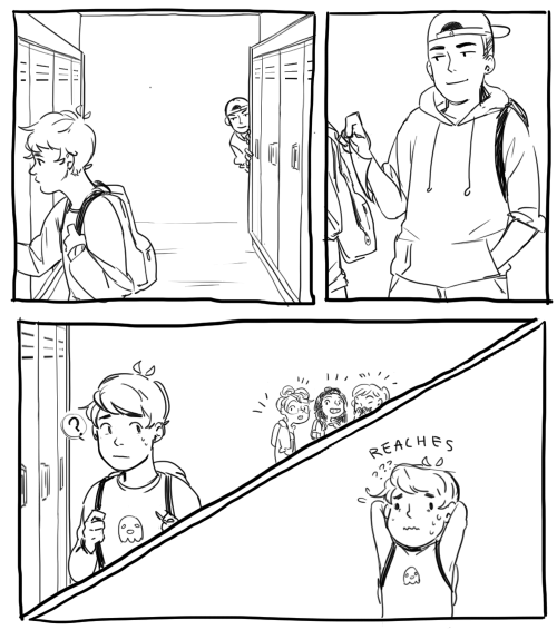
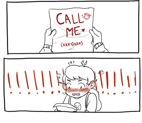

anyone please ask your crush out like this

*** REBLOG THIS AND GET A CHANCE TO WIN A FREE COPY OF SHEEP’S PATH! *** (Available until 14 July 2018)
Sheep’s Path is OUT!
Story Summary:
Clena, your normal everyday girl, finds herself in front of a circus filled with lovely animals. However, she quickly discovers that they are not ordinary animals - They are actually human boys who can transform into animals!
Get the full game here: http://zeiva.net/anicon/game_buy.html
Anicon Homepage: http://zeiva.net/anicon/index.html Anicon Demo: http://zeiva.net/anicon/game.html
Use this discount code for 15% off: EMER000E4 Valid for the first 100 orders!
Note: If you pre-ordered and have not receive a new download link, please email me at zeiva@hotmail.com. I might have missed you.

Anicon - Animal Complex - Cat’s Path is released!
Get the game here: http://zeiva.net/anicon/buy.html
Anicon Homepage: http://zeiva.net/anicon/index.html Anicon Demo: http://zeiva.net/anicon/game.html
Help me share the word! Thank you! (๑•̀ㅂ•́)و✧


all the king’s men Working on this was kind of like mourning, but my heart still hurts a lot.
…MERRY CHRISTMAS? 8’D;;;;;;;;;;;
friends, lemme share this little gem with you

FIRST! The inner flap:


oh dear indeed…


some people crayons are jerks.


:’(


:D

:D :D :D :D :D :D :D :’’’’) :’’’’’’’’)))))))))))


i just have a lot of feelings about this book and think everyone should own it

watercolor tips and tricks
some tips and tricks that have seriously helped me in excelling at watercolour
1. PAPER WEIGHT. for the love of god do not use any paper under 110-120 lbs to paint with watercolour, a very VERY wet medium that will soak clean through the paper if it’s not thick enough (most paper pads sold at craft stores have the weight listed on them. printer paper is around 20 lbs, sketch pads will be about 60 lbs, IDEAL watercolour paper 140 lbs+). i use only 140 lb paper for my serious watercolour works. canson and strathmore are my favourite brands
2. there’s no need to have very expensive watercolour paints, but it is important to use something better than crayola. my dad gave me a 24-pan windsor&newton watercolour set when i was 8 and these are still the paints i use today (i was a very careful child, but i never even had to replace my paint pans after almost 10 years either, so this brand, while super expensive, lasts and earns my gold star.) some other cheaper options are: x and x
3. if you’re going to be using watercolours, prepare to use WATER. so many people forget this, but it’s so important to realise this media is meant to look translucent, so you should see the paper through the paint. if you can’t see it, then you’re using the paints as if they’re gouache or acrylics, so try using more water and work with lighter colours.

OKAY NOW FOR THE ACTUAL TRICKS
4. SALT

quite overused in watercolour but it’s so freaking cool it can be pardoned. *remember for all of these effects, you have to use lots of water with the paint for it to work!
5. ALCOHOL/VODKA/HAND SANITIZER IF YOU’RE LAZY LIKE ME
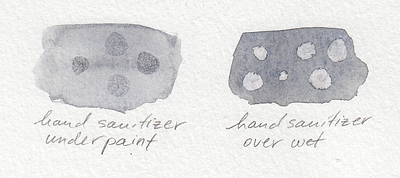
you have to be very careful here because the second image can turn into the first if you use too much alcohol and it soaks through the water and paint gets in the spot, so be sure to experiment plenty before using this!!
but yeah you can use whatever clear alcohol you can find and it does p much the same thing
6. LIGHT SKIN TONES
okay while the darker skin tones are more easily achievable with browns and additional yellows/blues/reds to bring out the undertone, light skintones are hard as hell to make with watercolour because it’s hard to even think of what to mix. think no more!
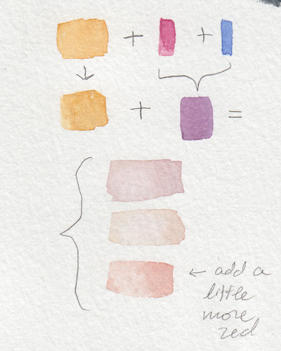
YELLOW OCHRE + ANY PURPLE = perfect skintone you can play around with. adding more of yellow or purple will give you either cool or warm skin tones you can build up on and layer until they’re the proper value. remember to use purple/cool shadows with skin in compositions with normal lighting!
7. PAYNE’S GREY
and finally to repeat my previous post, use PAYNE’S GREY instead of black for a richer, darker colour in your painting. don’t use black unless your entire composition has warm colours, but even then, try to use a very dark brown instead of black.

8. WHITE
finally, it’s very important to mention this: never use the white watercolour they sometimes give you. EVER. EVER. dilute your paint with water instead to get a lighter value, or else you’re not using watercolour to its full extent (which is something you might struggle with if you’re used to using acrylics or oil)
—
that’s all i can think of at the top of my head, but if you have any questions or need further brand recommendations etc, feel free to message me!

![[aggressively Supports And Encourages Young Artists]](https://64.media.tumblr.com/ea7c729cb69b1de141f3b972fb547567/tumblr_obrh2nDXjt1s6t3zyo1_1280.png)


Vampire Knight x Mystic Messenger CROSSOVER
The idea comes from here by @victuuri-on-ice-is-gay (Go check her tumblr ! She writes very good fanfics about Mysme and analysis ! >w< )
bnbnlnbal I thought I would never finish this. I drew everyone with the uniform ! I don’t know how Matsuri Hino can do it every time… (Sooo much detailed my god. )
I drew Saeyoung, Zen and Jaehee with the idea to when they were younger, (Idk why only them) I think that Saeyoung and Zen were more hostile (Zen would be more like Wild in this case and Zero for Saeyoung) and Jaehee with her long hair because she doesn’t have to cut her hair. MC and Saeran are the only humans !
-
 kansarv liked this · 5 years ago
 -
 dde-li-ri-um liked this · 5 years ago
 -
 manljusblog-blog liked this · 5 years ago
 -
 bigairplanes reblogged this · 6 years ago
 -
 4st3kl0-2mx8-x-2 liked this · 6 years ago
 -
 max-gif reblogged this · 6 years ago
 -
max-gif liked this · 6 years ago
-
 layll reblogged this · 6 years ago
 -
fricla liked this · 7 years ago
-
awb-adi liked this · 7 years ago
-
 nadaes-seguro-y-todo-es-posible reblogged this · 7 years ago
 -
nadaes-seguro-y-todo-es-posible liked this · 7 years ago
-
 destinyejarnay reblogged this · 7 years ago
 -
 divinecohmedy reblogged this · 7 years ago
 -
 boldfish reblogged this · 7 years ago
 -
 jsisissbsvid liked this · 7 years ago
 -
 y-am-i-here-blog1 liked this · 7 years ago
 -
 inviolableduck reblogged this · 7 years ago
 -
 donkeykongcountryreturnofthekong reblogged this · 8 years ago
 -
 ronniejcool reblogged this · 8 years ago
 -
thesecretsofmiguel liked this · 8 years ago
-
 w00nderwall reblogged this · 8 years ago
 -
 awesomego0dvibes liked this · 8 years ago
 -
 mogsf liked this · 8 years ago
 -
 macaronideluxe reblogged this · 8 years ago
 -
 loveirika-blog liked this · 8 years ago