To Live For Love, To Die For Love


to live for love, to die for love
The Lovers of Valdaro, Franz Kafka, My Liberation Notes (gizkasparadise), The Lark Farm, Rainer Maria Rilke, Monumento Moroni Scarneo, Monumento Rossi
More Posts from Parkerjones and Others

I have my favourite boys down to their bare essentials
(tap for better quality)
i would rather say "i love you" too much than too little, yk? i would rather yell "i love you" across a parking lot at 8:40 pm than to quietly go home, i would rather scream at my friends that "i love you" before i turn a corner, i would rather live in a world where my friends yell "i love you" back at the top of their lungs because life is so insufferably long but its also so so so short and i just. i would rather tell my people that i love them a ridiculous amount than have them not know,
yk?
i am a girlboss i am a war criminal i am a lunatic . i am clinically insane & the next virgin mary & i am never going to die

When Peter & MJ are that disgusting couple in matching outfits 😌
The excluded tags filter on Ao3 is such a fucking lifesaver. I love it so much.
Color Reference Guide to Recognize & Avoid Whitewashing
I’ve made a tutorial on how to color adjust to fix washed out colorings, but I noticed people aren’t always sure when their coloring needs fixing in the first place. So I’ve made a bunch of colorings you can use to compare your own to. It’s designed to help avoid whitewashing, but also help avoid over-correction.
If you’re not a content creator, you can also use this guide for reblogging as well. :)
Using the Guide
Each set comes in three: cool, neutral, and warm. If your coloring is bluer/whiter than the cool tone, consider readjusting.
Examples of what might be too pale/bright are beneath each set
There are various categories (daytime, night scenes, etc) for each type of scene you might encounter
Each coloring has a color palette beneath for the highlights, midtones, and shadows of the character’s face. If you’re having trouble eyeballing it, use the eyedropper tool to double check.
NOTES 1) For the sake of simplicity, I’ve used one character per category, but characters of color are not interchangeable. Identify the skin tone for the character you’re coloring and work with that. This is only meant to give a frame of reference for what is and isn’t whitewashing 2) If any of the colorings look different than what they’ve been stated as (i.e. the cool tones look too warm or some look way too dark to be visible) calibrate your monitor. It means your screen color and gamma needs readjustment.
Guide itself is under the read more!
Keep reading


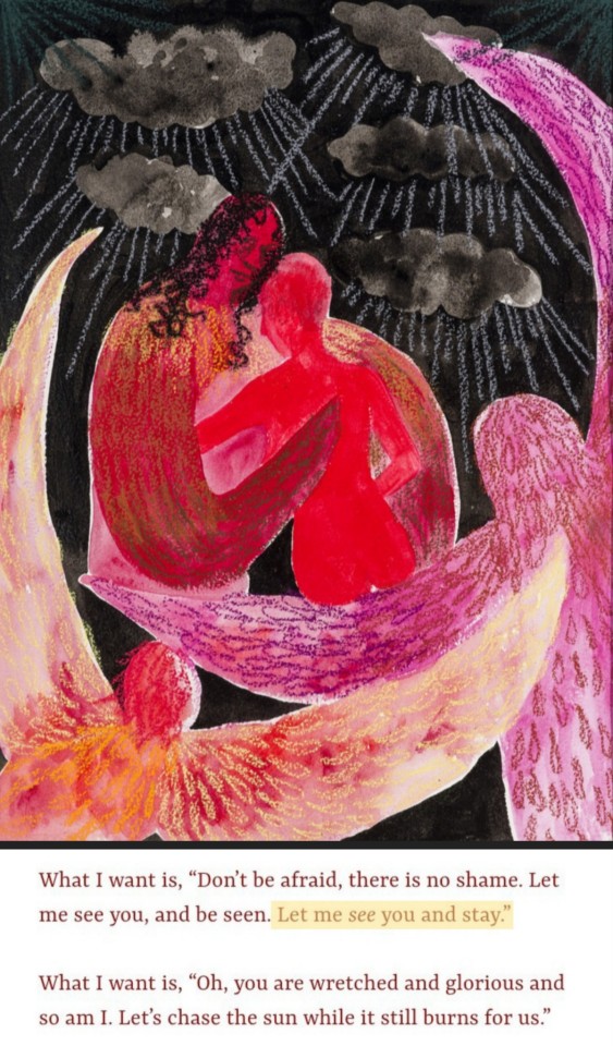


let me see you and stay
neil hilborn // text post – @rebeccabinch // naudline pierre – through the clouds, 2020 // flintcoded, 08 –15 – 21 // the first bad man – miranda july // sade alandria zabala // georges bataille // @tristamateer // mess is mine – vance joy // @softhe4rted , i will – mitski // taylor jenkins reid, the seven husbands of evelyn hugo //georges bataille – the dead Man //


-
 rosyfoam reblogged this · 4 weeks ago
 -
 littlebeastbysiken reblogged this · 1 month ago
 -
 richauntskeleton liked this · 1 month ago
 -
 legalcrimecommiter reblogged this · 1 month ago
 -
 pxasee liked this · 1 month ago
 -
 thearcaneuniversity reblogged this · 1 month ago
 -
 paramountie liked this · 1 month ago
 -
 thefantastickatinator liked this · 1 month ago
 -
thearcaneuniversity liked this · 1 month ago
-
 eclaireparlalune reblogged this · 1 month ago
 -
eclaireparlalune liked this · 1 month ago
-
 buckleyanddiaz reblogged this · 1 month ago
 -
 did-that-happen reblogged this · 2 months ago
 -
 c0smicsalt liked this · 2 months ago
 -
 sky-in-the-night liked this · 2 months ago
 -
 huaso-baby liked this · 3 months ago
 -
 pcygravity liked this · 3 months ago
 -
 adancernamedsophie liked this · 3 months ago
 -
 hanomalia liked this · 3 months ago
 -
 softduskhours liked this · 3 months ago
 -
 anyzkak liked this · 4 months ago
 -
 buffoppas liked this · 4 months ago
 -
 girlsfortzuyu reblogged this · 4 months ago
 -
girlsfortzuyu liked this · 4 months ago
-
 little-lion-man-self-ships liked this · 4 months ago
 -
 devil-doll13 reblogged this · 4 months ago
 -
 museofpoetry liked this · 4 months ago
 -
 cluuu3 liked this · 4 months ago
 -
 7umbler7rash liked this · 4 months ago
 -
 ae3ma liked this · 4 months ago
 -
 amanitavirosaa liked this · 4 months ago
 -
 rosesonfourthofjuly liked this · 4 months ago
 -
 hollowwomen reblogged this · 4 months ago
 -
 arcanangels reblogged this · 4 months ago
 -
 kasting-nets liked this · 4 months ago
 -
 midnighteclipse liked this · 4 months ago
 -
 r0tify reblogged this · 4 months ago
 -
 weepinghands liked this · 4 months ago
 -
 mileaie liked this · 4 months ago
 -
 cozyvoidchronicles liked this · 5 months ago
 -
 metamorphesque liked this · 6 months ago
 -
 anavitas liked this · 6 months ago
 -
 acenzer liked this · 7 months ago
 -
 pandorabox-rags reblogged this · 8 months ago
 -
 tilon15116530 liked this · 8 months ago
 -
goldenblush liked this · 8 months ago
-
 13leighstreet liked this · 8 months ago
