Week 3: Sept. 20
Week 3: Sept. 20
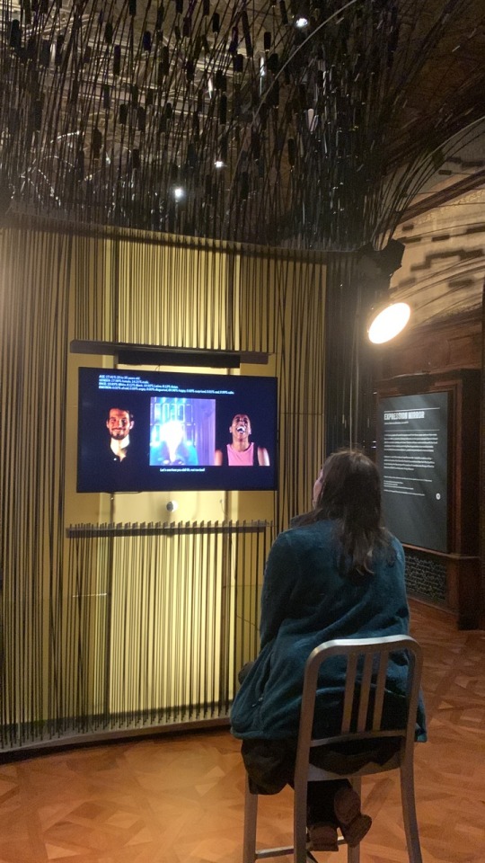
This week, I went with Jack to Nick’s show titled Voluntary Attempts to Overcome Necessary Obstacles at the Elizabeth Foundation for the Arts. Here is a short description below:

https://www.projectspace-efanyc.org/voluntary-attempts-to-overcome-necessary-obstacles
While I don’t think my project will really be involved with the game design space, this was a good opportunity to get some ideas for interactivity with museum pieces, as well as how work is presented.
The wall when you first walk into the exhibit:

Sheet we were given about the exhibit:


Second packet with all of the works in the show:


Special highlights:
Let’s Play Greek Punishment, 2011
By Pippin Barr

This was a series of games about mythology. In this one about sisyphus, you click in order to push the boulder up the hill. However, you are never able to actually complete the task, so continue to click until the player gives up. It’s supposed to be an “anti-game”, where the conventional goals in most mainstream game play are taken away, and this is what you are left with.
The Soft Rumor of Spreading Weeds by Porpentine Charity

This really got me thinking about how to present objects in a gallery space. The small rounded carpet felt super intimate, and made me thing of playing games on the computer on the floor as a kid. This also made me think a little bit about my talk with Kelly McGowan last year, and how she did her capstone project about her bedroom. It gives me similar “cozy” feelings.
Folds of Separation by Studio Oleomingus

I was a big fan of the artwork for this piece, it was very intricate maze game. Not necessarily the type of gameplay that I enjoy (it was very frustrating), but I did enjoy looking at it.
The Cloister by Everest Pipkin

The artwork for this pice was stunning as well.
If I recall, this was the box that held the cards for World Ending Game by Everest Pipkin. The instructions for the game were long, and it took an hour to play it, so I felt that it was a bit of a risky move for the exhibit only because not everyone (including me), would have the time or patience to read the instructions and play the game. But I did appreciate the attention to detail (for example, as pictured here, the slot created for the cards and dice for the game in their storage box).

The Tearoom by Robert Yang

It was in a separate corner of the exhibit. You interacted with the game that was projected on a wall with a mouse that was on a pedestal in the middle of the room, giving it a super simple interface. It was a very weird game, where you played as a man in a very dingy bathroom. You were at a urinal, and were able to watch men who came in and out of the bathroom to pee, except all male genitalia was replaced with guns. Ultimately, after watching someone too many times at the urinal, the player was able to pleasure the man to completion in the gross bathroom. I was really confused after watching Jack play, but after talking to Nick about it, he explained that it was about how in videogames and on many social media platforms (although we were specifically talking about Twitch in this context) censor male genitalia, but guns are allowed. I guess it is a little weird when you think about it that objects that inflict violence are less censored than our own bodies on the internet. I will try to get the video from Jack and post it here, if Tumblr allows it
Also, in a smaller amount of creative research, I found a new material?


I went to an event for CSA (Chinese Student Association), and we made these foam clay moon cakes in celebration of mid autumn festival, using mooncake presses like the one I’ve attached here. I’ve somehow never used clay like this though, and when it dried (which it did much quicker than any clay I used growing up), it was super lightweight and more like foam clay than the hard, more pottery-like textures that other clay I used growing up. I also liked the idea of the presses. They remind me of the carving blocks we used in design I to create prints of letterforms, but they make a 3D object instead of 2D. Maybe I will explore this idea in a future experiment for my capstone, although I don’t know exactly how I am going to position this in terms of juxtaposition yet.
Overall this week, I feel like I am still working through exactly what form my project is going to take. I feel like the foam clay in an interesting medium for a future creative research or making, but not necessarily for a final medium. Same with the stamp/mold/block printing idea. They’re fun mediums that I may experiment with, but am not sold on yet for the final project. I really enjoyed going to see the exhibit that Nick curated. To be honest, my interest does not really lie in games, but I did get inspiration from seeing how works were presented in an exhibit space, and made notes on what did and what did not work, as I have elaborated above. I will definitely plan to see more exhibits in the coming weeks as well.
More Posts from Rachelcapstone and Others
Final Crit Notes

Get Space-Crafty with Earth Science!
It’s time to get space-crafty! (Get it?) We’re getting ready to launch Landsat 9 into space this fall, and we want to know, how does Landsat inspire you?
For nearly 50 years, Landsat satellites have been collecting important data and taking beautiful images of Earth, as a partnership between NASA and the U.S. Geological Survey. Scientists and policy makers alike use this data to understand climate change, deforestation, the growth of cities, and so much more.

In celebration of the Landsat 9 launch in September, we are calling all crafters to create space-crafts inspired by your favorite Landsat image! From watercolor paintings to needlework to frosted cakes, let your creativity flow and show us how you see Landsat images.
Post a picture of your craft on Instagram, Twitter or Facebook with the hashtag #LandsatCraft. We will spotlight some on social media!
For a little inspiration, here are some #LandsatCraft examples from some of the people who work with Landsat:

“Looking through the Visible Earth Landsat gallery for inspiration, I saw the Landsat Image Mosaic of Antarctica (LIMA) and knew immediately what I had to do -- recreate it in a mosaic of my own. LIMA is a composite of more than 1,000 cloud-free Landsat 7 images of Antarctica, and when it was released in 2007 it was our first high resolution, true-color look at the icy continent.” – Kate Ramsayer, NASA Landsat Communications Coordinator

“I love embroidering satellite imagery and NASA data. For Landsat, I wanted something with lots of straight lines -- much easier to stitch! -- and crop fields like these fit the bill. It’s amazing how clearly we can see the influence of human activities in satellite imagery like this. It’s a constant reminder of the effect we have on our home planet.” – Katy Mersmann, Earth Science Social Media Lead

“We didn’t have the discipline or the organizational skills to do any of the really, really fancy images, like Lena Delta, so we chose Garden City, Kansas in 1972. We added a model of Landsat 1, too.” – Ryan Fitzgibbons, Earth Science Producer, and Charles Fitzgibbons, Age 8

"I was inspired by this Landsat image which demonstrates how we can use satellite imagery to remotely monitor cover crop performance, a sustainable farming practice that promotes soil health. Since I began working with NASA Harvest, NASA's Food Security and Agriculture Program, I've come to understand the critical importance of conservation agriculture and resilient farmlands in support of a food secure future for all, especially in the face of a changing climate." – Mary Mitkish, NASA Harvest Communications Lead

“I chose particular ingredients that represent the Landsat qualities that we celebrate:
The base spirit is gin because Landsat data is clean and precise. Vermouth represents our foreign collaborators. Using both lemon and lime juices signifies the diverse uses of the data. The ginger is for the land we study. The apple, well, because it’s American. The club soda makes it a long drink, for the long data record.” – Matthew Radcliff, NASA Landsat Producer

“Last year for the 50th Earth Day, I created this poster, inspired by our views of river deltas -- many captured by Landsat satellites -- which are particularly beautiful and evocative of water coursing through our land like a circulation system of nature. In 2000, Landsat 7 took one of my favorite images of the Lena Delta, which is the basis for this art.” – Jenny Mottar, Art Director for NASA Science
Are you feeling inspired to create yet? We’re so excited to see your #LandsatCraft projects! Follow NASA Earth on Twitter, Facebook, and Instagram to see if your art is shared!
Make sure to follow us on Tumblr for your regular dose of space!


In 1926, Wassily Kandinsky published two essays on his theory of form, the essays were accompanied by photographs and abstract drawings. Gret Palucca, a pioneer of the new expressive dance, was the model for the abstract drawings.
The Palucca-inspired sketches are originally based on photographs by Charlotte Rudolph
Week 10: November 8
This week, I tried again to explore playing with the printer after I saw someone on Tik Tok doing it (I lost the Tik Tok, the video may have been one of the removed ones from my favorites.)
I put a random phrase that I got from a generator, and placed it in photoshop after choosing a font, the printed it. I them scanned the printed images, and manipulated it as it was scanned, causing the text to come out distorted and wavy. I then also generated a random object to go with the random phrase, and would print an image of that and manipulate it as I scanned it. Finally, I would put the manipulated image and text together back in photoshop to form an interesting composition, and to see what connections were made between the random phrase and objects.
In this scan, the duck may not be a fish, but it does swim in the water like one, and it is out of water. Compositionally, I think that this scan is the most interesting.

This scan I had the most trouble finding a connection between the phrase and object. I actually more noticed the differences between them, as the fluffiness of the ideas of a cloud and the sharpness of the scissors contrasted in my mind.

In this scan, shot made me think of basketball, which made me think of a basketball, which is a ball just like a beach ball.

I also looked a little more into Surrealism since the critique last week. These scans kind of remind me of a combination between The Persistence of Memory by Salvador Dali and The Treachery of Images by René Magritte. The images and text have the same melting quality of the clocks in The Persistence of Memory, but have the format of a “mismatching” object and label like The Treachery of Images. In a similar way, it brings into questions what is meaning, and how do we even decide if an image goes together or not.
As mentioned above, my creative research was mostly focused on surrealism this week. I looked at The Historical Dictionary of Surrealism by Keith Aspley.
Citation: Keith Aspley. 2010. Historical Dictionary of Surrealism. Historical Dictionaries of Literature and the Arts. Lanham, Md: Scarecrow Press. https://search.ebscohost.com/login.aspx?direct=true&db=e000xna&AN=341973&site=ehost-live.
Link: http://ezproxy.stevens.edu/login?url=https://search.ebscohost.com/login.aspx?direct=true&db=e000xna&AN=341973&site=ehost-live&ebv=EB&ppid=pp_3
Summary: The Historical Dictionary of Surrealism relates the history of this movement through a chronology, an introductory essay, a bibliography, and over 600 cross-referenced dictionary entries on persons, circles, and groups who participated in the movement; a global entry on some of the journals and reviews they produced; and a sampling of major works of art, cinema, and literature.
Particular sections are highlighted below:

Here, Surrealism “refers to the artistic and literary movement that attempts to express the workings of the subconscious mind and is characterized by incongruous juxtapositions of images, probably needs to be approached from different angles: chronological, thematic, and linguistic, among others”. This definition is important because it emphasizes the importance of juxtaposition in the movement.

This quote talks about some terms that are used in surrealism.
This book was a great introduction to the Surrealist movement, and does a good job of explaining its history, timeline, terms, and notable figures. I like that it emphasizes juxtaposition as a key part of the movement, as meaning is made through the juxtaposition of images, text, and what the viewer is expecting.
Overall this week, I learned a lot more about Surrealism, where it came from, and how works from this period function. The article I read related well with the artwork that I made this week, which ended up seeming like a combination between The Persistence of Memory by Salvador Dali with the melting images, and The Treachery of Images by René Magritte with the image caption format. I further explored how connections are made between unlike images and phrases through this work (going back to how our brains will jump to find the pattern). This actually might be my first exploration that includes both images and text. I really liked the visual effect of the scanner as well, and thought that these pieces came out visually interesting as well as relating to my topic. Next week I plan to further explore meaning, as well as make something digital (maybe video?)
“Anyone who’s ever put a stamp on an envelope or a note on their refrigerator knows what it’s like to make a collage. There’s no esoteric technique.” - Elliott Hundley
I feel like I love and hate this quote because it’s true, and it’s one reason why I like collage - because it reflects life. But also I don’t like it for my capstone because I think it starts to get into “anyone could have done that” territory. Will think more about this...
Week 7: October 18
For scholarly research this week, I wanted to learn more about soft power. I read an article by Joseph Nye, the one who coined the term.
Citation: Nye, Joseph. “Soft Power: The Origins and Political Progress of a Concept.” Palgrave Communications 3, no. 1 (2017). https://doi.org/10.1057/palcomms.2017.8.
Link to article: https://www.nature.com/articles/palcomms20178
I learned more about the exact definition of soft power, straight from the source. He defines power as the following: “Power is the ability to affect others to get the outcomes one prefers, and that can be accomplished by coercion, payment, or attraction and persuasion. Soft power is the ability to obtain preferred outcomes by attraction rather than coercion or payment." I think it's interesting that he coined it because of an apparent decline in US imperialism, as I feel the same discussions are still being held today. He discussed how the meaning of the word has changed in relation to more recent events, and the varying responses to his invention of the word. I actually think still that soft power is underrated, because of its subtlety and its lack of discussion in politics. The same goes with juxtaposition, where I think that the power it has is subtle and underestimated.

I also wanted to highlight my own version of the recipe cards from that I saw at Poster House the previous week.

This is just a sample, but I was thinking maybe the cards could contain information about any objects I make, or maybe any significant quotes that I found in my research.

I was running out of blue ink, but I made the cards in photoshop and glued them to cardboard to make the cards.

It’s a little sloppy, but I enjoyed making them. I feel like they are less the main focus of my project, and maybe something that I would make to go along with it and hand out if I had time. I would need to figure out a way to mass make them though. The cards could probably be printed somewhere like CVS or staples, but I’m not sure if there’s a way to reproduce the carrying case cheaply (I’m sure getting a custom folder like that would be expensive) or easily (making that many by hand would take too much time. I will think further about this.
Overall this week, I was glad I got to learn more about the origins of soft power. The only reason I had heard that term before was in relation to Kpop, and how the tourism and hype that it brought has brought South Korea much more money and influence. I thought of the US as more of a hard power because of this country’s emphasis on the military, but I suppose our cultural influence would give use soft power as well. I would like to try to find another source that discusses this more in an art or media context though. I will also look more into the process of making the cards, or deciding exactly what information I would put on them. I may put it off for now though and decide to focus more on the main project, and make this more of an extra or side project.
Week 8: October 25
This week for my creative research I visited the Cooper Hewitt Museum. Here are some of the highlights:

From Design and Healing: Creative Responses to Epidemics
Zero-waste Scrub Set, 2020 by Danielle Elsener
This zero-waste scrub resulted from when the logo from the NHS (National Health Service) was printed at the wrong size.
I love the unique pattern that is created from the fabric scraps sewn together - it makes it look more high fashion than a normal scrub, even though it was made from a fabric that would normally have been thrown away because of errors.

Next was an exhibit on AI

Expression Portrait by R. Luke DuBois

This piece scanned your face, and guess the emotion that you were showing. It then asked you to hold that emotion for a minute. However, right after, it reveals that it had collected data from you about your age, ethnicity, current emotion, etc., and that the fun activity was not so fun after all. One thing that we noted was that the results for my roommate were a bit more accurate than mine, maybe because AI tends to be better at detecting white faces...?
The next exhibit we went to was designing for peace. I just really liked the theme of this exhibit and it was definitely my favorite due to the variety of cultures, ideas, issues, and solutions that were involved with it.

I through the opening wall was really cool, and how there was a hidden message depending on which angle you were looking at it.


I loved the typography and symbolism in this Black Lives Matter street art, and the imagery that was in each. They still all look cohesive.

Conflict Kitchen is a takeout kitchen in Philadelphia that serves food from countries in conflict with the United States.

The facade of conflict kitchen. It reminds me of Rich’s piece from last year.

This idea is great because it highlights food from countries that many Americans may normally be hesitant to try, due to lack of accessibility, knowledge, or fear of cultural differences. Restaurants representing these countries also may be more likely to face discrimination due to the bad media that they recieve due to the fact that they are the US’s “enemy”. Serving food though gives people the opportunity to associate these countries with something more positive, and experiencing the culture can help to humanize it's people. Food also acts as a gateway to learn more about these countries’ people and cultures in a more positive light that the media does, telling the other side of the story. Cultural exchange is a great was to confront bias and fear that Americans may have.
Take out wrappers for Conflict Kitchen contain interviews with multiple perspectives of people but currently living in and those who moved away from the focus country.


Universal Declarations of Human Rights Posters

“This is My Home” Poster based on the Declarations’s Article 25: Everyone has a right to a standard of living adequate for health and well-being.
By Cindy Chen

“Your Thoughts are Illegal” Poster and Postcard based on the Declaration’s Article 18: Everyone has the right to freedom of thought, conscience, and religion.
By Christopher Kosek

Everybody poster and postcard based on the Declaration’s Article 1: All human beings are born free and equal in dignity and right.
By Christopher Kosek

Sweat Shop Labor poster and postcard based on the Declaration’s Article 23: Everyone has the right to work... to equal pay...

I really like these posters because of the irony in the imagery, and how it gets the message across so clearly. Just the imagery alone implies what the topic of the poster is. The designs are really creative and clever.
I also talked to Jack as he also went to the Cooper Hewitt, and he said that the layout of the museum reminded him of my project, as the exhibits were really close to each other and juxtaposed each other.
I really enjoyed going to the museum this week, but I’m still not sure exactly the direction I want to go for my next project, I loved so many of the projects there, but I’m not exactly sure how some of them relate to my topic, as I feel like they maybe touch more on other interests I have that are not necessarily related. I did get some insirpation on how to present my work, and the various forms that it can take. Who knew medical devices could be placed in an “art” museum?
For scholarly research this week, I found a book by Gail Dexter Lord and Ngaire Blankenber called Cities, Museum, and Soft Power.
Citation: Lord, Gail Dexter, and Ngaire Blankenberg. 2015. Cities, Museums and Soft Power. Washington: American Association of Museums. https://search.ebscohost.com/login.aspxdirect=true&scope=site&db=nlebk&db=nlabk&AN=1341266.
Link to article: http://ezproxy.stevens.edu/login?url=https://search.ebscohost.com/login.aspx?direct=true&db=e000xna&AN=1341266&site=ehost-live&ebv=EB&ppid=pp_9
Summary: Soft power emerged as a concept in the late twentieth century to describe international relations based not on military or economic strength, but on influence. While the resources of "hard power" are tangible-force and finance-soft power resources include ideas, knowledge, values, and culture, as well as the ability to persuade. This volume discusses soft power from the vantage point of museums and demonstrates how they are quietly changing the world. With contributions by thirteen experts from ten countries, Cities, Museums and Soft Power reveals the world's 80,000 museums to be sleeping giants. Two major characteristics of soft power-the rise of cities and the role of civil society-are pushing museums from the margins toward the center as these institutions serve as education hubs, employers, magnets for creative industries, and engines of economic development. Meanwhile, the growth of technological networks and connectivity has enabled this soft power to spread even farther and deeper across the Internet and groups of people. Whether cozy and local or internationally renowned, museums possess a cultural strength that extends far beyond their walls

It also recaps some information that I learned earlier from a different perspective.
There was also some discussion about when soft powers collide, how cities and museums can use soft power to better the lives of the people that live there, and how soft power is not always employed positively.

I am glad this week that I finally found another book talking about soft power in an artistic or more localized scale. I was honestly surprised that a whole book existed. It focuses a little more on cities and museums than I probably will in my paper, but still has some good insight. Particularly, how soft power is not always a power used for good. In a similar way, juxtaposition is a soft power, but it can be used to portray a negative message as well.
Overall this week I got some really good inspiration from Cooper Hewitt. I particularly like the way that the Human Right posters played with meaning and were so easily able to grab my attention. The format and imagery with the text had great gestalt and already implied the topic at hand even with just the simple imagery. I also feel now after this week that I understand soft power enough in all sense (political, artistic, and the negative sides to it), so will find a different research topic for next week.
