Guyssss Shes Hereee

Guyssss shes hereee
More Posts from Slasherbog and Others
like to charge reblog to cast
🕯️ 🕯️ 🕯️
🕯️🕯️ may all 🕯️🕯️
🕯️🕯️corrupt politicians🕯️🕯️
🕯️🕯️ meet their fate 🕯️🕯️
🕯️🕯️ ‧͙☆༓happy ides༓☆‧͙🕯️🕯️
🕯️🕯️ to all 🕯️🕯️
🕯️ 🕯️ 🕯️
Horror Movies on Internet Archive
Spider Baby (1967)
Black Christmas (1974)
Carrie (1976)
Suspiria (1977)
Alucarda (1977)
Possession (1981)
An American Werewolf in London (1981)
The Evil Dead (1981)
Evil Dead II (1987)
Army of Darkness (1992)
Basket Case (1982)
The Thing (1982)
The Return of the Living Dead (1985)
Re-Animator (1985)
Bride of Re-Animator (1990)
The Lost Boys (1987)
Nekromantik (1987)
Elvira: Mistress of the Dark (1988)
Tetsuo: The Iron Man (1989)
Singapore Sling (1990)
Man Bites Dog (1992)
Braindead (aka Dead Alive) (1992)
Ghostwatch (1992)
Perfect Blue (1997)
Cure (1997)
Pulse (aka Kairo) (2001)
PEEPO MAN LMAOOOOOO

You know, I’ve done worse things in my life.
make a girl smile today.
give her a sword.

Yay, I finally found a HHN lore expert on Tumblr! So this question technically doesn't have to do with the lore, but it also kinda does. Do you know if The Usher was inspired by any particular horror movie or horror icon? I've been trying to find behind the scenes info on him, but I've come up with nothing. And if there's a horror movie out there that led to the creation of my favorite Icon, I definitely want to know about it!
Ok now this is a fun question! Buckle up because it's lore dump time! So Julian Browning the Usher actually is perhaps the most original icon of the bunch in terms of not being overly inspired by a film character in appearance. His inspiration comes the most from Universal's own The Phantom of the Opera, which just so happens to be his favorite movie. What Julian lacks in a Christine Daae he makes up for with his obsession with his job at The Universal Palace Theatre. The main inpiration for the character of the Usher came from the simple notion of "How can we present an event year where the headlining line up of attractions are big name horror movies?" Ofcourse they opted not to use The Director and instead come up with another movie themed icon character, figuring this icon would be USHERING guests into the horror movies that year. This quickly turned into a movie theater employee that snowballed into a full fledged character still present at the event today. Here's some more fun facts about the inspiration behind our beloved Usher.
Inspiration for The Usher's Name: Julian Browning's name was actually inspired by Rupert Julian (The Director of Universal's 1925 Phantom of the Opera) and Tod Browning (The Director of Universal's 1931 Dracula) putting the two director's names together to make a new one for HHN's original icon The Usher.
Inspiration for The Usher's Backstory: His death (accidently hanging himself backstage) was inspired by actual IRL tragic accidents that happened at old theaters back in the day, Universal's HHN Team just turned up the ghost lore aspects of it by alluding to an evil force inside the theater caused the accidents. Also some of the creative directors have noted that inspiration for Julian's strict enforcement of the rules stemmed from their own bosses at movie theaters they worked during their own teen years. Inspiration for The Usher's Personality: The actor who plays him the most in commercials and interviews has stated he took inspiration from the character Riff Raff from The Rocky Horror Picture Show and decidedly creepy old people when deciding how best to personify the undead usher. Many other actors who have played the character often point to inspiration from the original actor himself as well as a "chill version" of The CryptKeeper from the TV show Tales from the Crypt.
Inspiration for The Usher's Appearance: Surprisingly enough Universal's HHN Artists designed Julian's costume to be unique, not realizing until after having made countless duplicates for the event that the costume bares a striking resemblence to Disney's Tower of Terror bellhop uniforms. They literally shrugged and just went with what they had already designed. The flashlight was inspired by the actual flashlights used in movie theater ushers back during the 1940s. Julian's makeup was designed around the idea that he was dead, you'll note that Julian has a more yellow tint to his skin during 2009 that turns to a more regular pale shade as the years progress. This is because the makeup director wanted Julian to look like a real corpse who's skin had yellowed, cheeks had puffed while cheekbones had sunken in, and eyes had sunken in and darkened as well as lips had darkened. They actually researched actual images of dead people for reference when designing his makeup. The scar on his neck from his death seems to have become a sort of after thought after the 2009 event because occasionally you'll find images of actors playing the Usher where he's missing his most noteworthy wound and when it does appear anymore it's usually just a mark across the neck and not an actual prosthetic.
Inspiration for The Universal Palace Theatre: The Palace Theater Arcade inside of Universal Studios Orlando park was a clear inspiration for the name of the setting of Julian's backstory. While the building/facade of the arcade is nothing like The Universal Palace Theater. In the early days, Universal, unlike the top-tier studios, did not own any theaters to market its feature films. It wasn't until 1928 that Carl Laemmle Jr. (then head of Universal Studios) bought and built theaters that could technically be owned under the Universal Studios name. However as the Great Depression hit, the theater chain was scrapped entirely. Universal Studios never owned a theater again until modern day partnerships with CMX theaters in their City Walk areas outside their theme parks. So sadly there is no real Universal Palace Theater and there never was, but that didn't stop Universal Art and Design from researching other ritzy hollywood movie palaces that Universal didn't own. A movie palace is any of the large, elaborately decorated movie theaters built between the 1910s and the 1940s. The late 1920s saw the peak of the movie palace, with hundreds opened every year between 1925 and 1930. With the advent of television, movie attendance dropped, while the rising popularity of large multiplex chains signaled the obsolescence of single-screen theaters. There are three architectural design types of movie palaces. First, the classical style movie palace, with its opulent, luxurious architecture; second, the atmospheric theatre which has an auditorium ceiling that resembles an open sky as a defining feature; and finally, the Art Deco theaters that became popular in the 1930s. Specifically Art Deco was the design type Universal Art and Design went with for The Usher's Universal Palace Theater most probably because it set a time era visually, instantly recalling the olden days of when the theater would have been in it's hay day. Many IRL movie palace theaters inspired The Universal Palace theaters but to name just a few:
The Alameda Theatre (Almeda, California)
The Castro Theatre (San Francisco, California)
The El Capitan Theatre (Hollywood, California)
The Los Angeles Theatre (Los Angeles, California)
The Hollywood Pantages Theatre (Hollywood, California)
The Warner Grand Theatre (Los Angeles, California)
and of course it wouldn't be HHN lore without inspiration from Ohio!
The Palace Theater (Canton, Ohio)
and most notibly architecture wise
THE AKRON CIVIC THEATRE (Akron, Ohio)
Fun Facts: Actors cast as Julian Browning must meet the height range of 5'10" - 6'2"
Julian Brownings hair is officially listed in canon as brown/brunette, however actors who have played the character have appeared with dirty blonde and auburn hair colors.
In 2009 most of the flashlights were surprisingly heavy for cast members and apparently broke easy, as the event went on less and less flashlights were seen in characters' hands.
In 2010 Julian, Paulo, Jack, Albert, and Elsa all appeared with markings on their face (makeup) to denote their positions of Herald of Fear to Adaru the Lord of Fear. Julian's makeup design was apparently the easiest to work with for makeup artists applying the roman numeral XX branding overlay onto his makeup design.
In 2015 Julian was for the first time seen without short brown hair, however this was an allowance/oversight from the scarezone director for an actor who didn't want to cut his hair.
In 2021 Julian is the only icon in the Icons:Captured house that was seen with an entirely burgundy red covid mask, matching his burgundy red uniform. This was also the first year guests could see his cold dead lifeless corpse hanging from the ropes behind the torn screen in the Universal Palace Theater. His corpse was a dummy/static figure.
dealing with the worst case scenario
your condom breaks
you feel a lump on your breast
your friends are ignoring you
you’re stranded on an island
you got rejected by a crush
you get into a car accident
you got stung by a bee/wasp
you got fired from your job
you’re in an earthquake
your tattoo gets infected
your house is on fire
you’re lost in the woods
you get arrested abroad
you get robbed
your partner cheated on you
you’re on a ship that’s sinking
you fall into ice
you’re stuck in an elevator
you hit a deer with your car
you have food poisoning
your pet passed away
you fall off of a horse
you or your friend has alcohol poisoning
you have toxic shock syndrome
your house has a gas leak

I love you unwell elf girl


Manual Wheelchair Tutorial by Fade31415
So... I technically drew this 3 years ago but forgot to post it. I think I was going to clean up the end and make a nice recap, but I ran out of steam and then just left it as a wip for years. I got reminded of it because I was talking to a friend about how to draw wheelchairs today.
This covers most of what I view as the most common errors when it comes to drawing characters who use manual wheelchairs. I hope it helps you a lot.
Image description is in alt text, but there is a back up image description under the cut in case that does not work for some reason
[image description: a 4 picture long wheelchair tutorial. the background is white and the text, when it appears, is black and in calibri. each step will be labeled with "Step #" and a description of the drawing next to it, and "text" and then the text that is written to explain it to follow.
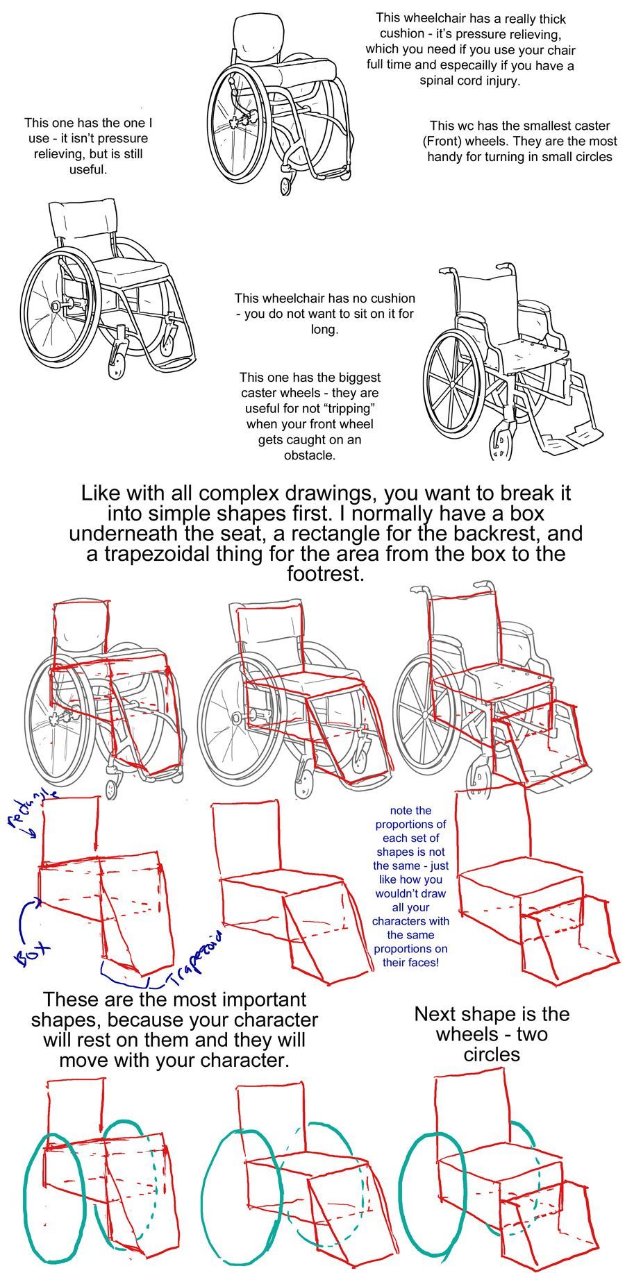
Step one text: So, you want to draw a character who uses a manual wheelchair? Awesome! I can't approve more. Drawing characters who use wheelchairs is a bit different than drawing standing characters, because of obvious posing differences. But to start, you need to know what parts of a wheelchair you will draw. So, without further ado, here are 3 wheelchairs!
Step one image: a simplified drawing of a chubby woman sitting in a quickie GPV manual wheelchair and resting her hand on the handrim of one of the wheels. this is labeled "the artist"
step two: next there is a lineart drawing of three wheelchairs. one is a tilite TR series 3. this is an ultralight wheelchair with a bucket seat (the back is lower than the front), a big cushion and a short backrest that kind of contours to the back of the person who would sit in it. the caster wheels (front wheels) are very small and the footrest is just two little metal bars. next image is a quickie GPV. this is also an ultralight wheelchair with a low back, but its caster wheels are slightly larger, the back has regular upholstery (it does not look like it was made to conform to the back of the person who sits there) and the frame is boxier -- there is no bar underneath the seat where the wheels would attach, rather each wheel is attached to the side of the chair. the next wheelchair is an invacare tracer. it is how most people imagine wheelchairs when they hear 'wheelchair'. it has no cushion and it has a high backrest with handles. it has high armrests that would be comfortable to rest your elbows on if you were just sitting. the wheels are not bicycle wheels like the previous two but are rather plastic. it has big footrests and big caster wheels.
text: the wheelchairs on the left are the ultralight, sporty kind. I have one of them (the quickie). the one on the right is a more standard one you might find in hospitals or as the public wheelchair in grocery stores or the mall.
step three: first is text to accompany the tilite. "This wheelchair has a really thick cushion - it's pressure relieving, which you need if you use your chair ufll tiem and especially if you have a spinal cord injury. This wc has the smallest caster (front) wheels. They are hte most handy for turning in small circles." next there is text to accompany the quickie gpv: "This one has the one I use -- it isn't pressure relieving, but is still useful." next is text to accompany the invacare: "this wheelchair has no cushion - you do not want to sit on it for long. This one has the biggest caster wheels - they are useful for not 'tripping' when your front wheel gets caught on an obstacle.”
step four text: like with all complex drawings, you want to break it into simple shapes first. I normally have a box underneath the seat, a rectangle for the backrest, and a trapezoidal thing for hte area from the box to the footrest. these are the most important shapes, because your character will rest on them and they will move with your character.
step four image: the lineart of each wheelchair has been put on reduced opacity, so we can see the square representing the backrest of each seat (the square is the smallest for the tilite and biggest for the invacare), the box for each seat and area underneath it, and the trapezoid for the footrests. the next step labels the images of these simplified shapes as the lineart is removed. "Note the proportions of each set of shapes is not the same - just like how you wouldn't draw all your characters with the same proportions on their faces!"
step 5: we see the same shapes to form the wheelchair, but now with blue circles drawn where the back wheels would be.
text: next shape is the wheels - two circles
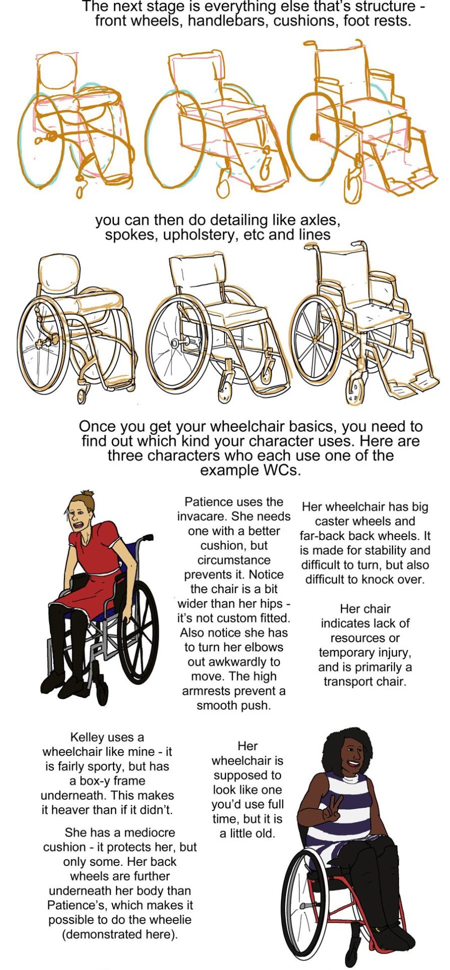
step six: next we see the wheels and shapes have been reduced in opacity and the basic structure of everything about each wheelchair: footrests, caster wheels, upholstery details, axles has been drawn on in orange.
text: the next stage is everything else that's structure - front wheels, handlebars, cushions, footrests.
Step seven: we see the lineart on top of the lowered opacity sketch.
text: you can then do detailing like axles, spokes, upholstery, etc and lines
step eight: next we see three drawings of different characters. there is patience, a skinny white woman sitting in a blue invacare wheelchair. kelley, a slightly chubby black woman wearing a stripey dress sitting in a red quickie gpv wheelchair and doing a wheelie while smiling. then luke, a white man with short blond hair wearing khaki pants. he is sitting in a tilite chair.
text: once you get your wheelchair basics, you need to find out which kind your character uses. here are three characters who each use one of the example WCs. patience uses the invacare. she needs one with a better cushion, but circumstance prevents it. Notice the chair is a bit wider than her hips - it's not custom fitted. Also notice she has to turn her elbows out awkwardly to move. the high armrests prevent a smooth push. her wheelchair has big caster wheels and far-back back wheels. it is made for stability and difficult to turn,but also difficult to knock over. Her chair indicates a lack of resources or temporary injury, and is primarily a transport chair
kelley uses a wheelchair like mine - it is fairly sporty, but has a box-y frame underneath. this makes it heaver than if it didn't.she has a mediocre cushion - it protects her, but only some. her back wheels are further underneath her body than Patience's, which makes it possible to do the wheelie (demonstrated here). her wheelchair is supposed to look line one you'd use full time, but it is a little old.
luke has a spinal cord injury. he has a very thick pressure relieving cushion for medical reasons. his chair is also ultralight, with no boxyness under the frame. his chair is the newest and lightest - it indicates his wealth/resources, but also that he needs to use on full time.
step nine: just a drawing of me sitting in my wheelchair holding my hands up to show fingerless wheelchair gloves. we're looking at me from above.
text: when you're choosing what wheelchair to give your character, think of both their disability and their resources and go from there. questions to ask yourself: is it made specifically for them or is it mass-produced or a hand-me-down (if it's custom, the seat will not be too wide or narrow in comparison to their body and their feet will rest on the footplate naturally). do they want more stability (further back back wheels, big caster wheels) or maneuverability (the inverse). do they need a pressure relieving cushion? how long are they using their wheelchair per day? how long have they needed a wheelchair? Do they have health insurance? do they have access to a lot of spending money? How much can they spend on their wheelchair? are they athletic etc etc
posing steps:
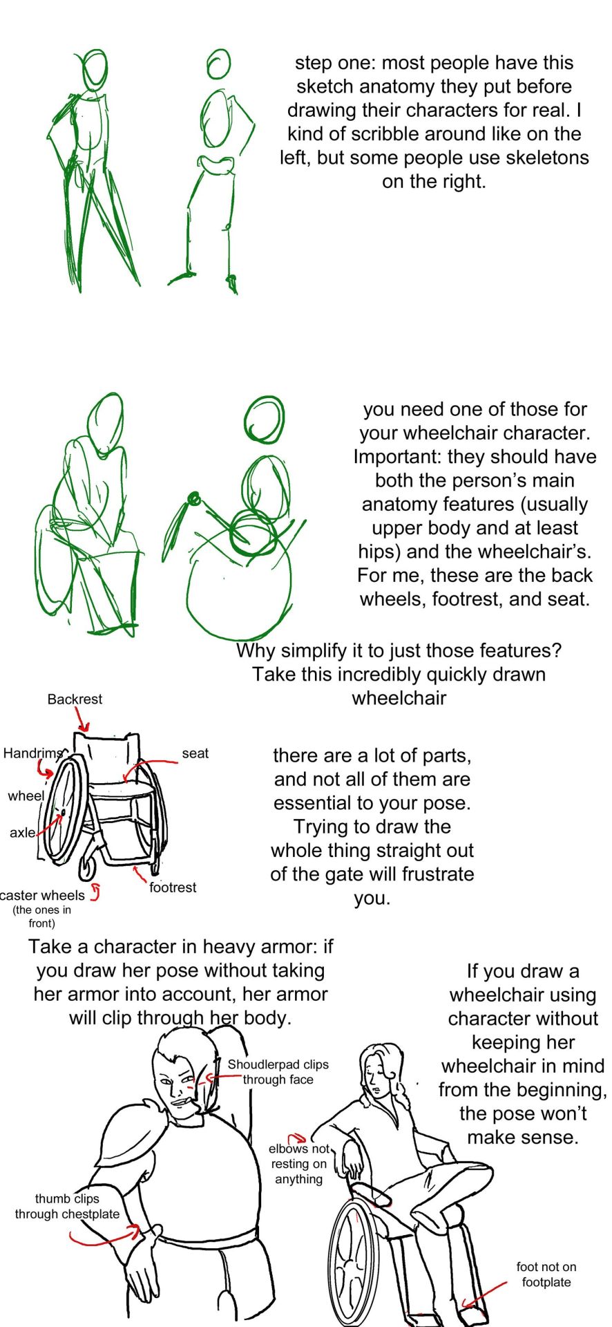
step one: a sketch of two people standing up. one just shows the outline of a person's body, with legs that are ind of triangle shaped, the other shows a sketched pelvis and rib cage to go along with the bones of the legs and arm. text: step one: Most people have this sketch anatomy they put before drawing their characters for real. I kind of scribble around like on the left, but some people use skeletons on the right.
step two: there are now too sketched pictures of people in wheelchairs. one shows lightly traced human form (arms articulated, curve for a stomach, legs that are kind of triangle shaped and pointing down) sitting in a wheelchair that is just the sketch of footrests and wheels. the other sketch shows the sketch of a body with a circle for hips and an oval for a rib cage and the person doing a wheelie (lifting the front end of the wheelchair off the ground and leaning back). their wheelchair is also sketched out and defined by a circle for their wheels and 2 lines, 1 of the seat and 1 for the backrest. text: you need one of those for your wheelchair character. important: they should have both the person's main anatomy features (Usually upper body and at least hips) and the wheelchair's. for me, these are the back wheels, footrest, and seat. why simplify to just those features? Take a look at this incredibly quickly drawn wheelchair.
step three: there is a lineart drawing of a manual wheelchair with slightly cambered (angled towards the seat) wheels, a backrest, and a footrest. the frame is light and there are no handlebars. there are labels pointing to different parts of the wheelchair: Backrest, handrims, wheel, axle, seat, footrest, and caster wheels (the ones in front). text: there are a lot of parts, and not all of them are essential to your pose. trying to draw the whole thing straight out of the gate will frustrate you.'
step four text: take a character in heavy armor: if you draw her pose without taking her armor into account, her armor will clip through her body. if you draw a wheelchair using character without keeping her wheelchair in mind from the beginning, the pose won't make sense.
step four image: next we see two lineart drawings of different characters. one is a bulky woman wearing plate armor. her hand is on her hip and she is trying to scratch her back with the other hand. there is the label "shoudlerpad clips through face" and "thumb clips through chestplate." the next drawing shows a woman in a wheelchair with one foot rested on her knee and her arms rested back, such that they would be rested on the back of a regular chair, but the back of her wheelchair is not wide enough for them to actually be resting on anything. the text here reads "elbows not resting on anything" and "foot not on footplate"
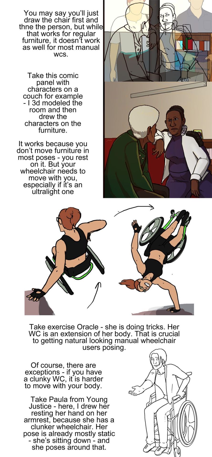
step five: there are two images, one is lineart on top of a 3d modelled apartment with sketchup, the other is a colored in version of that lineart with the background also colored in and no longer a 3d modelled screencap two characters, one old woman wearing a green jacket and one younger woman wearing a white shirt and blue undershirt, are sitting on a couch. the old woman is leaning forward and the young woman is resting her arm on the couch. behind the young woman is a bookshelf.
step five text: you may say you'll just draw the chair first and then the person, but while that works for regular furniture, it doesn't work as well for most manual wcs. take this comic panel with characters on a couch for example - I 3d modeled the room and then drew the characters on the furniture. it works because you don't move furniture in most poses - you rest on it. but your wheelchair needs to move with you, especially if it's an ultralight one.
step six image: there is a flat color drawing of barbara gordon in her wheelchair. she is wearing a black sportsbra and black shorts. in the first image we see she is doing tricks in her chair, zooming through the air (as if she has just launched herself off the ground in a skater park or somethign) while her left hand is resting on a structure and her right hand is heading towards the right handrim. the next image shows her right hand planted on the ground and her chair and body above her, such that she is briefly doing a one-handed handstand, but the motion line indicates that she is moving and this will not last. her left arm is near the handrim of her left wheel.
text: take exercise Oracle - she is doing tricks. Her WC is an extension of her body. That is crucial to getting natural looking manual wheelchair users after posing.
step seven: we see a lineart drawing of paula from young justice. she is sitting in a standard manual wheelchair with high armrests (goes up to the bottom of her ribs probably) and a high backrest (goes up to just below her shoulderblades). she is setting her hand on the armrest, leaning forward, and holding her other hand out.
text: of course, there are exceptions - if you have a clunky WC, it is harder to move with your body. Take Paula from young Justice - here, i drew her resting her hand on her armrest, because she has a clunker wheelchair. her pose is already mostly static - she's sitting down - and she poses around that.

Lookit! My first post is a funny sketch! Love me a good Blade
-
 tree484 liked this · 1 day ago
 -
 jetsrutt liked this · 2 days ago
 -
 nibi-nix liked this · 2 days ago
 -
 herc18 reblogged this · 2 days ago
 -
 hyacinthnoon liked this · 2 days ago
 -
 julialenastoeckl liked this · 2 days ago
 -
 kirakinnie1987 liked this · 2 days ago
 -
 allpathosandteeth liked this · 3 days ago
 -
 rookthegremlin liked this · 3 days ago
 -
 peachybeesplease liked this · 3 days ago
 -
 aprimreaper liked this · 3 days ago
 -
 archerwhiterp reblogged this · 3 days ago
 -
archerwhiterp liked this · 3 days ago
-
 oleander-neruim liked this · 3 days ago
 -
 nyuo liked this · 3 days ago
 -
 writerihardlyknowherr liked this · 3 days ago
 -
 the-skeleton-speaks reblogged this · 3 days ago
 -
 king-of-the-skeletons liked this · 3 days ago
 -
 evil-but-refined liked this · 3 days ago
 -
 deviousevilton liked this · 4 days ago
 -
 acricketcannot liked this · 4 days ago
 -
 elishortforelliott reblogged this · 4 days ago
 -
elishortforelliott liked this · 4 days ago
-
 gurorose reblogged this · 4 days ago
 -
 the-chaotic-dumbass liked this · 4 days ago
 -
 thedoroftheo liked this · 4 days ago
 -
 ineedanormalname liked this · 4 days ago
 -
 arcturusclear liked this · 4 days ago
 -
 reu-able-gok reblogged this · 4 days ago
 -
 carrabineer liked this · 5 days ago
 -
 thelambthatkilledthewolf reblogged this · 5 days ago
 -
thelambthatkilledthewolf liked this · 5 days ago
-
 drawing-dinos82 reblogged this · 5 days ago
 -
 teeny-beany reblogged this · 5 days ago
 -
teeny-beany liked this · 5 days ago
-
 fengo-ikaro-7115 liked this · 5 days ago
 -
 that-dumb-ollie liked this · 6 days ago
 -
 thebarrows liked this · 6 days ago
 -
 eveamethyst liked this · 6 days ago
 -
 mimocrocodilelol liked this · 6 days ago
 -
 failingracefully liked this · 6 days ago
 -
 blingedouteve liked this · 6 days ago
 -
 vee-thebee liked this · 6 days ago
 -
 checkeredcookie05 liked this · 6 days ago
 -
 one-awesome-beetle reblogged this · 6 days ago
 -
 onecoolbeetle liked this · 6 days ago
 -
 miss-este-eye liked this · 6 days ago
 -
 spookedstarzz reblogged this · 6 days ago
 -
spookedstarzz liked this · 6 days ago
-
 voidwithtoomanygooglyeyes liked this · 6 days ago
