I’m Such An Aleve Girlie
I’m such an aleve girlie
More Posts from Zephiris and Others
why don't the mitochondria cause cancer. if i was a mitochondria i would be suddenly struck by tremendous joie de vivre and remember my youth as a bacteria and be like holy shit why am i listening to this fucker. im gonna eat all my surroundings im freeeeee. ig probably its bc they depend a bunch on proteins encoded in the nucleus but like. cmon dude
Background decorative elements
I felt like the placement of your background images within the body tag to the top and bottom of your main content div is pretty intuitive overall. The only thing I could think of to improve the vines would be to make them pseudo elements (another YouTube video by Kevin Powell) of the body element so that way you don't have to have empty divs cluttering your html for them. Pseudo elements are useful for purely decorative elements because they're created purely out of CSS; no HTML required!
Now for color: below the fold bc hyperfixation go brrr
TLDR: Color contrast is hard; especially with the current color systems we have today (HSB/RGB) since the numeric incantations of popular color systems don't line up with how our eyes actually perceive color, especially when it comes to brightness. Google made a new color system (along with a tool based on that color system to generate color palettes) that lines up better with how humans perceive color but it still isn’t perfect. IMO using tools like palettte.app (with 3 t’s) and hand-selecting colors numbered by how light they are - more about that below - works best and gives projects more of a hand-made feel but Google's tool works well enough for making a quick and professional looking color palette.
Now for a very colorful rant:
Making CSS variables with the format
colorName-brightnessValue
makes it easier to meet contrast standards when coding up a website. I'll usually organize my colors to range from 0 to 1000 exclusive where 0 is black and 1000 is white. I usually use 100, 300, 500, 700, and 900 the most so I have those 5 shades of each main color ready to go whenever I start a new project. (I use the same 4 colors for all my projects so it's easy to copy and paste the colors from the last project into the new one!)
That way if I know my background is violet-100 and my text color is violet-700 that the text will be legible because of the difference in brightness values is 600 just based on the variable names alone. Generally a difference of at least 500 (assuming you go linearly in perceived brightness) is enough to get AAA contrast levels.
For an example, here are my css variables for zephiris.me:

Others do the numbering of the shades differently. Here's how tailwind does it:

Tailwind CSS color guide's section on making a custom color palette has links to some helpful tools on how to hand-pick several shades of a set of colors so that the brightnesses of the colors decrease with the numeric value in a way that actually lines up with people's perception of color.
On that same page, tailwind also has all those color palettes shown above free for you to steal use in your projects!

Google's Material 3 design framework has shades of every color go from 0 to 100 for brightness instead of my 0-1000 brightness or Tailwind's 0-1000 darkness.
Google also has a nice resource which will automatically generate a color palette for you (I like doing it manually with palettte.app [with 3 t's] but if you just need a quick and easy palette that meets contrast standards, Google’s resource works pretty well).

Google actually has a very interesting blog post on why it’s so hard to make accessible colors and get the right amount of contrast with current color systems like HSB/RGB etc.. To fix this, they created a new color system, HCT (Hue Chroma Tone), which helps solve that problem by having HCT's Tone value better match our human perception of brightness.
Wrangling Several Colors to Work Together

My main advice for overall UI design is to pick three colors: a primary color (for background colors), a secondary color (for card backgrounds/text colors), and a tertiary color (for any elements that should be interacted with like buttons and links). I made a site to try out various combinations of colors and share those palettes with others a while ago (apparently November of 2021, thanks GitHub!)

Recently Juxtopposed made a more professional version of what I made called realtimecolors.com along with an accompanying video. Her website also features a palette generator where you just enter in one color and it will generate a set of palettes off that one color!
Unfortunately neither mine nor Juxtopposed's websites support multiple shades of each key color, so to get those additional shades make sure to either use Google's generator or one of the tools mentioned by Tailwind once you have a general set of colors that you feel works well together.
Color Palette Inspiration


What works best for me is to pick colors based on environments which I enjoy to be surrounded by. I based my color palette for zephiris.me on:
the night sky's bluish-purple hue (maybe I wear rose-tinted glasses ok?)
greenish-blue seafoam from ocean waves
golden rays of sun filtering through pine trees
Lastly, I used the trans flag colors to describe my gender for obvious symbolic reasons - I also like being next to a particular shark :p
Conclusion
Meeting color contrast standards can get way easier by numbering your colors based on how light they are. There are plenty of ways to get a set of colors labeled by lightness:
using palettes already made from Tailwind
Have Google do some math wizardry to generate you a custom palette
Use tools like palettte.app to create your own set of colors to play with
Regardless of what option you choose, the overall added structure of numbering colors' brightnesses makes it dramatically easier to make incredibly legible, accessible, and colorful designs.
Colorful rant over!
i like your website! it looks very nice
especially the gradient colored text!! you used a separate font to make it more legible
whenever i try to do something like that, it always becomes really hard to read... maybe i should learn some basic web design?
my website looks like this and it took two days of fiddling with css
Thank you! The biggest thing with making text legible is making sure there is enough contrast between the text color and the background or make the text big enough that it’s legible even if there isn’t that much contrast. The best guide on color contrast that I know of is the Mozilla docs! If you scroll down to the solution part there it has many tools to check text contrast.
Since your website has a warm bright canvas background darker colors and gradients would work better and end up being more legible.
If you’re looking to learn more about web development and especially CSS I strongly recommend Kevin Powell on YouTube! His videos on flexbox and grid are very helpful in understanding those new browser features and making responsive websites (websites that look great on any screen size). For example, I used grid for the nickname table and for my projects so that on desktop those elements would be wider and shorter while on mobile they’d get narrower and taller.
I love your site too, especially the canvas theme with the green branch/orange leaves and the clever span box to show your favorite color complete with a title tag featuring the hex code!
To be clear my site took me at least 20 hours of fiddling and development to make. Feel free to look at the site code (and my commit history) on GitHub!
And now for something completely different.

This is the ADHD Teapot. I made it in a ceramics class a few years ago. I use it to explain executive dysfunction to people who haven’t come across the term before (and those who think of ADHD mostly as Hyperactive EightYear Old Boy Syndrome).
So, most people’s brains are like a regular shaped teapot with a single spout. Let’s say that your time, energy, focus etc is the liquid you have in the teapot. Your executive function is the spout, that directs the tea into the specific cup you want to fill-aka the task that you’re meant to be doing. Spills happen occasionally, but generally most of the tea goes in the right cup.
If you have executive dysfunction, you have multiple spouts going in different directions. You can try pointing one of them at your chosen cup and you will probably get some liquid in there, perhaps you will even fill it right up (finish the task). But meanwhile, tea is also pouring out of several other places and not going where you want it. If you have another container nearby, perhaps some of it will end up in there. But quite a lot of it is going to end up on the floor and accomplish nothing.
And at the end of the day you’ll have filled one or two cups ( or sometimes not even one) compared to the five or six that somebody with the same sized teapot (but only one spout) has filled, and everyone wonders why you’re so bad at getting tea poured, and why you make such a mess in the process.
One day I’d like to spend more time learning pottery and create a really technically good fucked up little adhd teapot. But that’s a long way off since i currently live in the outback and the nearest pottery workshop is some 400km away. But I figure that for now, it might be a useful or interesting metaphor to somebody even in its rough draft form.
This post is the cup I filled instead of cleaning my house btw.
the wii disc and the gamecube disc on the wii menu are dating btw

The first point and the third point are absolutely correct. It’s really crazy to think about how everything we see is just photons bouncing off one another relative to the particles around it which then are relative to us.
Also since each particle can’t be perfectly updated every frame sometimes we don’t have enough other particles around a specific photon in spacetime (3D space plus particles that were recently in the same space it’s currently in) so then that photon has to guess its location for the next frame like you summarized in point 3.
The second point about the speed of light limiting the number of particles is slightly innacurate since I’m assuming at each time step of the universe our in-universe time kinda freezes during the computation and any particle could contact any other particle instantaneously (think shared read-only universal hashmap where each particle can only modify its own entry). Therefore the limitation on checking all of the particles in the universe every frame isn’t based on the speed of light but rather on how each particle just doesn’t have the capacity to check all the billions of particles in a 1 meter radius of it and similarly those billions of particles don’t have the capacity to check that one additional particle so the universe fuzzes with randomness and gets it mostly correct instead. Fun fact: Fuzzing with randomness is actually used in Redis and other caches to have low latency most of the time without having to exactly track how many times each cache has been accessed or when the last access was.
Thank you so much for the distilled summary! I def appreciate the feedback and knowing what you understood from it all. I’m still refining my explanation so thank you!
honestly getting infodumped to is like. dreamy
there's nothing that melts me more than just hearing someone be passionate about something. And if someone has hurt you in the past and makes you reluctant to fuckin completely go off on the expanded canon of the X-Files or whatever, I'm gonna hit them in the head with a big mallet. You're adorable, show it. Please


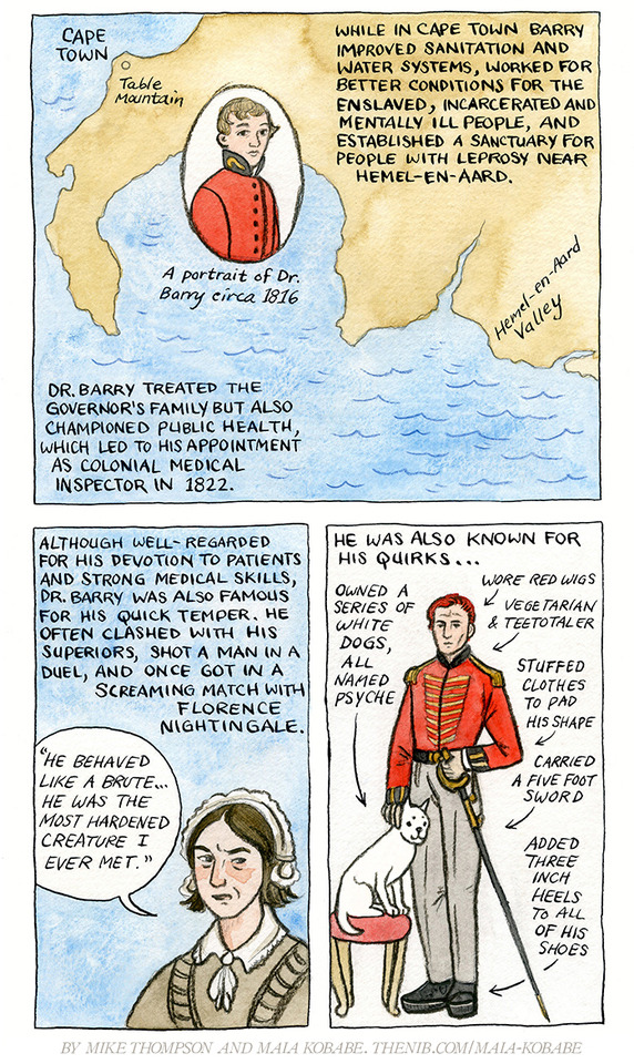


My latest comic for The Nib was written by my friend Mike Thompson- it’s his first published comics work!
The Nib has been a steady source of income and a huge support to me and many other indie cartoonists for years. They publish amazing work, but will be cut loose by their financial backer in July. You can read the official post about it from editor Matt Bors here. They are still running their kickstarter-funded print magazine, but have to put digital publishing on hiatus until they figure out their next steps. If you’ve been thinking about supporting their membership program, now would be a good time. They have levels from $2 to $40 per month. I really don’t want this to be my last Nib piece!
instagram / patreon / portfolio / the nib / etsy

Hey wait I’m one of those :D
life is beautiful because there's neurodivergent lesbains on the internet
here's to trans girls, transfems & nonbinary people who don't tuck or use gaffs. you do not have to hide your crotch bulge for anyone's comfort but your own. your penis is not a problem, whether or not it is noticeable through clothing doesn't mean or say anything about you, and it does not detract from your womanhood and/or femininity. anyone who gets upset about that part of your body is invading your privacy, you will never be invading someone else's privacy just by being clothed and having a penis. your body, your rules.
-
 gayfrasier liked this · 1 year ago
 -
 zephiris reblogged this · 1 year ago
 -
 moon-jellie liked this · 1 year ago
 -
 saintdamien reblogged this · 1 year ago

20, They/ThemYes I have the socks and yes I often program in rust while wearing them. My main website: https://zephiris.me
132 posts