Crotch And Buttocks Anatomy By NemoNova

Crotch and Buttocks Anatomy by NemoNova
More Posts from Arttuti and Others


I compiled this a while ago but I was just looking for references and found the file so...
Best places to find reference photos:
Body types, poses, and anatomy:
http://reference.sketchdaily.net/en
https://www.posemaniacs.com/
https://quickposes.com/en
https://www.characterdesigns.com/#home-section
https://www.adorkastock.com/sketch/
https://line-of-action.com/practice-tools/figure-drawing/
https://www.proko.com/browse/tools?af=242
Giant anatomy reference tutorials Pinterest board:
https://www.pinterest.com/deedee1232/body-reference/
General:
https://unsplash.com/
https://pixabay.com/
https://www.pexels.com/
https://stocksnap.io/
https://www.freeimages.com/
https://kaboompics.com/
https://commons.wikimedia.org/wiki/Main_Page
https://morguefile.com/
https://www.flickr.com/
https://www.dreamstime.com/
https://pmp-art.com/
https://www.freepik.com/
https://photobash.co/
https://picjumbo.com/
https://burst.shopify.com/
https://magdeleine.co/
https://wordpress.org/openverse/
Historical:
https://nos.twnsnd.co/


Need a bigger serving of practice? Check out the 19-paged worksheet and .psd practice file!
The difference between a beginner’s comic and an experienced artist’s comic comes down to the details, and one of the biggest “invisible” details is proportion.
How does an artist utilize page and panel layout, negative space, word balloons and composition to their best advantage? This Shingworks tutorial covers all of this information, and the 19-page supplement worksheet and comic proportion analysis template .psd takes it a step further and teaches you how to analyze real comics so that you can apply these principles to your own comics :]
My Patreon tutorials are unlocked to the public 6 months after their original publication month. You can find the full high-resolution archive of monthly tutorials at my Patreon! Thanks again to my Patrons for supporting me in the creation of my own comics, The Meek and Mare Internum.
My recent free-to-read tutorials on Tumblr:
Worldbuilding!
Understanding Patreon & Building A Patreon
Grow Your Brand
Acting for Comics
Researching for Comics
Writing for Webcomics
Coloring with Masks
This month’s Patreon tutorial: Webcomics 101
And as usual, thanks very much for not deleting my text~~
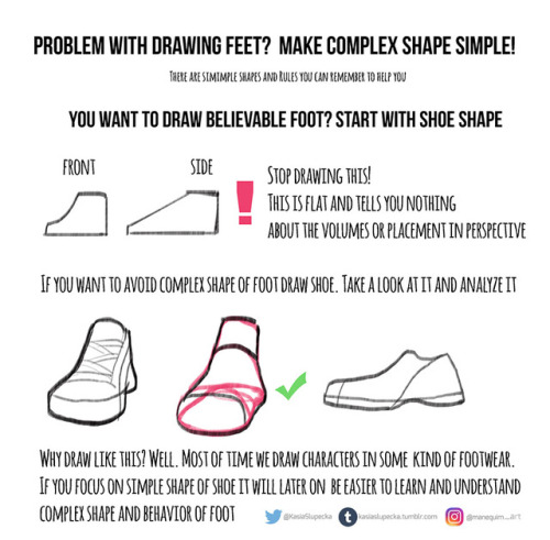
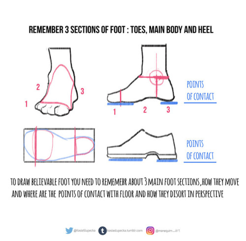
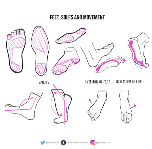
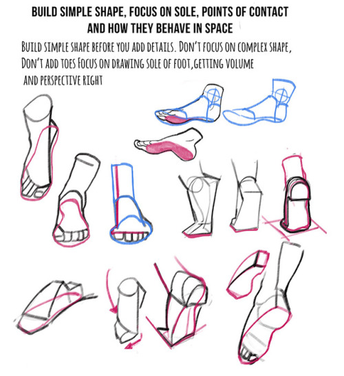
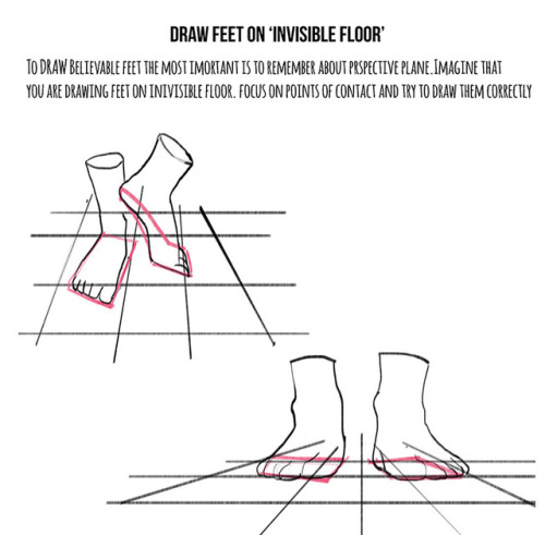
Weekly anatomy tip!
This week I tackle feet. I know how many of you asked for it.
It is hard topic indeed. It’s hard to draw nice looking character with feet that doesn’t look believable.
A lot practice is needed. I just presented few ideas and now you have to put it to practice.
Hope this helps !
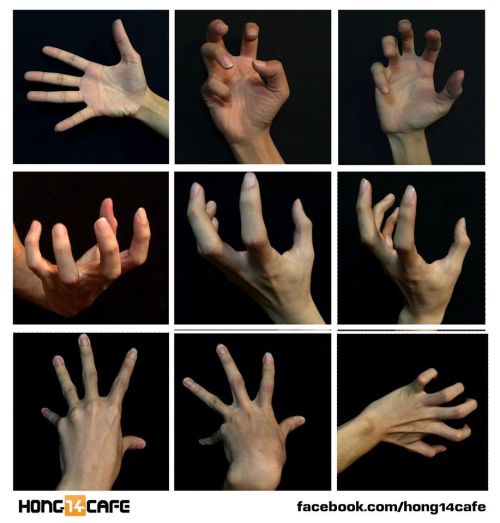
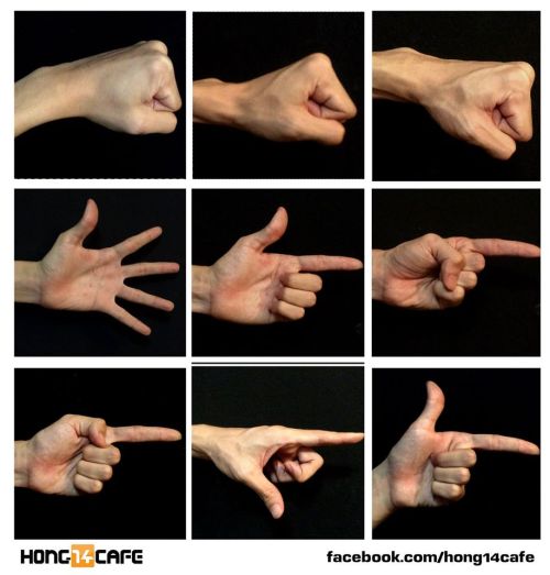
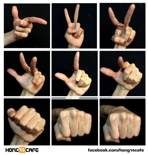
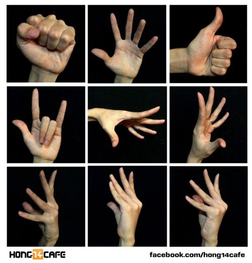
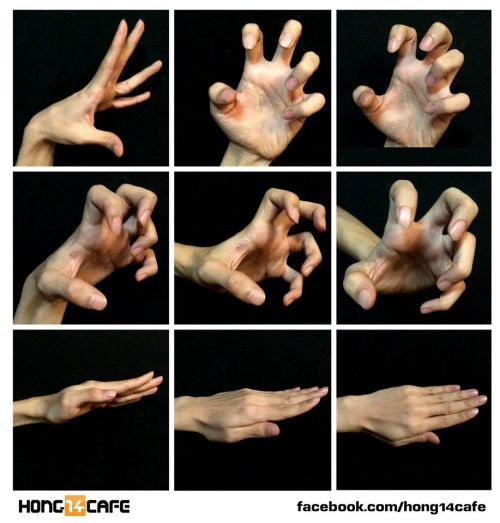
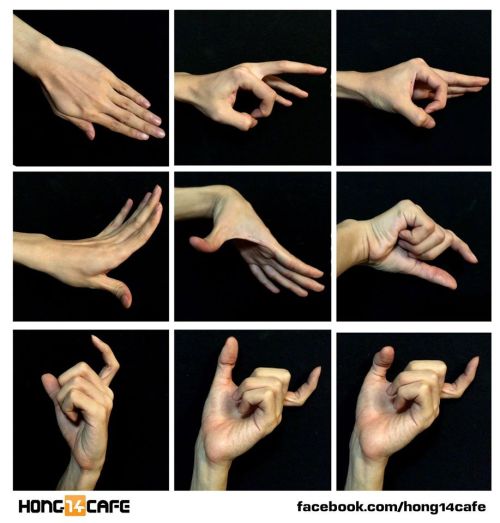
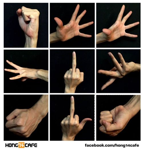
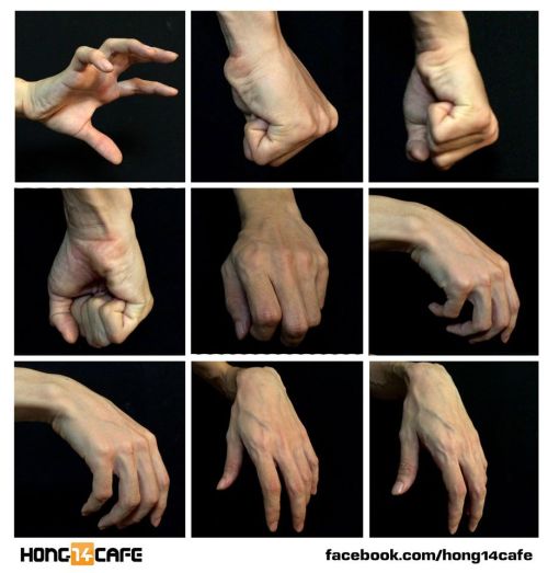
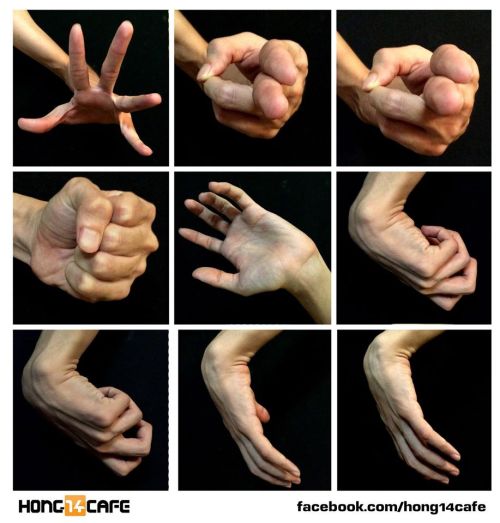
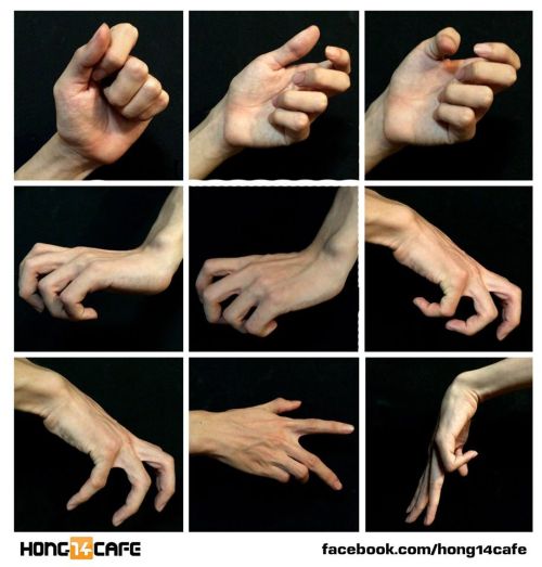
Fantastic hands references by the website Hong14cafe.
Hong14cafe: Facebook | Forum
Hands
As I do with most things, I draw hands from a series of gesture strokes that insinuate the pose and shape I want. Something I personally find very appealing about hands are all the joints, bends, and crooked bits so I start with those and build the rounder, meaty bits from there.

In the first two steps here if you just look at the individual strokes I’ve drawn, you can see they’re just some curves, really, that sketch out the shape of the hand, and I’m focusing on the joints and knuckles. (The fingertips in the second one are actually rly unnecessary and ugly to me haha – that’s usually the kind of thing I’d just throw down in step 3.)
And again below, just starting w/ some curves and squigglies to show the joints and knuckles:


These hands are by no means realistic or fully proportional but drawing’s supposed to be fun and these are really fun! I’m like, really not about that whole “draw a box and then the little tubes and those are the fingers” thing. It’s too technical and so much life gets lost when you sketch that way. Maybe it’s helpful for a pose you’re uncertain about but then just look at a photo or your own hand to see how things work, y’know?
Something else I’m really about is using shading and line to emphasize the bends and stuff even after I’ve got the hand down:

The first image here you can tell the fingers are bent, but they also look lumpy imo. To stylize further, I add some thin lines for the joints and fingernails, and then shade for some extra depth + to pronounce the foreshortening etc. (Fingers are so ugly from this angle! But we gotta draw them like this sometimes…)
Some examples where these extra lines assist in conveying the shape:

And shading:

(Bottom right is the same pose as a previous example which I didn’t realize till now sorry haha)
Some general tips:
- Use asymmetry!!! When the joints don’t line up exactly right, or you’ve drawn two hands doing the same thing but idk one’s curled a little bit more or the right pinky sticks out but the left doesn’t – these little touches make the drawing more dynamic, even if the general pose/concept is flat.
- Thumbs are really cool? They’re like trapezoidal. The same tapering thing kinda happens where the hand meets the wrist. A hand is like a big thumb
- Two things that a lot of beginner artists get wrong: which side the thumb is on (…always double-check…I still double-check sometimes too), and drawing the fingers straight instead of slightly bent when trying to draw a relaxed hand. Relaxed fingers curl! And this is much easier to draw imo than perfectly tense fingers
- Study your own hands and think about their shape. Part of developing a style + comfort with drawing a particular thing is how you choose to simplify the form thru line. I explained above that I focus on the joints and knuckles and seek to simplify those with curves and squiggles but maybe you’re more interested in a different aspect. (Like, you can see I don’t draw palms v much…that’s cuz I like knuckles haha)
Hope this is helpful/feel free to ask followup questions!
Webcomic tips
In the conclusion for now, some things I’d really recommend doing if you’re seriously considering making a webcomic (or really a comic in general). Some of these don’t really apply to strips or gag-a-day type of comics, but I’m not talking about those here.
1. Write down ideas\sketch stuff, LEGIBLY. “I’m gonna remember it later” NEVER works. And if you scribble it somewhere on a piece of paper, you’d better scan it or retype in one doc later, because tiny notes always get lost among other doodles in my skethbooks.

(i know it’s hard to keep everything clean and organized, but this mess is just not productive)
If your project is a collaboration, save your conversations. If you’re working alone, make a blog for your ramblings. You have no clue what tears of relief I cry when I open that blog and rememeber I don’t have to painstakingly look through my heaps of sketchbooks and folders for a tiny idea I’m not even sure I wrote down a few months ago.
2. Inspiration folders, or even better, inspo blog with tags also help with collecting and remembering ideas. Color schemes, landscapes, style inspirations, atmospheric stuff, maybe some photo references, all those neat things.

3. Basic tier: character design sheets. Top tier: common poses, expressions. God tier: outfits they wear throughout the comic. Holy cow tier: turnaround sheets for all those outfits.

(I’d die trying to find good pages for references without these)
4. If you haven’t finished detailing the plot, don’t even think about moving on to drawing the comic. You’re gonna regret it when you come up with a really cool plot element that can’t be incorporated anymore because you’ve already drawn all the parts you could’ve tweaked.
5. Don’t just define the plot, make a script. Writing down the lines and the brief description of the actions serves me fine:

(notice that I approximately divided the pages & the text that’d go to each panel on a page)
6. Hard mode: make thumbnails for all the pages, if possible. At least whenever a new chapter starts.
7. If your story involves some convoluted chronology shenanigans, you’d better write down the events of your timeline in the chronological order.
8. Backgrounds. You can’t avoid them, bro. Like half of the comics are backgrounds, especially if your story involves a lot of adventuring and looking around. I know it hurts, but you’ll have to become friends with them. Read some tutorials, practice on photos, go out and sketch some streets, use 3d programs (like Google Sketch) to understand the perspective, use sites like houseplans to visualize your buildings better, I don’t know. Just be prepared for their imminent evil.
9. If you’re drawing digitally, pick a brush size for the lines and stick with it. You don’t want your lines and detail levels to look all wonky and inconsistent in different panels. And I don’t mean the cool stylistic varying lines, I mean this:

Also, things on the background should have thinner and/or lighter lines to avoid distraction. Usually less details too, unless you’re making a busy background with a simple foreground to help it pop out. Or wanna draw the attention to an object on the bg.

10. Readable fonts. Even if you chose to ignore people with poor sight or dyslexia, the majority of your readers aren’t gonna be excited about struggling to decypher this:

Also, as much as I love my black speech bubbles, colorful text on black still kinda hurts the eyes. I wouldn’t recommend doing that for all the characters. Black speech bubbles are usually used for creepy, inhuman voices. And yes, having a colorful outline in this case helps.
11. Probably newsflash, but did you know that panels have their place, order and functions? They do! My favourite thing ever is how I used panels when I was like 12:

(comics ain’t rocket science, but this one is)
The composition of the panels and word balloons always serve for a better reading experience. They guide your eyes over the page, so that you never feel lost or confused. The images in the comic equal frames in a movie, so it’s pretty damn important in what order you look at things and how quickly you can understand what’s going on!

(Eric Shanower & Scottie Young’s Wizard of Oz)
12. One update a week is fine for testing waters. Don’t overestimate yourself, especially if you have a pretty busy life outside it. A stable comic that updates slowly, but regularly is better than an unpredictable erratic one. You can always pick up the pace later, if you feel confident enough.
13. Try to always have a buffer - a couple of pages in reserve. If you’re making the pages much faster than you’re updating, this shouldn’t be a problem. But if those paces are equally the same, it’s goddamn HARD. But on the other hand, if something happens and you skip an update, those come in handy.
If you’re looking at this list and thinking “wow that’s a LOT of work”, you’re totally right. And it’s okay to be intimidated at first! But that’s why it’s important to start with something small. Once you get the formula down, these things will be natural to you.
your art are amazing and you're so talented! I would like to ask how to draw Castiel's wild chaotic sex hair:)
LMAO umm I think it’s easiest to part it on one side and then have it fan out from there with the front flipping up.

thank you!!
can you give a run down on skintones?
PART ONE: COLOR SELECTION.
In painting skin tones, a lot of the time I see people choose colors that are over-saturated or unbalanced. There isn’t really an exact art to this that I can explain—you just need to get a feel for what saturation balance you need for that particular skintone. Here are some examples of what I usually pick.

As you can see, I used different base colors (orange, reddish, yellow) for the skin shades in all three examples. The reason for this is because all skin tones have a different base color besides just Light, Medium, and dark. Some people divide them into categories of “warm” and “cool.” Pantone has some really good examples and references for this.

PART TWO: COLOR VARIATION.
Another big part about drawing and painting skin tones that a lot of people forget is how skin thickness affects color variation. The presence of bone, blood, and muscle underneath the skin affects its colors. This is especially noticeable on the face.

The colors here are a little exaggerated to show my point, but with a little adjusting and blending…

Voila! Subtle, but more realistic.
PART THREE: DETAILS.
Our skin is the largest organ on our body, and as our body’s first line of defense against the outside world, it’ll be covered with tiny details and imperfections. Things like sunburns, tans, freckles, scars, and facial hair all add character to your subject matter. Here are some examples!
TANS: Everyone tans differently, depending on your ethnicity and skin tone. Fair skinned folks tend to burn more than tan, which means you’ll need a more startling, eye-catching red.If you have a skin type that tends to tan more, the color will be more brown than red. For black skin tones, the tan is less red. (And while we’re on the subject: black people DO tan, so it’s important for you to put on sunscreen and be careful in the sun, too.)

Those are the areas that the sun tends to hit the most—and things like goggles, hats, and masks can change the shape of that area.
FRECKLES AND MOLES: Freckles are also products of the sun. Some people have freckles that stay year-round, while others have freckles that fade in the winter and return in the summer. Moles are skin cells that grow in a cluster instead of being spread throughout the skin. When exposed to the sun, they tend to darken. (Another note on skin health: if you have any oddly-shaped/colored moles, moles that have changed color, size, or shape, or anything of the sort, please check with your doctor!)
Freckles like to cluster around each other, sort of like stars, and they vary greatly in size. You can have a few freckles in one place, or a lot of freckles in multiple places. Most commonly freckled areas are your face, shoulders and neck, back, and forearms.

FACIAL HAIR: Facial hair also affects the colors of the face. For simplicity’s sake we’ll be using black hair, as it is the most noticeable. Facial hair usually grows in these areas, and can make the skin look blueish/grayish because of the darker hairs beneath the skin. If your hair is red, this also very noticeable.

END NOTE.
There you go! That’s about all I can think of at the moment for skin tones. As always, references and practice are your best friend (and so is this neat little trick that pheberoni has.) Good luck with your arting!
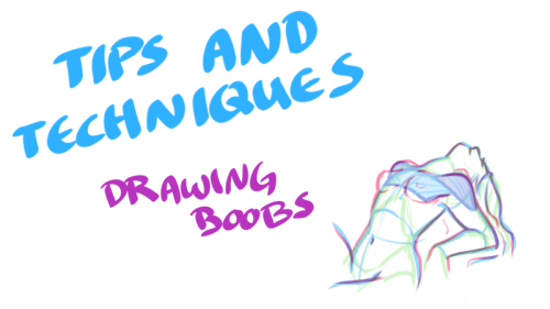
Just when you thought you knew everything about boobs… NSFW?


My darling friend Chizzi mentioned that there are a lot of booby tutorials out there are just predrawn boobs with the artist going HEY LOOK! HERE ARE SOME BOOBS! but not many that actually talk about the anatomical structure, and where to put the lines. I was like, “Hey, I can probably whip something up.“ And so I spent my thanksgiving making this.
Proportions probably aren’t exact, but I did my best. I also didn’t explore the various body types, but perhaps I could do a separate tutorial someday. I hope you find this tutorial useful :)
All photo references used in the tutorial were found on The Drawing Script. Credits to each photo belong to their respective owners.
-
 swaggaty liked this · 3 months ago
 -
 chroop liked this · 4 months ago
 -
 tails-of-a-dragon-rider liked this · 1 year ago
 -
 holidayinrhodeisland liked this · 1 year ago
 -
 hinataelyontoph liked this · 1 year ago
 -
 3dotinarow liked this · 2 years ago
 -
 wondershozen liked this · 2 years ago
 -
 my-sparklingr0ses liked this · 2 years ago
 -
 keith--akira--kogane liked this · 2 years ago
 -
 fireopals liked this · 3 years ago
 -
 gusty45 liked this · 3 years ago
 -
 temporacidal reblogged this · 3 years ago
 -
thelegend27butoriginal reblogged this · 3 years ago
-
 lilthz-references reblogged this · 3 years ago
 -
 shane-thebeast liked this · 3 years ago
 -
 invincibleweasel liked this · 3 years ago
 -
 secretzombiebeard liked this · 3 years ago
 -
 art-pechenka liked this · 3 years ago
 -
 heeelv reblogged this · 4 years ago
 -
 holddado0r liked this · 4 years ago
 -
 ushiochi liked this · 4 years ago
 -
 lunathekahuna liked this · 4 years ago
 -
 kinkybandages liked this · 4 years ago
 -
 lazzydawg17 liked this · 4 years ago
 -
 killercuda2 liked this · 4 years ago
 -
capitalbboy liked this · 4 years ago
-
 artist-in-an-ugly-sweater liked this · 4 years ago
 -
 loveu277 liked this · 4 years ago
 -
 jennjiart reblogged this · 4 years ago
 -
 flooferpoofer reblogged this · 4 years ago
 -
flooferpoofer liked this · 4 years ago
-
 nunyo-bizznez liked this · 4 years ago
 -
 aman-1994 liked this · 4 years ago
 -
radiotiger84 liked this · 5 years ago
-
 shonji-hayakawa liked this · 5 years ago
 -
furuit reblogged this · 5 years ago
-
furuit reblogged this · 5 years ago
-
 failing-lungs liked this · 5 years ago
 -
 rorobnb liked this · 5 years ago
 -
 ashleynake liked this · 5 years ago
 -
 tutorialesartedijital reblogged this · 5 years ago
