STUDY!!!
U use colors in such a enrichening way, how do you do that may I ask??
thank you so much! 💕
this answer is going to be a little long.
the first thing, i think, is that it's very common to think of color as a means to an end, as just another type of information about a drawing: i'm using brown on the hair to show that the hair is brown, i'm using green to show that the characters are standing in grass.
but if color is information, then we can use it to say a lot more than just the basic facts of a drawing!
if you love drawing but want to get better with color, you have to learn to love color, too.
to want to know everything about how color works, to explore what different colors mean to you, to try and try and try again.
because, and this is the kicker:
ALL COLORS ARE RELATED TO EACH OTHER!

[from this post about how to use a color wheel]
i think it's common for people to talk about complementary colors and that's helpful when you're starting out with coloring, but i feel that it can become very limiting when it's treated like a rule and can obscure the fact that all colors are related to each other. it's called a color wheel because there is no beginning or end!

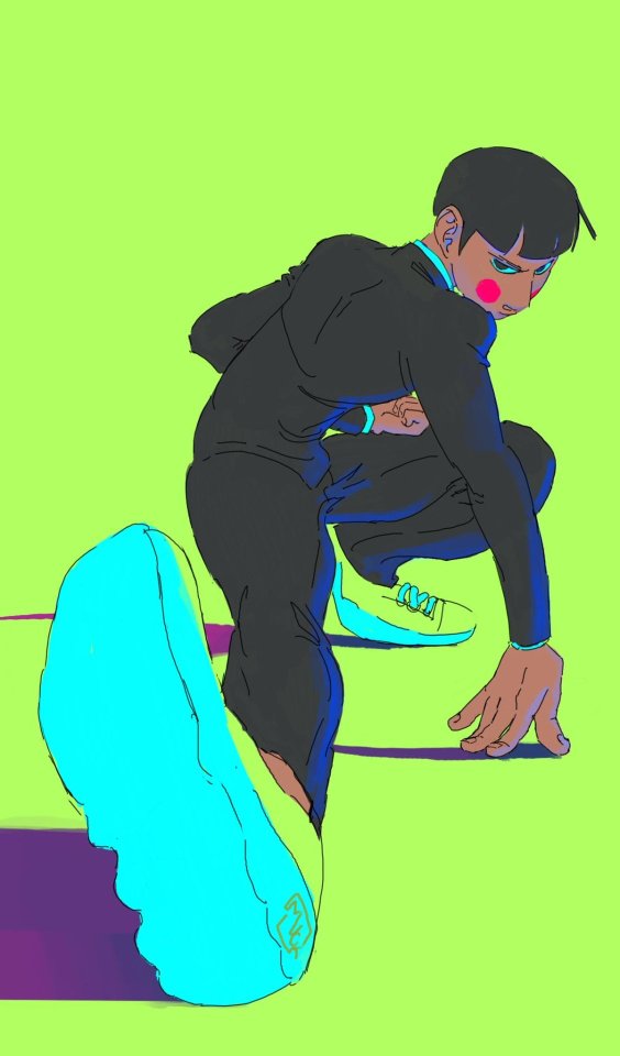
for example, take this drawing:

in this drawing, i'm using colors from all over:

but by just rearranging them slightly and throwing them against a black background like in the drawing, you can see how they're actually relating to each other and not nearly as random as they may seem at first glance!

[these notes are from this post where i break down how muted or "ugly" colors pull an image together] all colors are related to each other in some way, and that means that
YOU MUST DETERMINE WHAT EACH COLOR MEANS TO YOU, AND IT IS YOUR RESPONSIBILITY TO CONVEY THAT MEANING TO YOUR AUDIENCE.


for example, to me green can be uncomfortable and overwhelming, energetic and edgy, calm and natural, or fearful and tense. but no matter how it makes me feel, it's my responsibility to convey my relationship to green to whoever even glances at my drawing.
sure you can use commonly held ideas about colors [red = angry, blue = sad], but this shorthand is also limiting. if everyone used these commonly held ideas about color, there would be no room for experimentation or interesting, wild color choices! and colors mean different things to everyone-- that's what makes everyone's colorful art so different and so cool!!
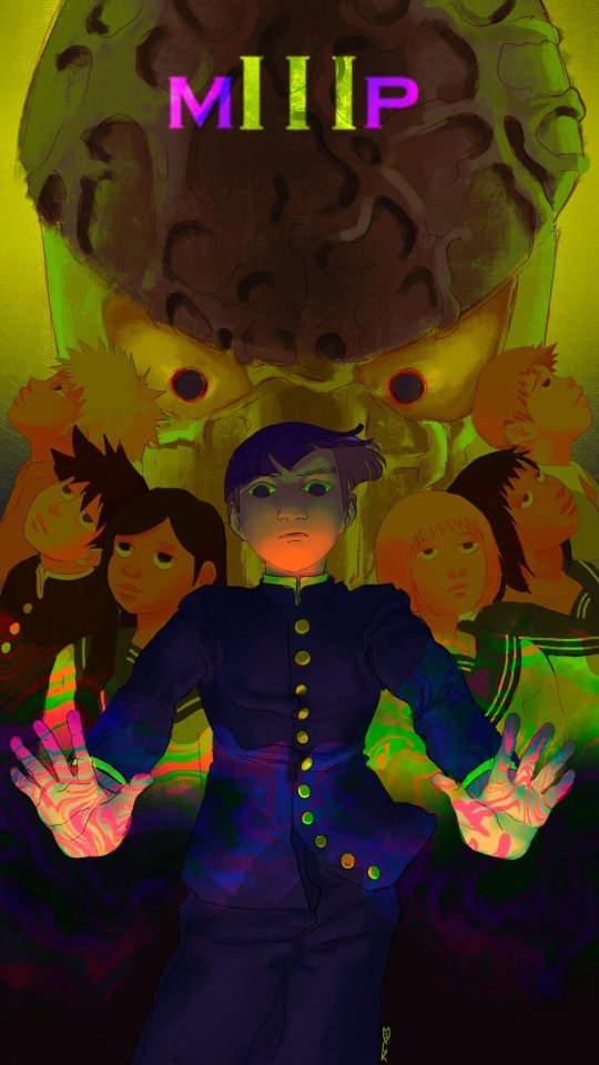
another thing to note about those green drawings: each one is using a specific type of green.
the one with reigen leans blue-green, which creates a cool-colored image. meanwhile, reigen is warmer tones, which almost makes it seem like he's overheating when he's thrown against such a cool-toned background, which further expresses his discomfort!
the dimple!mob drawing is like a sprite or mountain dew-green, which encourages the feeling of electricity or energy. it's a cool yellowish-green.
the one of mob floating is a warmer yellowish-green, to suggest sunny warmth without drawing sun rays.
the divine tree arc drawing is a lot of reddish-greens, which can suggest a sickliness.
experiment with color combinations and different shades and hues! explore what these different types of colors mean to you!
so now let's get into the nitty gritty of color choice. the following images are from my free pdf about color, composition, and intuitive drawing:


the main takeaways from these pages are:
consider simplifying your colors! more colors does not necessarily equal a better drawing.
see how much a single color can do! can you use it in multiple places on your drawing? what meaning can you ascribe to the colors you're using?
consider creating a concept for your colors and a few rules to guide your piece! a lot of great drawings can fall apart because the coloring concept was too vague or because there weren't enough rules or guidelines to keep the image coherent.
are your colors saturated enough? are the different colors you're using fighting for the viewer's attention? do you have focal points in your art, and if so, are the colors you're using reinforcing those focal points?
use the tools at your disposal! color-picking, color balance, overlay layers. it can feel important to try to prove something by hand-picking every color, but even when i hand-pick my colors i almost always check them with color balance anyway to make sure i'm picking the best colors possible.
YOU DO NOT HAVE TO SUFFER FOR ART. PLEASE use everything that is available to you, and make sure that you are aligned with what brings you joy when you're making art!
i wanted to show an example of a drawing i've done that is doing way too much vs a drawing that is simpler but more balanced:


on the left, the colors are interesting but the background is too strong and is competing with the actual drawing for attention. on the right, the clear background and simple coloring create a cute, easy to read, successful image! this is what i mean when i say that colors can fight for the viewer's attention and mess up a good drawing.
my final secret is that i rarely shade with or use white, black, or grays. i don't think this is a rule that you have to follow, but i like it because it pushes me to figure out what colors will go best with each other, and i think this single tip has strengthened my understanding of color immensely. however, there are a lot of beautiful art styles that shade with and use pure white, black, and gray. you have to decide what you love!
and
STUDY!!!
look at other people's art, color pick it, and make a palette based on their art! look at how they represent values through color, how they shade, etc. study your favorite artists' work!! you will learn so much!!
i hope this was helpful! if you have any more follow-up questions or if there's something that you want to know that i didn't explain here, please don't hesitate to ask!
More Posts from Basket-of-references and Others


Hello! I hope you dont mind me asking, but how do you draw those amazing black and white comics? (Coffee and The Goddess comics come to mind!) I love the way you do them and would love to know the process you go thru!
this is a pretty broad question and im guessing/hoping you meant “how do you color in black and white in your comics” so have a few random tips about values and paneling and stuff i guess


thank you


I am sad and I want to make you sad. I don’t know why but I love herm’s expression here. so much
i hate that every time i look for color studies and tips to improve my art and make it more dynamic and interesting all that comes up are rudimentary explanations of the color wheel that explain it to me like im in 1st grade and just now discovering my primary colors
Digital Painting: tips for beginners
Heyo! I got asked if I could make a tutorial on digital painting so I’m gonna throw together some advice meant for people who are starting out and want to figure out exactly how this stuff all works. Because it’s hard! What I hope to accomplish here is to make painting more approachable for you.
Firstly, I have put together something like this before, so for archival purposes here it is: http://holy-quinity.tumblr.com/post/89594801811/i-dont-know-how-much-of-this-kind-of-thing-you
For those of you who don’t wanna bother reading that, here are the main points:
1. Learn your program and its tools, from brush properties to layer styles. And I mean learn them. Make a cheatsheet that shows you exactly what each button and scale does, both in isolation and in conjunction with other buttons and scales. Refer to this as much as possible until it is intuitive. The end goal is to know exactly what to do to your brush’s settings to achieve a given effect.
2. It’s perfectly okay to use your sketches, linearts, and other forms of line in your paintings. They can help guide the form and there’s no need to make something fully “lineless”! I never make things “lineless.”
3. Study other people’s art and try to think how they could have possibly achieved the effects they did. You can learn a lot just by observing and mentally recreating the process stroke by stroke—muscle memory is a powerful tool at your disposal. This becomes easier to do once you’ve started doing item 1 above.
OKAY!
So where the heck do you even begin?
What I’m gonna do is try to make digital painting as approachable as possible for someone who’s never really done it. The main idea here is that digital painting is just like real painting. So if you’ve ever done real painting, you already kinda know what’s coming.
I’m gonna assume you know the basics of digital art: you can sketch, line those sketches using layers and opacity changes, and fill the lines with color, maybe even opting to add some shading…and you’ll get something like this:

You know, cell-shaded, or maybe the shading’s blended, but you’ve still obviously a line drawing with color put down on layers beneath the lines.
The next intuitive step is to try going “lineless”…but when you remove the lines you get this:

idk about you but I’m laughing at how stupid this looks
When I was first teaching myself to paint digitally, I didn’t really know how to deal with this. Without lines, the form of the subject vanished or became a mess like the above. Even if I was meticulous and careful about placing down the color such that without the lines layer turned on, the shapes fit together, it didn’t look quite right. There’d be gaps, I wouldn’t know how to incorporate the subject into a background, the contrast wouldn’t be high enough, or it’d just in general look too much like a screenshot from Super Mario 64.
Painting requires a different process than the above. You’ll have to let go of some of your habits and conventions. Such as staying in the lines. Such as fully relying on the lines. Like, I love my lines, I love my sketches—but in painting, they are guides for form, and are not the form itself. So let me go through how I approach a given painting:

My painting process starts with a sketch (here a boring portrait for demonstrative purposes). I make the opacity of the sketch layer something like 30%, and then throw down my base colors on a new layer underneath. I’m not being meticulous about the sketch itself, because again it’s just meant to guide my placement of color. I’m also not meticulous about my placement of the color.
We’re essentially sketching with color. Because ultimately what we want is for the color to take on the form and shapes conveyed by the sketch.
There’s a lot going into this about how to use value, how to shade, how to use color, etc. that I’m kinda skipping over because it takes a lot of time to explain…but there are hundreds of tutorials out there on those topics so please, google around! I found some helpful tuts that way when I was starting out.
Something I find v useful is to keep selecting colors that already exist in your image for shading and hue adjustment. This is why I start with really blendy, low-opacity brushes when throwing down color on top of the background. I can then select colors within there that are a mix of the two.
For instance, I’ll select the color of the lines here:

…and use that to shade:

And maybe I’ll select one of the darker shades around his eye, but not the darkest, to make the shading a smoother gradient…and so on.
What I do in general at this point is go over the shapes and lines of the sketch. Such that I can turn off the sketch layer and see this:

I’m replacing the lines with shading and value. I’ll continue to do this as I keep adding color.

This is all super loose. I am not dedicated to any particular stroke. I just want the colors and shading and light source to be right. I’ll use overlay layers to boost contrast or add a hue.
Here are other examples where I used this process:


I am constantly changing brushes and brush settings as I paint. It really depends on what effect I want where. I am also constantly selecting new colors and applying or blending those in. I don’t believe in having some uniformly applied base color and then shading with only one or two…that’s what I’d do if I was cell-shading like the first drawing I showed you here, but painting should be about messing with color and opacity and blending to make millions of hues!
Good rule of thumb: Hard, opaque brushes for applying color. Soft, dilute brushes for blending colors. Sometimes hard, dilute brushes can make some cool blending effects! I personally prefer harder edges on my shading so that’s a brush I use often.
This is getting a bit long so I’m gonna split it up into multiple parts, but really what I want you to get from this is:
1. learn the tools at your disposal until they are intuitive
2. sketch and line are guides for form, not the form itself
3. rather, hue and value will produce the form
And of course, practice makes perfect!!! Every drawing you make, every painting you make, will bring you one step closer to the artist you want to be, and thus every drawing and every painting, no matter what, is a success.
Other Words for "Look" + With meanings | List for writers
Many people create lists of synonyms for the word 'said,' but what about the word 'look'? Here are some synonyms that I enjoy using in my writing, along with their meanings for your reference. While all these words relate to 'look,' they each carry distinct meanings and nuances, so I thought it would be helpful to provide meanings for each one.
Gaze - To look steadily and intently, especially in admiration or thought.
Glance - A brief or hurried look.
Peek - A quick and typically secretive look.
Peer - To look with difficulty or concentration.
Scan - To look over quickly but thoroughly.
Observe - To watch carefully and attentively.
Inspect - To look at closely in order to assess condition or quality.
Stare - To look fixedly or vacantly at someone or something.
Glimpse - To see or perceive briefly or partially.
Eye - To look or stare at intently.
Peruse - To read or examine something with great care.
Scrutinize - To examine or inspect closely and thoroughly.
Behold - To see or observe a thing or person, especially a remarkable one.
Witness - To see something happen, typically a significant event.
Spot - To see, notice, or recognize someone or something.
Contemplate - To look thoughtfully for a long time at.
Sight - To suddenly or unexpectedly see something or someone.
Ogle - To stare at in a lecherous manner.
Leer - To look or gaze in an unpleasant, malicious way.
Gawk - To stare openly and stupidly.
Gape - To stare with one's mouth open wide, in amazement.
Squint - To look with eyes partially closed.
Regard - To consider or think of in a specified way.
Admire - To regard with pleasure, wonder, and approval.
Skim - To look through quickly to gain superficial knowledge.
Reconnoiter - To make a military observation of a region.
Flick - To look or move the eyes quickly.
Rake - To look through something rapidly and unsystematically.
Glare - To look angrily or fiercely.
Peep - To look quickly and secretly through an opening.
Focus - To concentrate one's visual effort on.
Discover - To find or realize something not clear before.
Spot-check - To examine something briefly or at random.
Devour - To look over with eager enthusiasm.
Examine - To inspect in detail to determine condition.
Feast one's eyes - To look at something with great enjoyment.
Catch sight of - To suddenly or unexpectedly see.
Clap eyes on - To suddenly see someone or something.
Set eyes on - To look at, especially for the first time.
Take a dekko - Colloquial for taking a look.
Leer at - To look or gaze in a suggestive manner.
Rubberneck - To stare at something in a foolish way.
Make out - To manage to see or read with difficulty.
Lay eyes on - To see or look at.
Pore over - To look at or read something intently.
Ogle at - To look at in a lecherous or predatory way.
Pry - To look or inquire into something in a determined manner.
Dart - To look quickly or furtively.
Drink in - To look at with great enjoyment or fascination.
Bask in - To look at or enjoy something for a period of time.


did you know moa (the hatoful boyfriend creator) has a blog page solely for references of hands?
well now you do, and here it is!

-
 twistedvulture reblogged this · 3 weeks ago
 -
 k0m3t0 liked this · 5 months ago
 -
 matchaira liked this · 7 months ago
 -
 cold-mold reblogged this · 7 months ago
 -
 ygodmyy20 liked this · 8 months ago
 -
ygodmyy20 reblogged this · 1 year ago
-
 m-bbert liked this · 1 year ago
 -
 russenoire reblogged this · 1 year ago
 -
russenoire liked this · 1 year ago
-
 plaintain-waste reblogged this · 1 year ago
 -
 cydoniartreferences reblogged this · 1 year ago
 -
 pixels-nonexistent-art liked this · 1 year ago
 -
 technologicallyme-reblogs reblogged this · 1 year ago
 -
 technologicallyme liked this · 1 year ago
 -
 cvsb-fan-center reblogged this · 1 year ago
 -
 askthe7 reblogged this · 1 year ago
 -
 bi-toya reblogged this · 1 year ago
 -
bi-toya liked this · 1 year ago
-
 soweli-mosiwa liked this · 1 year ago
 -
 painless-innit-colourful liked this · 1 year ago
 -
 apollyons liked this · 1 year ago
 -
 rvbyaoi reblogged this · 1 year ago
 -
rvbyaoi liked this · 1 year ago
-
 sobbinghorses liked this · 1 year ago
 -
 liuliu78910 reblogged this · 1 year ago
 -
liuliu78910 liked this · 1 year ago
-
 iamanaveragejamm reblogged this · 1 year ago
 -
 cosmic-worm reblogged this · 1 year ago
 -
cosmic-worm liked this · 1 year ago
-
 lorddoodle liked this · 1 year ago
 -
 the-artchivist reblogged this · 1 year ago
 -
 wi-giggles liked this · 1 year ago
 -
 squid-here liked this · 1 year ago
 -
 sea-of-souls1100 liked this · 1 year ago
 -
 original-character-chaos liked this · 1 year ago
 -
 randowaffle reblogged this · 1 year ago
 -
randowaffle liked this · 1 year ago
-
 lonestarwolf2006 reblogged this · 1 year ago
 -
plaintain-waste liked this · 1 year ago
-
 twodragonsinatrenchcoat liked this · 1 year ago
 -
 oasisofgalaxies reblogged this · 1 year ago
 -
 renthewren reblogged this · 1 year ago
 -
 passeriformess reblogged this · 1 year ago
 -
 xavalav reblogged this · 1 year ago
 -
xavalav liked this · 1 year ago
-
 creators-rb-dump liked this · 1 year ago
 -
 wizardingace reblogged this · 1 year ago
