Dubiasdead - Welcome To My Empty Blog

More Posts from Dubiasdead and Others
Webcomic tips
In the conclusion for now, some things I’d really recommend doing if you’re seriously considering making a webcomic (or really a comic in general). Some of these don’t really apply to strips or gag-a-day type of comics, but I’m not talking about those here.
1. Write down ideas\sketch stuff, LEGIBLY. “I’m gonna remember it later” NEVER works. And if you scribble it somewhere on a piece of paper, you’d better scan it or retype in one doc later, because tiny notes always get lost among other doodles in my skethbooks.

(i know it’s hard to keep everything clean and organized, but this mess is just not productive)
If your project is a collaboration, save your conversations. If you’re working alone, make a blog for your ramblings. You have no clue what tears of relief I cry when I open that blog and rememeber I don’t have to painstakingly look through my heaps of sketchbooks and folders for a tiny idea I’m not even sure I wrote down a few months ago.
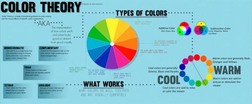
2. Inspiration folders, or even better, inspo blog with tags also help with collecting and remembering ideas. Color schemes, landscapes, style inspirations, atmospheric stuff, maybe some photo references, all those neat things.

3. Basic tier: character design sheets. Top tier: common poses, expressions. God tier: outfits they wear throughout the comic. Holy cow tier: turnaround sheets for all those outfits.

(I’d die trying to find good pages for references without these)
4. If you haven’t finished detailing the plot, don’t even think about moving on to drawing the comic. You’re gonna regret it when you come up with a really cool plot element that can’t be incorporated anymore because you’ve already drawn all the parts you could’ve tweaked.
5. Don’t just define the plot, make a script. Writing down the lines and the brief description of the actions serves me fine:

(notice that I approximately divided the pages & the text that’d go to each panel on a page)
6. Hard mode: make thumbnails for all the pages, if possible. At least whenever a new chapter starts.
7. If your story involves some convoluted chronology shenanigans, you’d better write down the events of your timeline in the chronological order.
8. Backgrounds. You can’t avoid them, bro. Like half of the comics are backgrounds, especially if your story involves a lot of adventuring and looking around. I know it hurts, but you’ll have to become friends with them. Read some tutorials, practice on photos, go out and sketch some streets, use 3d programs (like Google Sketch) to understand the perspective, use sites like houseplans to visualize your buildings better, I don’t know. Just be prepared for their imminent evil.
9. If you’re drawing digitally, pick a brush size for the lines and stick with it. You don’t want your lines and detail levels to look all wonky and inconsistent in different panels. And I don’t mean the cool stylistic varying lines, I mean this:

Also, things on the background should have thinner and/or lighter lines to avoid distraction. Usually less details too, unless you’re making a busy background with a simple foreground to help it pop out. Or wanna draw the attention to an object on the bg.

10. Readable fonts. Even if you chose to ignore people with poor sight or dyslexia, the majority of your readers aren’t gonna be excited about struggling to decypher this:

Also, as much as I love my black speech bubbles, colorful text on black still kinda hurts the eyes. I wouldn’t recommend doing that for all the characters. Black speech bubbles are usually used for creepy, inhuman voices. And yes, having a colorful outline in this case helps.
11. Probably newsflash, but did you know that panels have their place, order and functions? They do! My favourite thing ever is how I used panels when I was like 12:

(comics ain’t rocket science, but this one is)
The composition of the panels and word balloons always serve for a better reading experience. They guide your eyes over the page, so that you never feel lost or confused. The images in the comic equal frames in a movie, so it’s pretty damn important in what order you look at things and how quickly you can understand what’s going on!

(Eric Shanower & Scottie Young’s Wizard of Oz)
12. One update a week is fine for testing waters. Don’t overestimate yourself, especially if you have a pretty busy life outside it. A stable comic that updates slowly, but regularly is better than an unpredictable erratic one. You can always pick up the pace later, if you feel confident enough.
13. Try to always have a buffer - a couple of pages in reserve. If you’re making the pages much faster than you’re updating, this shouldn’t be a problem. But if those paces are equally the same, it’s goddamn HARD. But on the other hand, if something happens and you skip an update, those come in handy.
If you’re looking at this list and thinking “wow that’s a LOT of work”, you’re totally right. And it’s okay to be intimidated at first! But that’s why it’s important to start with something small. Once you get the formula down, these things will be natural to you.
2d Animation - Smearing
What is smearing? Smearing is a multitude of techniques used in animation to bridge two or more frames to create the illusion of motion through methods like blurring, warping, distortion, and a few others.
I wanted to start of with a fresh animation to demonstrate some movements.

It looks like it can definitely use some extra information to convey the motion of the sword. This is where we starting thinking about how to smear the object(s).
The most common approach that I’ve noticed that animators take, especially newer animators, is that they warp the whole object. As in they have a point A, and a point B, and then they just have a “mass” of implied motion in between those points.

Here’s a still shot

It works quite well with objects like swords. So here’s what my attempt looked like.

It definitely helped explain the movements more, but I’m not sure I liked it.
Thankfully there are other “types” of smears that we can look at to try to see if they fit in this particular animation.
The next one I wanted to try was “speedlining.” This is basically when you distort the edges or add speedlines to the edges to make the object appear in motion.
Here’s an example

and the still shot:

notices how the edges appear more sketchy. This one is really common and it can be executed in different ways.
Here’s my attempt

I really like this type of smearing, even though it still lacks some of the motion that the first iteration lacked. The speedlines really add character to the motion that would otherwise be missing in a normal warp, but I still needed that smear to bring it to the point where it needed to be.
So here’s what some call “doubling.” (and just as a side comment, I don’t think any of these have “official names” other than just smearing)

Here’s the still shot

This was a really well executed smear which I don’t think would have worked the same if you would have just warped the faces.
Here’s another slightly different execution

with the still shot

It’s like a distortion mixed with doubling, and that’s what I like about smears.. you can mix and match things you feel would work in the particular scene.
So here’s my mix n’ match smear.

Not the best execution, but for our purposes I think it works well.
Motion blurring is really powerful as well. Film uses it all the time, as does 2d animation. Notice the force of the impact being pronounced with the added blur at the head.

Here’s the still shot

There are a few other smears I thought were interesting because it just speaks to the way our brain interprets these frames without even considering the logical implications of the individual frames.
Here’s one example

I don’t know if you caught that, but here is the still shot:

The guy has a knob for a hand. It works so well, you don’t stop to think about implication of that hand’s morphology.
Here’s another one that doesn’t make too much sense.

Like what is this

That’s Imaishi. It’s part of why we love that animator so much. It’s part of his style and character. It conveys an emotion that would otherwise be absent in a “realistic” smear. Animation doesn’t have to make sense. It just has to look good.


after that you can just merge everything or dont (i didnt merge it) and then you would get:

some stuff to mention:
ty for the compliment i appreciate it <33
sorry if my handwriting is hard to read xd
along the making of this tutorial thing i had no idea where this was going, so i just decided to do a tutorial on how i did certain details of water and shit
there were multiple different things i did for drawing water while i made the comic so it seemed more appropriate to just do a tutorial(?)/explanation on what i did and how i did it
some of this information may not be accurate since im not a pro at art or anything i just learn from what i see
some parts mostly consisted of trial and error since water is a pain in the ass (dont be afraid of that)
there are other people who could have given a better tutorial and process than me, and this is just what i know, so maybe this helped you and others in some way, who knows ¯\_(ツ)_/¯
Hello angels, I'm in a dire need of help and kindness. I understand these are awful times for everyone right now and I understand that everyone is trapped and limited. But please hear and spread my story if you can.


I'm living in a very unsafe place. I live in a severe hoarding situation, and this is actually the best it has ever been. Earlier this year the hoard was worse but my family cleared a lot if it out which only made my grandmother panic and she has actually gotten worse. I've been physically stuck, buried and trapped in this hoard before, the white on the left photo is the ceiling. It almost crushed me to death.


This is really awful for me in so many ways. Rats and mice are everywhere, I see one every day. The building structure of the house itself is collapsed in two rooms next to my room and my room is collapsing now. I dont have any electricity in my room... I have a broken window and I live in Wisconsin. When winter comes I will freeze to death because I'm disabled and cant regulate my body temperature. I cant cook food here because next to the stove behind me in the third photo is where most of the rats run from and I'm afraid everything will fall on me. I can't even safely use the toilet because the toilet isnt secure into the floor. We dont even have an actual floor. :(
I'm getting really sick because of the decades of mold and decay and vermin in this house. The stairs are majorly blocked by hoard and has no railing, I have almost fallen and for me that would mean something dislocated and broken.
Please please be an angel to me and help me escape here :( my friend is trying to help me move into her home in Wyoming. I'm trying to move around November 17th, before it gets too cold for me to stay alive. We need money for the travel ticket and to send the sentimental possessions I have over to hopefully start my first healthy safe life.
My ko-fi is https://ko-fi.com/liquidsnake
My PayPal is paypal.me/temptationrevelation
My friend's PayPal: paypal.me/lavaeris
(Mindful of our deadnames)
Thank you angels please stay safe, stay kind ♡
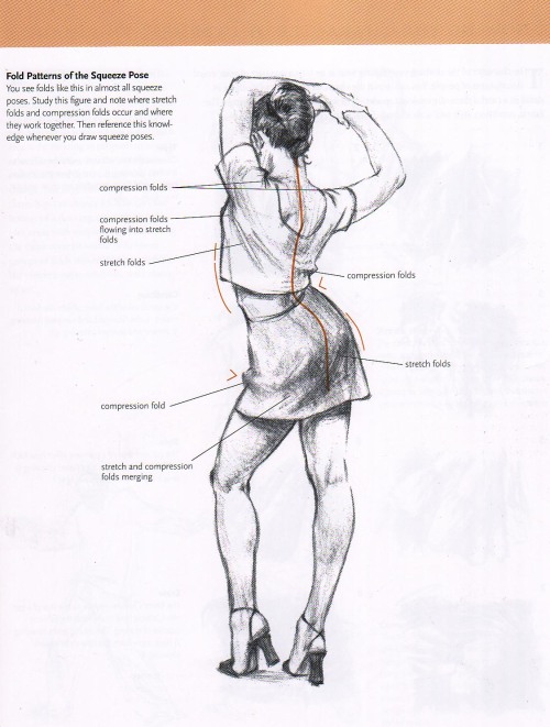
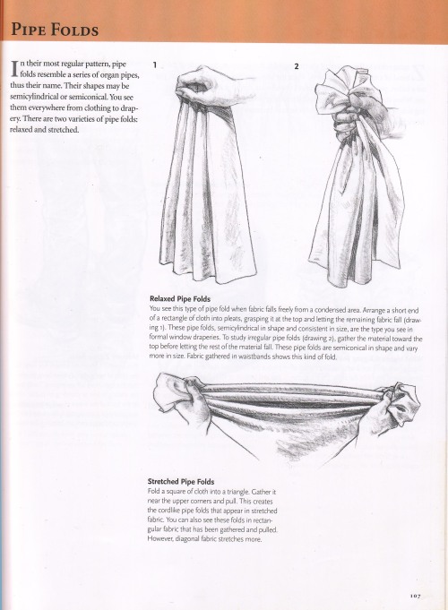
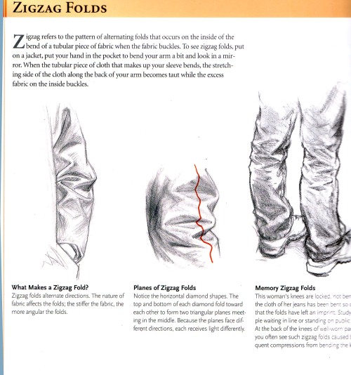
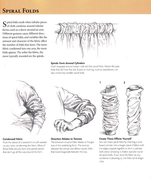
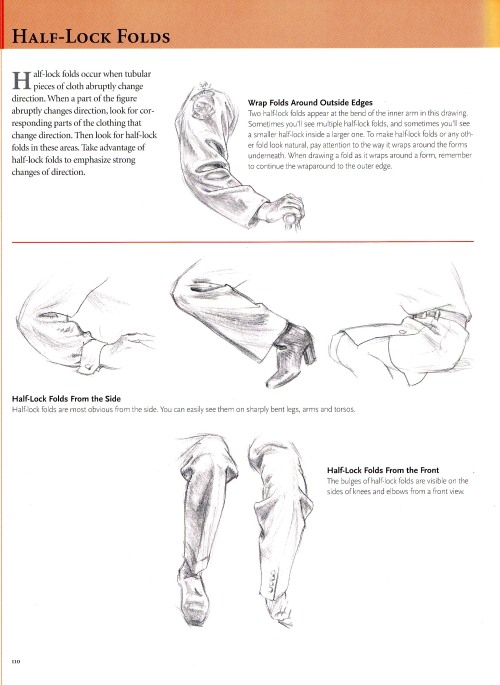
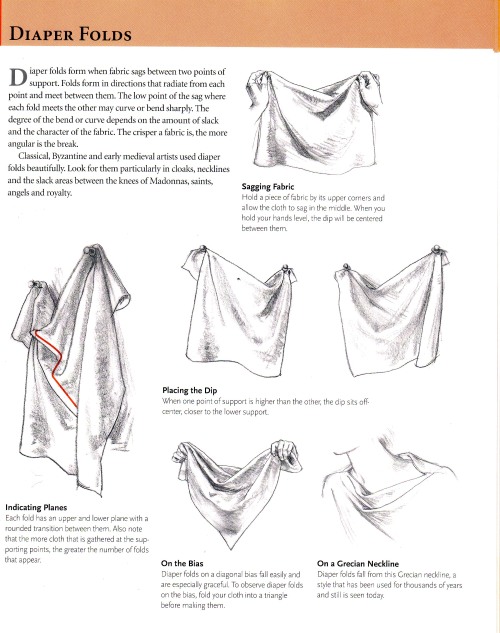
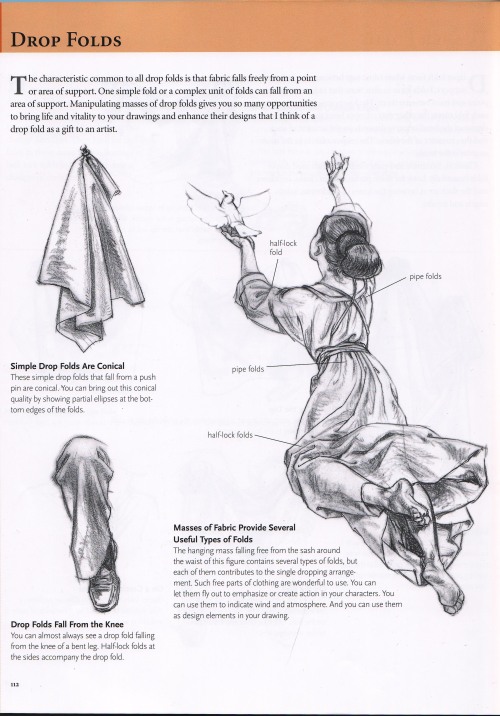
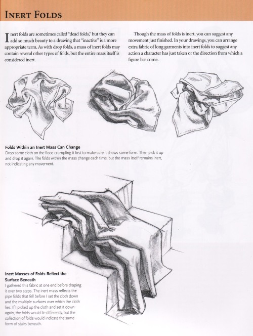
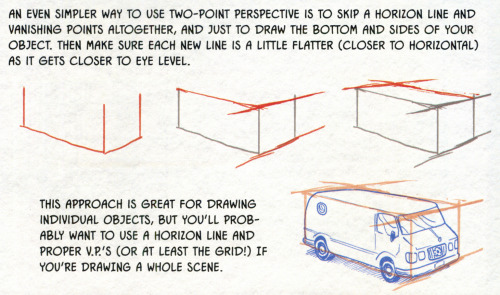
How to draw folds
Notes on how to draw folds back when I was teaching manga classes back in 2006. From the book “Drawing people” by Barbara Bradley.
http://www.amazon.com/Drawing-People-Portray-Clothed-Figure/dp/1581803591
This book has a very detailed description of 6 types of commonly seen folds and I think is one of the most educational resource on how to draw folds(Besides Vilppu and Bridgeman).
這是我以前教漫畫課程時給學生看的講義.來源是芭芭拉布莱德丽的"着装人物素描"<<上海人民美术出版社出版>>.
書裡講解了皺摺形成的兩個主要原理(拉扯與擠壓)以及因兩種作用力下形成的六種常見的皺褶類型.


When you shatter a diamond


Source


It seems like all of the resources I can easily find online for identifying wolves vs dogs are either massive and difficult to understand without prior knowledge of the subject, or extremely bare-bones and miss a lot of key information. I tried to hit a comfortable middle-ground. (sorry if it’s a little wordy) This tutorial is made as a reference for drawing, so everything but purely visual differences between dogs and wolves have been left out. I’ve been wanting to make this for a while now, so I’m glad I finally sat down and did it! **EDIT** When it comes to the section on wolfdogs, please take it with a grain of salt. With something as complicated as genetics, they are of course, not going to be as simple as I make it seem. What features different levels of content can display, and even which percentages designate which levels of content are often hotly debated within the wolfdog community. At this point I’ve elected not to change the image set itself because: a. it’s a huge pain in the ass b. this is a tutorial for beginning artists. It’s meant to be a hugely simplified version of the topic, and I’ve stated clearly that it is NOT to be used in real-world identification. **EDIT 2** A couple people have noted that the puppies section is a little misleading. Wolf puppies will always be born a solid brown, but that brown can range from a very dark brown (appearing as black) to a llight, gray-ish brown. The important point is that wolf pups will always be a solid color with even less distinguishable markings than even adult wolves. (also this guide does not include color possibilities related to birth defects or other genetic anomalies such as albinism) ((Huge thanks to yourdogisnotawolf. who’s blog inspired me to make this and for digging up that amazing picture of the wolf/lab mix))

This originally was going to be for Patreon but I decided to share it for free.
Basic realistic canine hind leg tutorial. Please note that some dogs do have dew claws on their hind legs, but not most.
-
 kurama1711 liked this · 3 months ago
 -
 bunnitjump liked this · 4 months ago
 -
 anannalogy reblogged this · 5 months ago
 -
 hypnotic-melodies reblogged this · 5 months ago
 -
 abndonware liked this · 5 months ago
 -
 artking-4 reblogged this · 5 months ago
 -
 dohorwarmautumn reblogged this · 5 months ago
 -
dohorwarmautumn liked this · 5 months ago
-
 flaminghawkblazie reblogged this · 5 months ago
 -
flaminghawkblazie liked this · 5 months ago
-
 annallzs0 liked this · 7 months ago
 -
 mkm11490 reblogged this · 7 months ago
 -
 linesart reblogged this · 7 months ago
 -
 inspirations-4-my-creations reblogged this · 8 months ago
 -
 always-a-slut-4-ghouls liked this · 8 months ago
 -
 shalvis liked this · 8 months ago
 -
artking-4 reblogged this · 9 months ago
-
 icey-popp liked this · 9 months ago
 -
artking-4 reblogged this · 11 months ago
-
 azuma-s liked this · 11 months ago
 -
 jellycaustic reblogged this · 11 months ago
 -
 hildegard-von-bloggen reblogged this · 11 months ago
 -
hildegard-von-bloggen liked this · 11 months ago
-
 nightfuryqueen reblogged this · 11 months ago
 -
 webginz liked this · 1 year ago
 -
 refer-a-ence reblogged this · 1 year ago
 -
 alexdrawings reblogged this · 1 year ago
 -
alexdrawings liked this · 1 year ago
-
 someones-anachronism liked this · 1 year ago
 -
 imma-put-dis-here reblogged this · 1 year ago
 -
 decemberthenemesis liked this · 1 year ago
 -
 vivimeiometro liked this · 1 year ago
 -
 greykittycat liked this · 1 year ago
 -
 blacksheeptown liked this · 1 year ago
 -
 stafiredaily liked this · 1 year ago
 -
 nebulousnoiz liked this · 1 year ago
 -
 094847h94 reblogged this · 1 year ago
 -
 randomblognumberfuck liked this · 1 year ago
 -
 merakiblr liked this · 1 year ago
 -
 metal-o-halos liked this · 1 year ago
 -
 tttt-ty reblogged this · 1 year ago