#Africa #Justice

Public schools in Boston are using a new global map to help show students what the world really looks like.
Boston Public Schools, a network that includes 125 institutions, announced Thursday that instead of just using the widely popular, over 400-year-old Mercator projection map, which grossly distorts the size of the world’s countries and continents, classrooms will be incorporating the Peters projection map because it is more accurate.

👇🏾👇🏾 The Peters projection map shows the world’s countries and continents at their true scale.

“Overall, we hope students gain a deeper understanding of the importance of researching and analyzing multiple perspectives in order to develop their own conclusions about the world around them,” BPS’ History and Social Studies Director Natacha Scott said. “By exploring geography, we also hope to increase an awareness of the relationship between themselves to other countries, communities, cultures, and individuals around the world.”
First of all I’d like to admit that no map is 100% accurate (though some are more accurate than others). But the ISSUE here is that the Mercator map doesn’t even get the size of Africa and South America right to the naked eye. Whichever map they use, people need to keep in mind just how many countries can fit into the African continent.
Africa is enormous, and people still somehow call it a country. I personally hate that!
The Peters projection represents a more area accurate map, which makes other continents more proportional to one another.
And what I like the most is that white people triggered by accurate map projections!!!!
#Africa #Justice
More Posts from Extra-origami and Others
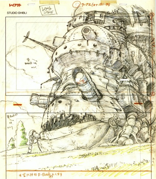
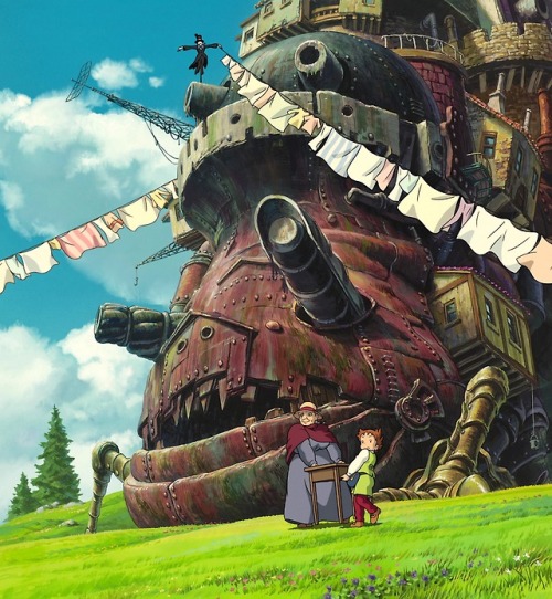
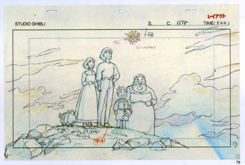
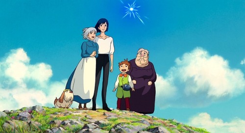

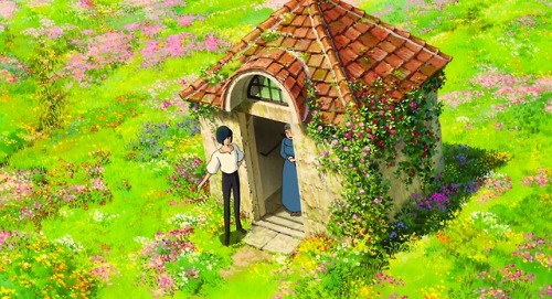
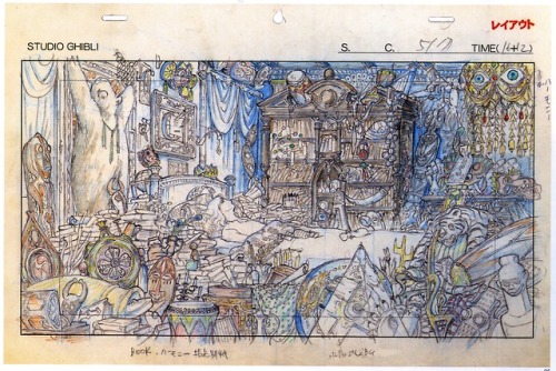
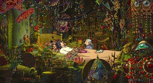
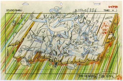
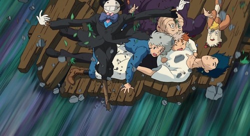
Hayao Miyazaki’s Anime Blueprint Layouts - Howl’s Moving Castle (2004)


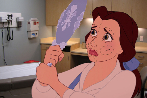

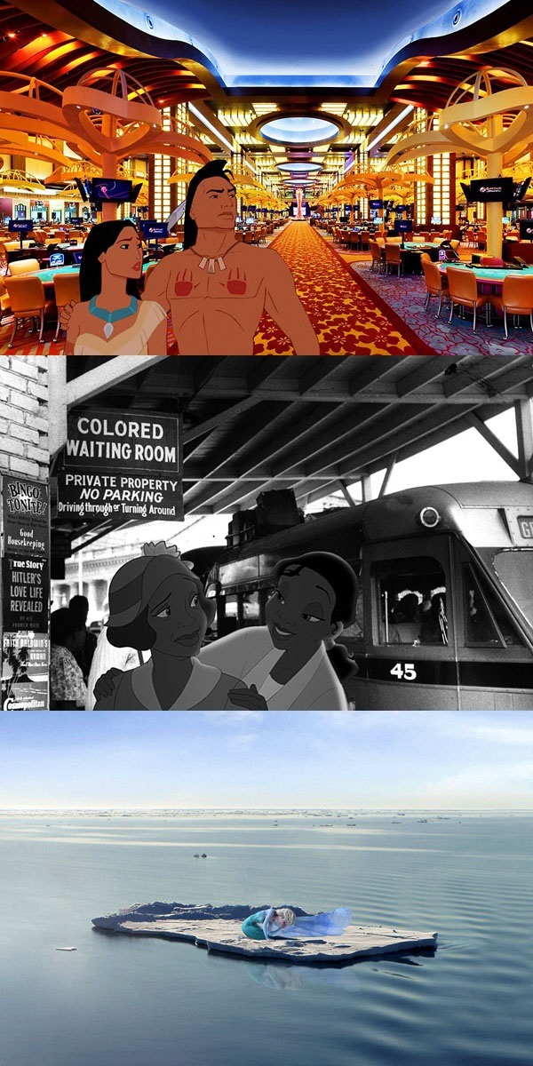
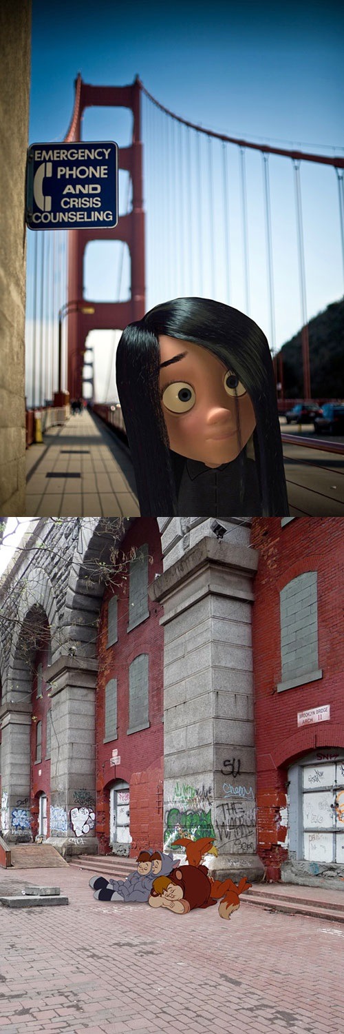
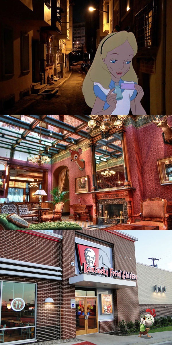

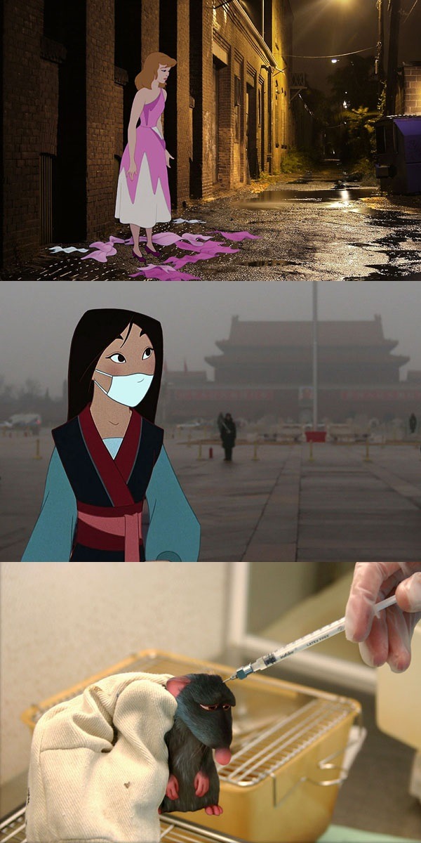
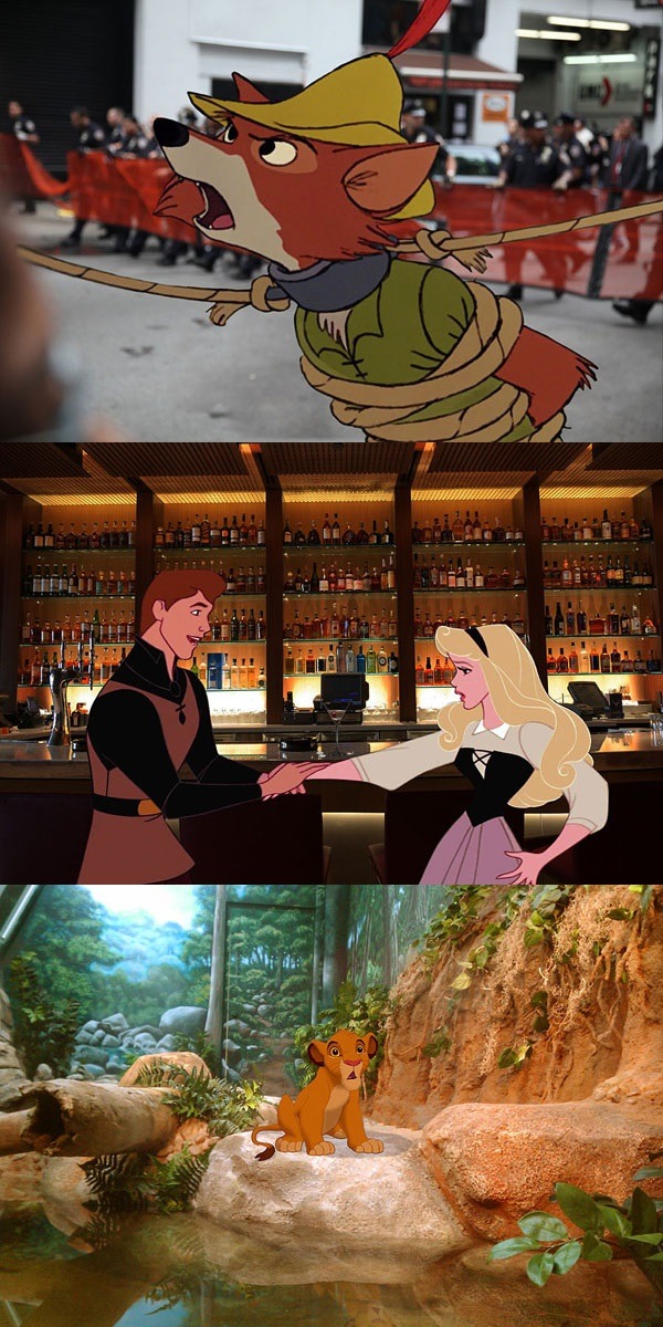

Unhappily Ever After by Jeff Hong
New York animation artist Jeff Hong has created less-than-rosy portrayals of Disney characters as they might fare in today’s world. They are not cheery images, but they are poignant in their depictions of very real challenges, from animal testing and ocean pollution to drug addiction and teen suicide.


Latinx students across the country have also felt the brunt of racist attacks.
Honestly the best video I’ve seen in a while Tears shed lol

K.w.
I emotionally nut every time I see this
asking for straight pride is like asking for able bodied parking spaces
New Trailer for “Ponoc Short Films Theatre: Volume 1 – Modest Heroes” In Japanese Cinemas 24th August

Previously, I’d only seen the first two panels and assumed it was the complete comic.
This version is much better.
ADDENDUM: As this approaches 100,000 notes as of this writing (less than three days after it was first posted), there are a couple of things that need to be added, and I prefer to add them to the original post, rather than to a reblog.
FIRST… there are a number of reblogs and replies–mostly from white males who see their precious capitalism threatened–that ignore the point of the comic and go after the fact that the people pictured didn’t pay for a ticket to get into the stadium.
If you need to see the point without the barrier (hah) of this particular comic, imagine this scenario instead. The scene is the maternity ward of a hospital. A joyful father is looking into the nursery window to see his newborn daughter…
First panel (equality): The father’s older child–a son–is standing next to him, wanting to see his new little sister. The boy is too short and can’t see into the window, but he and Dad are on equal footing. This is “equality.”
Second panel (equity): Dad picks the kid up so he be at an equal height and peer into the window at his sister. This is equity.
Third panel (removal of the systemic barrier): Instead of a window, the entire wall is made of transparent glass. The nurse brings the newborn over to show dad, and then squats down to show little brother as well.
Better? Everyone complaining about them watching the game “illegally” can now shut the fuck up.
SECOND… there have been a couple of inquiries about the source. Turns out, the original was indeed the first two panels only. It was an MS Paint image thrown together by a business professor named Craig Froehle to illustrate the difference between equality of opportunity and equality of outcomes. The three-panel version featuring the removal of the barrier is one of many adaptations.
For the somewhat fascinating story behind the original and how it came to be adapted in myriad ways, see https://medium.com/@CRA1G/the-evolution-of-an-accidental-meme-ddc4e139e0e4
That’s it!
-
 elegantkittycat reblogged this · 3 years ago
 -
elegantkittycat liked this · 3 years ago
-
 fourtris-is-4ever liked this · 6 years ago
 -
 gingerwarlock liked this · 6 years ago
 -
 alanfromrochester reblogged this · 7 years ago
 -
 super-dragon reblogged this · 7 years ago
 -
super-dragon liked this · 7 years ago
-
 tathrin reblogged this · 7 years ago
 -
tathrin liked this · 7 years ago
-
 ilivevicariouslythroughfiction reblogged this · 7 years ago
 -
 leah-black liked this · 7 years ago
 -
 thekyraalexandriablog liked this · 7 years ago
 -
 naturalcrwn reblogged this · 7 years ago
 -
 issablkqueen reblogged this · 7 years ago
 -
 extra-origami reblogged this · 7 years ago
 -
extra-origami liked this · 7 years ago
-
 what-is-originality liked this · 7 years ago
 -
 elvencomedownn liked this · 7 years ago
 -
 rdvo-geography reblogged this · 7 years ago
 -
 noahandbrian liked this · 7 years ago
 -
 ladytron2000 liked this · 7 years ago
 -
 orville-redenbacher-space-hero liked this · 7 years ago
 -
 mightyxray reblogged this · 7 years ago
 -
 notenoughtrees liked this · 7 years ago
 -
 koalablu liked this · 7 years ago
 -
 grooby42 reblogged this · 8 years ago
 -
 dracoape liked this · 8 years ago
 -
 awesomeonly liked this · 8 years ago
 -
 aquestionmark reblogged this · 8 years ago
 -
 musingsofburnttoast reblogged this · 8 years ago
 -
musingsofburnttoast liked this · 8 years ago
-
 honeykyun liked this · 8 years ago
 -
 canwriteitbetterthanueverfeltit reblogged this · 8 years ago
 -
 kiba3sixxes reblogged this · 8 years ago
 -
kiba3sixxes liked this · 8 years ago
-
 apeachymama reblogged this · 8 years ago
 -
 chambe5r-the-5-is-silent-blog reblogged this · 8 years ago
 -
chambe5r-the-5-is-silent-blog liked this · 8 years ago
-
 epic-mel reblogged this · 8 years ago
 -
 taciturnlexemic reblogged this · 8 years ago
 -
 lanterns-in-the-night-sky liked this · 8 years ago