
(but mostly things I want to keep with me)
149 posts
Latest Posts by nikol-fangirling-creates - Page 2
4 Minutes and the Cinematography of Nipples
I said before that I thought 4 Minutes was pretty instantaneously the best looking BL on the market for 2024 after one episode. Which, not gonna lie, is a pretty big fucking claim. There’s been a lot of BL that’s come out that’s looked good, and I do think there’s been a steady improvement overall in the market in the last few years. Personally I think Japanese and Korean BL have a stronger production quality over a majority of Thai BL but like, if that’s a hot take I guess I prefer my food spicy.
The point being~ if I’m gonna make such a hyperbolic statement, well I better back it up right?
So I’m gonna break down a few scenes from the first episode, what I liked about them, why they worked for me, and why on a technical level I think 4 Minutes has just got it going on.
For better readability you can also check out this essay here.
Sidenote: my google docs kept trying to autocorrect “Bible” to “the Bible” and idk how to teach google I mean the hot Thai actor and not the book of Jesus.
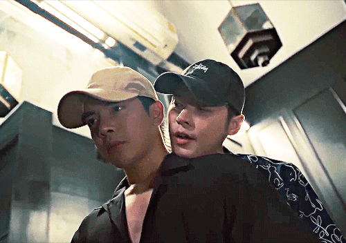
To start, I’m going to break down this scene featuring Great and his nepo baby cat:
I thought starting with this scene would be good because it’s such a low-key scene and honestly making these simplistic scenes visually interesting is very difficult! But if you have the basics down, the foundations of cinematography and film making, these simpler scenes can be really memorable.
Like yeah we’re all gonna remember this scene because shirtless Bible and oh my god Akira!? - I have only recently learned who Akira is; why is this cat getting a bigger bag than me? - but beyond that, what makes it cool to watch? What makes it interesting? What information does it showcase to the audience?
One thing I added to the video was a grid for the rule of thirds.
Rule of thirds is a shot composition technique applied to both film and photography. It’s the grid you see if you film a homevideo and helps a Director and Cinematographer figure out where to place the subject or subjects of the shot. The idea is the gridlines show you where you “should” place the subject(s) of said shot.
Like everything, the rule of thirds is a guideline in filmmaking, not a hard and fast unbreakable rule. Filmmakers like Wes Anderson like to play more with central composition shots, rather than ROT.
Anyway on to the opening shot, right after our credits and we’re moving into the shot.
To start, the first thing I notice is the scene’s color grading. Color grading in film is the manipulation of raw film footage to create specific color tones throughout a project. Sometimes this grading is more pointed and obvious, think The Matrix, while in other films it’s not as obvious but still very prominent, think Killers of the Flower Moon.

It’s not that the before credits scene looks entirely, jarringly different from the opening scene, but the hospital scene is surrounded by whites and blue tones, it’s darker, and only a single source of light exists. It gives the entire scene a much more frantic, uneasy aesthetic but it’s not so far off from the darker muted tones of the next scene that it feels jarring or out of place.
The second big thing I noticed in the episode is the use of aspect ratio. I’m not 100% sure what aspect ratio the production used exactly, but the use of widescreen as opposed to full screen in my opinion, gives the episode a more cinematic feel to it in comparison to other Thai BLs.
Example, if you look at Century of Love (2024) it appears to be filmed in the standard full screen - which I believe is 16:9? - while 4 Minutes is widescreen (thus the black bars at the top and bottom). Widescreen can give a show a more “movie like” quality to it which is part of the vibes I get from 4 Minutes.

(source)
Onto Great’s actual introduction scene.
We’re not starting the shot with static movement, but with a camera panning right. I’ve talked about camera panning and such in BL before and it’s something I’ve found doesn’t happen as often as it should. Which is a shame! It’s such a simple technique but it adds so much.
Imagine if we entered the frame with a static center shot, and then a cut to Great sleeping and turning off his alarm clock, and then another cut to above the bed. Think about how much more boring that could be visually.
Instead, we enter the scene with movement, panning over and creating some interesting visual framing.

So here’s our opening shot, do you notice anything interesting? To start, what I like about this shot other than the panning movement in, is that we don’t see Great’s face yet. In fact we don’t see his face in full until about 30 seconds into the scene. This builds anticipation, yeah we all know what Bible looks like, but for the audience who doesn’t this helps build anticipation.
Who is this character? What does he look like? What’s his deal?
It also engages the audience more, if you notice part of the composition of the shot has Great in the mid-ground slightly blurred out, while the foreground emphasizes the things on his desk. He’s distant from us, the audience, sleeping off his hangover not yet ready to “join” the world yet.
Here’s another two more things I like about this shot:

Lines.
Using lines and shapes can make a scene more visually interesting and invoke different feelings to the viewer. In this shot, I get a sense of symmetry, the camera panning right, lightly drags across the screen alongside the lines below and above Great, almost creating a frame within a frame effect. As if Great is boxed into a clock in and of itself.

You can also see the use of balance in the scene as well, connecting back to that visual theme of symmetry as well as blocking our view of Great’s face. The lava lamb and champagne bottle are almost the same height, which helps create balance in the shot. The champagne bottle informs us Great has been drinking or does drink since it’s positioned so close to his bed, whilst also continuing to hide his face away from the viewer.
I also like that the lava lamp is a bright spot of color. The tone of the scene is mostly muted greens, and gray, but the bright orange lava lamp and even the pink champagne bottle draw our attention but don’t overwhelm us either. It provides the scene with some warmth but doesn’t offset the overall tone of the color grading.
And then, the last bit of this shot:

We have Great knocking over the champagne bottom, and turning off his alarm clock. Notice that the alarm clock and the champagne bottle hit those ROT dots almost exactly. There’s also the use of lines by the length of Great’s arm - I just forgot to add a line I’m a failure, a fake, fml - we see him knock over the bottle, and then we follow the line of his arm directly to the alarm clock which is also a shape, a circle.
I like that they used a clock with a specific notable shape, since by the end of this scene the clock is relevant to the story as a whole. Using a shape makes the clock more visually noticeable and memorable to the audience.
So in the next cut we’re above Great - just like Great’s gonna be above Tyme, fuckin hell I’m corny - in a medium-full shot and there’s a couple things I really like here.
I really like the use of lines here with the bed going in one direction but Great’s body going another. It’s disconcerting, and off kilter a bit.
The use of patterns plus the opposing symmetry, whereas in the previous shot the lava lamp and champagne bottle were providing balance, here one side of the bed is patterned, while the other isn’t. This creates a sense of imbalance and makes the shot more visually interesting.
This medium-full shot at a high angle makes Great smaller, and continues to showcase his dishevelment, keeping him distant from the world itself. Also notice the lack of color here as well.
What could this say about Great as a character? Or his story?

So this next cut is the one that actually inspired me to write this essay to begin with and know what I’ma eat some crow here. I originally said it was a great ROT shot but I was wrooooooong. It’s definitely a center composition shot.

Notice as well, the bed itself is its own shape - rectangle - center in the frame, and yet the shot almost looks unbalanced again because of that singular patterned rug. It’s the only pattern in the entire shot, not even Great’s pillows have noticeable patterns on them.
The above view camera angle in a full shot creates almost an omnipresent feel, as if the audience - or something else? - were looking down upon Great. Whose face we still haven’t seen! It makes him smaller, less powerful, and almost vulnerable. Shots like this are often used in horror films like James Wan’s Malignant (2021) where the horror spector will be looking down above the would-be victim.
Another thing I like about this scene though is we have Great moving. It would be simpler and easier to have his phone just by his alarm clock, or under his pillow, but think about how much more visually interesting it is that he has to move down the bed and reach for his phone. It creates action in an actionless low stakes scene.
And now, 30 whole seconds in and we’ve finally seen Great’s face!

Fun fact, with the ROT grid the gridlines fall right across Bible’s nipples. That’s not a film analysis, just something I noticed entirely intentionally. Thanks Madam Director Ning Bhanbhassa Dhubthien.
The actual shot is in center composition again, as Great rolls over and reveals his face the camera begins to zoom in.
This creates movement in the scene instead of leaving the camera to statically observe it’s now, finally, inviting the audience to meet Great. Pulling us in towards him whereas before we were kept at a distance. Great’s awake and, well as ready to meet the world as somebody with a raging hangover can be.
I also like how Bible is moving constantly in this scene; he rubs his eyes and nose, he twitches his fingers, titles his head back and forth, etc it’s nothing revolutionary but it’s appreciated.
When the scene cuts, we get this shot:

I didn’t put the red dot on his nipple, it just landed there. This is all Madam Director Ning chepie.
But you can see how Great’s body is landing on all those gridlines pretty solidly. Also in the background we see his alarm clock again, a bright blurred circle in the distance. I also like the angle of this shot, as it creates depth in the frame, with Great’s head being in the foreground his lower body in the mid-ground and the background blurred out.
What follows is Akira appearing in frame. Which was really difficult to capture so I don’t have a screenshot. But what I really like is Akira entering the frame out of focus. They could have just cut to Akira, but instead they opted for Akira to enter the frame which is more interesting.

When we do cut, Akira is firmly on one of those dots so we don’t miss them in the frame. I think it’s also interesting that we’ve pulled out again, into a mid-full shot, hanging above Great, and we see that clear symmetry line again between the patterned rug and the regular carpet.
I also really love that when we got to Great sweet-talking Akira and feeding them we’re not just doing a cut, we’re panning downwards which continues to add movement to the scene. And we get that moneyed sponsor shot!

Durex can’t pay for everything okay?
So in the final bit of this scene we get focus on Great, who’s in focus, before he gets up and leaves the frame where the camera then focuses on the clock behind him.


See how in the first frame the background is all blurred out, but once Great walks out of the frame - again, great that he walks out, movement!! Y’all don’t understand how boring 1000 Stars was for me to watch because of the lack of this stuff okay? - and then the focus shifts to the clock. Which is round.
God I know that sounds so dumb, but imagine the clock without that ring light bit on it, it’s just a tiny little rectangle. Not as fun or interesting to look at right? Or as noticeable especially from a distance?
This shift in focus also tells us “this is important” whatever “this” is. The subject of the shot goes from Great to the alarm clock but they are positioned as equally important. We’re meant to pay attention to this seemingly innocuous item, which we learn later in the episode is time. We’re meant to remember and note that time will be important to the story - I know with a title like 4 Minutes you’d fucking hope time would be important but have y’all ever read Youtube comments? It’s rough out there for visual comprehension okay?
So all in all this scene is only 1 minute and 40 seconds give or take. It’s very short, but I don’t think it was boring at all. I think it’s a really solid introduction to a main character. Think, Korn didn’t get this much time to showcase his introduction, his scene is shorter - though also well done - which showcases which character is more of a story priority.
This scene eases the audience into the story, inviting us to wake up into the world like Great is. It uses techniques like lines, shapes, symmetry, color and focus to make what could be a very boring scene into an interesting one.
There’s so so much I probably and certainly missed, I’m far from an expert, but I hope I was able to articulate what I liked about this scene, and why I think it looks good.
Stay tuned for more if I can manage to focus long enough to breakdown more scenes lol
Also red dots on Bible’s nipples are just funny to me it be what it be.
Further Reading:
Composition in Cinematography / THE LAST OF US
Center-Framing vs Chaos-Cinema: Mad Max vs Transformers
Camera Framing: Shot Composition & Cinematography Techniques Explained [The Shot List, Ep 2]
The Ultimate Guide to Camera Shots (50+ Types of Shots and Angles in Film)
Color Grading 101 - Everything You Need to Know
Mixing Film And Digital Footage: Killers Of The Flower Moon
In Praise of Subtle Cinematography
cinematic universe of director Ray Jiang, featuring sad/traumatized men in water:


different types of water for different types of pain


rakmut + tongue 👅👅


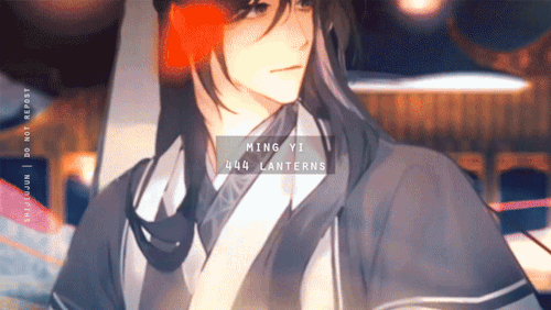

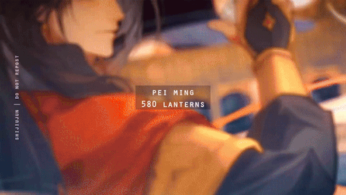
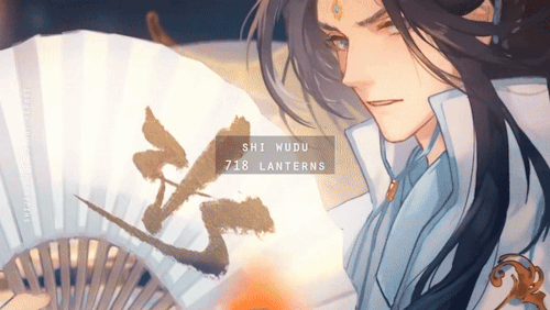
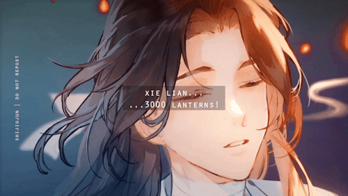

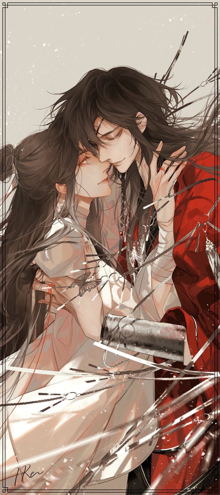
🏮 3,000 lanterns from Hua Cheng to his gege
From the TGCF AD S2 (2024) Teaser Clip
🏮 3,000 lanterns from Hua Cheng to his gege
From the TGCF AD S2 (2024) Teaser Clip
I need Youku to release all of the deleted scenes. It was so important that we also saw things from Yuan's perspective here and they cut it. I understand that lines were removed (first line Yuan says is, "I don't want you to accomodate me".) but including this would have helped the flow of the scene so much better.
BTS: confirm relationship.
Between this and the kiss being removed after thier hug I'm going to cry. This would have been a perfect way for Qian to confirm boyfriend.

Editing team you let us down.


Don't worry Tharn, Phaya got your back!
Billy Patchanon and Babe Tanatat in THE SIGN (2023)
Novels I read for the audiodrama cover art
judge a book by the cover of its adaptation ~
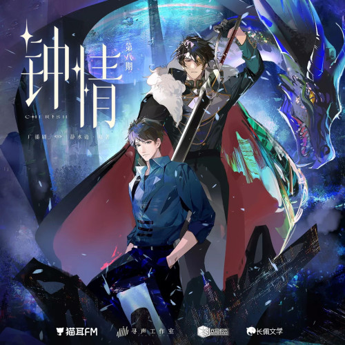
钟情 by 静水边 on Mao'er FM -- We have dragons, capes, and swords, in space! Are they real or symbolic? What genre is this actually? I never read a space-themed danmei or any original guide/sentinel stories, so this picture totally hooked me for the novelty.

心眼 by 北南 on Manbo-- This cover art actually sketches out a story instead of "just vibes". Why is this guy leaving? Why did the other person take until the train station to try to stop him? Are the big red headphones over the ears important symbolism to contrast or complement the "eyes" in the title?

我成了虐文女主她亲哥/I Became the Older Brother of the Heroine in an Abusive Novel by 刘狗花 on Mao'er FM -- You can just tell the boy in white is Best Boy™ who deserves ALL the cookies and encouraging pats on the head. The boy in blue is obviously trying to be cool and ready to bite the head off anyone who is mean to Best Boy™, so he also deserves cookies and a pat on the head.

督主有病/Governor’s Illness by 杨溯 on Mao'er FM -- Bare branches, autumn leaves, and dramatic winds. Based on my years of watching c-drama, two people looking at each other like this under a pavilion are almost certainly headed for a dramatic and/or tragic confrontation. This picture is promising beautiful, poetic angst.

君有疾否/Jun You Ji Fou by 如似我闻– on Mao'er FM -- That gremlin's little smile and adoring expression while he plays with his partner's hair! The intimacy implied by the the bare forearm, loose hair, and untied cloak! The reservation and uncertainty in one partner's expression, contrasted with their physical closeness! This relationship is going to be so much to unpack!


Kiseki: Dear to Me (2023) - Cameos From left to right; top to down Aaron Lai and Hank Wang (Main couple of Be Loved in House: I do) Matt Lee and Zheng Qi Lei (Side couple of Plus & Minus) An Jun Peng (Side couple of HIStory 4: Close to You) Wilson Liu (Side couple of HIStory 3: Make Our Days Count) Max Lin and Shi Cheng Xuan (Main couple of Plus & Minus) Huang Chun Chih and Wayne Song (Main couple of HIStory 3: Make Our Days Count)


🫡🫡🫡


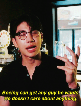
All my life, I’ve been told not to be friends with this one guy.
BAD BUDDY October 29, 2021 — January 21, 2022
![Kinnporsche + Text Posts [6]](https://64.media.tumblr.com/1f564e9760208b44b23f8f69757adb56/c57a7da4b342b9de-1d/s500x750/96fde1064386da1e7ea819d2f0bdd7e2961ea4b8.gif)
![Kinnporsche + Text Posts [6]](https://64.media.tumblr.com/f041e88e2216b42179a2ee83e45a7781/c57a7da4b342b9de-fa/s500x750/40db2775a5504d6bd017693363b42a4b375cd19c.gif)
![Kinnporsche + Text Posts [6]](https://64.media.tumblr.com/e8569fbef5f531028ac0b584c4e06cec/c57a7da4b342b9de-ec/s500x750/8a3ed36b4d735e55611c7c359dd8a4e0c279ad7d.gif)
![Kinnporsche + Text Posts [6]](https://64.media.tumblr.com/04c43d2ad745018ec988f5be3ab59674/c57a7da4b342b9de-34/s500x750/9ea691e1f40da16ddce9e6b07ead8c3635583896.gif)
![Kinnporsche + Text Posts [6]](https://64.media.tumblr.com/912a8350fbd3b688d35f7b8a026b5210/c57a7da4b342b9de-9a/s500x750/d332ed5c6dc72f8425403175f445ace9b6461e5f.gif)
![Kinnporsche + Text Posts [6]](https://64.media.tumblr.com/29942af7f7040c7fb49e1b817b3298ef/c57a7da4b342b9de-14/s500x750/c00a8ac6d061909afed688964d10c16b7ee55317.gif)
![Kinnporsche + Text Posts [6]](https://64.media.tumblr.com/a13a4faab6d0252c8306159ddfc13676/c57a7da4b342b9de-22/s500x750/92821e888211106623851ec36cef667cc8cc9430.gif)
![Kinnporsche + Text Posts [6]](https://64.media.tumblr.com/d4cc8e589361007f6fe33cd2e3a7c479/c57a7da4b342b9de-4e/s500x750/e0671edc1821e6ce66e2647e39786cc8289000e0.gif)
![Kinnporsche + Text Posts [6]](https://64.media.tumblr.com/4360adfbfb3d49a1a3fdf3921c6d123b/c57a7da4b342b9de-2c/s500x750/5d96e73a84ac2f49b24eba5fa09a489ef07f1888.gif)
![Kinnporsche + Text Posts [6]](https://64.media.tumblr.com/72245282cde8eb38c65ca379e879c5be/c57a7da4b342b9de-cf/s500x750/9f4535a6170f683d77746b37159319ca01eb3962.gif)
kinnporsche + text posts [6]


triple kill
Twitter: @iRenrain107


BEHIND THE SHOW | KinnPorscheWorldTour💫


TMMN CRACK


Fanboy Sho^3^ Also , love how Nino is the only one not bowing, www


Landscape in Tian Guan Ci Fu - illustrated by STARember


KINNPORSCHE (2022) dir. Khom Kongkiat — #when you’re trying to keep your mafia husband alive, but he’s a horny little sh*t
#an otp that can do both 🔥

tag yourself i’m all three at the same time
excuse me

we're kind of in the middle of

a dangerous situation here

can you both just

chill out for a moment?

thanks!


do you still believe in the justice system?
Not Me Character Alignments
Lawful Good: acts with sense of duty and honor, and follows their code for good — Nuch/นุช

Neutral Good: believes doing the right thing requires breaking some rules — Dan/แดน (UNAR)

Chaotic Good: does whatever is needed, often with disorganized methods, for good — Yok/หยก & Gram/แกรม

Lawful Neutral: follows concepts like honor and tradition but for their own personal code — White/ไวท์

True Neutral: neutral on both axes and doesn’t lean towards any alignment — Gumpha/กุมภา

Chaotic Neutral: abandons rules and pursues their own desires […] — Sean/ฌอห์ณ

Lawful Evil: uses well-ordered systems and strict code of conduct for evil [often through exploitation] — Tawi/ทวี

Neutral Evil: sees no value in order and has no passion for chaos; has allies but will turn on them if they see fit — Todd/ต๊อด

Chaotic Evil: has no respect for rules or others; pursues their own, often cruel, desires and freedom — Black/แบล็ค

Not Me The Series + character alignments (credit for alignment explanations)
inspired by @absolutebl
*side note: these alignments can—and probably will—change as the series progresses 😉


by 파파제이@jennygin2
Winter 2021 Anime Watchlist
Kimetsu no Yaiba: Yuukaku-hen - December 5

Hakozume: Kouban Joshi no Gyakushuu - January 5

Tokyo 24-ku - January 6

Baraou no Souretsu - January 9

Akebi-chan no Sailor-fuku - January 9

Futsal Boys!!!!! - January 9

Shingeki no Kyojin: The Final Season Part 2 - January 10

Sasaki to Miyano - January 10

Vanitas no Karte 2nd Season - January 15

Chikyuugai Shounen Shoujo - January 28

Sono Bisque Doll wa Koi wo Suru - January

Koroshi Ai - January

Orient - January

Tribe Nine - January

Ryman’s Club - January

Fruits Basket: Prelude - February 18

Goodbye, DonGlees! - February 18

Blue Thermal - March


it blows my mind how you did this to me with all of your shine

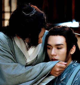
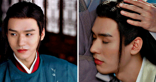
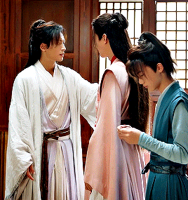
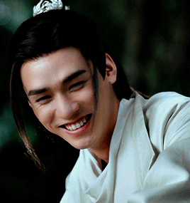


MAKE ME CHOOSE ─ anonymous asked: wenzhou’s moments of tenderness or wangxian’s