Something I Try To Keep In Mind When Making Art That Looks Vintage Is Keeping A Limited Color Pallette.
Something I try to keep in mind when making art that looks vintage is keeping a limited color pallette. Digital art gives you a very wide, Crisp scope of colors, whereas traditional art-- especially older traditional art-- had a very limited and sometimes dulled use of color.
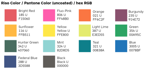
This is a modern riso ink swatch, but still you find a similar and limited selection of colors to mix with. (Mixing digitally as to emulate the layering of ink riso would be coloring on Multiply, and layering on top of eachother 👉)
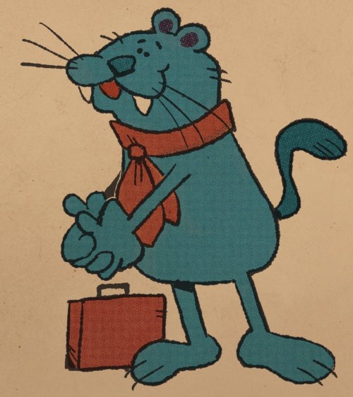
If you find some old prints, take a closer look and see if you can tell what colors they used and which ones they layered... a lot of the time you'll find yellow as a base!
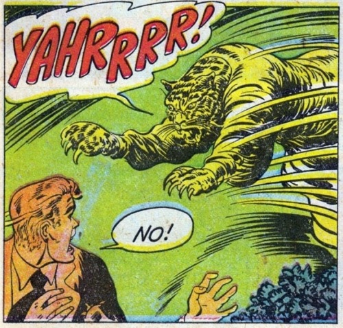
Misprints can really reveal what colors were used and where, I love misprints...
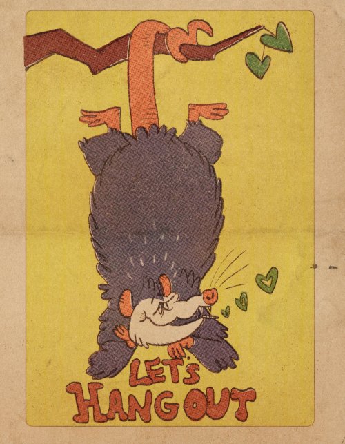
Something else I keep in the back of my mind is: how the human eye perceives color on paper vs. a screen. Ink and paint soaks into paper, it bleeds, stains, fades over time, smears, ect... the history of a piece can show in physical wear. What kind of history do you want to emulate? Misprinted? Stained? Kept as clean as possible, but unable to escape the bluing damages of the sun? It's one of my favorite things about making vintage art. Making it imperfect!
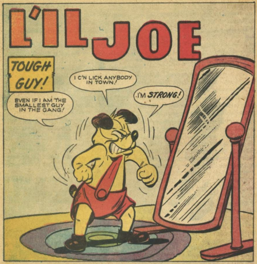
You can see the bleed, the wobble of the lines on the rug, the fading, the dirt... beautiful!!
Thinking in terms of traditional-method art while drawing digital can help open avenues to achieving that genuine, vintage look!
More Posts from Quirinah and Others


the nin that keeps on drawing (nindraw 5.5? 6?)


tomesaburou gekkans

tomei thursday! get hype for tomei thursday!!
alt bg:


Art fight attack aimed at @quirinah of their character Sawyer.


WE GO OC MODE 🦇🦇🦇🦇
yippee!!!
i want to try and get out of my own neuroses sometimes and just draw things i like because i like drawing them... lol but the frustration of not being able to create anything that feels like it has that special something gets to me sometimes. i think the best thing to think about is just measuring my own progress versus how i did in the past and acknowledge both my shortcomings and the efforts I put in to try and get to where I want to be....orz. sparkle on be yourself. or something
oogh. imminent film deadline art imposter syndrome crashout. ogh
ALSO getting sleep omg 😭😭😭 #tweaking
most of my entire brand is being the terminally online guy and the caffeine guy but literally being forced to get off the internet during film crunch and weaning off coffee has put me in a way better mood and im not even joking. dattebayo

the new animate cafe collab promo art. never kill yourself


my finale two mass attacks! I wanted to riff off a similar composition and maybe color palette but give them both totally different tones…
characters belong to Jay_Abracadabra, ~Ham_2345, @starfruitd, ~saver, @kidoblivion, ~Apearcity, ~Telecat, ~littlexghost, ~Imperatori, and @strawberri-draws !
-
 feelinghumdrum liked this · 3 weeks ago
 -
 neonandfuckinggarbage liked this · 3 weeks ago
 -
 vulcanautistic liked this · 3 weeks ago
 -
 steelb1ues liked this · 4 weeks ago
 -
 just-bastard-u-know liked this · 4 weeks ago
 -
 battlebreasts liked this · 4 weeks ago
 -
 cacozealouscatenjoyer reblogged this · 4 weeks ago
 -
 cacatorycatenjoyer liked this · 4 weeks ago
 -
 mageofpanic liked this · 1 month ago
 -
 aheartmadeofstars reblogged this · 1 month ago
 -
 teoceearts reblogged this · 1 month ago
 -
 anothermusicalstepladder17 liked this · 1 month ago
 -
 siyurikspakvariisis liked this · 1 month ago
 -
 koilarist liked this · 1 month ago
 -
 cityboys-modelgirls reblogged this · 1 month ago
 -
 massivelynuttypainter liked this · 1 month ago
 -
 gonnaneedthatlater reblogged this · 1 month ago
 -
 princedetectives liked this · 1 month ago
 -
 ldragonofvoidl reblogged this · 1 month ago
 -
ldragonofvoidl liked this · 1 month ago
-
 sunshinehunter liked this · 1 month ago
 -
 fantaoftheopera--23 reblogged this · 1 month ago
 -
fantaoftheopera--23 liked this · 1 month ago
-
 viiridiangreen reblogged this · 1 month ago
 -
 shenny100 liked this · 1 month ago
 -
 bobokitty liked this · 1 month ago
 -
 mothreblogmess reblogged this · 1 month ago
 -
 cobyrabbit liked this · 1 month ago
 -
 iggnorantart liked this · 1 month ago
 -
 francesthecute liked this · 1 month ago
 -
 alwayslookingforthose liked this · 1 month ago
 -
 chulippi reblogged this · 1 month ago
 -
chulippi liked this · 1 month ago
-
 frankforested reblogged this · 1 month ago
 -
 rockyapboa liked this · 1 month ago
 -
 soulsilvercartridge liked this · 1 month ago
 -
 suzcatonmars liked this · 1 month ago
 -
 s3tsuna-3ien reblogged this · 1 month ago
 -
 helcathelcat reblogged this · 1 month ago
 -
helcathelcat liked this · 1 month ago
-
 infinisse reblogged this · 1 month ago
 -
infinisse liked this · 1 month ago
-
 pomeg-juice-and-rinds reblogged this · 1 month ago
 -
 twentydaysofmay reblogged this · 1 month ago
 -
 lassideblog reblogged this · 1 month ago
 -
 bsq-reblogs reblogged this · 1 month ago
 -
 braingoaaaaaah liked this · 1 month ago
 -
 juicycloud reblogged this · 1 month ago
 -
 selkramazed reblogged this · 1 month ago

|| Q || || ENG/中文 || calarts ca 28 || animator, character designer, yapper. a place to upload art logs/doodles.
239 posts