Rachelcapstone - Rachel's Capstone
More Posts from Rachelcapstone and Others
Week 12: November 22
For creative research this week, I went back to Poster House to see two exhibits that weren't open the last time I went.
Title wall from the first exhibit, Schoolgirls at War: French Propaganda Posters from World War I.

Nous Saurons by Camille Boutet 1918

Title card for Nous Saurons

Title wall for the second exhibit, With My Little Eye: Warnings for the Homefront

Careless Talk Costs Lives Posters


Both of these exhibits focus on propaganda posters. Going back to the topic of soft power, these posters often harness it and use juxtaposition as a way to compare contrasting imagery with the war in order to deliver a political message. For example, Nous Saurons features children looking longingly at a candy store, with the caption “We will know how to deprive ourselves”. There is a juxtaposition between the candy store, the longing children, the caption, and the presumably adult viewer that implies that if children can find the strength and discipline to ration and control their desires during the war, then adults should be more than capable to do the same. The poster is an effort to get the French people to support the sugar rations put in place by the war effort. The use of children to juxtapose the underlying message of supporting a war is much more effective than a poster that would have just said “Rationing sugar is patriotic”. It sets an extreme contrast that says “if you, an adult, are not able to ration sugar, you have worse self control than a child”, without saying that phrase explicitly. This way of using juxtaposition to construct guilt in order to support the war is subtle yet potent. Similarly, in the Careless Talk Costs Lives Posters, people chatting with each other or over the phone in mundane situations are juxtaposed with the captions that they are participating in something deadly.
This week for scholarly research I read This Means This, This Means That: A User's Guide to Semiotics by Sean Hall.
Citation: Hall, Sean. 2012. This Means This, This Means That : A User’s Guide to Semiotics. Vol. 2nd ed. London: Laurence King Publishing. https://search.ebscohost.com/login.aspx?direct=true&db=e000xna&AN=926138&site=ehost-live.
Link: http://ezproxy.stevens.edu/login?url=https://search.ebscohost.com/login.aspx?direct=true&db=e000xna&AN=926138&site=ehost-live&ebv=EB&ppid=pp_75
Summary: Semiotics is the theory of signs, and reading signs is a part of everyday life: from road signs that point to a destination, to smoke that warns of fire, to the symbols buried within art and literature. Semiotic theory can, however, appear mysterious and impenetrable. This introductory book decodes that mystery using visual examples instead of abstract theory. This new edition features an expanded introduction that carefully and clearly presents the world of semiotics before leading into the book's 76 sections of key semiotic concepts. Each short section begins with a single image or sign, accompanied by a question inviting us to interpret what we are seeing. Turning the page, we can compare our response with the theory behind the sign, and in this way, actively engage in creative thinking. A fascinating read, this book provides practical examples of how meaning is made in contemporary culture.
In particular I wanted to focus on this section:

It essentially discusses how differences between signs is only due our own perception, because what really defines “sameness” or “difference”. After all, it’s only when two objects are the same in every respect that we can say there are no differences. There are two kinds of difference: difference in kind (which is the fundamental thing that the object is) and difference in degree, which when there may be small variations between two things that may be very similar in general. This is important to the function of juxtaposition because juxtaposition is the comparison of two objects or concepts that are different from each other. But what does different really mean?
I’m glad that this week I got to see the exhibits as poster house that were closed the last time I was there. I saw some good examples of how juxtaposition can be wielded to push a political agenda. The issue is that these juxtapositions are not based in the whole truth, or are not allowing equal comparisons. The lack of context in this case can be misleading, as comparing two extremes (such as the best of something with the worst of something) does not allow for a fair comparison. Without the full facts though, people may not be able to counter the juxtapositions that were put before them, and will come to the conclusion that the creator of that juxtaposition wants them to believe. Thus is the soft power of juxtaposition, and the importance of knowing how it functions and when to recognize it in order to think carefully before making any connections or conclusions. I also learned that line line between same and different is more blurred than I previously would have expected - could this be part of the reason that we can always find connections between unlike things? Or is it their degree of difference or kind that actually creates connections through differences instead? Perhaps both are true. I will explore both of these topics further maybe next week.

Complete documents of every scholarly research article I’ve found (WIP)
Get Space-Crafty with Earth Science!
It’s time to get space-crafty! (Get it?) We’re getting ready to launch Landsat 9 into space this fall, and we want to know, how does Landsat inspire you?
For nearly 50 years, Landsat satellites have been collecting important data and taking beautiful images of Earth, as a partnership between NASA and the U.S. Geological Survey. Scientists and policy makers alike use this data to understand climate change, deforestation, the growth of cities, and so much more.

In celebration of the Landsat 9 launch in September, we are calling all crafters to create space-crafts inspired by your favorite Landsat image! From watercolor paintings to needlework to frosted cakes, let your creativity flow and show us how you see Landsat images.
Post a picture of your craft on Instagram, Twitter or Facebook with the hashtag #LandsatCraft. We will spotlight some on social media!
For a little inspiration, here are some #LandsatCraft examples from some of the people who work with Landsat:

“Looking through the Visible Earth Landsat gallery for inspiration, I saw the Landsat Image Mosaic of Antarctica (LIMA) and knew immediately what I had to do -- recreate it in a mosaic of my own. LIMA is a composite of more than 1,000 cloud-free Landsat 7 images of Antarctica, and when it was released in 2007 it was our first high resolution, true-color look at the icy continent.” – Kate Ramsayer, NASA Landsat Communications Coordinator

“I love embroidering satellite imagery and NASA data. For Landsat, I wanted something with lots of straight lines -- much easier to stitch! -- and crop fields like these fit the bill. It’s amazing how clearly we can see the influence of human activities in satellite imagery like this. It’s a constant reminder of the effect we have on our home planet.” – Katy Mersmann, Earth Science Social Media Lead

“We didn’t have the discipline or the organizational skills to do any of the really, really fancy images, like Lena Delta, so we chose Garden City, Kansas in 1972. We added a model of Landsat 1, too.” – Ryan Fitzgibbons, Earth Science Producer, and Charles Fitzgibbons, Age 8

"I was inspired by this Landsat image which demonstrates how we can use satellite imagery to remotely monitor cover crop performance, a sustainable farming practice that promotes soil health. Since I began working with NASA Harvest, NASA's Food Security and Agriculture Program, I've come to understand the critical importance of conservation agriculture and resilient farmlands in support of a food secure future for all, especially in the face of a changing climate." – Mary Mitkish, NASA Harvest Communications Lead

“I chose particular ingredients that represent the Landsat qualities that we celebrate:
The base spirit is gin because Landsat data is clean and precise. Vermouth represents our foreign collaborators. Using both lemon and lime juices signifies the diverse uses of the data. The ginger is for the land we study. The apple, well, because it’s American. The club soda makes it a long drink, for the long data record.” – Matthew Radcliff, NASA Landsat Producer

“Last year for the 50th Earth Day, I created this poster, inspired by our views of river deltas -- many captured by Landsat satellites -- which are particularly beautiful and evocative of water coursing through our land like a circulation system of nature. In 2000, Landsat 7 took one of my favorite images of the Lena Delta, which is the basis for this art.” – Jenny Mottar, Art Director for NASA Science
Are you feeling inspired to create yet? We’re so excited to see your #LandsatCraft projects! Follow NASA Earth on Twitter, Facebook, and Instagram to see if your art is shared!
Make sure to follow us on Tumblr for your regular dose of space!
Week 8: October 25
This week for my creative research I visited the Cooper Hewitt Museum. Here are some of the highlights:

From Design and Healing: Creative Responses to Epidemics
Zero-waste Scrub Set, 2020 by Danielle Elsener
This zero-waste scrub resulted from when the logo from the NHS (National Health Service) was printed at the wrong size.
I love the unique pattern that is created from the fabric scraps sewn together - it makes it look more high fashion than a normal scrub, even though it was made from a fabric that would normally have been thrown away because of errors.

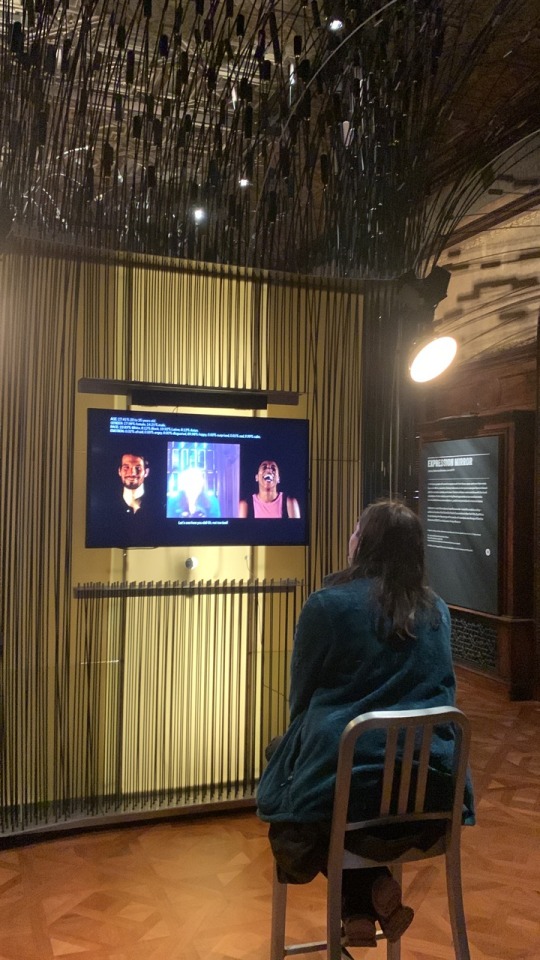
Next was an exhibit on AI

Expression Portrait by R. Luke DuBois

This piece scanned your face, and guess the emotion that you were showing. It then asked you to hold that emotion for a minute. However, right after, it reveals that it had collected data from you about your age, ethnicity, current emotion, etc., and that the fun activity was not so fun after all. One thing that we noted was that the results for my roommate were a bit more accurate than mine, maybe because AI tends to be better at detecting white faces...?
The next exhibit we went to was designing for peace. I just really liked the theme of this exhibit and it was definitely my favorite due to the variety of cultures, ideas, issues, and solutions that were involved with it.

I through the opening wall was really cool, and how there was a hidden message depending on which angle you were looking at it.


I loved the typography and symbolism in this Black Lives Matter street art, and the imagery that was in each. They still all look cohesive.

Conflict Kitchen is a takeout kitchen in Philadelphia that serves food from countries in conflict with the United States.

The facade of conflict kitchen. It reminds me of Rich’s piece from last year.

This idea is great because it highlights food from countries that many Americans may normally be hesitant to try, due to lack of accessibility, knowledge, or fear of cultural differences. Restaurants representing these countries also may be more likely to face discrimination due to the bad media that they recieve due to the fact that they are the US’s “enemy”. Serving food though gives people the opportunity to associate these countries with something more positive, and experiencing the culture can help to humanize it's people. Food also acts as a gateway to learn more about these countries’ people and cultures in a more positive light that the media does, telling the other side of the story. Cultural exchange is a great was to confront bias and fear that Americans may have.
Take out wrappers for Conflict Kitchen contain interviews with multiple perspectives of people but currently living in and those who moved away from the focus country.


Universal Declarations of Human Rights Posters

“This is My Home” Poster based on the Declarations’s Article 25: Everyone has a right to a standard of living adequate for health and well-being.
By Cindy Chen

“Your Thoughts are Illegal” Poster and Postcard based on the Declaration’s Article 18: Everyone has the right to freedom of thought, conscience, and religion.
By Christopher Kosek

Everybody poster and postcard based on the Declaration’s Article 1: All human beings are born free and equal in dignity and right.
By Christopher Kosek

Sweat Shop Labor poster and postcard based on the Declaration’s Article 23: Everyone has the right to work... to equal pay...

I really like these posters because of the irony in the imagery, and how it gets the message across so clearly. Just the imagery alone implies what the topic of the poster is. The designs are really creative and clever.
I also talked to Jack as he also went to the Cooper Hewitt, and he said that the layout of the museum reminded him of my project, as the exhibits were really close to each other and juxtaposed each other.
I really enjoyed going to the museum this week, but I’m still not sure exactly the direction I want to go for my next project, I loved so many of the projects there, but I’m not exactly sure how some of them relate to my topic, as I feel like they maybe touch more on other interests I have that are not necessarily related. I did get some insirpation on how to present my work, and the various forms that it can take. Who knew medical devices could be placed in an “art” museum?
For scholarly research this week, I found a book by Gail Dexter Lord and Ngaire Blankenber called Cities, Museum, and Soft Power.
Citation: Lord, Gail Dexter, and Ngaire Blankenberg. 2015. Cities, Museums and Soft Power. Washington: American Association of Museums. https://search.ebscohost.com/login.aspxdirect=true&scope=site&db=nlebk&db=nlabk&AN=1341266.
Link to article: http://ezproxy.stevens.edu/login?url=https://search.ebscohost.com/login.aspx?direct=true&db=e000xna&AN=1341266&site=ehost-live&ebv=EB&ppid=pp_9
Summary: Soft power emerged as a concept in the late twentieth century to describe international relations based not on military or economic strength, but on influence. While the resources of "hard power" are tangible-force and finance-soft power resources include ideas, knowledge, values, and culture, as well as the ability to persuade. This volume discusses soft power from the vantage point of museums and demonstrates how they are quietly changing the world. With contributions by thirteen experts from ten countries, Cities, Museums and Soft Power reveals the world's 80,000 museums to be sleeping giants. Two major characteristics of soft power-the rise of cities and the role of civil society-are pushing museums from the margins toward the center as these institutions serve as education hubs, employers, magnets for creative industries, and engines of economic development. Meanwhile, the growth of technological networks and connectivity has enabled this soft power to spread even farther and deeper across the Internet and groups of people. Whether cozy and local or internationally renowned, museums possess a cultural strength that extends far beyond their walls

It also recaps some information that I learned earlier from a different perspective.
There was also some discussion about when soft powers collide, how cities and museums can use soft power to better the lives of the people that live there, and how soft power is not always employed positively.

I am glad this week that I finally found another book talking about soft power in an artistic or more localized scale. I was honestly surprised that a whole book existed. It focuses a little more on cities and museums than I probably will in my paper, but still has some good insight. Particularly, how soft power is not always a power used for good. In a similar way, juxtaposition is a soft power, but it can be used to portray a negative message as well.
Overall this week I got some really good inspiration from Cooper Hewitt. I particularly like the way that the Human Right posters played with meaning and were so easily able to grab my attention. The format and imagery with the text had great gestalt and already implied the topic at hand even with just the simple imagery. I also feel now after this week that I understand soft power enough in all sense (political, artistic, and the negative sides to it), so will find a different research topic for next week.
Midterm Critique Notes + Reflections

Notes from Meeting with Nancy 9/16/22
Put two disparate things together and see what happens
My capstone might be my process, meaning it’s more emergent
Finding a balance between knowing what I’m doing and giving myself room to explore
Play is important
Put some rules in place:
- 10 experiments over the course of the next week
- use 10 different materials
- It can't be more than 1-2 minutes per experiment
Or something like that....
Week 7: October 18
For scholarly research this week, I wanted to learn more about soft power. I read an article by Joseph Nye, the one who coined the term.
Citation: Nye, Joseph. “Soft Power: The Origins and Political Progress of a Concept.” Palgrave Communications 3, no. 1 (2017). https://doi.org/10.1057/palcomms.2017.8.
Link to article: https://www.nature.com/articles/palcomms20178
I learned more about the exact definition of soft power, straight from the source. He defines power as the following: “Power is the ability to affect others to get the outcomes one prefers, and that can be accomplished by coercion, payment, or attraction and persuasion. Soft power is the ability to obtain preferred outcomes by attraction rather than coercion or payment." I think it's interesting that he coined it because of an apparent decline in US imperialism, as I feel the same discussions are still being held today. He discussed how the meaning of the word has changed in relation to more recent events, and the varying responses to his invention of the word. I actually think still that soft power is underrated, because of its subtlety and its lack of discussion in politics. The same goes with juxtaposition, where I think that the power it has is subtle and underestimated.

I also wanted to highlight my own version of the recipe cards from that I saw at Poster House the previous week.

This is just a sample, but I was thinking maybe the cards could contain information about any objects I make, or maybe any significant quotes that I found in my research.

I was running out of blue ink, but I made the cards in photoshop and glued them to cardboard to make the cards.

It’s a little sloppy, but I enjoyed making them. I feel like they are less the main focus of my project, and maybe something that I would make to go along with it and hand out if I had time. I would need to figure out a way to mass make them though. The cards could probably be printed somewhere like CVS or staples, but I’m not sure if there’s a way to reproduce the carrying case cheaply (I’m sure getting a custom folder like that would be expensive) or easily (making that many by hand would take too much time. I will think further about this.
Overall this week, I was glad I got to learn more about the origins of soft power. The only reason I had heard that term before was in relation to Kpop, and how the tourism and hype that it brought has brought South Korea much more money and influence. I thought of the US as more of a hard power because of this country’s emphasis on the military, but I suppose our cultural influence would give use soft power as well. I would like to try to find another source that discusses this more in an art or media context though. I will also look more into the process of making the cards, or deciding exactly what information I would put on them. I may put it off for now though and decide to focus more on the main project, and make this more of an extra or side project.
“Anyone who’s ever put a stamp on an envelope or a note on their refrigerator knows what it’s like to make a collage. There’s no esoteric technique.” - Elliott Hundley
I feel like I love and hate this quote because it’s true, and it’s one reason why I like collage - because it reflects life. But also I don’t like it for my capstone because I think it starts to get into “anyone could have done that” territory. Will think more about this...
Thinking through new statements
I am interested in the design convention of juxtaposition and the phenomenon of how our brains naturally create connections between disparate imagery. I hope for my audience to be more aware of when this phenomenon happens and how it can change our viewpoint.
I’m an interested in the phenomenon of juxtaposition and how psychologically connections are created between disparate items. I hope to learn how juxtaposition can be manipulated to create beauty and harm, and to make people more aware of its soft power.
I am interested in juxtaposition’s importance in design and psychology, and how we tend to make connections between disparate imagery. I hope to demonstrate this phenomenon so that people are more aware of it and can detect when the brain is creating these connections.
Week 5: October 4
For scholarly research this week, I found an article from NASA’s Color Usage Research Lab (that existed???) about successive and simultaneous contrast.
Citation: “Simultaneous and Successive Contrast.” Using Color in Information Display Graphics. NASA. Accessed October 4, 2022. https://colorusage.arc.nasa.gov/Simult_and_succ_cont.php.
Link: https://colorusage.arc.nasa.gov/Simult_and_succ_cont.php
“The terms "simultaneous contrast" and "successive contrast" refer to visual effects in which the appearance of a patch of light (the "test field") is affected by other light patches ("inducing fields") that are nearby in space and time, respectively. The names are somewhat misleading since both simultaneous and successive contrast involve inducing fields that are close in both time and space.”

Basically, it means that we see colors differently depending on what it’s surrounding colors are. This is a color theory related topic, but I just think it’s interesting that NASA has done research on this, as it’s a bit unexpected.

For creative research, I made a model of the mockup I created last week out of jewelry wire I had laying around, tissue paper, and other craft materials I had. The clear transparent material that is on the frame is two ziploc bags.


It was a slight failure, and it came out a bit wonkier than I expected, but it was probably still good to go through the process of making it. I’m still not sure about the exact works/materials that I would put on the windows. I used various textures, and definitely tried to keep with materials that light could shine through. I feel like it looks a bit childish though because of the use of craft materials….
If I actually made this, I’m realizing I would probably need to use several different arches and connect them on sight, so it could be easily transported and disassembled. Maybe I could use a shower curtain in place of a ziplock bag, and that was I could just drape that over the arches, and just make sure all of the squares are lined up.
I was a big fan of the successive and simultaneous contrast article from NASA, as I feel like it was a good bridge between the graphic design and psychology side of my topic. I am a bit disappointed by my creative research this week though, as it didn’t turn out as beautiful as it was in the mock-up. I am concerned by the lack of specificity of what I want to put in the windows and how I feel like it looks nice, but doesn’t completely convey the message of my topic. It would definitely need an explanation. Maybe I’ll get some feedback during crit next week on that.
