Prepping Your Print From File To Finish: I Always Hear People Complaining About How Much Better The Piece


Prepping your print from file to finish: I always hear people complaining about how much better the piece looked digitally, SO, here is a run down on how to get prints that look more like your original piece. First of all, every printer is different. Every paper is different. Make sure you take the time to do test prints and become familiar with how your printer and paper combo work, as you’ll rarely nail a print your first try. This one took about 5 test prints before I was confident to print on the expensive large paper Every time I mess up on a print, I save the remaining paper to use as scraps for test prints. As you can see, the original piece looks very nice! The focus is super strongly on the tiger, and all of the vibrant colors are still super evident in the background. That said, when I print it as is, everything about 85% gray or darker turns BLACK. And this is high quality paper designed to get accurate vibrant colors, too. The best way to fix this is to do layer effects. Brightness/contrast is my favorite, as a typical piece will generally print about 5x better if you up the brightness to around 15-25, and adjust the contrast up or down by 5-10 points. That said, if you have a HIGH contrast piece (Darks against brights) like this one, you typically need to do a few more steps. Often I’ll do a second brightness/contrast adjustment layer and push brightness to an obnoxious level so the darkest darks are closer to a mid-dark range. From there, I’ll create a mask and use a transparent gradient tool to slowly pull back the brightness on all of the lighter areas of the image. Additionally, due to printers using CMYK and your screen being RBG certain colors just physically CANNOT print. Some people will always work in CMYK because of this, but honestly I like my saturated colors and most of my work is intended to be seen digitally so I only ever work in RGB. Photoshop has a nifty toggle (Ctrl + Y) where you can toggle between CMYK and RGB view to see how your piece will appear when it prints. It’s useful to check this because if you worked in a color that cannot replicate in print, you may want to shift it entirely before you even bother printing. Artwork tends to desaturate a bit as it prints, so I’ll often make a Hue/saturation layer to play with, too. In this case the image was already pretty damn saturated, BUT some of the shadows on the tiger were printing more brown than orange, so I adjusted the saturation a bit to keep them vibrant with the rest of the image. **DO NOT use “Lightness” to lighten your image! It basically adds a white overlay to your image. Always use Brightness, instead. After all of that, I have a final print that much more closely captures the essence of the original painting. I could have tinkered even more, but to me the goal is a good print rather than an exact copy. For ULTRA high contrast images, like a dark room looking out into a snowy exterior, expect to do a LOT of adjustment to get it to print correctly. Printers just aren’t too fond of super darks right up against super lights. I could make a proper tutorial on this if people request it. Mostly, just wanted to put my thoughts down in one spot!
More Posts from Scrapbox-in-the-attic and Others


10 part compilation of quick little tutorial on how to draw people, realistic or more cartoony, or pretty much anatomical. Hope this helps some people out there!
been scrolling on your art tag for a good 38 mins
(can you tell there's something desperately wrong with me)
and HOW DO YOU HANDDSSSSS ghhhhh theyre so perfect how like EURGHH chomp chomp delicious but HOW??? 😭 youre magic dude
OMG. OMGGG. THANK YOUUU WHAT THE HELL I JUST BLUSHED. and im glad u like how i draw hands hehe thats so nce... theyre pretty fun(most of the time) to draw for me(when i actually do draw them) so i hope it shows. idk if this is you asking for hand tips BUT EVEN IF ITS NOT. IM DOING IT ANYWAYS!!!!!!!!!!!!!!!!!!!
HANDS are all about SHAPES!!!!! theyre just a bunch of wobbley squares and wonky cubes and sometimes triangles too depending on the angle.

and if the pose/angle is more complicated? break the shapes down into even MORE squares and cubes. They are your best friend. we love cubes. (sorry. these arent great outlines bc im using my mouse. but you get the deal)

and im still not great at drawing softer hands tbh, but if you want them to not be so pointy and tough looking, just round out the corners and throw in more slopes and squishes.

and now im gonna say something and youre probably gonna groan really loud but just hold on for a second. hold my hand. okay. i feel like my mind awakened when i learned how to make hands in blender. NOW im not saying you have to learn blender just to figure out how to draw hands. because i still dont know blender either. and hands still stump me from time to time. but just the act of building a shitty hand out of cubes put me on this mindset for the rest of my life. i dont even know if this is anything, but heres a good video of someone building a very simple hand in blender and maybe itll lock into your brain like it did mine.


UPDATED DISCORD FORMATTING ♡ updated reference sheet for those newer to discord (or those who aren't familiar with markdown in general) ! my last post didn't include links, headers, or lists. you can access the google doc version in the source link.

Writing Tips
Punctuating Dialogue
✧
➸ “This is a sentence.”
➸ “This is a sentence with a dialogue tag at the end,” she said.
➸ “This,” he said, “is a sentence split by a dialogue tag.”
➸ “This is a sentence,” she said. “This is a new sentence. New sentences are capitalized.”
➸ “This is a sentence followed by an action.” He stood. “They are separate sentences because he did not speak by standing.”
➸ She said, “Use a comma to introduce dialogue. The quote is capitalized when the dialogue tag is at the beginning.”
➸ “Use a comma when a dialogue tag follows a quote,” he said.
“Unless there is a question mark?” she asked.
“Or an exclamation point!” he answered. “The dialogue tag still remains uncapitalized because it’s not truly the end of the sentence.”
➸ “Periods and commas should be inside closing quotations.”
➸ “Hey!” she shouted, “Sometimes exclamation points are inside quotations.”
However, if it’s not dialogue exclamation points can also be “outside”!
➸ “Does this apply to question marks too?” he asked.
If it’s not dialogue, can question marks be “outside”? (Yes, they can.)
➸ “This applies to dashes too. Inside quotations dashes typically express—“
“Interruption” — but there are situations dashes may be outside.
➸ “You’ll notice that exclamation marks, question marks, and dashes do not have a comma after them. Ellipses don’t have a comma after them either…” she said.
➸ “My teacher said, ‘Use single quotation marks when quoting within dialogue.’”
➸ “Use paragraph breaks to indicate a new speaker,” he said.
“The readers will know it’s someone else speaking.”
➸ “If it’s the same speaker but different paragraph, keep the closing quotation off.
“This shows it’s the same character continuing to speak.”
Hello and welcome back to another Show and Tell Saturday! Show off a finished craft, a work in progress, or a completed trade - what's new in your world this week?

Okay so I followed this video about foreshortening and…


Sycra. I love you so much for making this video.
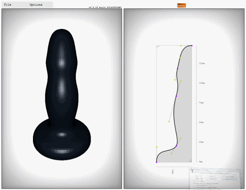

Dildo Generator
Online 3D experiment by Ikaros Kappler which is described as a “Extrusion/Revolution Generator” ….
Created with three.js, you can alter the bezier curves and angle of the form, and is designed with 3D printing in mind (models can be exported and saved, as well as calculated weight in silicone).
Try it out for yourself (if you wish) here


Get access to my brushes, art tips, process videos, and files here https://www.patreon.com/ramonn90
-
 aytayayn liked this · 9 months ago
 -
 softypyro liked this · 11 months ago
 -
 wonderer125blog liked this · 1 year ago
 -
 scrapbox-in-the-attic reblogged this · 1 year ago
 -
 artking-4 reblogged this · 1 year ago
 -
 dirkdarmstaedter liked this · 1 year ago
 -
 gibbousgirl reblogged this · 1 year ago
 -
 asexualwonderwoman liked this · 1 year ago
 -
 wheredidalltheseelvescomefrom reblogged this · 1 year ago
 -
wheredidalltheseelvescomefrom liked this · 1 year ago
-
 izumi-yami liked this · 1 year ago
 -
 butchhatred liked this · 1 year ago
 -
 screeeeeech7 reblogged this · 1 year ago
 -
screeeeeech7 liked this · 1 year ago
-
 multidimensionalfang1rl liked this · 1 year ago
 -
 meltybrie reblogged this · 2 years ago
 -
 vanycat liked this · 2 years ago
 -
 blackrayser reblogged this · 2 years ago
 -
 6-eyed-possum reblogged this · 2 years ago
 -
 alvadee liked this · 2 years ago
 -
 kinokoco liked this · 2 years ago
 -
 bellamatto reblogged this · 2 years ago
 -
bellamatto liked this · 2 years ago
-
 ammomancer liked this · 3 years ago
 -
 anjapaints liked this · 3 years ago
 -
 kiba24 liked this · 3 years ago
 -
 kurushiteyaruna liked this · 3 years ago
 -
 arieldavison liked this · 3 years ago
 -
 ivaalo liked this · 3 years ago
 -
 elstreem liked this · 3 years ago
 -
 going-to-become-ghostly liked this · 3 years ago
 -
 dreamyycarnival-archived liked this · 3 years ago
 -
 cyraenea liked this · 3 years ago
 -
 imaginaryartist liked this · 3 years ago
 -
 dumpster-pet liked this · 3 years ago
 -
 klscriver liked this · 3 years ago
 -
 moonblossom-bunny liked this · 3 years ago
 -
 abz-solute-art reblogged this · 3 years ago
 -
abz-solute-art liked this · 3 years ago
-
 pandebonos liked this · 3 years ago
 -
 otherviosmainblog reblogged this · 3 years ago
