HIIRAREFS: Basic And Intermidiate Guide To Colouring In
HIIRAREFS: Basic and Intermidiate guide to colouring in
What better day to end the year then with a basic guide to colouring- This is for beginners or intermediate artists. Colouring is a big part to an art piece, whether you decide to use colours or not, that’s up to you, but for the most part, having some knowledge on appliance of colour will really help you out!
____________________________________________
ARTISTS WITH AN INSPIRING KNOWLEDGE OF COLOUR APPLICATION! Please take the time to have a look at other artists work so that you ca research and get inspired!
Gullacass: Uses brights, dulls and pastels to create brilliant guro, pop and macabre pieces| DA + TUMBLR
TinyCalcium: Old friend of mine who explores brights and mustard colours and places them as a foundation for their work | TUMBLR
BeastPop: Talented with opposing and Triwheel colours. Outstanding cell-shading, and knows how to flexibly bend colour form to their will in popart. | DA
H0stel: Fantastic composition of light direction and applies colour to bodies based on ambient occlusion. | TUMBLR
_____________________________________________
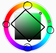
COLOUR SLANG: I use some strange slang to express colour types and shades as well as groups. Although they may not be canonically correct, I will use these terms to describe colour palates to the best of my ability! Analogous: Colours that are near or adjacent to each other on the colour wheel, EG: Red and Orange
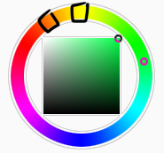
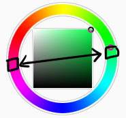
Oppositional/complimentary: Colours that are opposed or opposite from each other on the colour wheel, EG: Cherry and Green
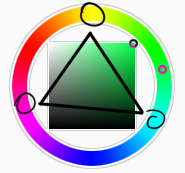
Triadic: Colours that form a triangle on the Colour wheel, EG: Cyan, Magenta and Yellow. These three colours when mixed together will make black.
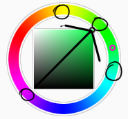
Arrowtype/Quadcolour: Four colours, that generally form an arrow shape on the colour wheel.
Tetradic: Colours that form a rectangle or square in the colour wheel
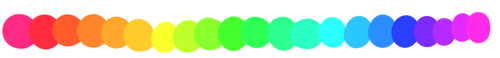
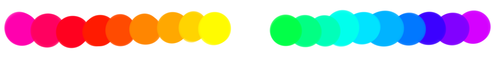
Neons: The very brightest you can get a colour, be careful where you use them as they can look ugly together at the most. Try to use neons when you are adding bright glowing objects to your piece. Neons are great for highlights.

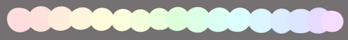
Brights: Slightly washed Neons. Appropriate if you have characters that are colourful.
Washed: Very washed brights with a hint of grey. These are also useful for colourful characters.
Pastels: Colour with white in them to make them seem light.
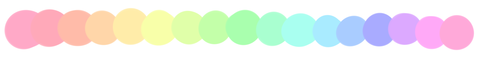
Baby Pastel: Pastel with even more white in them, good for subtle highlights.
Darks: Colour with black added to them. Used mostly for lineart.

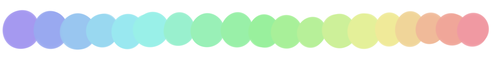
Mustards: Colours with dark grey added to them

Earthen: Colours with brown added to them

Warm and Cool colours: Warm colours are colours that range fromMagenta to Yellow. Cool ones range from Lime to Fuchsia.
Straight tones: A greyscale palate. or a straight scale of one colour from black to it’s neon form.

Warm and cool tones: Warm tones are a greyscale mixed with warm colours and cool tones are greyscale mixed with cool colours.

Skintones: Warm washed or pastel colours generally used to colour in skin, but they don’t have to be warm at all! ( I will not show you a palate for this however)
______________________________________________
WHAT TO AVOID WHEN COLOURING: beginner artists, tend to go ahead and start by colouring their line art with neon and mustard colours. Neons are not necessarily good for base colours unless the character has a glow.
I often see lazy attempts to shade, often a beginner artist with use an airbrush and use black and white to shade and highlight their piece. This is not very effective, and I’m sorry to say… It’s kind of gross as well. Try to avoid being lazy. If you have a piece that has bold black lines, avoid using soft shading and airbrushing at this point of time.
Black and white isn’t always the best option when colouring in your piece, but it also depends on the style you are trying to convey. If you plan on only using straight tones to colour in a piece, black and white is good.

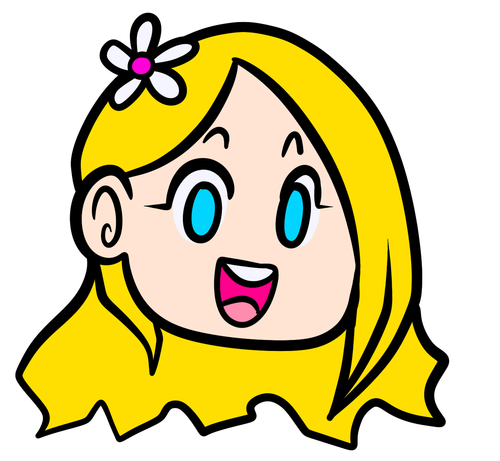
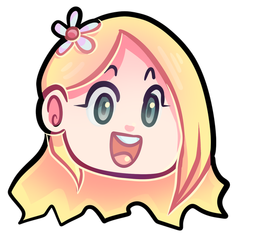
A GOOD BASIC WAY TO COLOUR For this basic tutorial I will show you a nice way to colour in a piece with bold lines. I will be using Minty’s Classic character as an example.
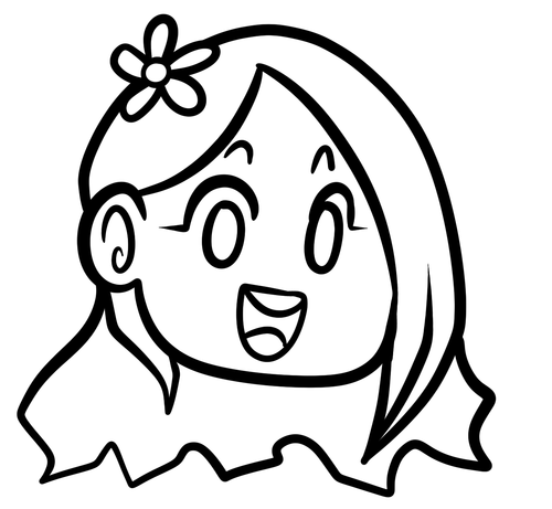
Begin with using brights that have been washed down a little and washed skin tones if your character is human based. Avoid using neons or mustards if you are able. If there is white on the character, such as the white on an eyeball or the teeth, consider using baby pastels. For Minty’s eyeballs I have used a baby pastel blue. I have chosen to use a darker and more washed version for her Irises.

With you foundation colours placed down, use a washed warm colour for the skin tone, such as a salmon. If the character’s hair or fur is warm coloured, use a pink or red orange to shade that as well. Use the cell shading technique. This may mean you will have to erase some of your shading so be sure to do this on another layer. For your baby pastels, you can use a regular pastel to shade it. For Minty’s eyes I have used pastel blue and lowered the opacity by a little.
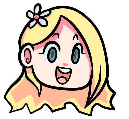
For Highlights, I have chosen to use baby pastel yellow. I wanted the piece to be warm.
Applying a light airbrush over the top of the piece makes it feel a little softer. I have also applied the airbrush over the initial borders to create colour bleed, giving a very subtle reflective approach.
Colouring your line art layer, particularly if you have bold lines, can really make a piece look more interesting! I like to leave the overall outline black. You can gradient and bleed colour in your line art as well

Light tracing is a technique lots of artist’s use, where they run a sharp line of highlight next to line art to divide borders.
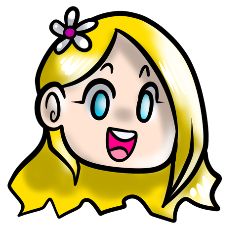
This looks a lot nicer than the black and white shading, doesn’t it!? __________________________________________
This is a very very simple guide to applying colour to your piece! If This helped, please reblog and share this guide around!
If you have any questions or feedback, don’t be afraid to send me a message!
More Posts from Artrefforsteph and Others


literally most things that people write off as just ‘textures’ to use in graphics are stolen & unsourced material created by artists or photographers NOT meant to be used as elements in projects without royalty payments. you can say ‘it’s just random tumblr posts they don’t care’ but you wouldn’t want someone to take your work and edit into their work so they can be praised for their beautiful style and creativity even if they just post it on social media w/o profit, would you?? so maybe if you browse pinterest or google images for pictures without finding the original source, you’re using images that you’re not allowed to use without realizing it.
you see it on here a lot especially in (i won’t link anything but i’m sure you know what i mean) those album track ‘aesthetics’ posts, au ‘aesthetic’ posts (you see these less in kpop, but where people use non-royalty free images to kinda craft a visual au), and even just rather typical graphics that have a lot of ‘texture’ elements. and texture packs too!! that’s often where the problem starts; people just collect images (often literal art), compile them in a folder w/o sources, then insist no one can repost those images w/o crediting the person who compiled them. what???
SO may i suggest some of my fave places you can get FREE, ROYALTY-FREE elements that are totally legal to use
creativemarket has 6 free high-quality resources (textures, brushes, fonts, etc), different every week! wow awesome i check it every week
search ‘freebie’ on behance. awesome stuff!!! lots of v nice templates textures and fonts
mockup zone freebies
unsplash: tons of very nice free photographs, not shitty stock photos
pexels: same idea. + they have an adobe plugin so you can get photos without closing your editor damn nice
pixelsquid is a super cool free program (again w a ps plugin that i love) with lottts of super cool hq 3d elements!
as to not make this too long: spoongraphics, lostandtaken (textures galore), pixeden, freebiesbug.

Check out Color Supply! The site has inspirational colour palettes from designers & illustrators around the world!
It’s got some tips and tricks about picking colours. They also have a Hex Colour Palette Generator!

(Thanks to @magnetholic for showing us!)


I’ve been seeing a lot of Big Hero 6 concept art and I wanted to set a brush to kind of mimic the graphite style of some of the sketches. I don’t have a “fully functional” version of SAI, so I tried to make this as simple as possible.

Hey! i like how you draw hands, can you do a guide on how you do it???????
I looove drawing hands, but they're as fun to draw as they are difficult 👌👏

Usually when I draw, I don't go for perfect realism/anatomically correct, I mostly follow whatever makes the drawing look good, with exaggerated shapes, sharp angles, etc.


Drawing with references is the best advice I can give you!
When I struggle to draw hands I usually just look at my own hand and try to copy it (I have a small mirror next to my computer to make it easier), it works, but it's not always the best option. If you want to improve quickly, find some pictures and practice by drawing them!
A lot of websites have a built-in timer for studies, here is the one I used for this one for example:

So yeah, practice practice practice! The more you draw, the better you'll get!
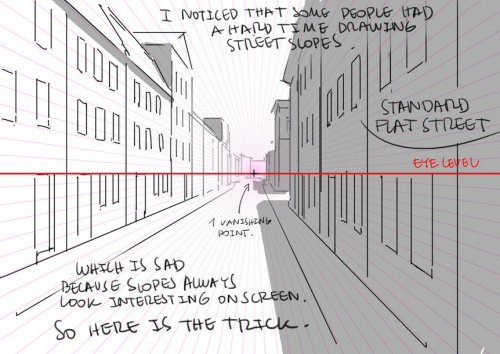
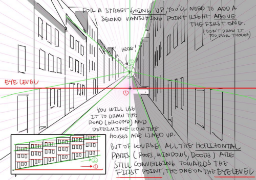
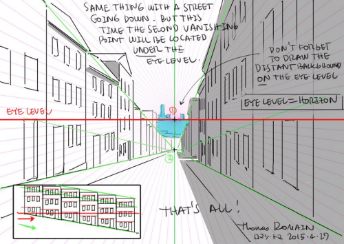
How to draw street going up & down without losing your mind.
by Thomas Romain (Space Dandy, Code Lyoko, Basquash!, E.P. Kiss Dum, Cannon Busters). Another one…


I got multiple people asking for help with eyes, so I threw something together quick
EDIT: ah yeah, my bad! thank you @yipyo20

HOLY FREE ART PROGRAMS BATMAN
I’ve had this list sitting around for a while (in case I ever want to try something new) and I thought I’d share it, because why the hell not, everybody loves free stuff. I’ve only used a couple, so for all I know these could be complete shit. BUT YOU NEVER KNOW, RIGHT?
*= available for both windows and mac os
GIMP * - Does a lot of the same stuff as Photoshop.
FireAlpaca * - Similar to Paint Tool Sai, so it’s a good alternative for Mac users.
Autodesk Sketchbook Copic Edition * - Simulates the look of copic markers.
MyPaint * - Basic stuff, nothing fancy.
Pinta * - Drawing program modeled after paint.NET.
Inkscape * - Vector/drawing program meant to be similar to Illustrator.
ArtRage * - Digital painting program; you can get the trimmed down version for free or buy the full version with more features.
Sumo Paint * - In-browser drawing app.
DAZ Studio * - Some sort of 3D model poser thing.
Pencil * - Software for animating.
SketchUp * - Tool for making 3D models. Looks handy for stuff like architectural drawings.
Blender * - Pretty popular 3D software.
escape motions * - Some browser apps, fun to fiddle with when you’re bored (the fluid fire simulation is pretty cool imo).
Twistedbrush (Pixarra) - Seems to be meant for replicating the look of traditional media.
Pixia/Phierha - A popular program in Japan, according to the website.
Krita - This was originally made for Linux and it looks like the developers haven’t ironed out all of the kinks in the Windows installer.
Artweaver - Another trimmed down free thing if you don’t want to buy the full program.
paint.NET - Pretty basic kit, probably good for simple stuff.
Project Dogwaffle - I’m not sure what this one is all about because I couldn’t stop laughing at the terrible website.
Speedy Painter - Lightweight digital painting program.
mtPaint - Originally made for pixel art; simple enough to run on older computers.
Chasys Draw IES - Supposed to be some sort of drawing+image editor thing.
PaintRibbon - Seems to be another plain old basic image editor.
DrawPlus - Looks like it’s made for graphic design and vector stuff.
SmoothDraw - I’m guessing this is a basic thing for people who don’t want to bother with complicated stuff.
-
 00zhully liked this · 2 months ago
 -
 lizzybugsblog liked this · 2 months ago
 -
 catt-crossing liked this · 3 months ago
 -
 daengeli liked this · 3 months ago
 -
 setrija-nibelungenfangirl liked this · 4 months ago
 -
setrija-nibelungenfangirl reblogged this · 4 months ago
-
 setrija-fuchsfreund reblogged this · 4 months ago
 -
 kilinosoup liked this · 4 months ago
 -
 meimeiwatson liked this · 5 months ago
 -
 solar-nightengale reblogged this · 5 months ago
 -
 the-letter-horror-lover liked this · 6 months ago
 -
 annatxu5w liked this · 7 months ago
 -
 quietsheepy reblogged this · 7 months ago
 -
quietsheepy liked this · 7 months ago
-
 spacexlunami liked this · 7 months ago
 -
 tantaniumflare liked this · 8 months ago
 -
 fluffofy liked this · 8 months ago
 -
 asperanna reblogged this · 8 months ago
 -
 rexyhexa reblogged this · 9 months ago
 -
 dors-ee liked this · 9 months ago
 -
 quartz26x liked this · 9 months ago
 -
 katppi liked this · 9 months ago
 -
 kiseki-no-robotto-translations liked this · 10 months ago
 -
 chonaku-things liked this · 10 months ago
 -
 secretfanbread reblogged this · 10 months ago
 -
secretfanbread liked this · 10 months ago
-
 cinderbop reblogged this · 11 months ago
 -
 rorororoblooobo liked this · 11 months ago
 -
 muconflao liked this · 1 year ago
 -
 pleaseignorelmao reblogged this · 1 year ago
 -
 artreferencesvault reblogged this · 1 year ago
 -
 wackysach liked this · 1 year ago
 -
 blacksweettea liked this · 1 year ago
 -
 dotdotdotpng reblogged this · 1 year ago
 -
dotdotdotpng liked this · 1 year ago
-
 easily-broken-by-emotion reblogged this · 1 year ago
 -
 ye-old-references reblogged this · 1 year ago
 -
 grimaussiewitch liked this · 1 year ago
 -
 zai-sc234 liked this · 1 year ago
 -
 liliane-ghost liked this · 1 year ago
 -
 galatean-frequency liked this · 1 year ago
 -
 woodyium liked this · 1 year ago
 -
 toxiibun liked this · 1 year ago
 -
 shaddytheguyislazy liked this · 1 year ago
 -
 cityboys-modelgirls liked this · 1 year ago
 -
 blueblazininfernotigon reblogged this · 1 year ago
 -
blueblazininfernotigon liked this · 1 year ago
NSFW because there will probably be nude refs | this is a side blog to sort all of the art stuff I need | none of it is mine
151 posts