artrefforsteph
NSFW because there will probably be nude refs | this is a side blog to sort all of the art stuff I need | none of it is mine
151 posts
Latest Posts by artrefforsteph

The Pale Horseman - Submitted by: fastman27
#FDFBEE #DEDEBA #B5C19C #619058 #3F5943 #27332A #121514

Keep Your Distance - Submitted by SeesawSiya
#8c1664 #d53b23 #c4883f #ffea8a #448c5a #9cd1fb


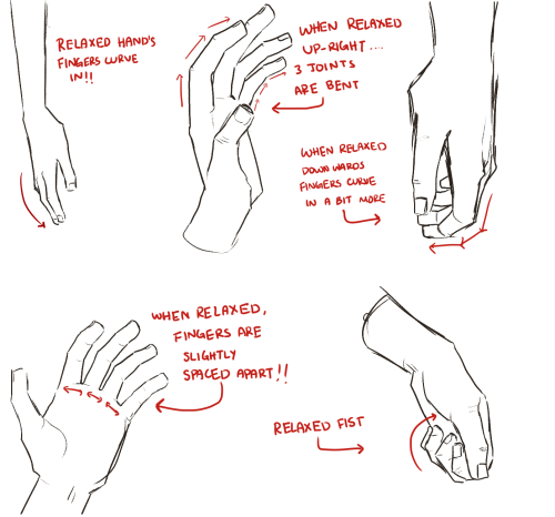

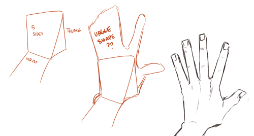
i actually really love drawing hands and only recently have I enjoyed it haha
I’m still not very good at it nor do I understand a single thing about anatomy but here’s some small tips I hope help!!!
tbh ive been waiting for someone to ask for a hand tutorial
how do i learn how to storyboard comics
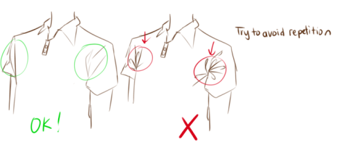
1. set the panels

the first version is the easier but also boring for the eye, the sequence rectangular-square-square and repetitive, try to use diagonal cut, open space and vertical cut to help the movement of the story and action.2. use movement to tell the story

3. Pose, Perspective and Line density
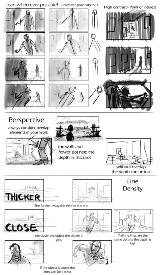
4. Framing and Silhouettebeing the file too big it’s a link format
In my opinion, those are the main rules to make a good storyboard. If you need more help ask awayMOD.gif
All this time. ALL THIS TIME i had no idea SAI had perspective transform capabilities.

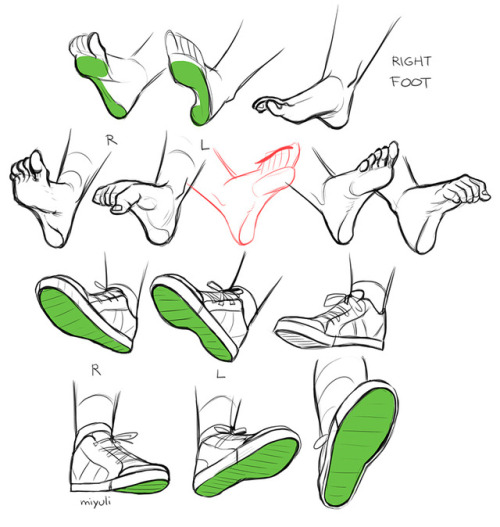
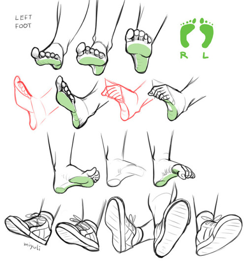
hi! i love your art, it's so pretty ♥ and you draw feet really well, do you have any tips?
thank you a lot anon!! ( /)w(\) here, i made a few notes about the steps i follow while drawing feet:

^ that’s assuming you’re not drawing from a low perspective, as if the camera was on the floor or something like that!


SORRY MY HANDWRITING SUCKS and i’m not really good at explaining things bc i don’t really follow a guide and stuff so yeah BUT I HOPE IT WAS HELPFUL TO YOU!!


Please keep in mind that I’m not a professional or anything!
I just took some art classes when I was younger, so these are just a few things I remember or have learned since then!
Anyways, this ‘tutorial’ is just something I made very quickly…and I’m not good at explaining or teaching.
So please don’t take this seriously lol
The lip sync tutorial they DON’T give you
I mentioned on twitter that I wanted to do a lip sync tutorial and immediately got some people who were interested so I put one together real quick!
I’m going to use a bit of unfinished lip sync from my taz animated part as reference. They’re just gifs so no sound, but you should still be able to tell that he’s saying “I’d say a solid B… Solid B minus.”
Anyone who’s looked up how to do lip sync has seen phoneme charts. Phonemes are just the shape your mouth makes when you make certain sounds.

When you do lip sync, you want some kind of reference to make sure it’s right
What’s easiest is to say it yourself and pay attention to the shapes your mouth is making. Since you’re going frame by frame, your audio is slow enough that you can make each shape slowly and distinctly and you can get each individual phoneme down in the animation.

Don’t do this.^
An easy way to tell if you’re animating lip sync wrong is if you run out of frames to make each shape. You don’t need them! Making each shape is unnatural. People talk quickly and the mouth doesn’t have the time to get into each shape. They blend together, sometimes to the point where the shape doesn’t change at all!

Not only does the 2nd gif take less frames and energy to make, it’s more relaxed, it looks less distracting, and his lips are much easier to read!
These are reference charts to show the differences more clearly


This is the difference between getting swallowed up in every last detail and paying attention to reality.
What matters more than hitting every syllable is making it look natural and flow with the acting. That’s why anime mouth flaps can work so well. A strong pose through the whole body matters more than one mouth shape.
art cheats
hello i am here today to not lose track of the art cheats i have discovered over the years. what i call art cheat is actually a cool filter/coloring style/way to shade/etc. that singlehandedly makes art like 20 times better
80’s anime style
glitch effect
glow effects
adding colors to grayscale paintings
foreshortening ( coil )
foreshortening ( perspective )
clipping group (lines)
clipping group (colors)
dramatic lighting ( GOOD )
shading metal
lighting faces
that is all for today, do stay tuned as i am always hunting for cool shit like this
FREE ART PROGRAMS
So recently I came across a fellow artist who was struggling to find a free art program, and considering dropping the large amount of money for a Photoshop license. I know not everyone can afford such an expensive program, so I’ve compiled a list of programs with no cost to download and use.
Keep in mind all computers are different, so not all will work for everyone. Also, I’ve only ever used Windows, so for the most part, I’m not sure if everything will work for Mac. if in doubt check the website linked.
Photoshop CS2 - (Windows, not sure about Mac.)
FireAlpaca - (Windows and Mac)
Sketchbook Copic Edition - (Windows and Mac)
GIMP - (Windows) (Mac)
Paint tool SAI [cracked] - (Windows) (Mac)
Paint tool SAI 2 beta - (tumblr post on said program)
iPaint - (Mac)
Paintbrush - (Mac)
Pencil - (Windows, Mac)
Paint.NET - (Windows)
Seashore [still in development, ver 0.5] - (Mac)
ChocoFlop - (Mac)
Inkscape - (Mac and Windows)
ArtRage [Demo] - (Mac and Windows)
OpenCanvas 1.1[must pay for 2.0] - (Windows, not sure about Mac.)
MyPaint - (Windows)
Krita - (Windows)
Vectorian [Supports Animation] - (Windows)
Pixia[Japanese, some English versions] - (Windows)
Asperite - (Windows)
Chasys Draw IES - (Windows)
SmoothDraw - (Windows)
TwistedBrush Open Studio - (Windows)
BOUNS - CTRL+Paint [Great for teaching all kinds of stuff, like how to use digital programs.]
If you know more free programs, please add onto this!
i feel bad for people who use sai but dont know about stabilizer, transparent brushes and clipping groups

Check out Color Supply! The site has inspirational colour palettes from designers & illustrators around the world!
It’s got some tips and tricks about picking colours. They also have a Hex Colour Palette Generator!

(Thanks to @magnetholic for showing us!)


HEY ARTISTS!
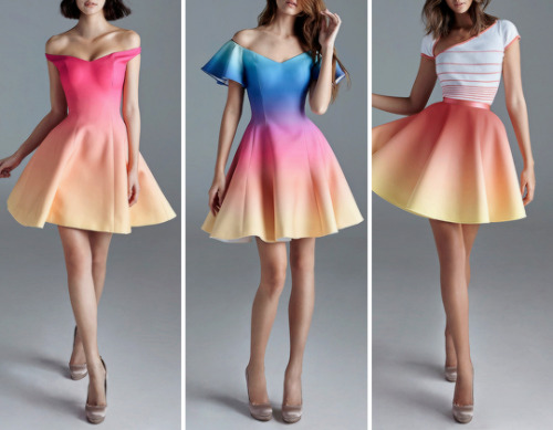
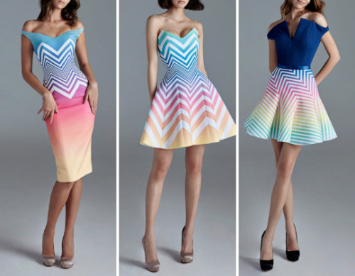
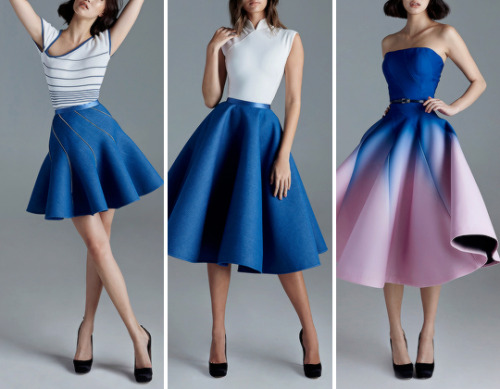
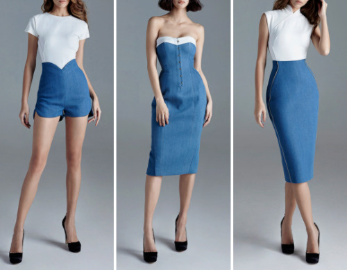
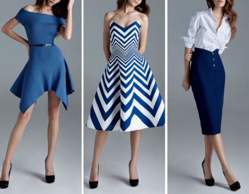
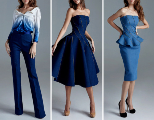
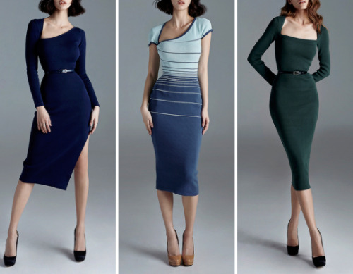
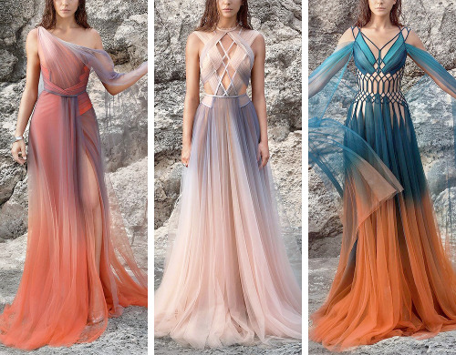
Do you design a lot of characters living in not-modern eras and you’re tired of combing through google for the perfect outfit references? Well I got good news for you kiddo, this website has you covered! Originally @modmad made a post about it, but her link stopped working and I managed to fix it, so here’s a new post. Basically, this is a costume rental website for plays and stage shows and what not, they have outfits for several different decades from medieval to the 1980s. LOOK AT THIS SELECTION:

OPEN ANY CATEGORY AND OH LORDY–

There’s a lot of really specific stuff in here, I design a lot of 1930s characters for my ask blog and with more chapters on the way for the game it belongs to I’m gonna be designing more, and this website is going to be an invaluable reference. I hope this can be useful to my other fellow artists as well! :)


Again this is my personal take on color! It really depends on the situation and what you personally value, and in the end practice is your best friend.
links:
genice’s color practices
color palette challenge (one iteration of it; there’s lot of people who made them)
(not mentioned, but helpful)
Patrick (H) Willems’s video essays on color in film; specifically his ones on
Wonder Woman and Marvel
I thought he had one on John Wick too but I can’t find it. If you like saturated colors though, check that movie out!!
those are only a couple of exterior references, there’s lots out there!! so good luck & I hope this helped!!

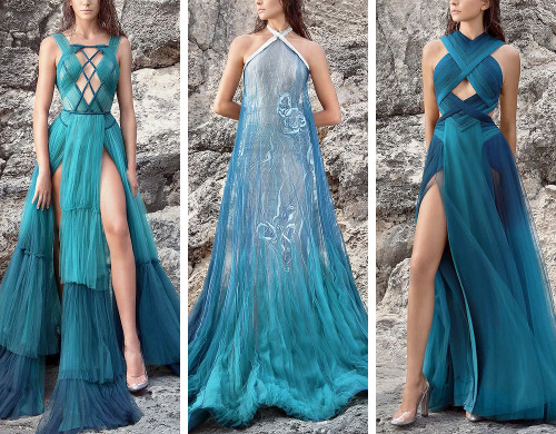
Low Light Likeness - Submitted by AstronomyForTwo
#a3a0a8 #514d8c #3b1287 #190f42 #0f031c
hi!! i actually just got sai and i was wondering if u had any tips for it?? thanks in advance!!
BUTTONS
Shortcut buttons are your best friend. Rework your brushes to a certain keyboard button and remember them, it’s easier and faster than manually changing them.
CTRL-ALT changes your brushes sizes on the spot.
SPACEBAR is to move the canvas but not the drawing itself
CTRL moves the drawing
CTRL-SHIFT moves a layer drawing
ALT is the eyedropper tool if you don’t want to right click.
ALT-SPACEBAR turns the canvas
CTRL-SPACEBAR does the zoom in.
CTRL-ALT-SPACEBAR does the zoom out
H will flip the canvas horizontally, just the canvas.
CTRL-Z Undo
CTRL-Y Not undo
CTRL-F fill in selection
SHIFT additional selection
ALT delete selection
GROUP MOVING

CTRL-CLICK
Click on the layer to select a thing.

PRESERVE OPACITY
In case clipping group doesn’t always help, preserve opacity helps you colour a certain thing.

STABLIZER

CTRL ONLY ON SELECT
The transform tool itself does a lot of things, but press CTRL while in select mod can free deform your selection without having to switch.

CTRL-SHIFT ON SELECT

;w; If you need to know more like brushes and other various things, you can always look them up, but for now I hope this helped !!
![Yep… So This Is What I Think Might Be Helpful. Check This Tutorial By Sinix [x] It’s Super Helpful](https://64.media.tumblr.com/41f1b7decc5b76e5eb4d359f1da5f2b6/tumblr_p4daqxcgoF1u5z07fo1_500.png)
![Yep… So This Is What I Think Might Be Helpful. Check This Tutorial By Sinix [x] It’s Super Helpful](https://64.media.tumblr.com/e917ce74c3b35ab72183547c62e3183a/tumblr_p4daqxcgoF1u5z07fo2_500.png)
Yep… So this is what I think might be helpful. Check this tutorial by Sinix [x] it’s super helpful for drawing faces from different angles. Generally, if I can imagine a head in 3D I’m able to draw it and drawing eyes first helps me visualise everything. (It’s super sketchy but hope it’s understandable anyway :))

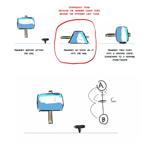
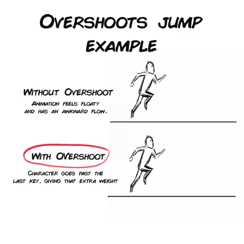
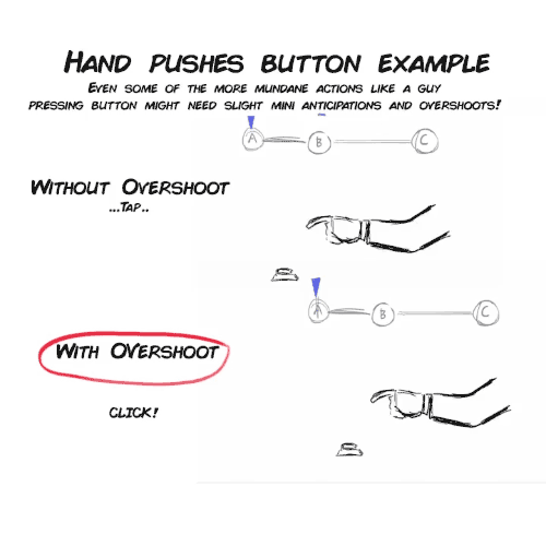


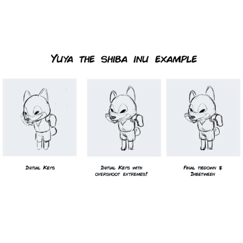


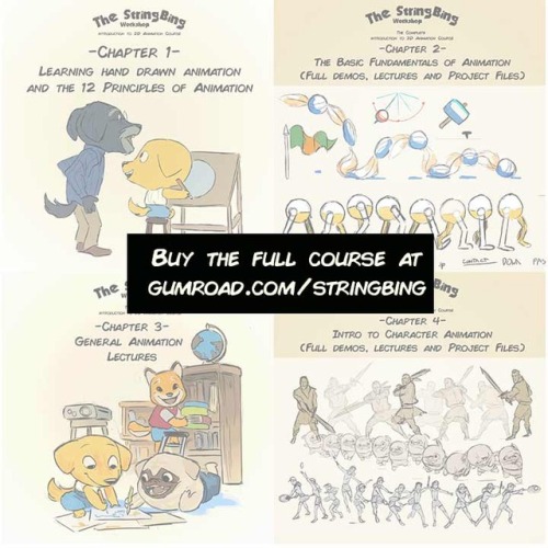
Overshoots and Mini Anticipations lecture from my Complete Introduction to 2D animation package.
https://gumroad.com/l/Introto2DComplete or you can buy each chapters, or my other tutorials: https://gumroad.com/stringbing
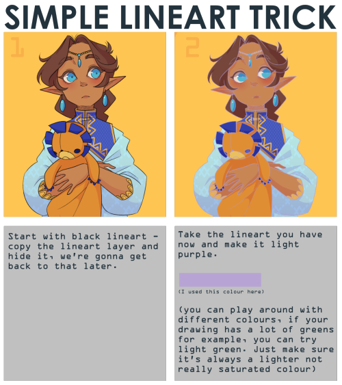
note that it works best with thin lineart (I used SAI2 for this, but I think you can use any art program with a overlay layer mode)
Webcomic tips
In the conclusion for now, some things I’d really recommend doing if you’re seriously considering making a webcomic (or really a comic in general). Some of these don’t really apply to strips or gag-a-day type of comics, but I’m not talking about those here.
1. Write down ideas\sketch stuff, LEGIBLY. “I’m gonna remember it later” NEVER works. And if you scribble it somewhere on a piece of paper, you’d better scan it or retype in one doc later, because tiny notes always get lost among other doodles in my skethbooks.

(i know it’s hard to keep everything clean and organized, but this mess is just not productive)
If your project is a collaboration, save your conversations. If you’re working alone, make a blog for your ramblings. You have no clue what tears of relief I cry when I open that blog and rememeber I don’t have to painstakingly look through my heaps of sketchbooks and folders for a tiny idea I’m not even sure I wrote down a few months ago.
2. Inspiration folders, or even better, inspo blog with tags also help with collecting and remembering ideas. Color schemes, landscapes, style inspirations, atmospheric stuff, maybe some photo references, all those neat things.

3. Basic tier: character design sheets. Top tier: common poses, expressions. God tier: outfits they wear throughout the comic. Holy cow tier: turnaround sheets for all those outfits.

(I’d die trying to find good pages for references without these)
4. If you haven’t finished detailing the plot, don’t even think about moving on to drawing the comic. You’re gonna regret it when you come up with a really cool plot element that can’t be incorporated anymore because you’ve already drawn all the parts you could’ve tweaked.
5. Don’t just define the plot, make a script. Writing down the lines and the brief description of the actions serves me fine:

(notice that I approximately divided the pages & the text that’d go to each panel on a page)
6. Hard mode: make thumbnails for all the pages, if possible. At least whenever a new chapter starts.
7. If your story involves some convoluted chronology shenanigans, you’d better write down the events of your timeline in the chronological order.
8. Backgrounds. You can’t avoid them, bro. Like half of the comics are backgrounds, especially if your story involves a lot of adventuring and looking around. I know it hurts, but you’ll have to become friends with them. Read some tutorials, practice on photos, go out and sketch some streets, use 3d programs (like Google Sketch) to understand the perspective, use sites like houseplans to visualize your buildings better, I don’t know. Just be prepared for their imminent evil.
9. If you’re drawing digitally, pick a brush size for the lines and stick with it. You don’t want your lines and detail levels to look all wonky and inconsistent in different panels. And I don’t mean the cool stylistic varying lines, I mean this:

Also, things on the background should have thinner and/or lighter lines to avoid distraction. Usually less details too, unless you’re making a busy background with a simple foreground to help it pop out. Or wanna draw the attention to an object on the bg.

10. Readable fonts. Even if you chose to ignore people with poor sight or dyslexia, the majority of your readers aren’t gonna be excited about struggling to decypher this:

Also, as much as I love my black speech bubbles, colorful text on black still kinda hurts the eyes. I wouldn’t recommend doing that for all the characters. Black speech bubbles are usually used for creepy, inhuman voices. And yes, having a colorful outline in this case helps.
11. Probably newsflash, but did you know that panels have their place, order and functions? They do! My favourite thing ever is how I used panels when I was like 12:

(comics ain’t rocket science, but this one is)
The composition of the panels and word balloons always serve for a better reading experience. They guide your eyes over the page, so that you never feel lost or confused. The images in the comic equal frames in a movie, so it’s pretty damn important in what order you look at things and how quickly you can understand what’s going on!

(Eric Shanower & Scottie Young’s Wizard of Oz)
12. One update a week is fine for testing waters. Don’t overestimate yourself, especially if you have a pretty busy life outside it. A stable comic that updates slowly, but regularly is better than an unpredictable erratic one. You can always pick up the pace later, if you feel confident enough.
13. Try to always have a buffer - a couple of pages in reserve. If you’re making the pages much faster than you’re updating, this shouldn’t be a problem. But if those paces are equally the same, it’s goddamn HARD. But on the other hand, if something happens and you skip an update, those come in handy.
If you’re looking at this list and thinking “wow that’s a LOT of work”, you’re totally right. And it’s okay to be intimidated at first! But that’s why it’s important to start with something small. Once you get the formula down, these things will be natural to you.


I forgot I have to be active here so here’s my Twitter tutorial on how to draw folds I made a while back to help a friend!


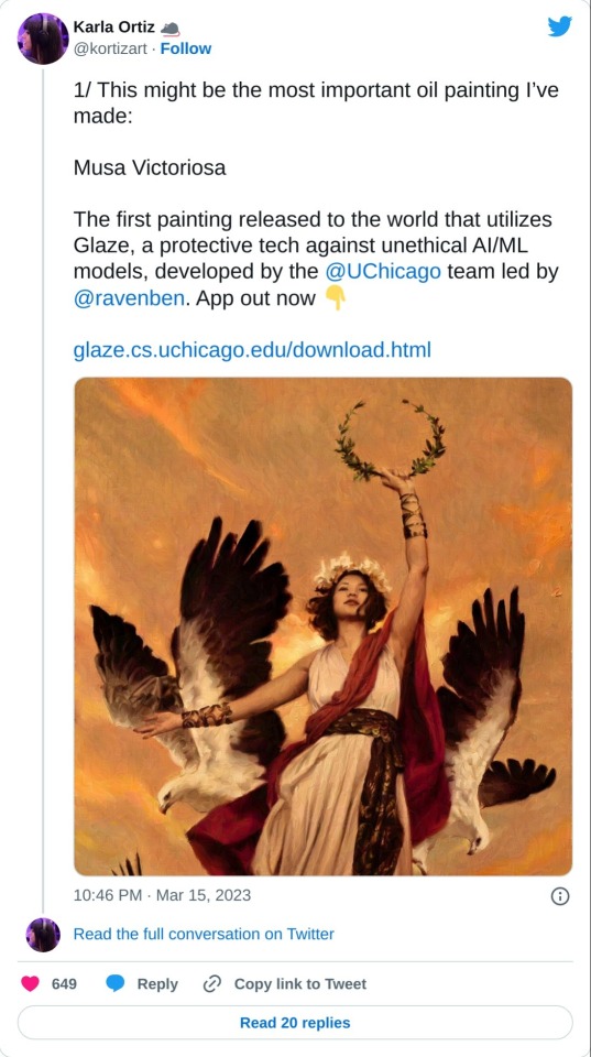
Glaze is out!
Tired of having your artwork used for AI training but find watermarks dismaying and ineffective?
Well check this out! Software that makes your Art look messed up to training AIs and unusable in a data set but nearly unchanged to human eyes.
I just learned about this. It's in Beta. Please read all the information before using.
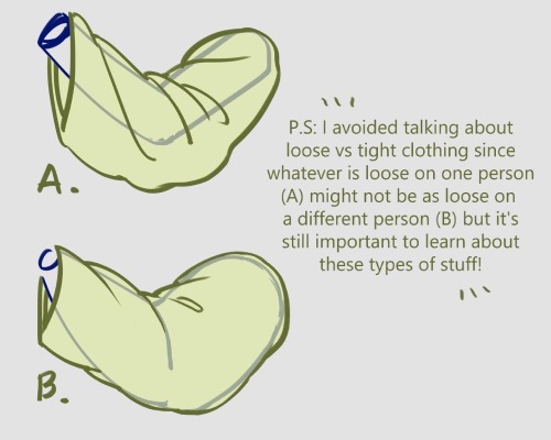
Hey! i like how you draw hands, can you do a guide on how you do it???????
I looove drawing hands, but they're as fun to draw as they are difficult 👌👏

Usually when I draw, I don't go for perfect realism/anatomically correct, I mostly follow whatever makes the drawing look good, with exaggerated shapes, sharp angles, etc.


Drawing with references is the best advice I can give you!
When I struggle to draw hands I usually just look at my own hand and try to copy it (I have a small mirror next to my computer to make it easier), it works, but it's not always the best option. If you want to improve quickly, find some pictures and practice by drawing them!
A lot of websites have a built-in timer for studies, here is the one I used for this one for example:

So yeah, practice practice practice! The more you draw, the better you'll get!