How To Transformer: Part 2


How to Transformer: Part 2
Vehicle Art Tutorial
Featuring @littleyarngoblin's car; Carwen 🚙
Flyer Art Tutorial coming soon!
Ko-fi
More Posts from Basket-of-references and Others
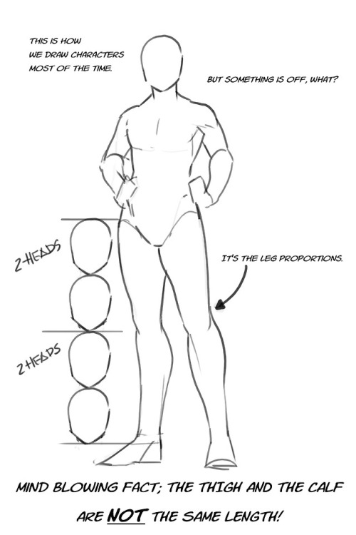
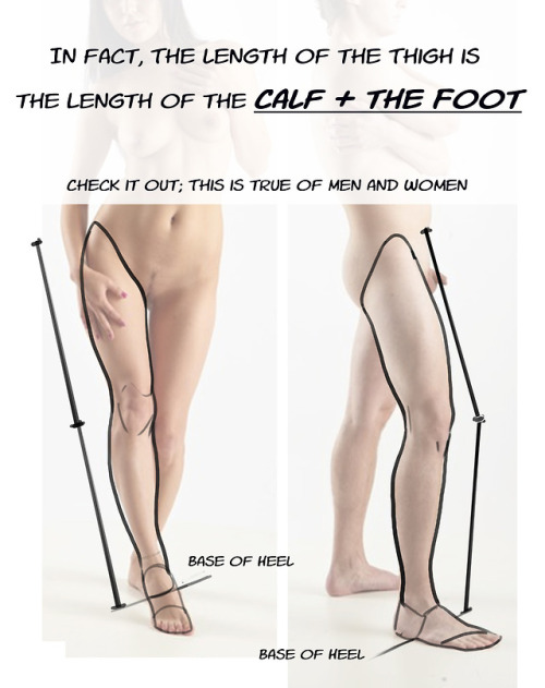
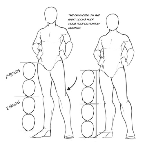
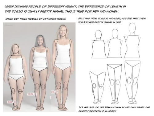
Just a quick thing I put together. This blew my fucking MIND when my anatomy teacher pointed it out. My drawings instantly got better. You might know it (good for you, I wish I knew it before too T_T) or you might not and it might help you get better.


A master post of Thomas Romain’s art tutorials.
There’s not enough space to post all of them, SO here’s links to everything he has posted (on twitter) so far : 1 2 3 4 5 6 7 8 9 10 11 12.
Now that new semesters have started, I thought people might need these. Enjoy your lessons!
Wdym by distinctive nose?
(this was what i said was one of my "signature" OC traits in some tags awhile back)
noses are one of my favorite features to draw, so i put all my Best Shapes in the nose. i try to give each character a different one (unless they're related), because it's fun!

noses (੭ ˊᵕˋ)੭
Hello! I hope you dont mind me asking, but how do you draw those amazing black and white comics? (Coffee and The Goddess comics come to mind!) I love the way you do them and would love to know the process you go thru!
this is a pretty broad question and im guessing/hoping you meant “how do you color in black and white in your comics” so have a few random tips about values and paneling and stuff i guess


thank you
if ur ever feeling bad about your art just remember your twelve year old self would think it was soooo cool
Digital Painting: tips for beginners
Heyo! I got asked if I could make a tutorial on digital painting so I’m gonna throw together some advice meant for people who are starting out and want to figure out exactly how this stuff all works. Because it’s hard! What I hope to accomplish here is to make painting more approachable for you.
Firstly, I have put together something like this before, so for archival purposes here it is: http://holy-quinity.tumblr.com/post/89594801811/i-dont-know-how-much-of-this-kind-of-thing-you
For those of you who don’t wanna bother reading that, here are the main points:
1. Learn your program and its tools, from brush properties to layer styles. And I mean learn them. Make a cheatsheet that shows you exactly what each button and scale does, both in isolation and in conjunction with other buttons and scales. Refer to this as much as possible until it is intuitive. The end goal is to know exactly what to do to your brush’s settings to achieve a given effect.
2. It’s perfectly okay to use your sketches, linearts, and other forms of line in your paintings. They can help guide the form and there’s no need to make something fully “lineless”! I never make things “lineless.”
3. Study other people’s art and try to think how they could have possibly achieved the effects they did. You can learn a lot just by observing and mentally recreating the process stroke by stroke—muscle memory is a powerful tool at your disposal. This becomes easier to do once you’ve started doing item 1 above.
OKAY!
So where the heck do you even begin?
What I’m gonna do is try to make digital painting as approachable as possible for someone who’s never really done it. The main idea here is that digital painting is just like real painting. So if you’ve ever done real painting, you already kinda know what’s coming.
I’m gonna assume you know the basics of digital art: you can sketch, line those sketches using layers and opacity changes, and fill the lines with color, maybe even opting to add some shading…and you’ll get something like this:

You know, cell-shaded, or maybe the shading’s blended, but you’ve still obviously a line drawing with color put down on layers beneath the lines.
The next intuitive step is to try going “lineless”…but when you remove the lines you get this:

idk about you but I’m laughing at how stupid this looks
When I was first teaching myself to paint digitally, I didn’t really know how to deal with this. Without lines, the form of the subject vanished or became a mess like the above. Even if I was meticulous and careful about placing down the color such that without the lines layer turned on, the shapes fit together, it didn’t look quite right. There’d be gaps, I wouldn’t know how to incorporate the subject into a background, the contrast wouldn’t be high enough, or it’d just in general look too much like a screenshot from Super Mario 64.
Painting requires a different process than the above. You’ll have to let go of some of your habits and conventions. Such as staying in the lines. Such as fully relying on the lines. Like, I love my lines, I love my sketches—but in painting, they are guides for form, and are not the form itself. So let me go through how I approach a given painting:

My painting process starts with a sketch (here a boring portrait for demonstrative purposes). I make the opacity of the sketch layer something like 30%, and then throw down my base colors on a new layer underneath. I’m not being meticulous about the sketch itself, because again it’s just meant to guide my placement of color. I’m also not meticulous about my placement of the color.
We’re essentially sketching with color. Because ultimately what we want is for the color to take on the form and shapes conveyed by the sketch.
There’s a lot going into this about how to use value, how to shade, how to use color, etc. that I’m kinda skipping over because it takes a lot of time to explain…but there are hundreds of tutorials out there on those topics so please, google around! I found some helpful tuts that way when I was starting out.
Something I find v useful is to keep selecting colors that already exist in your image for shading and hue adjustment. This is why I start with really blendy, low-opacity brushes when throwing down color on top of the background. I can then select colors within there that are a mix of the two.
For instance, I’ll select the color of the lines here:

…and use that to shade:

And maybe I’ll select one of the darker shades around his eye, but not the darkest, to make the shading a smoother gradient…and so on.
What I do in general at this point is go over the shapes and lines of the sketch. Such that I can turn off the sketch layer and see this:

I’m replacing the lines with shading and value. I’ll continue to do this as I keep adding color.

This is all super loose. I am not dedicated to any particular stroke. I just want the colors and shading and light source to be right. I’ll use overlay layers to boost contrast or add a hue.
Here are other examples where I used this process:


I am constantly changing brushes and brush settings as I paint. It really depends on what effect I want where. I am also constantly selecting new colors and applying or blending those in. I don’t believe in having some uniformly applied base color and then shading with only one or two…that’s what I’d do if I was cell-shading like the first drawing I showed you here, but painting should be about messing with color and opacity and blending to make millions of hues!
Good rule of thumb: Hard, opaque brushes for applying color. Soft, dilute brushes for blending colors. Sometimes hard, dilute brushes can make some cool blending effects! I personally prefer harder edges on my shading so that’s a brush I use often.
This is getting a bit long so I’m gonna split it up into multiple parts, but really what I want you to get from this is:
1. learn the tools at your disposal until they are intuitive
2. sketch and line are guides for form, not the form itself
3. rather, hue and value will produce the form
And of course, practice makes perfect!!! Every drawing you make, every painting you make, will bring you one step closer to the artist you want to be, and thus every drawing and every painting, no matter what, is a success.
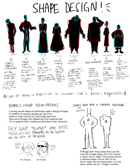
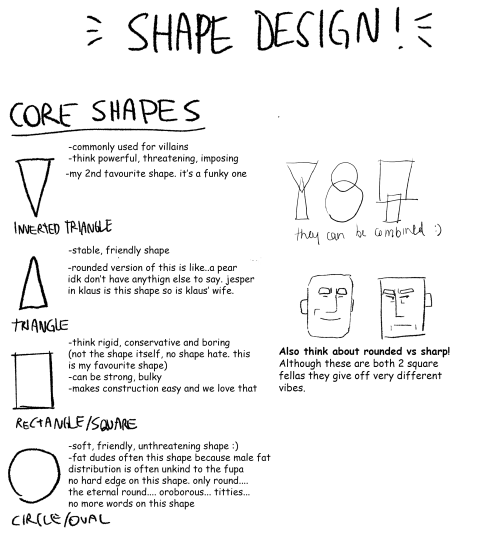
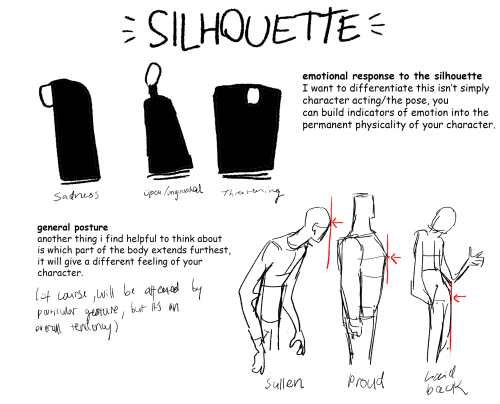
Part 2 of cino art tips is some basic tips on shape and silhouette design which are also principles I think about a lot :)
(also i'm so sorry i chose comic sans to write this in idk what i was thinking but i already flattened the layers)
i don't have any other obvious tips off the top of my head rn but feel free to ask anything you are curious about! i love getting asks uwu
Art-Res Start Here
Help me keep Art-Res running for years to come!
> buy me a coffee / patreon
> art commissions @astrikos )
> book 1:1 tutoring/question session
> Buy the Art-Res Anatomy Ebook!
> Link Tree
Sharing this blog w/your homies also helps a ton!
Start here!
Join our community - networking + discord invite!
Art Book Recommendations
anatomy masterpost
perspective masterpost
Resources to help you master color theory & color theory primer
Beginner’s Guide to Digital Art
Beginner’s guide to traditional art
Ultimate guide to photography for beginners
How to find and develop artistic style
Surefire Ways to Defeat Artist’s Block and Writer’s Block
How to create a free portfolio and blog site
Learn How to Market Your Art the Right Way
A Collection of Great iOS Apps for Artists
Community Tested Social Networking Tips for Artists
Artist Utilities
Idea Generator
Visual Reference Boards
Random Color Palettes
Free Habit Tracker Printable
Note, I working to remove Amazon Affiliates and will not add new links to them until I see substantial change in the way big companies like them treat their workers.
Recent Posts / More Useful Links
Art-Res Website / Personal Art Blog / Instagram / Facebook
Inqueries Please feel free to contact me via email for business inqueries. Open to guest writing, collaborations, sponsorship/advertisements.

-
 anomymous1 reblogged this · 1 month ago
 -
anomymous1 liked this · 1 month ago
-
 robotsandworldbuilding reblogged this · 1 month ago
 -
 robotcove reblogged this · 1 month ago
 -
robotcove liked this · 1 month ago
-
 ezroar liked this · 1 month ago
 -
 azzie2art liked this · 1 month ago
 -
 smileyssinkhole liked this · 1 month ago
 -
 eggsandghost liked this · 1 month ago
 -
 ran5066 liked this · 1 month ago
 -
 popmagical liked this · 2 months ago
 -
 fandombrainrotsunite reblogged this · 2 months ago
 -
 emptymasks liked this · 2 months ago
 -
 himulrai liked this · 2 months ago
 -
 swiftyangx12 reblogged this · 2 months ago
 -
 ditheringtouhoufan liked this · 2 months ago
 -
 lilly-of-the-gallery liked this · 2 months ago
 -
 bunnyscribblesbjd liked this · 2 months ago
 -
 hydraxplateau liked this · 2 months ago
 -
 disco-wyrm liked this · 2 months ago
 -
 lemolives reblogged this · 2 months ago
 -
lemolives liked this · 2 months ago
-
 fern-bee liked this · 2 months ago
 -
 derpyhawker reblogged this · 2 months ago
 -
 bruceandsons reblogged this · 2 months ago
 -
bruceandsons liked this · 2 months ago
-
 fadedfox24 liked this · 2 months ago
 -
 alexhampton0430 liked this · 2 months ago
 -
 blue-aya liked this · 2 months ago
 -
 boredandblank reblogged this · 2 months ago
 -
 mechinamicrowave reblogged this · 2 months ago
 -
 dez-threestar liked this · 2 months ago
 -
 astron3wt liked this · 2 months ago
 -
 gayelectro liked this · 2 months ago
 -
 mayonakaotsumami liked this · 2 months ago
 -
 thebirdkiwi reblogged this · 2 months ago
 -
 snap-oversteer reblogged this · 2 months ago
 -
 rupertholmes liked this · 2 months ago
 -
 love-letter-4-u reblogged this · 3 months ago
 -
 glitterfixation reblogged this · 3 months ago
 -
 hyp3rdr1ve liked this · 3 months ago
 -
 nexmalin liked this · 3 months ago
 -
 emeloura liked this · 3 months ago
 -
 thefinaltransmasc liked this · 4 months ago
 -
 theundeadmemelord liked this · 4 months ago
 -
 skizabaa liked this · 4 months ago
 -
 iamsneakypal liked this · 4 months ago
 -
 rebecca1014 liked this · 4 months ago
