➤ GUŌ PÉI | 郭培 Spring Summer 2018 Couture Collection — ELYSIUM


➤ GUŌ PÉI | 郭培 Spring Summer 2018 Couture Collection — ELYSIUM
More Posts from Rachelcapstone and Others

Complete documents of every scholarly research article I’ve found (WIP)
Week 3: Sept. 20
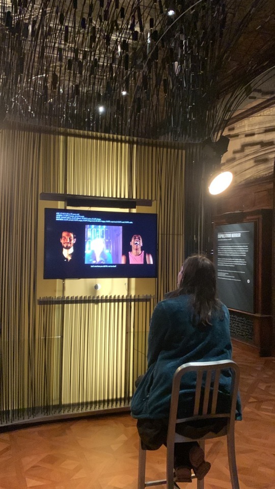
This week, I went with Jack to Nick’s show titled Voluntary Attempts to Overcome Necessary Obstacles at the Elizabeth Foundation for the Arts. Here is a short description below:

https://www.projectspace-efanyc.org/voluntary-attempts-to-overcome-necessary-obstacles
While I don’t think my project will really be involved with the game design space, this was a good opportunity to get some ideas for interactivity with museum pieces, as well as how work is presented.
The wall when you first walk into the exhibit:

Sheet we were given about the exhibit:


Second packet with all of the works in the show:


Special highlights:
Let’s Play Greek Punishment, 2011
By Pippin Barr

This was a series of games about mythology. In this one about sisyphus, you click in order to push the boulder up the hill. However, you are never able to actually complete the task, so continue to click until the player gives up. It’s supposed to be an “anti-game”, where the conventional goals in most mainstream game play are taken away, and this is what you are left with.
The Soft Rumor of Spreading Weeds by Porpentine Charity

This really got me thinking about how to present objects in a gallery space. The small rounded carpet felt super intimate, and made me thing of playing games on the computer on the floor as a kid. This also made me think a little bit about my talk with Kelly McGowan last year, and how she did her capstone project about her bedroom. It gives me similar “cozy” feelings.
Folds of Separation by Studio Oleomingus

I was a big fan of the artwork for this piece, it was very intricate maze game. Not necessarily the type of gameplay that I enjoy (it was very frustrating), but I did enjoy looking at it.
The Cloister by Everest Pipkin

The artwork for this pice was stunning as well.
If I recall, this was the box that held the cards for World Ending Game by Everest Pipkin. The instructions for the game were long, and it took an hour to play it, so I felt that it was a bit of a risky move for the exhibit only because not everyone (including me), would have the time or patience to read the instructions and play the game. But I did appreciate the attention to detail (for example, as pictured here, the slot created for the cards and dice for the game in their storage box).

The Tearoom by Robert Yang

It was in a separate corner of the exhibit. You interacted with the game that was projected on a wall with a mouse that was on a pedestal in the middle of the room, giving it a super simple interface. It was a very weird game, where you played as a man in a very dingy bathroom. You were at a urinal, and were able to watch men who came in and out of the bathroom to pee, except all male genitalia was replaced with guns. Ultimately, after watching someone too many times at the urinal, the player was able to pleasure the man to completion in the gross bathroom. I was really confused after watching Jack play, but after talking to Nick about it, he explained that it was about how in videogames and on many social media platforms (although we were specifically talking about Twitch in this context) censor male genitalia, but guns are allowed. I guess it is a little weird when you think about it that objects that inflict violence are less censored than our own bodies on the internet. I will try to get the video from Jack and post it here, if Tumblr allows it
Also, in a smaller amount of creative research, I found a new material?


I went to an event for CSA (Chinese Student Association), and we made these foam clay moon cakes in celebration of mid autumn festival, using mooncake presses like the one I’ve attached here. I’ve somehow never used clay like this though, and when it dried (which it did much quicker than any clay I used growing up), it was super lightweight and more like foam clay than the hard, more pottery-like textures that other clay I used growing up. I also liked the idea of the presses. They remind me of the carving blocks we used in design I to create prints of letterforms, but they make a 3D object instead of 2D. Maybe I will explore this idea in a future experiment for my capstone, although I don’t know exactly how I am going to position this in terms of juxtaposition yet.
Overall this week, I feel like I am still working through exactly what form my project is going to take. I feel like the foam clay in an interesting medium for a future creative research or making, but not necessarily for a final medium. Same with the stamp/mold/block printing idea. They’re fun mediums that I may experiment with, but am not sold on yet for the final project. I really enjoyed going to see the exhibit that Nick curated. To be honest, my interest does not really lie in games, but I did get inspiration from seeing how works were presented in an exhibit space, and made notes on what did and what did not work, as I have elaborated above. I will definitely plan to see more exhibits in the coming weeks as well.
Final Crit Notes

Week 4: September 27
Last week, I talked to Nancy about how juxtaposition was a difficult topic to research, as it can be sort of a generic word that can be about the comparison of any two things, from scientific topics to art. This means that when researching it, it can be difficult to find articles that relate to it in the art/design context that I am looking for.
Links from Nancy on juxtaposition:
https://arttalks.com/exhibition/juxtaposition/
https://kayleyhutchinson.wordpress.com/2013/12/11/juxtaposition-composition-and-deconstruction/
I was thinking about how Nancy said that movement can be a medium, which also reminds me of the images I reposted on here from Wassily Kandinsky, who published two essays on his theory of form. The essays were accompanied by photographs and abstract drawings. Gret Palucca, a pioneer of the new expressive dance, was the model for the abstract drawings. The Palucca-inspired sketches are originally based on photographs by Charlotte Rudolph
This reminded me of another article that I found about dance notation, and how dance is recorded and notated in a 2D form:
https://www.jstor.org/stable/1567163


They’re not really standardized, but I just love how beautiful and intricate the pieces in this article are, and it reminded me a bit of when I was looking into data visualization. I also shared this article with Arianna, as I thought it related to her topic as well.

For creative research, this week I was thinking about what Toni said when I talked to her about making something people could walk through. I was thinking about a garden arches, or tunnels, or doors. I actually made a door that people couldn’t walk through for 3D class as a freshman.

Detail shots

I was really into iridescent paper


Cutting through the door after

So I’ve been thinking about maybe making some sort of collage or juxtaposition related tunnel that people could walk through.
I first started thinking of those wire or metal garden gates that people have.


I though about what if there was a collage or multimedia piece that people could walk through, and see a variety of colors/materials, or maybe collage themes or topics that people could walk through. I like the idea of light being able to pass through it as well. I made a mockup in photoshop here using the garden gate shown above

I was also thinking about quilts and how they can sort of be a collage, and maybe I could make something quilt like and drape it over a structure that people could walk through. It would be cool if some of it could be transparent too….


Overall this week, I feel like I’ve been thinking a little differently than previously, and about movement and medium. I think the problem with the mockup that I made above is that it is beautiful, but I’m not sure how well it conveys the message of my topic. I also still feel like I need an exact topic for my juxtaposition though, but hopefully I am getting closer. I’ve reposted some other images this week that also interest me. This week I will also focus more on refining exactly what I want to make, and will go to the studio to make my inspiration board on the cardboard given in class. Next week I may try to make a small model of the mockup I made today.
Week 2: September 13
This week, I started out thinking about collage, but ended by deciding to focus more on juxtaposition.
Day 1: Found material collage on printer paper
Explores collage as something that can be made of putting things together around you.

Day 2: Digital collage
Exploring the digital collage. Based on more “aesthetic” collages that can be found on the internet.

Day 3: Printer scans
Explores alternate ways of making collage with non-2D objects, and flattening them.


Day 4: Moodboard
Exploring mood boards as a type of collage

Day 5: Ugly moodboard

Exploring mood boards as a type of collage, but purposely making one that is ugly, and seeing how we make connections between the unrelated images and colors.
Day 6: Autofill poems
Used autofill in the Notes app to generate poems that are a collage of words. On the last one, it ran out of word suggestions.


I thought that it was interesting that in the one below, autocorrect ran out of suggestions.

Day 7: Cake! (Chocolate with vanilla frosting)
“Anyone who's ever put a stamp on an envelope or a note on their refrigerator knows what it's like to make a collage. There's no esoteric technique.” - Elliot Hundley
This is what I hate and like about collage - anyone can do it.

Going back to the ugly moodboard, I tried really hard to find things that were random, did not go together, or were just not aesthetically pleasing (some of the images were even a little gross. I gave it a nauseating pink background, and the colors were bright and clashing. However, despite my best efforts to try and make an anti-moodboard that seemed completely random and ugly, the more I look at it the more I feel like it works....? I couldn't tell you what mood it is giving, but I feel like I'm putting things together that aren't there.
This made me think about how humans tend to find patterns all the time in things that aren’t really there. There are actually several psychology articles about the subject.

Mattson, Mark P. “Superior pattern processing is the essence of the evolved human brain.” Frontiers in neuroscience vol. 8 265. 22 Aug. 2014, doi:10.3389/fnins.2014.00265
Chandrashekara, K. “Finding Patterns in Nature’s Maze: An Endless Quest.” Current Science, vol. 69, no. 5, 1995, pp. 406–09. JSTOR, http://www.jstor.org/stable/24097149. Accessed 19 Sep. 2022.
I feel like this week was just exploring juxtaposition as a new aspect of my topic, rather than just focusing on collage. I noticed it in my “ugly” moodboard how people find relations between things that aren’t there, which the articles by Mattson that I mentioned above basically says that our ability to recognize patterns to the extent that we can is part of what makes us human. I should keep this in mind in terms of how people perceive my project I suppose. Can I take advantage of this?
Also not as related, but speaking of two things that I didn't think would work but it does, a Kpop song I like by the group TXT called Eternally sounds like two different songs blended together, to the point that when my friend first showed it to me I thought it was two different songs. It switches from slow to dark and fast. But I really like it.
https://youtu.be/60RWCfwmfYc

Notes from meeting with Nancy 9/9/22
I can explore a technique, material, or technology
Sometimes choosing something smaller is better than something bigger
3D printing (after talking about the Taemin lightstick project)
What are people 3D printing?
Look at the most popular files and history of 3d printing
I want to explore collage: Giving myself a rule like a collage a day
Damien Davis
Acrylic collages
Am I more interested in the how of things rather than why?
Easier than choosing a social topic
Go on a walk
Stephanie Syjuco
Daan van den Berg
Week 12: November 22
For creative research this week, I went back to Poster House to see two exhibits that weren't open the last time I went.
Title wall from the first exhibit, Schoolgirls at War: French Propaganda Posters from World War I.

Nous Saurons by Camille Boutet 1918

Title card for Nous Saurons

Title wall for the second exhibit, With My Little Eye: Warnings for the Homefront

Careless Talk Costs Lives Posters


Both of these exhibits focus on propaganda posters. Going back to the topic of soft power, these posters often harness it and use juxtaposition as a way to compare contrasting imagery with the war in order to deliver a political message. For example, Nous Saurons features children looking longingly at a candy store, with the caption “We will know how to deprive ourselves”. There is a juxtaposition between the candy store, the longing children, the caption, and the presumably adult viewer that implies that if children can find the strength and discipline to ration and control their desires during the war, then adults should be more than capable to do the same. The poster is an effort to get the French people to support the sugar rations put in place by the war effort. The use of children to juxtapose the underlying message of supporting a war is much more effective than a poster that would have just said “Rationing sugar is patriotic”. It sets an extreme contrast that says “if you, an adult, are not able to ration sugar, you have worse self control than a child”, without saying that phrase explicitly. This way of using juxtaposition to construct guilt in order to support the war is subtle yet potent. Similarly, in the Careless Talk Costs Lives Posters, people chatting with each other or over the phone in mundane situations are juxtaposed with the captions that they are participating in something deadly.
This week for scholarly research I read This Means This, This Means That: A User's Guide to Semiotics by Sean Hall.
Citation: Hall, Sean. 2012. This Means This, This Means That : A User’s Guide to Semiotics. Vol. 2nd ed. London: Laurence King Publishing. https://search.ebscohost.com/login.aspx?direct=true&db=e000xna&AN=926138&site=ehost-live.
Link: http://ezproxy.stevens.edu/login?url=https://search.ebscohost.com/login.aspx?direct=true&db=e000xna&AN=926138&site=ehost-live&ebv=EB&ppid=pp_75
Summary: Semiotics is the theory of signs, and reading signs is a part of everyday life: from road signs that point to a destination, to smoke that warns of fire, to the symbols buried within art and literature. Semiotic theory can, however, appear mysterious and impenetrable. This introductory book decodes that mystery using visual examples instead of abstract theory. This new edition features an expanded introduction that carefully and clearly presents the world of semiotics before leading into the book's 76 sections of key semiotic concepts. Each short section begins with a single image or sign, accompanied by a question inviting us to interpret what we are seeing. Turning the page, we can compare our response with the theory behind the sign, and in this way, actively engage in creative thinking. A fascinating read, this book provides practical examples of how meaning is made in contemporary culture.
In particular I wanted to focus on this section:

It essentially discusses how differences between signs is only due our own perception, because what really defines “sameness” or “difference”. After all, it’s only when two objects are the same in every respect that we can say there are no differences. There are two kinds of difference: difference in kind (which is the fundamental thing that the object is) and difference in degree, which when there may be small variations between two things that may be very similar in general. This is important to the function of juxtaposition because juxtaposition is the comparison of two objects or concepts that are different from each other. But what does different really mean?
I’m glad that this week I got to see the exhibits as poster house that were closed the last time I was there. I saw some good examples of how juxtaposition can be wielded to push a political agenda. The issue is that these juxtapositions are not based in the whole truth, or are not allowing equal comparisons. The lack of context in this case can be misleading, as comparing two extremes (such as the best of something with the worst of something) does not allow for a fair comparison. Without the full facts though, people may not be able to counter the juxtapositions that were put before them, and will come to the conclusion that the creator of that juxtaposition wants them to believe. Thus is the soft power of juxtaposition, and the importance of knowing how it functions and when to recognize it in order to think carefully before making any connections or conclusions. I also learned that line line between same and different is more blurred than I previously would have expected - could this be part of the reason that we can always find connections between unlike things? Or is it their degree of difference or kind that actually creates connections through differences instead? Perhaps both are true. I will explore both of these topics further maybe next week.
Week 8: October 25
This week for my creative research I visited the Cooper Hewitt Museum. Here are some of the highlights:

From Design and Healing: Creative Responses to Epidemics
Zero-waste Scrub Set, 2020 by Danielle Elsener
This zero-waste scrub resulted from when the logo from the NHS (National Health Service) was printed at the wrong size.
I love the unique pattern that is created from the fabric scraps sewn together - it makes it look more high fashion than a normal scrub, even though it was made from a fabric that would normally have been thrown away because of errors.

Next was an exhibit on AI

Expression Portrait by R. Luke DuBois

This piece scanned your face, and guess the emotion that you were showing. It then asked you to hold that emotion for a minute. However, right after, it reveals that it had collected data from you about your age, ethnicity, current emotion, etc., and that the fun activity was not so fun after all. One thing that we noted was that the results for my roommate were a bit more accurate than mine, maybe because AI tends to be better at detecting white faces...?
The next exhibit we went to was designing for peace. I just really liked the theme of this exhibit and it was definitely my favorite due to the variety of cultures, ideas, issues, and solutions that were involved with it.

I through the opening wall was really cool, and how there was a hidden message depending on which angle you were looking at it.


I loved the typography and symbolism in this Black Lives Matter street art, and the imagery that was in each. They still all look cohesive.

Conflict Kitchen is a takeout kitchen in Philadelphia that serves food from countries in conflict with the United States.

The facade of conflict kitchen. It reminds me of Rich’s piece from last year.

This idea is great because it highlights food from countries that many Americans may normally be hesitant to try, due to lack of accessibility, knowledge, or fear of cultural differences. Restaurants representing these countries also may be more likely to face discrimination due to the bad media that they recieve due to the fact that they are the US’s “enemy”. Serving food though gives people the opportunity to associate these countries with something more positive, and experiencing the culture can help to humanize it's people. Food also acts as a gateway to learn more about these countries’ people and cultures in a more positive light that the media does, telling the other side of the story. Cultural exchange is a great was to confront bias and fear that Americans may have.
Take out wrappers for Conflict Kitchen contain interviews with multiple perspectives of people but currently living in and those who moved away from the focus country.


Universal Declarations of Human Rights Posters

“This is My Home” Poster based on the Declarations’s Article 25: Everyone has a right to a standard of living adequate for health and well-being.
By Cindy Chen

“Your Thoughts are Illegal” Poster and Postcard based on the Declaration’s Article 18: Everyone has the right to freedom of thought, conscience, and religion.
By Christopher Kosek

Everybody poster and postcard based on the Declaration’s Article 1: All human beings are born free and equal in dignity and right.
By Christopher Kosek

Sweat Shop Labor poster and postcard based on the Declaration’s Article 23: Everyone has the right to work... to equal pay...

I really like these posters because of the irony in the imagery, and how it gets the message across so clearly. Just the imagery alone implies what the topic of the poster is. The designs are really creative and clever.
I also talked to Jack as he also went to the Cooper Hewitt, and he said that the layout of the museum reminded him of my project, as the exhibits were really close to each other and juxtaposed each other.
I really enjoyed going to the museum this week, but I’m still not sure exactly the direction I want to go for my next project, I loved so many of the projects there, but I’m not exactly sure how some of them relate to my topic, as I feel like they maybe touch more on other interests I have that are not necessarily related. I did get some insirpation on how to present my work, and the various forms that it can take. Who knew medical devices could be placed in an “art” museum?
For scholarly research this week, I found a book by Gail Dexter Lord and Ngaire Blankenber called Cities, Museum, and Soft Power.
Citation: Lord, Gail Dexter, and Ngaire Blankenberg. 2015. Cities, Museums and Soft Power. Washington: American Association of Museums. https://search.ebscohost.com/login.aspxdirect=true&scope=site&db=nlebk&db=nlabk&AN=1341266.
Link to article: http://ezproxy.stevens.edu/login?url=https://search.ebscohost.com/login.aspx?direct=true&db=e000xna&AN=1341266&site=ehost-live&ebv=EB&ppid=pp_9
Summary: Soft power emerged as a concept in the late twentieth century to describe international relations based not on military or economic strength, but on influence. While the resources of "hard power" are tangible-force and finance-soft power resources include ideas, knowledge, values, and culture, as well as the ability to persuade. This volume discusses soft power from the vantage point of museums and demonstrates how they are quietly changing the world. With contributions by thirteen experts from ten countries, Cities, Museums and Soft Power reveals the world's 80,000 museums to be sleeping giants. Two major characteristics of soft power-the rise of cities and the role of civil society-are pushing museums from the margins toward the center as these institutions serve as education hubs, employers, magnets for creative industries, and engines of economic development. Meanwhile, the growth of technological networks and connectivity has enabled this soft power to spread even farther and deeper across the Internet and groups of people. Whether cozy and local or internationally renowned, museums possess a cultural strength that extends far beyond their walls

It also recaps some information that I learned earlier from a different perspective.
There was also some discussion about when soft powers collide, how cities and museums can use soft power to better the lives of the people that live there, and how soft power is not always employed positively.

I am glad this week that I finally found another book talking about soft power in an artistic or more localized scale. I was honestly surprised that a whole book existed. It focuses a little more on cities and museums than I probably will in my paper, but still has some good insight. Particularly, how soft power is not always a power used for good. In a similar way, juxtaposition is a soft power, but it can be used to portray a negative message as well.
Overall this week I got some really good inspiration from Cooper Hewitt. I particularly like the way that the Human Right posters played with meaning and were so easily able to grab my attention. The format and imagery with the text had great gestalt and already implied the topic at hand even with just the simple imagery. I also feel now after this week that I understand soft power enough in all sense (political, artistic, and the negative sides to it), so will find a different research topic for next week.
-
 atefingersdagger liked this · 3 months ago
 -
 unhumanfashion reblogged this · 3 months ago
 -
 fina1chase reblogged this · 3 months ago
 -
 shuriann liked this · 5 months ago
 -
 justbes-stuff liked this · 8 months ago
 -
 darknovalatte liked this · 10 months ago
 -
 holytrapazoid liked this · 10 months ago
 -
 canopener420 reblogged this · 11 months ago
 -
 collectivetiredmass liked this · 11 months ago
 -
 dvamanning liked this · 11 months ago
 -
canopener420 reblogged this · 11 months ago
-
canopener420 liked this · 11 months ago
-
 folditdouble reblogged this · 1 year ago
 -
 the-fool-darkane85 reblogged this · 1 year ago
 -
the-fool-darkane85 liked this · 1 year ago
-
 cocogold333-blog liked this · 1 year ago
 -
 afirestar reblogged this · 1 year ago
 -
 iconic-lamb liked this · 1 year ago
 -
 namu815 reblogged this · 1 year ago
 -
 katharina-aaron reblogged this · 1 year ago
 -
 crystalclrs liked this · 1 year ago
 -
 the-charming-sexy reblogged this · 1 year ago
 -
 bsotted liked this · 1 year ago
 -
 neovenoms reblogged this · 1 year ago
 -
 painfullyiced reblogged this · 1 year ago
 -
 luminoussphereofplasma reblogged this · 1 year ago
 -
 primarilygowns reblogged this · 1 year ago
 -
 heartkreuz liked this · 1 year ago
 -
 acidbathcat liked this · 1 year ago
 -
 boilingcolorsuntilcooked reblogged this · 1 year ago
 -
 theworldis-amazing reblogged this · 1 year ago
 -
 gay-fandom-menace liked this · 1 year ago
 -
 yourlocalegotisticalqueerishere reblogged this · 1 year ago
 -
yourlocalegotisticalqueerishere liked this · 1 year ago
-
 helloiamacashier reblogged this · 1 year ago
 -
 southclan liked this · 1 year ago
 -
 trespastiche reblogged this · 1 year ago
 -
 legalassassino liked this · 1 year ago
 -
 aastraeus liked this · 1 year ago
 -
 apobezinsky reblogged this · 1 year ago
 -
 gothgleek liked this · 1 year ago
 -
 imeverysparklywoman reblogged this · 1 year ago
 -
 vclyrias reblogged this · 1 year ago
 -
 big-flrda-kys reblogged this · 1 year ago
 -
big-flrda-kys liked this · 1 year ago
-
 tomato-cultivator liked this · 1 year ago
 -
 metafirefly reblogged this · 1 year ago
 -
metafirefly liked this · 1 year ago
-
 aphelion-cellstorm liked this · 1 year ago
