“Where Should I Host My Webcomic?”
“Where should I host my webcomic?”
If you’re making a new webcomic it’s often difficult to decide where to put it, especially since if you need this kind of resource you’re probably just starting out. So, here’s some info I’ve gathered on some popular hosting platforms and their benefits/downsides. I’m not an artist, so this isn’t an inside scoop, but I’ve put some research into this and I know what artists have said about their experiences. All of these platforms are free and public to use unless noted otherwise.
Tapas (aka Tapastic)
Tapas is a website and app that is made for hosting webcomics.
Example - Example
Benefits:
VERY well known, one the most popular hosting platforms around.
It’s mostly set up so users check out as many comics as possible -> easier time attracting readership.
Once you start getting subscriptions it starts figuring out what other comics get similar readership. It’ll start recommending your comic and you’ll get more consistent readers.
It’s very easy to use and smoothly designed. Pefect for new artists.
There’s kind of a social aspect to it? I don’t know how to describe it. Every user has a page you can comment on and there’s a robust comment system on pages/episodes.
TAPAS TIPPING. A brilliant, original system. Users can watch ads for “tapas coins”, which they can “tip” towards their favorite artists! This turns into free real money for you. You can also apply to tapas premium to make a comic or novel that’s unlocked per episode with coins. (novels are only acessible on the tapas app, which it seems to be moving towards)
Downsides:
It’s very reader-centered. Not so much on artists.
In fact it recently tried a really sketchy move where it added a clause to its terms of service potentially restricting where else artists could post even the free comics. It was later removed after sitewide backlash and mass comic removal.
No control over how your website appears. You get to make a banner and an icon, that’s it. This could be a good thing, since you don’t have to worry about it and its theme works very well.
Sometimes it’s a little buggy. I’ve noticed a lot of artists post with links to other platforms and apologies because it won’t let them add an update.
How to Join:
Create a free account.
Create your comic.
LINE Webtoon
Example - Example
Webtoons is a free website and app for hosting webcomics.
Benefits:
Similar to Tapas, but with a more high-class feel.
(By that I mean I see very few debut artists and more professionals there.)
It’s about as easy to use, and it’s becoming much more well-known, especially after the mass exodus to Webtoons after the Tapas TOS incident. They also advertise comics on others’ pages with similar readership, but it’s kinda skewed towards comics that already have a lot of readers. I get the feeling that it’s focused on providing a good experience for its users more than reading a lot of comics.
You still cannot control how your site works, but again, what they give you is very good.
Every month the staff chooses some comics to become “featured” artists. Featured Artists make $2000/month as long as they don’t post on any other webcomic sites. As the name implies, they also advertise you more. They really like to mention this benefit.
Downsides:
You might not get any traffic? Mostly the biggest problem is just having to use its framework which is designed for webcomics.
How to Join:
Create a free account.
Create your comic.
Smackjeeves
Example - Example
Smackjeeves is yet another free host for webcomics.
Benefits:
You get a subdomain automatically, which you can heavily customize the appearance of.
It has a very social format compared other hosts.
Smackjeeves also recommends comics, but not on other comics’ pages. You can explore comics throughtout the site.
Downsides:
I personally find the website very confusing. I can’t imagine it’s much better on the artist side of things.
How to Join:
Create a free account.
Create your comic.
Tumblr
Example - Example
You’re on it! Tumblr is a social media platfrom that is based on users having one or more blogs to create streams of posts with.
Benefits:
Tumblr blogs already have a “page” format for scrolling through chunks of posts. Just set your post per page ratio to one and voila! Already looks very similar to actual webomic sites.
One of the highlights of Tumblr as a social media platform is being able to manually edit your blog’s HTML. There are even publicly available user-made themes for webcomics.
It’s a social media platform! It’s very easy to interact with your fanbase.
A lot of webcomic fans use Tumblr - it’s well-suited to fandom in particular.
Your updates would in reality be posts on a blog. Readers might reblog them and share your work with other people. It’s by far the best platform for word-of-mouth advertisement.
If you’re reading this you probably already know how to use it.
Downsides:
Tumblr is just … not made for webcomics. At all.
Archiving in particular is very counterintuitive for webcomics. Page urls are not static - “page 2” is the second-most recent update, not the second page. In order to find an individual update you have to actually page back to it or scroll through the default uneditable archive.
How to Join:
Get a free account.
If you already have one, you can simply create a sideblog. But you might want a whole account just for the comic - outgoing likes and asks show up as your main blog, so if you’re using a sideblog it exposes your personal/main blog whenever you interact with fans.
Edit your blog’s theme extensively.
Begin posting your updates.
Custom Website
Example - Example
No external host. Make your own website, just for your comic!
Benefits:
ABSOLUTE CONTROL. You decide how it looks, how it works, and what features it has. Most webcomic sites have similar formats: prominent centered pages (and usually the current update on the “main” page), first/previous/next/recent buttons, an archive, an about page, information on when it updates, etc. But in general everything is 100% up to you.
I cannot stress that ^^^ enough.
No license or restrictions of any kind. Except, like, laws. Obviously.
Many features are easy to add to your website. Disqus (Insertable commenting platform. Sorta structured like Reddit) is getting more and more popular and I haven’t heard anyone mention it costing anything.
You can get ad revenue from your site, and 100% of it goes to you.
Downsides:
Unless you have the skills to make a functional professional website on your own, it costs money. Plus, there’s the relatively small monthly/yearly cost of reserving a domain name.
Finicky and difficult to fix problems. When Tapas eats your update, you wait a day or two before it works again. When the commenting system disappears, you have to call whoever made your website or fix it yourself.
There’s no real way of attracting readership (and ad revenue!) other than word-of-mouth or paying for ads. No handy recommendation system in place. This is ONLY a move for someone who already has a guaranteed reader base. However, almost every popular comic artist eventually gets their own site so it must be worth it past a certain threshold.
How to Join:
Get a domain name and a website.
Post your comic on your new website.
Advertise the heck out of it.
SpiderForest
Example - Example
SpiderForest is a collective of comic artists, not a public service. You must apply to join.
Benefits:
The application process isn’t very strict; it’s there so that it isn’t flooded with low-quality comics. Not sure how I feel about it but it works pretty well for them.
You get the benefits of any vetted group. They advertise you on their main site, and being a member adds credibility to your work.
Even though it is an exclusive group, its policy allows unlimited mirrors, so you can still use anything else you want.
Downsides:
In order to be a member you have to have at least one mirror on a custom site they can link to or host directly on their site. Not much of a downside but still.
Your comic should already exist somewhere else. They generally won’t approve pitches for potential projects, unless you’re already an established creator with previous work to show instead.
It’s not as well known? It’s still pretty high up there.
How to Join:
Apply using the link at the top of their main page.
Be accepted.
Post your comic on your associated Spiderworks site.
Hiveworks
Example - Example
Hiveworks is a for-profit professional organization. You don’t ask to be a member, Hiveworks asks you to join. There’s like a 95% chance you should SAY YES.
Benefits:
Hiveworks gives you a free website (see: custom website benefits)
All Hiveworks sites have a little sidebar advertising other hiveworks comics. They also advertise your comic on their main aggregate site.
They look for good comics, it’s their job. Having their logo on your site is a testament to the quality of your work. You’ll get so many readers and comissions, trust me on this one.
Downsides:
You do have to provide some art to them. They’ll sell merch of your comic (which you get a large cut of!), and you need to provide icons and banners for them to advertise you with. When they do well, you do well, and vice versa.
If you are a member you cannot host your comic any new sites, especially their biggest competitor, SpiderForest. This contract lasts a while. Sometimes you get to keep your existing ones, though.
^^ Contracts. There’s still the tiniest bit of risk, but it’s a reputable organization.
How to Join:
Be asked to by Hiveworks.
Negotiate a contract.
This is all of the things I have been able to learn as a reader. If one or more of them sounds promising for you, try and send a message asking an artist who uses these platforms for what they think. Good luck!
More Posts from Scrapbox-in-the-attic and Others
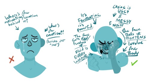
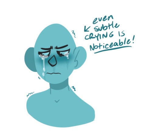
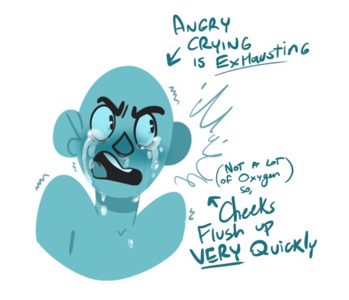
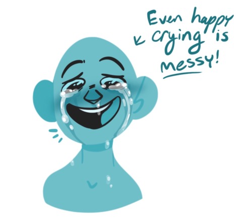
Some crying tips. I’m pretty bored of seeing movies with clean crying, but wow it’s by no means clean. It’s gross and messy and just downright fun to draw.
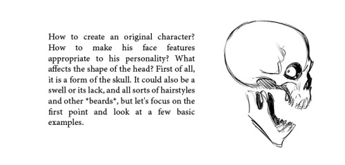
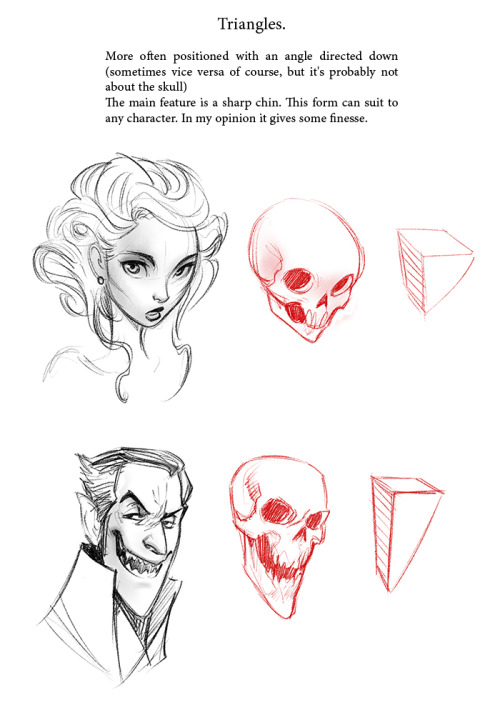
FACES
Drawing a face (the circle thing)
How to draw faces
Heads in profile
Drawing heads
A face tutorial
Avoid same facing
Diversify your faces
Face shapes
To make your drawing look like the person you’re drawing
Make your faces look like the person
Expressions
More about expressions
Drawing lips
Lip tutorial
Drawing ears
Drawing eyes
Realistic eyes
Drawing a nose
Drawing kisses
Drawing glasses
Drawing hoods
BODIES
Guide to human types part 1
Guide to human types part 2
Guide to human types part 3
Different kinds of athletic body types
Ladies tutorial (nudity)
Fellas tutorial
Curves on girls tutorial
How to draw necks
Drawing shoulders
Drawing arms
Drawing hands
Hand tips
More hands
Hands tips and techniques
Hands, arms, legs and feet
Legs, torso and expressions
Drawing boobs
How to boob
Boobs and hips
Drawing abs
Beer belly tutorial
Drawing backs
How to draw back views
Legs reference
Drawing knees
How to draw butts
Penis tutorial (nsfw)
Drawing feet and shoes
Sitting reference
Realistic woman body shape chart
Hair
Drawing hair
Hair tutorial
Drawing curls
Drawing braids
ANIMALS & CREATURES
Canines vs felines
Drawing cats
Drawing cats tips
How to draw big cats
Drawing rats
Basic deer tutorial
Deer sketching
Dog anatomy
Dog anatomy tutorial
Dog nose tutorial
Dog paw tutorial
Basic wolf tutorial
Horse tutorial
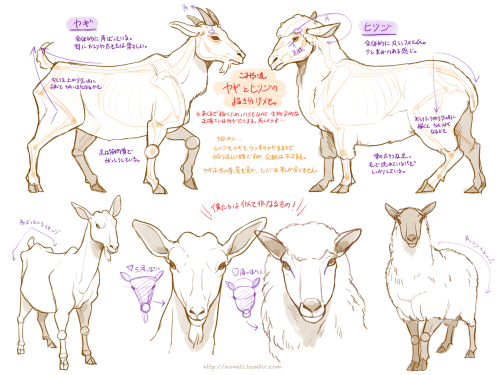
Sheep vs goats
Drawing giraffes
Basic owl tutorial
Bird wing tutorial
Drawing bird beaks and faces
Butterfly tutorial
Drawing animal legs on humans
Winged people anatomy
Dragon tutorial
Drawing dragons
Dragon wing tutorial
Fur tutorial
Drawing sharp teeth
OTHERS
Drawing clothes
Clothing folds tutorial
Collars, vests and pants reference
Hats reference
Drawing jeans
Drawing bows
Drawing trees
Tree tutorial
Drawing water
Water tutorial
Drawing crystals
Ice
Clouds
Creating form
Perspective tricks
Character design reference
How to draw better (video)
Learn how to draw better
Art reference & tutorials blog
Tutorial masterpost
How to draw anything


Creative Writing Tarot Spread
Writers block bogging you down? Use this 7-card spread to help jumpstart your creativity! This prompt can help you generate a very basic storyline.
First, pull a character card! Decide for yourself what this means: will your character carry the traits of the positive meanings of this card? Will your character’s conflicts be brought about by the card’s negative meanings? Will your character look like the figure depicted on the card? Will they wield the item depicted on the card? (Note: if your story has multiple main characters, you may wish to pull a card for each)
Next, pull the plot cards! Pull a card for the beginning of your story, a card for the middle, and a card for the end. Again, let yourself decide what this means. Do these cards describe your character’s emotional state(s) as the story progresses? Do these cards describe internal or external conflicts? Do these cards represent other characters your MC will meet along the way?
Finally, pull your meat cards! These cards are the “meat” of your story. Pull one card for the main or most important setting of your story, one card for the main conflict, and one card for the resolution of that conflict.
Have fun with it! Remember that these cards are just tools, and this spread is simply to kickstart your brain. If you get halfway through the spread and come up with something on your own, or if you start writing and realize your plot is deviating from what the cards gave you, don’t stress about it! You write for yourself, not for the cards. Thank them for their help and continue on with your own imagination.
Deck pictured here: The Essential Tarot by Chloé Zarka Grinsnir


Prepping your print from file to finish: I always hear people complaining about how much better the piece looked digitally, SO, here is a run down on how to get prints that look more like your original piece. First of all, every printer is different. Every paper is different. Make sure you take the time to do test prints and become familiar with how your printer and paper combo work, as you’ll rarely nail a print your first try. This one took about 5 test prints before I was confident to print on the expensive large paper Every time I mess up on a print, I save the remaining paper to use as scraps for test prints. As you can see, the original piece looks very nice! The focus is super strongly on the tiger, and all of the vibrant colors are still super evident in the background. That said, when I print it as is, everything about 85% gray or darker turns BLACK. And this is high quality paper designed to get accurate vibrant colors, too. The best way to fix this is to do layer effects. Brightness/contrast is my favorite, as a typical piece will generally print about 5x better if you up the brightness to around 15-25, and adjust the contrast up or down by 5-10 points. That said, if you have a HIGH contrast piece (Darks against brights) like this one, you typically need to do a few more steps. Often I’ll do a second brightness/contrast adjustment layer and push brightness to an obnoxious level so the darkest darks are closer to a mid-dark range. From there, I’ll create a mask and use a transparent gradient tool to slowly pull back the brightness on all of the lighter areas of the image. Additionally, due to printers using CMYK and your screen being RBG certain colors just physically CANNOT print. Some people will always work in CMYK because of this, but honestly I like my saturated colors and most of my work is intended to be seen digitally so I only ever work in RGB. Photoshop has a nifty toggle (Ctrl + Y) where you can toggle between CMYK and RGB view to see how your piece will appear when it prints. It’s useful to check this because if you worked in a color that cannot replicate in print, you may want to shift it entirely before you even bother printing. Artwork tends to desaturate a bit as it prints, so I’ll often make a Hue/saturation layer to play with, too. In this case the image was already pretty damn saturated, BUT some of the shadows on the tiger were printing more brown than orange, so I adjusted the saturation a bit to keep them vibrant with the rest of the image. **DO NOT use “Lightness” to lighten your image! It basically adds a white overlay to your image. Always use Brightness, instead. After all of that, I have a final print that much more closely captures the essence of the original painting. I could have tinkered even more, but to me the goal is a good print rather than an exact copy. For ULTRA high contrast images, like a dark room looking out into a snowy exterior, expect to do a LOT of adjustment to get it to print correctly. Printers just aren’t too fond of super darks right up against super lights. I could make a proper tutorial on this if people request it. Mostly, just wanted to put my thoughts down in one spot!


Get access to my brushes, art tips, process videos, and files here https://www.patreon.com/ramonn90


-
 sillyghostboi reblogged this · 1 month ago
 -
sillyghostboi liked this · 1 month ago
-
 pomegranateplumes liked this · 1 month ago
 -
 fruityribbits liked this · 1 month ago
 -
 bicommies liked this · 1 month ago
 -
 l-tropica liked this · 4 months ago
 -
 arinotsmart liked this · 6 months ago
 -
 ministar100 liked this · 7 months ago
 -
 jpsimplified liked this · 7 months ago
 -
 thehellishtrinity liked this · 7 months ago
 -
 andersam5 liked this · 8 months ago
 -
 waggisbag liked this · 8 months ago
 -
 zbearhugz liked this · 9 months ago
 -
 nuggsthewuggs liked this · 9 months ago
 -
 worldyea liked this · 10 months ago
 -
 aoichikawaii liked this · 10 months ago
 -
 toffeezel liked this · 11 months ago
 -
 paintedpigeon1 liked this · 11 months ago
 -
 ar-lum liked this · 1 year ago
 -
 scrapbox-in-the-attic reblogged this · 1 year ago
 -
 anomaly-404-err reblogged this · 1 year ago
 -
anomaly-404-err liked this · 1 year ago
-
 honks-n-stonks liked this · 1 year ago
 -
 gamergal-ds reblogged this · 1 year ago
 -
gamergal-ds liked this · 1 year ago
-
 dragonairice reblogged this · 1 year ago
 -
dragonairice liked this · 1 year ago
-
 thevioletthread liked this · 1 year ago
 -
 aliensya liked this · 1 year ago
 -
 neptunecookies reblogged this · 1 year ago
 -
neptunecookies liked this · 1 year ago
-
 bikercatboi liked this · 1 year ago
 -
 ros13pos13 liked this · 1 year ago
 -
 screamgull liked this · 1 year ago
 -
 katotude reblogged this · 2 years ago
 -
katotude liked this · 2 years ago
-
 ri0tsn0tdiets liked this · 2 years ago
 -
 tinygremlim liked this · 3 years ago
 -
 noizycat reblogged this · 3 years ago
