Zelo-ref


More Posts from Zelo-ref and Others
Anonymous asked you:
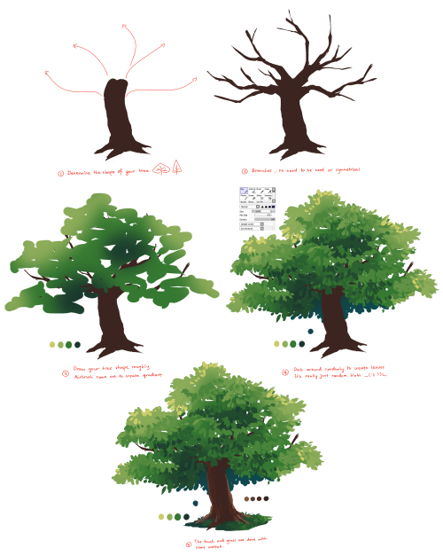
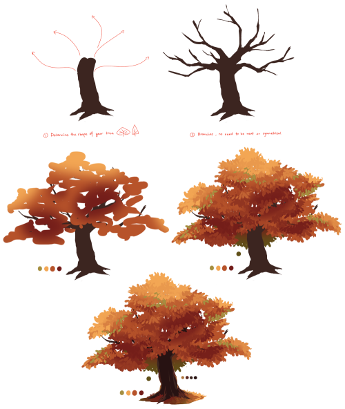
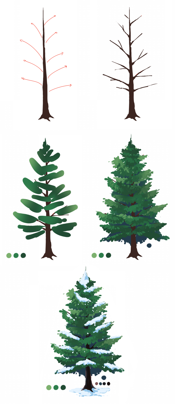
Hey, is it okay if you like do a tutorial on trees and shrubs? PS: I looooooove your art and tutorial they are just soooooo wonderful, inspiratonal, amazing.
aww thank you so much!! ;v; haha well I don’t know a lot of trees so here’s two I actually know lmao, oak tree and pine tree I will go study more tree names when I have the time ohgosh _(:3 7 hope it helps!


Imperial Guard Officer Horse Grenadier Sword
Dated: 1811
Maker: Lefevbre Paris
Culture: French
Measurements: overall length 1.17m; weight 1.964kg; weight without scabbard 1.28kg
The sword features a brass and leather scabbard similar to the second model for the Horse Grenadier troop sword. This particular model could have also belonged to the Empress’s Dragoons or to an officer of the Cuirassiers since the steel blade is straight and not curved. In any case it did belong to an Heavy Cavalry Officer from Napoléon Army. It is marked with the manufacturer’s name “Lefevbre Paris”, while the scabbard tip is marked "ND”.
Source: Copyright © 2016 Sword Collection


Really usefull
I'm kinda ashamed to ask this, but could you make a tutorial on how to draw hands? ;A;
omg dont be ashamed at all!! Hands are generally tough to get used to, lots of artists struggle with it! so dont be ashamed i feel you.
and I actually have made a hand anatomy guide before in fact! If you want to get better at drawing hands I def recommend you learn the basic anatomy first. Please check out the ones I made, I try to make it simple and easy to understand:
Artistic Anatomy: Hands Part 1
Artistic Anatomy: Hands Part 2
There’s my guide to the anatomy, but here’s some more tips that I’ve noted to myself that I’d like to include
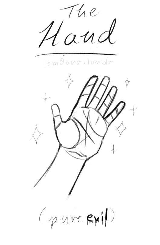
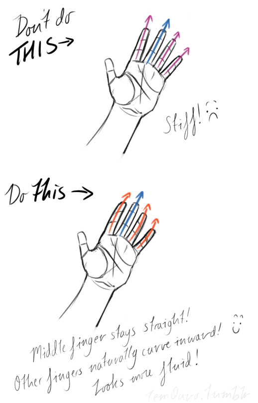
First off, I’d like to just note on the fingers: if you pay close attention to your own hand, you may notice the fingers are ever ever so slightly curved inward. It’s a very subtle detail, but I noticed that, despite how slight it is, it can make a hand look more lively, and less stiff.
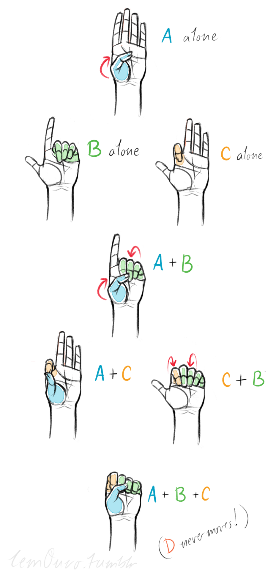
Second, the “M” on the palm! Your hand moves in many ways, and because it does it creates creases in your hand. The most prominent creases appear to make an M shape; this is handy to remember for what I’m going to talk about next. (It also could be a “W” I guess, or to be more specific a “ )X( “; just think of it in whatever way helps you remember!)

SO now that you see the M, draw your hand as a basic blocked shape and add your details. As you do, you can see that the M divides the palm into four basic parts!


When the hand moves, parts A, B, or C of the palm, alone or in different combos, will create the general poses that the hands do normally. These parts are the parts that move, with D being stationary, no matter what!
Here’s a chart of all the possible combos. Once you have down what part of the hand moves for a certain pose, you can change up the fingers and tweak it a bit to do what you need to make it more specific!
This is simply my method of drawing hands. God knows there are hundreds of tutorials out there by other artists, but personally, this way helps me the best (after learning the anatomy first).
This way I can divide the hand and combine the parts in any such way I need!
Hands take a lot of effort to grapple, and you need to practice them a lot, especially foreshortening of the hand; that’s really something you need to learn through your own studies. Look at your own hands, draw hands from life, from magazines, shows, comics; just draw hands! You’ll eventually figure out a method that works best for you. So to get better at drawing hands; draw hands!! And don’t stress over it, have fun with it!


It seems like all of the resources I can easily find online for identifying wolves vs dogs are either massive and difficult to understand without prior knowledge of the subject, or extremely bare-bones and miss a lot of key information. I tried to hit a comfortable middle-ground. (sorry if it’s a little wordy) This tutorial is made as a reference for drawing, so everything but purely visual differences between dogs and wolves have been left out. I’ve been wanting to make this for a while now, so I’m glad I finally sat down and did it! **EDIT** When it comes to the section on wolfdogs, please take it with a grain of salt. With something as complicated as genetics, they are of course, not going to be as simple as I make it seem. What features different levels of content can display, and even which percentages designate which levels of content are often hotly debated within the wolfdog community. At this point I’ve elected not to change the image set itself because: a. it’s a huge pain in the ass b. this is a tutorial for beginning artists. It’s meant to be a hugely simplified version of the topic, and I’ve stated clearly that it is NOT to be used in real-world identification. ((Huge thanks to yourdogisnotawolf. who’s blog inspired me to make this and for digging up that amazing picture of the wolf/lab mix))


Basically I just shade with a very dark color, and apply a small gradient of some bright saturated color along the borders to emulate diffused light.

Varying light angles and intensity for mood! I love back light HAHAHa–
Can work it in other hues, too! And I guess here’s a quick walk through of smth similar to that pic you were talkin about, with windows of strong light.

Draw the projected light over the subject

Add shadows on the character. Moved the light going past the character hitting the floor.

Overlay the bleeding light!
I use a lot of this kinda thing in finished pics too– here’s a recent example!

(This image was a collaboration– Sketched by labonbull and linearted by 73oss)

Close up of new capelet in ivory :) For all about my designs, see: www.somniaromantica.com ^^


These are all the characters I designed for Spera: Ascension of the Starless Vol 1 (now available in stores: Amazon/bookstores etc). Enjoy!

-
 alpha-hyaenchen liked this · 6 years ago
 -
 derek38 liked this · 6 years ago
 -
 uncleflaco liked this · 6 years ago
 -
 artreferencecafe reblogged this · 7 years ago
 -
 spockemma liked this · 7 years ago
 -
 vec-loves-these reblogged this · 7 years ago
 -
 aerstic-spire reblogged this · 8 years ago
 -
 amaatii liked this · 8 years ago
 -
 kaelyn92 reblogged this · 8 years ago
 -
 8bitpixelheart reblogged this · 8 years ago
 -
 nitrousoxide90 liked this · 8 years ago
 -
 nerdiestnug liked this · 8 years ago
 -
 mumblefox liked this · 8 years ago
 -
 mossyhobgoblin liked this · 8 years ago
 -
 nereusthings liked this · 8 years ago
 -
 thefiresabove liked this · 8 years ago
 -
 nuclearkielbasa liked this · 8 years ago
 -
 nocti-luca liked this · 8 years ago
 -
 withthespring liked this · 8 years ago
 -
 mizushiba liked this · 8 years ago
 -
mizushiba reblogged this · 8 years ago
-
 wonderwars liked this · 8 years ago
 -
 bonsquiggle liked this · 8 years ago
 -
 heraldsrest reblogged this · 8 years ago
 -
 schokoobananaa liked this · 9 years ago
 -
 iscarium reblogged this · 9 years ago
 -
 brennahogarty liked this · 9 years ago
 -
 aldreaoakley reblogged this · 9 years ago
 -
 cazymenow reblogged this · 9 years ago
 -
cazymenow liked this · 9 years ago
-
 seaderg liked this · 9 years ago
 -
 earl-goupil reblogged this · 9 years ago
 -
 turkishowl liked this · 9 years ago
 -
 gayboysupreme reblogged this · 9 years ago
 -
 mysticartx reblogged this · 9 years ago
 -
mysticartx liked this · 9 years ago
-
 kamiporterbridges reblogged this · 9 years ago
 -
kamiporterbridges liked this · 9 years ago
-
 iwozlegit liked this · 9 years ago
 -
 ref4theartists reblogged this · 9 years ago
 -
 myjustmilkastuff-blog liked this · 9 years ago