zelo-ref
Reblog, inspiration & reference
403 posts
Latest Posts by zelo-ref


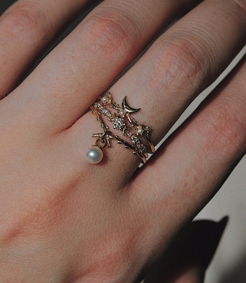
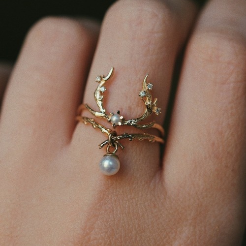

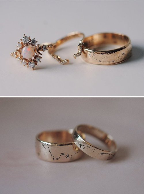

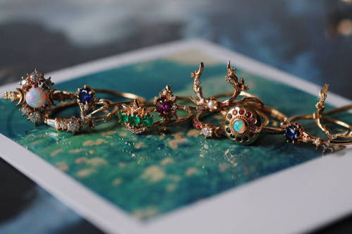
Rings by Sofia Zakia on Etsy
See our ‘rings’ tag
Really usefull
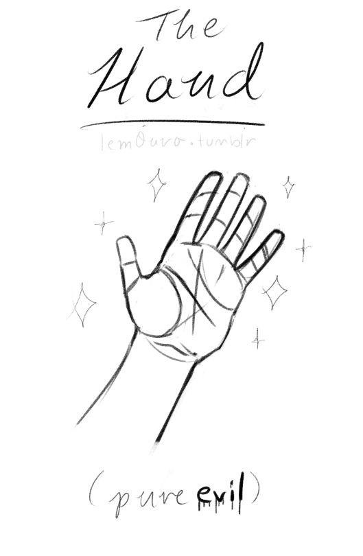
I'm kinda ashamed to ask this, but could you make a tutorial on how to draw hands? ;A;
omg dont be ashamed at all!! Hands are generally tough to get used to, lots of artists struggle with it! so dont be ashamed i feel you.
and I actually have made a hand anatomy guide before in fact! If you want to get better at drawing hands I def recommend you learn the basic anatomy first. Please check out the ones I made, I try to make it simple and easy to understand:
Artistic Anatomy: Hands Part 1
Artistic Anatomy: Hands Part 2
There’s my guide to the anatomy, but here’s some more tips that I’ve noted to myself that I’d like to include
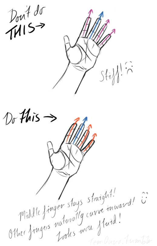
First off, I’d like to just note on the fingers: if you pay close attention to your own hand, you may notice the fingers are ever ever so slightly curved inward. It’s a very subtle detail, but I noticed that, despite how slight it is, it can make a hand look more lively, and less stiff.
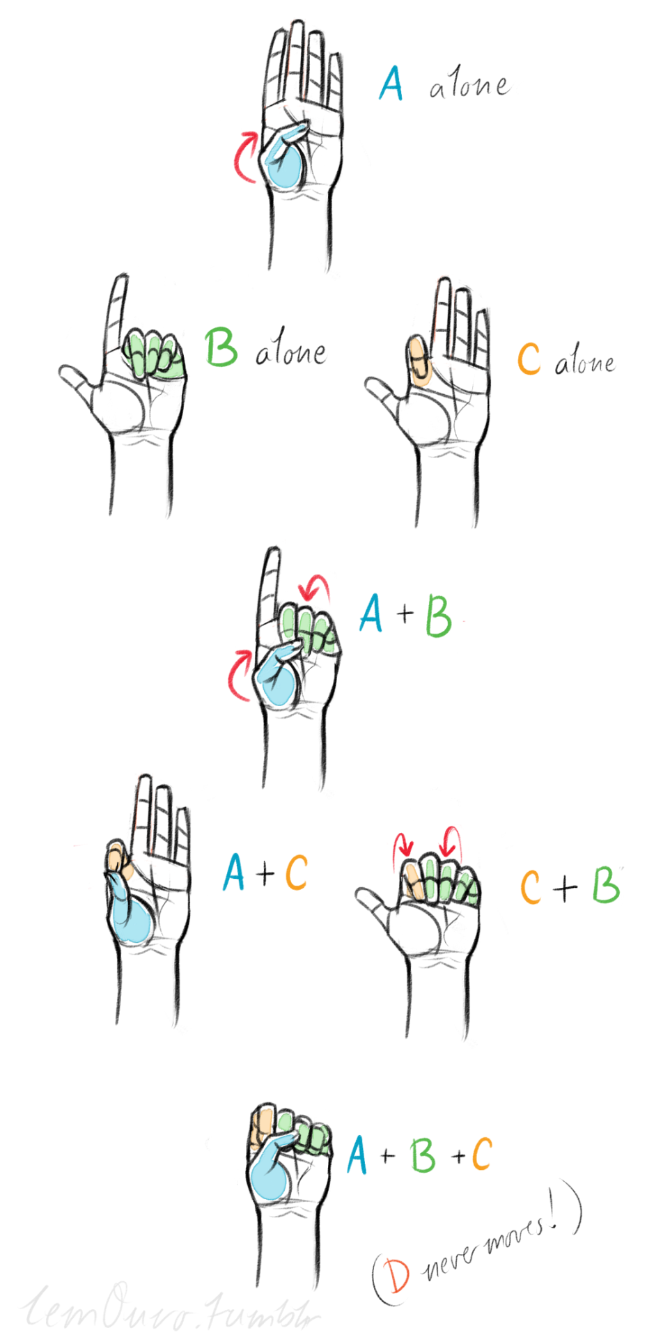
Second, the “M” on the palm! Your hand moves in many ways, and because it does it creates creases in your hand. The most prominent creases appear to make an M shape; this is handy to remember for what I’m going to talk about next. (It also could be a “W” I guess, or to be more specific a “ )X( “; just think of it in whatever way helps you remember!)

SO now that you see the M, draw your hand as a basic blocked shape and add your details. As you do, you can see that the M divides the palm into four basic parts!


When the hand moves, parts A, B, or C of the palm, alone or in different combos, will create the general poses that the hands do normally. These parts are the parts that move, with D being stationary, no matter what!
Here’s a chart of all the possible combos. Once you have down what part of the hand moves for a certain pose, you can change up the fingers and tweak it a bit to do what you need to make it more specific!
This is simply my method of drawing hands. God knows there are hundreds of tutorials out there by other artists, but personally, this way helps me the best (after learning the anatomy first).
This way I can divide the hand and combine the parts in any such way I need!
Hands take a lot of effort to grapple, and you need to practice them a lot, especially foreshortening of the hand; that’s really something you need to learn through your own studies. Look at your own hands, draw hands from life, from magazines, shows, comics; just draw hands! You’ll eventually figure out a method that works best for you. So to get better at drawing hands; draw hands!! And don’t stress over it, have fun with it!

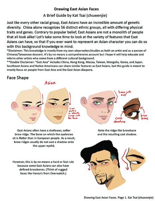
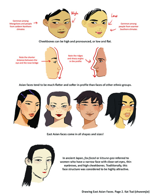

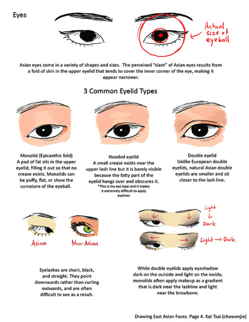

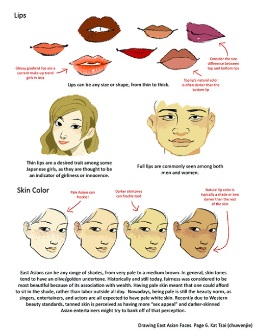
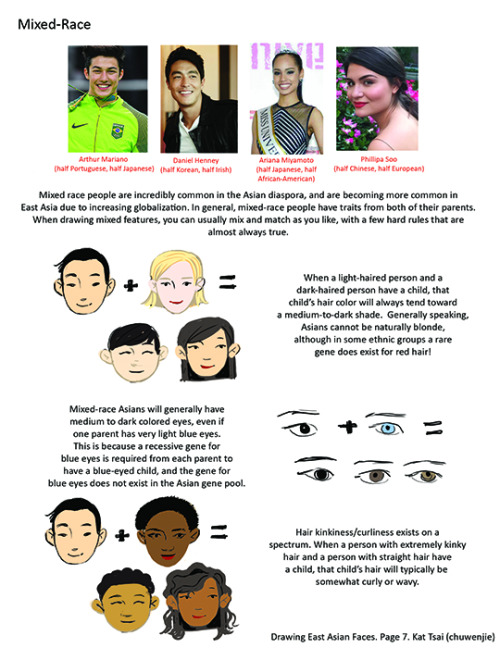
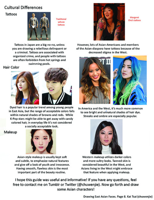
A compilation of stuff I know about drawing Asian faces and Asian culture! I feel like many “How-To-Draw” tutorials often default to European faces and are not really helpful when drawing people of other races. So I thought I’d put this together in case anyone is interested! Feel free to share this guide and shoot me questions if you have any! I’m by no means an expert, I just know a few things from drawing experience and from my own cultural background.

Jacket
Elsa Schiaparelli, 1937
The Philadelphia Museum of Art
Beating Brush Lag in Manga Studio

Booooooooo… what is this, Photoshop?!
Lagging brushes are an occasional problem in any illustration software. Here’s a troubleshooting guide for Manga Studio if your tools are acting like molasses. (Some settings may be different on Windows or if you’re running the Clip Studio Paint branding of the software. For what it’s worth, I’m running Manga Studio 5.0.3 on Mac OS 10.7.5. Yup, I’m behind the times.)
There are a few options to beat the lag:
1. Quit Stuff Bye bye, YouTube. See ya, Skype. Later, Tumblr.
Save your computer’s processor by quitting RAM-hogging apps and tasks while painting. Streaming audio/video will drastically reduce performance, but even leaving browsers open can slow things down, so best to just close it up. Guess that rules out Spotify, but then there’s always ye olde Zune. Gotta love cringing through those high school playlists while working.
2. Change Preferences Easier than changing your mind, and quicker too.
Check under the hood of Manga Studio’s Preferences for a few speed boosts. Do the following in these sub menus:
Preferences/Tablet/Tablet Settings: Change from 1 to 6 (I believe this option is Mac only).

Preferences/Performance/Undo: Lower the Undo count. Try taking it down 10-15 notches from default. You could also turn up that long-titled setting (“Delay before recognizing new object…”) by 100 ms, but I haven’t figured out what that does exactly…
Preferences/Cursor/Display Position of Reversed Cursor: Make sure to check “No Delay”.
After changing preferences, it’s a good idea to close and reopen Manga Studio.
3. Modify Brush Tool Settings Your brushes may take it personally, but remember you’re in charge here.
The Tool Settings window is a wealth of options for customizing brushes. Some are more processor-intensive than others. Here are a few of the best ones to modify: (Note: the look and behavior of brushes may be affected. You may want to duplicate and/or export a brush before changing its settings.)
Tool Settings/Anti-Aliasing: Turn down to “Little” or “None”
Tool Settings/Brush Tip: Reduce the number of materials on your brush.
Tool Settings/Stroke/Space: Increase spacing, but not too much. Brushes are essentially a string of material stamps. A low space setting means a smoother brush, but more work for your computer. Picture it frantically scrubbing a rubber stamp across your canvas. On that note, also make sure Continuous Spraying is not on.

Tool Settings/Watercolor Border: If your brush uses this setting, turn on the “Process After Drag” option. This renders the effect after each brush stroke and saves computing power.
Tool Settings/Correction: Turn off (or decrease) Stabilization, Post Correction, and Brush Stroke.
Tool Settings/Starting and Ending: Turn off all this stuff. Pfffft, who needs it, right?
Here’s a speed test after fiddling with some settings:

Woooooooo! We’re getting faster! Still a bit laggy, which leads to one last tip:
4. Rework The Canvas Might as well rework my life goals too.
Okay, disclosure: The two gifs in this post were recorded on a 4500x3000 canvas at 300dpi with a size 500 brush to emphasize lag. This third one is recorded on a 1080x720 canvas at 72dpi with a size 100 brush:

Yes! We’re cruising now!
Canvas sizing and resolution has a big affect on brush performance. It’s a bit of a conundrum. Getting the best image quality means working at a minimum resolution of 300dpi, which can be taxing for brushes on large canvases. So what to do? Just like traditional paintings start with thumbnail sketches, digital work can start on a low-resolution canvas. Here’s the method:
Set up your canvas normally at the full target resolution. But before drawing anything on the canvas, use the handy tool under Edit/Change Image Resolution. Reduce Resolution to 72dpi. Use this smaller canvas for rough sketching, background filling, blocking in large areas of color, etc. Then increase resolution to 144dpi for building up the body of the painting, still keeping it loose. (I’d recommend switching Interpolate to Hard Outline when increasing resolution.) Finally, blow it up to full resolution and get into the nitty gritty of rendering. This is where you’ll do the crisp line work, highlights, details, etc.

The idea here is to work big to small. This will keep away brush lag by using large brushes on small canvases. As the canvas resolution increases, decrease brush size and work smaller, tightening things up in the process. NOTE: Increasing canvas resolution causes pixilation. Don’t worry about it. This can be cleaned up in the final stages of painting.
Hope this guide is helpful! If lagging persists, remember to check drivers and tablet settings as well. If all else fails, Google’s a good friend ;)
-Armin


ELIZABETH ARDEN PARTY DRESS, c. 1955
White lace outlined in black & trimmed w/ rhinestones & black velvet band at neck, fitted, full skirt w/ irregular cut-out hemline


Hey, friends!
It’s Meg! Sorry about the late TUTOR TUESDAY, but I’m here! Today we take a look at drawing environments! This uses our last tutorial on perspective, so if you haven’t check that out! If you have any recommendations, send ‘em in here or my personal! Keep practicing, have fun, and I’ll see you next week!
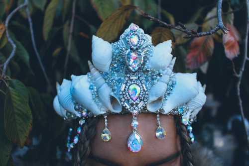
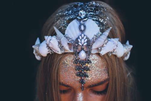
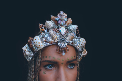
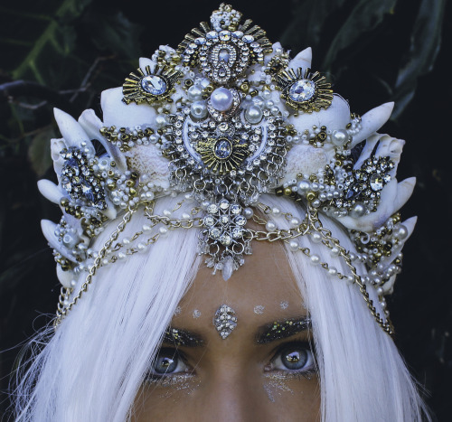
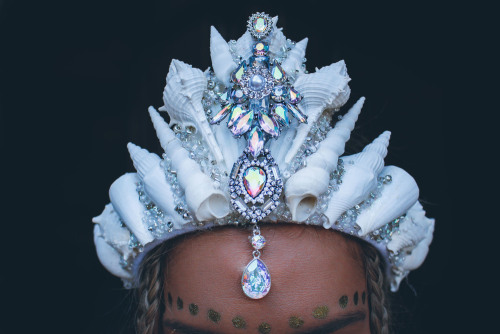
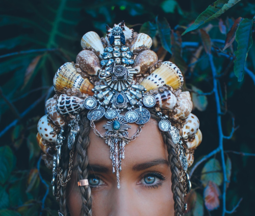
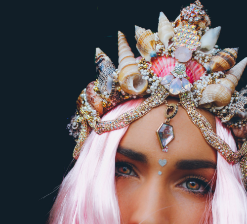
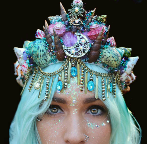
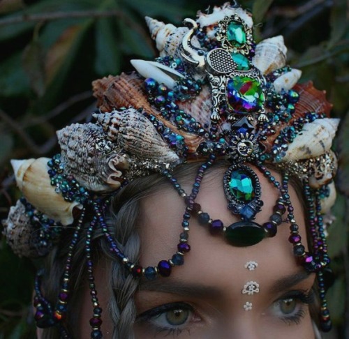
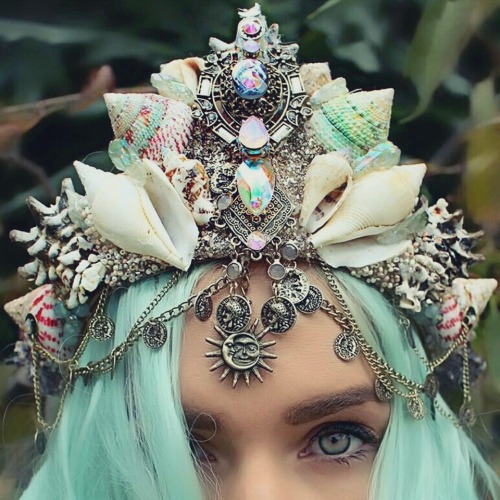
“Mermaid Crowns” by Chelseas Flowercrowns
Chelsea started as a florist in Melbourne, Australia when she was a teenager and has always been passionate about nature and floristry. She then began to create flowercrowns to cover her scar on her forehead, which was a result of an incident when she was just a baby. At the time flowercrowns were just beginning to be sold in shops, however majority of other crowns lacked detail and individuality. Chelsea saw this as an opportunity to not only create crowns for herself, but for others around her who wanted something different yet beautiful.
Over time, she expanded her range to Mermaid Crowns which have taken the world by storm. Her Mermaid Crowns allow girls alike to be the mermaid they always dreamed of since being a little girl.
Follow her journey via social media, and if you would like to access your inner Ariel, purchase a crown from her shop or etsy.
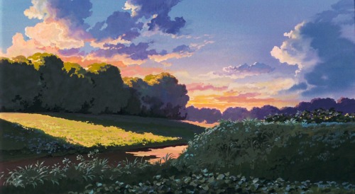

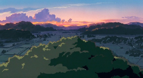
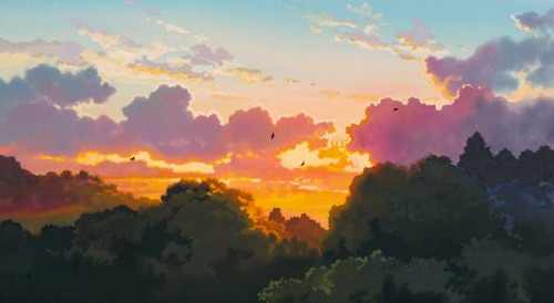

Cloud Strewn Skies Of My Neighbor Totoro - Art Director Kazuo Oga (1988)

That’s right folks, following the unbelievable response we’ve had to these tutorials, I’ve licensed a BRAND NEW SECOND SERIES of tutorials to a mystery publication (may not be a mystery to some of you!). This means that in addition to the FREE TUTORIALS I’ll be dropping here on Tumblr and around the web each week, there’ll ALSO be a DIFFERENT, 2ND tutorial every week for you, should you wish to subscribe. Full details coming on FRIDAY! Here’s a little peek at a section of one of the 2nd series’ tutorials, which looks at how to THINK when you draw RUNNING FIGURES… And if you want ALL MY OTHER TUTORIALS so far for FREE, just go HERE and HERE! Lorenzo!
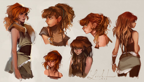
So happy to finally be able to share this! It’s some early concept art of Aloy, the lead character of Horizon: Zero Dawn. I worked on this character together with the rest of the character team for a few months in 2013. It was a huge honor working with Guerrilla Games and their inspiring, talented team. I loved working on this character! These images can be seen in this neat featurette about Aloy: www.youtube.com/watch?v=bw5Jnh… as well as in the artbook that comes with the collector’s edition of the game! Images © Sony and Guerrilla Games.
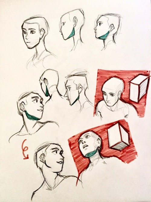
a study on drawing heads at different angles :V
Do you have any tips for drawing round ladies? :D
Hiya anon!
Well, I’m still learning myself, but here’s a few tips I usually keep in mind!
1.) “Fat” is not just a big belly!

Fat distributes everywhere, but not necessarily equally! Like at any weight, every body is different and has an unique shape! Some keep a hourglass shape, some become more pear-like, some are shaped like teardrops or apples… but the basic thing is, fat doesn’t just choose one place where it WON’T gather. It may not be as visible in some area compared to another, but in real life, it’s reeeeaaaaalllllyyyy rare to just find a person whose fat only stores in their bum, thighs and tits, leaving their waist, arms, neck and etc slim. Keep the body pleasant and thick all around, not just in the places where the weight-gain is the most imminent!
Keep the round shapes in mind!
2.) Rolls! Folds! What are they?


What are they? Not something to be afraid of, that’s for sure!
Basically, don’t hesitate to give your characters fat rolls. Skin folds, stretches and moves along with the body, and so does the fat under it! However, a lot of people who draw rolls tend to give the character many super small ones — this is not how rolls work! Usually, the thicker the person, the thicker the rolls — they increase in size, not necessarily in number.
Rolls are the most preminent in places where the body moves the most, AKA the joints. Fat folds over itself and creates creases and ‘rolls’.
3.) HOWEVER….
(No references here, sorry!!!)
When we age, our skin loses its elasticity and it can’t keep the rolls and folds thick and perky. In our youth, our weight can be held up way better than in our elderly days due to the stength and adaptivity of our skin which disappears as we age. Thus, fat tends to droop lower with older people, and the rolls appear thinner. This can also happen if someone who has had a LOT of weight packed up suddenly losing a big chunk of it — the skin can’t adapt and will begin to “droop“ down and lower. Make sure to keep such factors in mind when drawing and planning how the weight of your characters should be carried!
And then, a lil tip that;
4.) Study references and real life!
If you yourself pack some weight or have access to internet, libraries or just life on the street, you will see how bodies at different weights and shapes work and move. Use references, see for yourself — try to find how fat distributes and especially, HOW IT FOLDS! Folds and rolls seem to be one of the biggest problems many have while drawing thicker characters, and that’s ok — we’re taught as a society that fatrolls are inherently bad and disgusting, therefore there are not many situations where we’d find ourselves just… staring and studying how the fat in our bodies works and moves. You’ll learn quickly, though!
I’m still learning myself, but especially since every body is different and the weight we pack acts in unique ways, it can be really challenging to find the ‘absolute’ right way to draw thicker characters. Don’t give up! You’ll get the hang of it eventually!!
Dealing with ART BLOCK

INTRODUCTION
Path of art is a path of struggle. A path that one time can be easy and appealing, quickly leading you to its destination, but the other time it can be full of obstacles or even blocks… art blocks.
What is an art block? Various artists from around the world seem to refer to ‘art blocks’ every time they have troubles producing new works. The cause and process of typical art block will differ from one person to another, but generally speaking: everything that prevents you from creating art, despite all the opportunities, can be called an art block. Although very common, art blocks can lead to some serious issues like loss of confidence, no motivation to improve or even fear of drawing (to avoid disappointing oneself).

In this little article I’ll do my best to tell you how to deal with this biggest artistic illness!
Afficher davantage

I’m sure Vaja is having a lot of fun with that cape.


Summer dress, 1860′s
From the John Bright Historic Costume Collection


(via Walking costume | Bosworth, Frederick | V&A Search the Collections)
London (made)
c. 1908 (designed)
Bosworth, Frederick (designer)
Wool, silver thread, silk braid, lined with silk


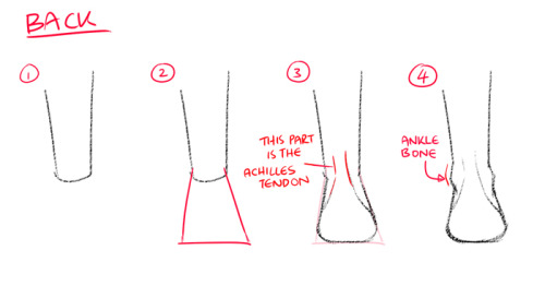

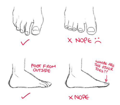


How to draw feet

Jean Paul Gaultier, ss2007, Couture
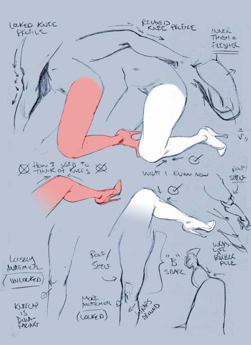
Knee notes for patrons :)
https://www.patreon.com/thepaulrichards

Dolce & Gabbana at Milan Fashion Week Fall 2012
Hello! I'm a self taught artist who wants to get better at shading/lighting and backgrounds especially. But whenever I try to do a background study, I can't break it down and it ends up looking terrible. Do you know of anything that would help?

Hi! I would like to talk a little bit of the thought process behind photo study and the importance of simplicity.

It is really important to break down an image to chunks of value rather than seeing the detail first, which can lead to over-complicated mush of colors with no constructed value.
These are some of the artists that inspired me to get used to breaking down images in the most simplest way possible:

Notice how super simple and straight-on-point his thumbs are? And this is how his colorscript for Moana looks like:


Zero detail. Yet you have all the information you need!
I personally think these thumb studies are super important to train your eyes to break down an image in values and colors and therefore be able to organize and design your painting better.


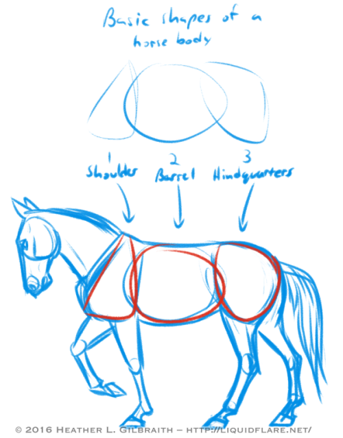

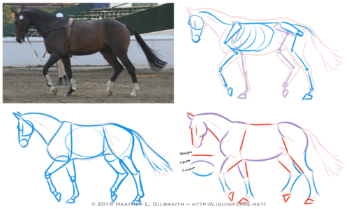
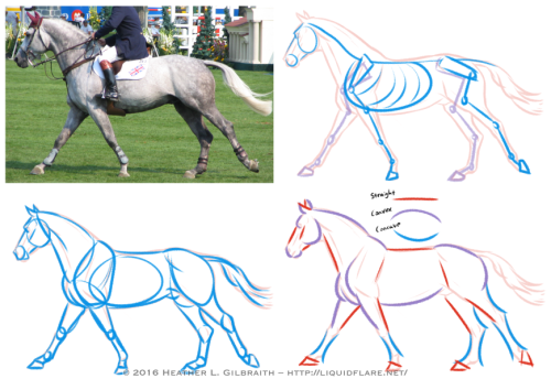
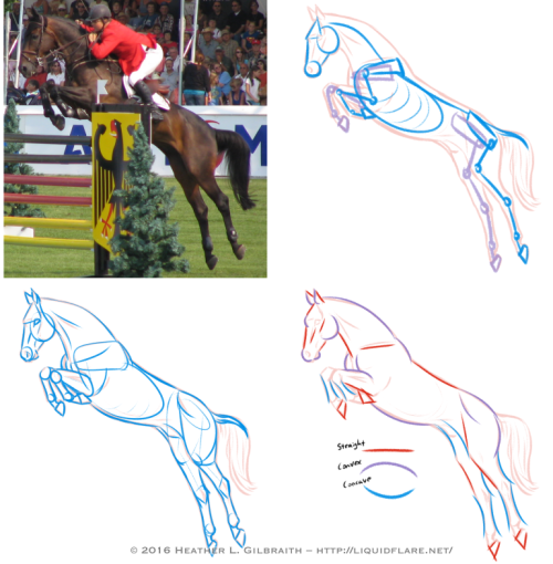
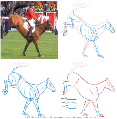
– Horse Drawing Tips –
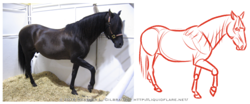
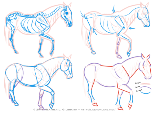
Hello, all! I thought I’d put this together to try and give people a place to start when trying to learn about and understand horse anatomy. Drawing horses, like anything else, definitely requires some work and observation to be able to draw confidently, but some of the these ideas/tips can help you find ways of analyzing references and simplifying forms to make the journey easier. Drawing horses doesn’t have to be scary! Read on for some notes on the drawings above…
Basic Shapes of a horse body:
Use these shapes to help you block in the body forms of your horse and to help you simplify the anatomy of the horses you draw. When you study photos of horses, try to see how these shapes move/stretch in relation to the horse’s pose/action.
Horse Anatomy Studies:
1) Standing/Walking:
a. Reference photo – Start with a photograph that you’d like to study. Try to choose a clear one with visible anatomy (obscured as little as possible) and interesting shapes.
b. Outline – The outline gives me a point to start from to analyze the anatomy of the horse from the photograph. I use it as a guide for the next few steps.
c. Skeleton – The skeleton usually takes too much time to do with every photograph, but it’s very helpful to be aware of the bones of a horse, so you know what you’re working with. Do a few of these with a drawing/photograph of a horse skeleton for reference and familiarize yourself!
d. Simplified Skeleton – Then draft out a quick, “simplified” skeleton. Try to block out the important angles, joints, and important anatomy reference points, such as the shoulder/elbow bones and the hip/knee bones. These angles will go a long way to helping you get the proper feel for a horse and the way its body naturally moves.
e. Simple Block Shapes – From there, block out the forms of the horse. Keep the skeleton in mind, but be aware of the masses of muscle and fat that moves with and covers the bones. Find ways to simplify the shapes that work for you, and try using these shapes in the future when blocking in a drawing of a horse.
f. Curves vs. Straights – Juxtaposing curved (both concave and convex) and straight lines helps to emphasize the anatomy, and add a pleasing sense of rhythm to your drawing. Experiment with emphasizing convex curves vs. concave curves, or straights against curves, etc., to get a look that is pleasing to you and also compliments the horse’s anatomy.
2) The Trot: The trot is a horse’s natural “jogging” gait, the next gait up from a walk. When trotting, the horse almost always has at least one, usually two, hooves on the ground at any moment. Remember that in most cases, horses walk/trot/canter/etc. with opposite legs moving together or in sequence; for example, right front leg raised, and left back leg raised, while the other two legs (left front leg and right front leg) are bearing the weight. Remember this when sketching your horse’s pose! (The exceptions to this are pacers and Icelandic horses doing the “tolt”, feel free to look them up!) When drawing this gait, it is sometimes helpful to emphasize the two opposing legs that mirror each other; with two legs straight/weight-bearing, and too legs extended/bent/moving. Keep the opposing legs in tandem with one another and you’ll have this gait down!
3) The Canter/gallop: Cantering is a horse’s natural running gait. In this gait it’s possible for all of a horse’s hooves to leave the ground for a moment with each stride. If a canter is a horse’s equivalent a human’s run, then a gallop is a sprint; in a gallop a horse reaches its maximum stride length and speed, though they don’t have the endurance to keep a full-on gallop up for long. When drawing the canter, watch out for which legs are bearing the weight and use that the guide you. (In my photo example, the right back leg and the left front leg are currently bearing the weight, with the right front leg about to take the weight to allow the left front leg to raise. Ugh, complicated…!)
4) The Jump: It’s when jumping that a horse reaches its maximum “stretch”! Keep in mind that a horse’s back is not very flexible (which is what makes them great to ride!), so try to keep that spine straighter/stiffer than you would for a dog or a cat. Bending the horse’s spine too much will start to make it look broken, or at the very least, very old and decrepit, as horse’s spine starts to bend/sag with age.
5) The Landing: To emphasize the weight of a horse coming down on its front hooves, be sure to bend it’s “toe joint”, or pastern, so that its fetlock or knuckle joint is nearly touching the ground. Let that joint bend to absorb the shock of the landing!

Try to avoid these common anatomy mistakes when drawing horses. Study photos and the horse’s skeleton/anatomy to avoid these! (And seriously, please forgive how horrible these drawings are! I literally whipped them up in only a few minutes, haha…)
Afficher davantage

1634 Anthony van Dyck - Gaston de France, duc d'Orléans


Assassin’s Creed concepts from 2005. part 2/2

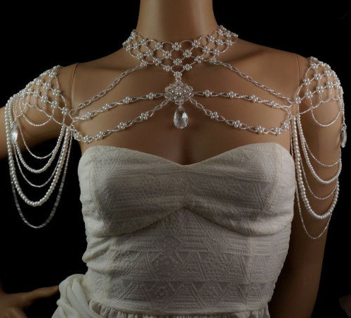

Swarovski white shoulder beaded necklace. This elaborate and sensuous off the shoulder beaded necklace is lavished in pearl and crystal. A silver Czech glass choker woven with clusters of Celestial glass pearl caresses the neck, attached to a center focal of Preciosa crystal and Celestial pearl, framed with woven silver Czech glass. Intricately designed shoulder epaulettes of pearl and silver Czech glass are connected with strands of Czech glass and pearl, and a Swarovski crystal white patina pear pendant sits at the end of each shoulder and the bottom of the chest pendant.

Costume for La Mer de Glace, act III, 1909
(Robe en satin de fil métallique argenté ornée de sequin et perles tubulaires parsemées et brodées de duvet de cygne blanc) Ballet-opéra by Jean Lorrain, music by Charles Silver Nouveau Musée National de Monaco [photo Mauro Magliani and Barbara Piovan, 2010]
Source/Source