Basically I Just Shade With A Very Dark Color, And Apply A Small Gradient Of Some Bright Saturated Color


Basically I just shade with a very dark color, and apply a small gradient of some bright saturated color along the borders to emulate diffused light.

Varying light angles and intensity for mood! I love back light HAHAHa–
Can work it in other hues, too! And I guess here’s a quick walk through of smth similar to that pic you were talkin about, with windows of strong light.

Draw the projected light over the subject

Add shadows on the character. Moved the light going past the character hitting the floor.

Overlay the bleeding light!
I use a lot of this kinda thing in finished pics too– here’s a recent example!

(This image was a collaboration– Sketched by labonbull and linearted by 73oss)
More Posts from Zelo-ref and Others


hi there!! may i ask if you have any tips when it comes to making a color palette/picking colors? the colors of your finished pieces (and even your wips) are always amazing to look at!
ALRIGHT ANON BRACE YOURSELF. I spent a really long time on this sO HERE COMES A REALLY INTENSIVE COLOUR TUTORIAL AKA Houdi learns much in college painting classes.As usual, we need sth to work with so we’re gonna use my OC Anna. Everyone, meets Anna.

Anyway, every drawing starts with a sketch. We have a sketch plus a crash course on warm and cool colour idk why I wrote “hot” and “cold” here but whatever it’s late.

ANYWYAY, what you’ll need to know is red = warm and blue = cool. Anything deprived from these two are gonna be either cool or warm based on the colours surrounding them, so there is no in between. And an important thing related to palette is the line colours. If you’re painting without lines then it doesn’t matter, obv. But choosing the line colours for your drawing is very important. I used to do dark red but HAHA no. Lately I’ve been enjoying a lot of greyish purples and blues, since they’re pretty dark and neutral.
While we’re at it, let’s talk grey. Below is a horrible chart of complementary colours –> greys.

Idealy, they all should be cool machine grey. But alas, I’m not pulling out my oil paint for this and I can’t really blend digitally like I blend tradinationally sO WHATEVER. Anyway, greys are important in your piece. At least for me. It calms the colours down if it’s too vibrant, and lets the eyes travel throughout with ease. I’ll show you the differences later!


Now on to the actual colouring. Usually I start out with the lightest and then shade. Here I’ve blocked out the part where I want the shadow to be. What I do when I choose colours to shade is I use a warm and cool colour, not neccessairly complementary. It depends on which colours you like. I would advise to not use too saturated colours as of yet. I would blend those colours out, and choose the greyish/greenish colour they make. Sometimes you would get purple too, I usally just choose it from the colour wheel if I need it.


Now is the time to choose a darker slightly more saturated colours for the shadows. And just, blend everything until u die. More layers of shadows adds more depth, but it’s also can destroy all your colours altogther, so I suggest 3-4 shades + blush (is applicable) at most. (Althought 5 is when the fun really starts. It’s also kinda advanced and I suck at it lol)

Anyway, colouring lines makes the face lit up.
Hair. Same process.


For the clothes, I chose a really de-saturated blue, and a yellow that’s not too bright. You can see the most saturated thing right now on her is the hair, the eyes, and the buttons on her collar.

Below I have messed around with the saturation. And while to each their own (I kno, that really saturated one might look temtping but stay with me), if you’re just starting out with colours, try to use a more variety of saturation. Too saturated makes it very hard on the eyes, and the printing is gonna be hell on Earth. Too much de-saturation is just meh for me. Ofc, there are artists who utilizes these colours very well, but they know when to and not to abuse them. Just play around and see what you like. BUT TRY AND USE SOME GREYS THEY ARE MAGICAL. And no absolutely no black for shading. Just don’t. please.

Anyway, filters. I like overlaying. Just don’t abuse it cause when you’re doing traditional art after this you’ll cry.

Here’s some colour relationship charts I had to do in college lol it was really hard to mix them with oil paint.

I hope that was useful for you anon! There is another question for how I do BG and PLEASE BE PATIENCE WITH ME IT’S TAKING A VERY LONG TIME TO COMPILE THINGS TOGETHER ;;;;;


anyway here’s some river story stuff

Day dress, 1860′s
From the Museo de la Moda via the Museo del Romanticismo on Twitter

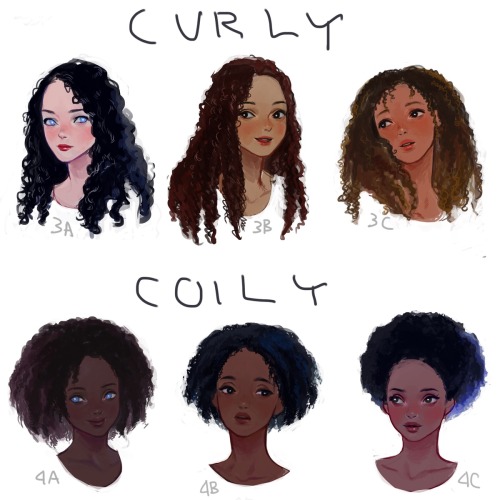
I drew a visual hair type classification guide. I thought I’d share it here. Mine is between 1b-1c.

Is there any chance you could give some tips on how to get better at accuracy? I feel like no matter how much I practice, I can't get poeple to look right. Even if I trace, it doesn't look right (which is funny to me considering how often people accuse you of tracing--seriously have they ever tried it?). You make it look so easy, and I feel like it's the hardest part of drawing.
Okay three things first:
It is the hardest part of drawing.
Tracing will actually set you back unless you do it the right way.
You don’t have to be accurate to make good art.
I grabbed a random screencap to show you how I do it (keep in mind that I’ve made thousands of drawings at this point in my life, so a lot of this is stuff I don’t even stop to think about anymore, so I apologize if any of my advice sounds muddy or confusing):

The first thing I do is note the positive and negative spaces and distances between them (marked in pink and blue below):


I reversed the colors so you only see the spaces for what they are. Look at the black space in particular because that’s the barrier between the two major halves of the entire space.
I also note the angles of things:

And then I start to sketch.
First I break up the space and mark out the major axis of the figure (a good rule of thumb with figures is to draw where their spine would be, and perhaps where their shoulders are as well—you don’t have to do it this way of course but if you’re having trouble seeing an axis, it can be helpful):

Then I start to mark out the major shapes, using each previous set of marks to help me refine things. Some people use circles or scribbles or even whole chunks of light and dark. There are an infinite ways to block out a drawing, but I’ve found that angles and lines work best for me:


You’ll see above that I made a cross for his face the same way I made a cross for his body to marke the center line and where his eyes would be. If you want to practice these angles, something like a fashion magazine works great. Get some paper and just flip through each face and try to copy the angles you see.
Anyway, so then I slowly refine details using the lines and angles to help me see how things are shaped. I can build the shapes of fabric and muscle over the angles as if they were a wire skeleton:


And that’s basically it!
Now, to address tracing…
There are two ways you can use tracing to help you. The first is to pinpoint landmarks, like the corner of a shoulder or the eyes. You can do this by making a dot—and only make as many dots as you absolutely need. Too many, and tracing becomes a crutch, and you want to help yourself learn, not skip over learning. I don’t recommend tracing any lines.
You can also use tracing to repair what you’ve done.
Here’s my sketch overlaid onto the screencap:

It’s pretty good! I don’t have to fix it if I don’t want to, but if I want, I can use tracing to mark the places where things are a little off:

And then I can go back and adjust.
This trick is really useful for helping you see the mistakes you keep making so that you can work at correcting them. For example, I tend to make eyes too big and shoulders too wide. I don’t always need to fix that, but this method helps.
The idea isn’t to make drawing easier but to make learning easier, you know? That’s why you want to be careful with tools like tracing (or even gridwork) because you’ll find that you’re not giving yourself enough of a chance to learn. That’s also why tracing can’t replace skill.
Anyway, like I said, you don’t have be accurate or mechanically perfect to make good art. These are just some tips to help you see in observational art and to be more confident. But remember that sometimes the best and most beautiful art is a mechanical mess.
Here’s Van Gogh’s room as proof:

Good luck! <3


![[full Size]](https://64.media.tumblr.com/702d549c20986abd58a697c0341b09e2/tumblr_mocui8MFjd1rfiet9o1_500.jpg)
[full size]
This is perhaps approaching graduate level information as far as digital costuming is concerned, but I think that the more fidelity professional game artists have access to, the more mindful the details ought to be. This is especially true in the case of low-tech/medieval/pre-industrial fantasy where everything in the world is handmade; these little details are really crucial to selling that look.
-
 recsources reblogged this · 2 years ago
 -
 demoruu liked this · 3 years ago
 -
 dohorwarmautumn liked this · 3 years ago
 -
 toxicsponge456 reblogged this · 4 years ago
 -
 art-refrence-stash reblogged this · 4 years ago
 -
 starieldreamer reblogged this · 5 years ago
 -
 wildlyunabashedstudent-05ec6bef liked this · 5 years ago
 -
 mafiachicken liked this · 5 years ago
 -
 deep-nerd liked this · 6 years ago
 -
 fourends reblogged this · 6 years ago
 -
 susahnasomething liked this · 6 years ago
 -
 arte-sei reblogged this · 6 years ago
 -
 turtwiggles reblogged this · 6 years ago
 -
 plutxbug liked this · 6 years ago
 -
 drakara liked this · 6 years ago
 -
 starry5hark reblogged this · 6 years ago
 -
starry5hark liked this · 6 years ago
-
 alex-the-mediocre liked this · 6 years ago
 -
 planetcrayon reblogged this · 6 years ago
 -
 koo-maeda liked this · 6 years ago
 -
 nemesisvariant liked this · 7 years ago
 -
 anon-star liked this · 7 years ago
 -
 xirosh reblogged this · 7 years ago
 -
xirosh liked this · 7 years ago
-
 jcathryn88-blog reblogged this · 7 years ago
 -
 nothingoingon liked this · 7 years ago
 -
 odd-alchemist liked this · 7 years ago
 -
 brillohead reblogged this · 7 years ago
 -
 scarywaves liked this · 7 years ago
 -
 yetanotherreferenceblog reblogged this · 7 years ago