Hi There!! May I Ask If You Have Any Tips When It Comes To Making A Color Palette/picking Colors? The
hi there!! may i ask if you have any tips when it comes to making a color palette/picking colors? the colors of your finished pieces (and even your wips) are always amazing to look at!
ALRIGHT ANON BRACE YOURSELF. I spent a really long time on this sO HERE COMES A REALLY INTENSIVE COLOUR TUTORIAL AKA Houdi learns much in college painting classes.As usual, we need sth to work with so we’re gonna use my OC Anna. Everyone, meets Anna.

Anyway, every drawing starts with a sketch. We have a sketch plus a crash course on warm and cool colour idk why I wrote “hot” and “cold” here but whatever it’s late.

ANYWYAY, what you’ll need to know is red = warm and blue = cool. Anything deprived from these two are gonna be either cool or warm based on the colours surrounding them, so there is no in between. And an important thing related to palette is the line colours. If you’re painting without lines then it doesn’t matter, obv. But choosing the line colours for your drawing is very important. I used to do dark red but HAHA no. Lately I’ve been enjoying a lot of greyish purples and blues, since they’re pretty dark and neutral.
While we’re at it, let’s talk grey. Below is a horrible chart of complementary colours –> greys.

Idealy, they all should be cool machine grey. But alas, I’m not pulling out my oil paint for this and I can’t really blend digitally like I blend tradinationally sO WHATEVER. Anyway, greys are important in your piece. At least for me. It calms the colours down if it’s too vibrant, and lets the eyes travel throughout with ease. I’ll show you the differences later!


Now on to the actual colouring. Usually I start out with the lightest and then shade. Here I’ve blocked out the part where I want the shadow to be. What I do when I choose colours to shade is I use a warm and cool colour, not neccessairly complementary. It depends on which colours you like. I would advise to not use too saturated colours as of yet. I would blend those colours out, and choose the greyish/greenish colour they make. Sometimes you would get purple too, I usally just choose it from the colour wheel if I need it.


Now is the time to choose a darker slightly more saturated colours for the shadows. And just, blend everything until u die. More layers of shadows adds more depth, but it’s also can destroy all your colours altogther, so I suggest 3-4 shades + blush (is applicable) at most. (Althought 5 is when the fun really starts. It’s also kinda advanced and I suck at it lol)

Anyway, colouring lines makes the face lit up.
Hair. Same process.


For the clothes, I chose a really de-saturated blue, and a yellow that’s not too bright. You can see the most saturated thing right now on her is the hair, the eyes, and the buttons on her collar.

Below I have messed around with the saturation. And while to each their own (I kno, that really saturated one might look temtping but stay with me), if you’re just starting out with colours, try to use a more variety of saturation. Too saturated makes it very hard on the eyes, and the printing is gonna be hell on Earth. Too much de-saturation is just meh for me. Ofc, there are artists who utilizes these colours very well, but they know when to and not to abuse them. Just play around and see what you like. BUT TRY AND USE SOME GREYS THEY ARE MAGICAL. And no absolutely no black for shading. Just don’t. please.

Anyway, filters. I like overlaying. Just don’t abuse it cause when you’re doing traditional art after this you’ll cry.

Here’s some colour relationship charts I had to do in college lol it was really hard to mix them with oil paint.

I hope that was useful for you anon! There is another question for how I do BG and PLEASE BE PATIENCE WITH ME IT’S TAKING A VERY LONG TIME TO COMPILE THINGS TOGETHER ;;;;;
More Posts from Zelo-ref and Others


Alexander Wang rtw sp’17


Anonymous asked you:
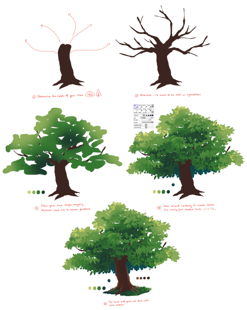
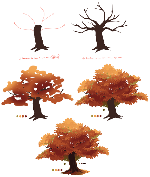
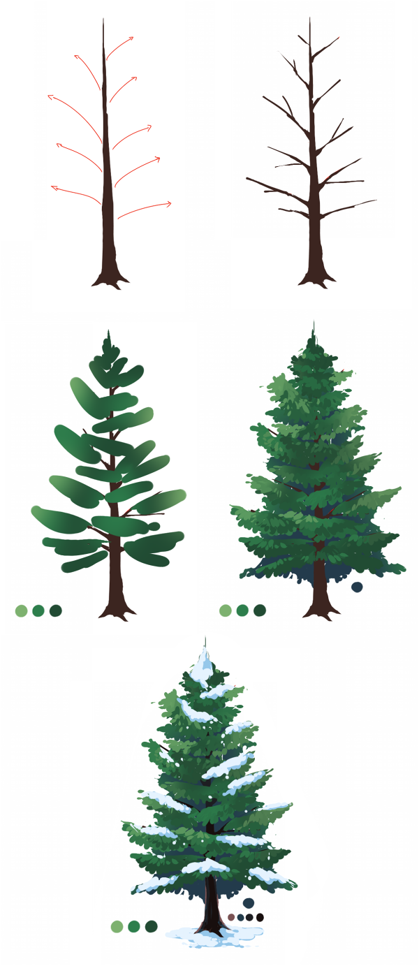
Hey, is it okay if you like do a tutorial on trees and shrubs? PS: I looooooove your art and tutorial they are just soooooo wonderful, inspiratonal, amazing.
aww thank you so much!! ;v; haha well I don’t know a lot of trees so here’s two I actually know lmao, oak tree and pine tree I will go study more tree names when I have the time ohgosh _(:3 7 hope it helps!
Balenciaga SS 06
How To Shade
a quick tutorial on shading (with graphite) by yours truly. this is the process I use for shading, and there are tons more out there if this one doesn’t work for you.
MATERIALS USED

1 HB graphite pencil
1 2B graphite pencil
1 4B graphite pencil
1 blending stub (the bigger the better)
1 plastic eraser (white)
1 kneaded eraser (grey)
now why do I use two erasers? well, they’re very different from one another, and each serves their own purpose.
the plastic eraser is harder, and when it erases, it erases everything. the kneaded eraser is soft, and it doesn’t completely erase everything all at once. you can use it to pick up some of the graphite and leave some behind, lightening (but not totally erasing) your shading. plus, the kneaded eraser is so soft you can mold it, and it doesn’t leave pencil shavings. if one end gets too used, you can just stretch it out, and it’s as good as new.
REFERENCE USED

now lets get this started, shall we?
STEP ONE
scribble lightly over your drawing with either an HB (aka a regular #2 pencil) or 2B pencil. you don’t have to be extremely neat, but do it light and nice enough so it can still be erased/you can still see the original lines underneath.

STEP TWO
take your blending stub (the wider the better, and if you don’t have one, use a tissue) and rub in the opposite direction of the scribbling. don’t press too hard, because it might streak/not work if you do.


STEP THREE
erase the extra shading around the edges (using the plastic eraser.).

STEP FOUR
roughly add your darks

STEP FIVE
roughly add your lights by erasing with the kneaded eraser

STEP SIX
add your finishing touches (secondary shadows, background, etc)

(I reshaped the sides, added more lights, and added the background shadow)
and voila! you just did some shading!


-
 xsolar-ghost reblogged this · 2 months ago
 -
 cosm1cbrownie liked this · 11 months ago
 -
 artking-4 reblogged this · 1 year ago
 -
 mysty-inkii reblogged this · 1 year ago
 -
 aeryth-lc liked this · 1 year ago
 -
mysty-inkii liked this · 2 years ago
-
 fictionfreakazoid reblogged this · 2 years ago
 -
fictionfreakazoid liked this · 2 years ago
-
 shrozie reblogged this · 2 years ago
 -
shrozie liked this · 2 years ago
-
 geometricdork liked this · 2 years ago
 -
 icareyleeb-blog liked this · 3 years ago
 -
 naikipokki reblogged this · 3 years ago
 -
 kotori-monou-chan reblogged this · 3 years ago
 -
 tutoriarts reblogged this · 3 years ago
 -
 artbyvinblad liked this · 3 years ago
 -
 dreissimist reblogged this · 3 years ago
 -
 arnoolde-blog liked this · 4 years ago
 -
 thebookofcircus liked this · 4 years ago
 -
 purplemuffindreamzine-blog liked this · 4 years ago
 -
 abubblyartist liked this · 4 years ago
 -
masartsu reblogged this · 4 years ago
-
 valeriavales liked this · 4 years ago
 -
 c12-h22-o11 liked this · 4 years ago
 -
 juvmx liked this · 4 years ago
 -
rachel78-99 liked this · 4 years ago
-
 saturnartdump reblogged this · 4 years ago
 -
 molagart-blog reblogged this · 4 years ago
 -
instantdragonbananaperson liked this · 5 years ago
-
 kibou-no-hana liked this · 5 years ago
 -
 makerocketsnotwar liked this · 5 years ago
 -
 kagomai liked this · 5 years ago
 -
 kiki-demonchu liked this · 5 years ago
 -
 amandas-art-advice reblogged this · 5 years ago
 -
 book-oholic liked this · 5 years ago
 -
 luceon reblogged this · 5 years ago
 -
 tatianebelarmino liked this · 5 years ago
 -
tatianebelarmino reblogged this · 5 years ago
-
 yesireblogstuff reblogged this · 5 years ago
 -
 scoopiii liked this · 5 years ago
 -
 sskitty reblogged this · 5 years ago
 -
 d0ughy reblogged this · 5 years ago
 -
d0ughy liked this · 5 years ago