Do Not Repost, Thank You ^^


do not repost, thank you ^^
More Posts from Zelo-ref and Others
Beating Brush Lag in Manga Studio

Booooooooo… what is this, Photoshop?!
Lagging brushes are an occasional problem in any illustration software. Here’s a troubleshooting guide for Manga Studio if your tools are acting like molasses. (Some settings may be different on Windows or if you’re running the Clip Studio Paint branding of the software. For what it’s worth, I’m running Manga Studio 5.0.3 on Mac OS 10.7.5. Yup, I’m behind the times.)
There are a few options to beat the lag:
1. Quit Stuff Bye bye, YouTube. See ya, Skype. Later, Tumblr.
Save your computer’s processor by quitting RAM-hogging apps and tasks while painting. Streaming audio/video will drastically reduce performance, but even leaving browsers open can slow things down, so best to just close it up. Guess that rules out Spotify, but then there’s always ye olde Zune. Gotta love cringing through those high school playlists while working.
2. Change Preferences Easier than changing your mind, and quicker too.
Check under the hood of Manga Studio’s Preferences for a few speed boosts. Do the following in these sub menus:
Preferences/Tablet/Tablet Settings: Change from 1 to 6 (I believe this option is Mac only).

Preferences/Performance/Undo: Lower the Undo count. Try taking it down 10-15 notches from default. You could also turn up that long-titled setting (“Delay before recognizing new object…”) by 100 ms, but I haven’t figured out what that does exactly…
Preferences/Cursor/Display Position of Reversed Cursor: Make sure to check “No Delay”.
After changing preferences, it’s a good idea to close and reopen Manga Studio.
3. Modify Brush Tool Settings Your brushes may take it personally, but remember you’re in charge here.
The Tool Settings window is a wealth of options for customizing brushes. Some are more processor-intensive than others. Here are a few of the best ones to modify: (Note: the look and behavior of brushes may be affected. You may want to duplicate and/or export a brush before changing its settings.)
Tool Settings/Anti-Aliasing: Turn down to “Little” or “None”
Tool Settings/Brush Tip: Reduce the number of materials on your brush.
Tool Settings/Stroke/Space: Increase spacing, but not too much. Brushes are essentially a string of material stamps. A low space setting means a smoother brush, but more work for your computer. Picture it frantically scrubbing a rubber stamp across your canvas. On that note, also make sure Continuous Spraying is not on.

Tool Settings/Watercolor Border: If your brush uses this setting, turn on the “Process After Drag” option. This renders the effect after each brush stroke and saves computing power.
Tool Settings/Correction: Turn off (or decrease) Stabilization, Post Correction, and Brush Stroke.
Tool Settings/Starting and Ending: Turn off all this stuff. Pfffft, who needs it, right?
Here’s a speed test after fiddling with some settings:

Woooooooo! We’re getting faster! Still a bit laggy, which leads to one last tip:
4. Rework The Canvas Might as well rework my life goals too.
Okay, disclosure: The two gifs in this post were recorded on a 4500x3000 canvas at 300dpi with a size 500 brush to emphasize lag. This third one is recorded on a 1080x720 canvas at 72dpi with a size 100 brush:

Yes! We’re cruising now!
Canvas sizing and resolution has a big affect on brush performance. It’s a bit of a conundrum. Getting the best image quality means working at a minimum resolution of 300dpi, which can be taxing for brushes on large canvases. So what to do? Just like traditional paintings start with thumbnail sketches, digital work can start on a low-resolution canvas. Here’s the method:
Set up your canvas normally at the full target resolution. But before drawing anything on the canvas, use the handy tool under Edit/Change Image Resolution. Reduce Resolution to 72dpi. Use this smaller canvas for rough sketching, background filling, blocking in large areas of color, etc. Then increase resolution to 144dpi for building up the body of the painting, still keeping it loose. (I’d recommend switching Interpolate to Hard Outline when increasing resolution.) Finally, blow it up to full resolution and get into the nitty gritty of rendering. This is where you’ll do the crisp line work, highlights, details, etc.

The idea here is to work big to small. This will keep away brush lag by using large brushes on small canvases. As the canvas resolution increases, decrease brush size and work smaller, tightening things up in the process. NOTE: Increasing canvas resolution causes pixilation. Don’t worry about it. This can be cleaned up in the final stages of painting.
Hope this guide is helpful! If lagging persists, remember to check drivers and tablet settings as well. If all else fails, Google’s a good friend ;)
-Armin

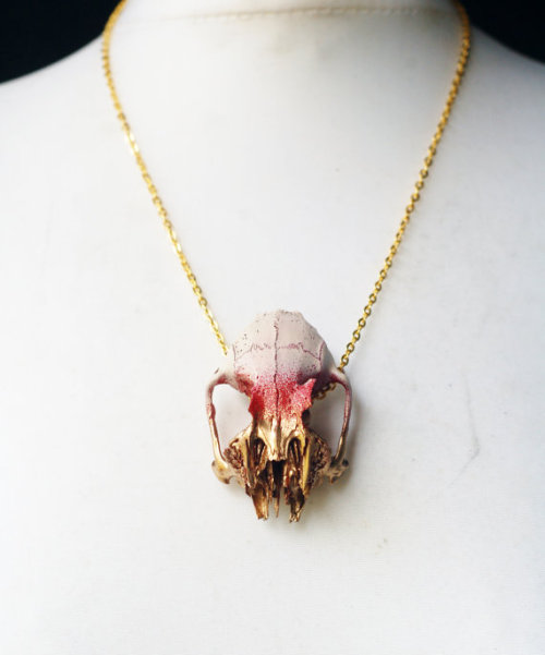
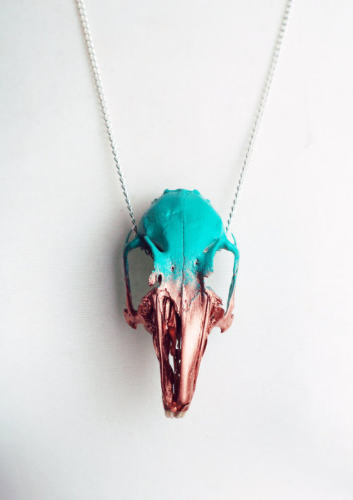


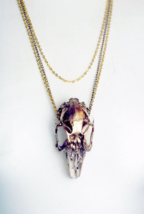

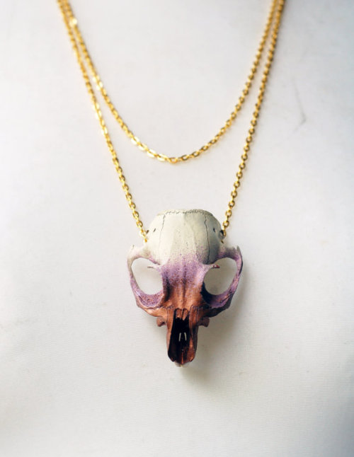

real animal skull necklaces
Virginia the Wolf

Do you have any tips for drawing round ladies? :D
Hiya anon!
Well, I’m still learning myself, but here’s a few tips I usually keep in mind!
1.) “Fat” is not just a big belly!

Fat distributes everywhere, but not necessarily equally! Like at any weight, every body is different and has an unique shape! Some keep a hourglass shape, some become more pear-like, some are shaped like teardrops or apples… but the basic thing is, fat doesn’t just choose one place where it WON’T gather. It may not be as visible in some area compared to another, but in real life, it’s reeeeaaaaalllllyyyy rare to just find a person whose fat only stores in their bum, thighs and tits, leaving their waist, arms, neck and etc slim. Keep the body pleasant and thick all around, not just in the places where the weight-gain is the most imminent!
Keep the round shapes in mind!
2.) Rolls! Folds! What are they?


What are they? Not something to be afraid of, that’s for sure!
Basically, don’t hesitate to give your characters fat rolls. Skin folds, stretches and moves along with the body, and so does the fat under it! However, a lot of people who draw rolls tend to give the character many super small ones — this is not how rolls work! Usually, the thicker the person, the thicker the rolls — they increase in size, not necessarily in number.
Rolls are the most preminent in places where the body moves the most, AKA the joints. Fat folds over itself and creates creases and ‘rolls’.
3.) HOWEVER….
(No references here, sorry!!!)
When we age, our skin loses its elasticity and it can’t keep the rolls and folds thick and perky. In our youth, our weight can be held up way better than in our elderly days due to the stength and adaptivity of our skin which disappears as we age. Thus, fat tends to droop lower with older people, and the rolls appear thinner. This can also happen if someone who has had a LOT of weight packed up suddenly losing a big chunk of it — the skin can’t adapt and will begin to “droop“ down and lower. Make sure to keep such factors in mind when drawing and planning how the weight of your characters should be carried!
And then, a lil tip that;
4.) Study references and real life!
If you yourself pack some weight or have access to internet, libraries or just life on the street, you will see how bodies at different weights and shapes work and move. Use references, see for yourself — try to find how fat distributes and especially, HOW IT FOLDS! Folds and rolls seem to be one of the biggest problems many have while drawing thicker characters, and that’s ok — we’re taught as a society that fatrolls are inherently bad and disgusting, therefore there are not many situations where we’d find ourselves just… staring and studying how the fat in our bodies works and moves. You’ll learn quickly, though!
I’m still learning myself, but especially since every body is different and the weight we pack acts in unique ways, it can be really challenging to find the ‘absolute’ right way to draw thicker characters. Don’t give up! You’ll get the hang of it eventually!!


Audrey Fry - https://www.facebook.com/fryillustration - https://www.etsy.com/shop/fryillustration - http://audreyfry.blogspot.com.es

DIY Outlander Inspired Cosplay Pattern Series by American Duchess for Simplicity
If you’ve been looking for affordable sewing patterns for 18th century Cosplay dresses or a pattern for a corset, this is the post for you. These are patterns for beginners, and all notions needed for these garments can be found at fabric stores.
The pattern sizes range from Size 6 to Size 22.
What’s included in the 2 patterns?
With the restrictions on the patterns - things like tissue size and complexity/length of instructions - we came up with two pattern packets that work together: the underpinnings packet with a chemise, bum pad, and stays; and the ensemble packet with a gown, petticoat, bodice, and stomacher.
You can find the American Duchess’ post on her Outlander Inspired Cosplay Patterns here.
Also, the Amercian Duchess’ now has a series of Outlander Pattern Hacks posted here. The pattern hack series already has several posts (including one on corset stays), and will eventually include:
Hand-stitched eyelets instead of metal grommets
Creating robings and closing the bodice with pins
Interior lacing, buttons, and other bodice closures
Drafting and applying a 1740s winged cuff
Redrawing bodice seams and stays boning patterns
Drafting skirting for the bodice, to create a jacket
Extending the front edges for a center front closure
Setting sleeves with the 18th century method
18th c. hand stitching techniques for finishing edges and sewing seams
Fitting through the side back seams the mantua maker’s way
Proper silhouette through bum pads, petticoats, and more petticoats
Binding and facing the stays with chamois leather
Proper materials - wool, linen, cotton, silk
How the heck to get dressed
What’s Included in the Outlander Simplicity Patterns?
Simplicity Pattern 8161 can be found here. The pattern costs $12.57 and consists of:
Misses’ 18th century highland costumes includes outfits in two styles: the first is a gown with stomacher and petticoat, and the second is a bodice with petticoat and stomacher.
You can find the FREE CROCHET Pattern for the Highlander Crochet Cowl here.


Simplicity Pattern 8162 can be found here. This pattern also costs $12.57 and consists of:
chemise, bum pad, and lined corset.


-
 dutifullyzanynacho liked this · 2 months ago
 -
 you-nice--keep-going liked this · 2 months ago
 -
 coolperson19876 liked this · 4 months ago
 -
 currentlymissing reblogged this · 4 months ago
 -
currentlymissing liked this · 4 months ago
-
 fruitloopsfactory liked this · 5 months ago
 -
 missesthundybuns liked this · 5 months ago
 -
 flothebest68686 liked this · 7 months ago
 -
 c-winchester67 liked this · 9 months ago
 -
 maya-custodios-dionach reblogged this · 9 months ago
 -
 shadowyfirereview liked this · 10 months ago
 -
 ale180506 liked this · 10 months ago
 -
 skin-bible reblogged this · 10 months ago
 -
 delicatesaladgentlemen liked this · 10 months ago
 -
 eurobutt liked this · 10 months ago
 -
 steampunkskulls liked this · 10 months ago
 -
 thedragonchilde reblogged this · 1 year ago
 -
 sassykinzonline liked this · 1 year ago
 -
 s-t-y-x liked this · 1 year ago
 -
 porcelainlop reblogged this · 1 year ago
 -
 booksfromthestars reblogged this · 1 year ago
 -
 bomberman82 liked this · 1 year ago
 -
 tortoiselighthingandstainy liked this · 1 year ago
 -
 izar-tarazed liked this · 1 year ago
 -
 miserycorde reblogged this · 1 year ago
 -
 dodybow3 liked this · 1 year ago
 -
 heylittlejess liked this · 1 year ago
 -
 thesimonthedevious reblogged this · 1 year ago
 -
 irukkaartzz liked this · 1 year ago
 -
 pshattuck liked this · 1 year ago
 -
 inky-da-dinky liked this · 1 year ago
 -
 m3gahet liked this · 1 year ago
 -
 milobat reblogged this · 1 year ago
 -
 expired-bat liked this · 1 year ago
 -
 thatwritingho liked this · 1 year ago
 -
 sillydorito reblogged this · 1 year ago
 -
 melijuniqui-084 liked this · 1 year ago
 -
 bunnyepie liked this · 1 year ago
 -
 poisonouspotatochips liked this · 1 year ago
 -
 princesstoadstoolpeach liked this · 1 year ago
 -
 vickykawaiisblog liked this · 1 year ago
 -
 prottioslipmorsue liked this · 1 year ago
 -
 rebelresolve liked this · 1 year ago
 -
 casketcrush liked this · 1 year ago
 -
 tails090 liked this · 1 year ago