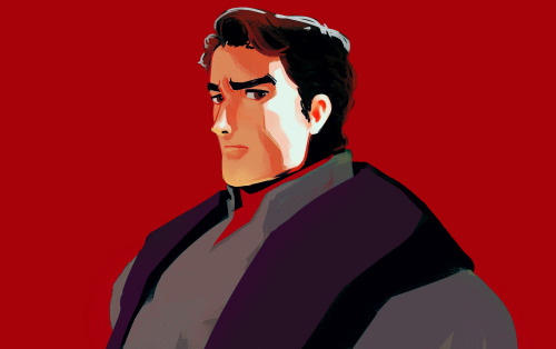
Made A Sketch Of Bearded Glasses Guy From This Coloured Study.

Made a sketch of bearded glasses guy from this coloured study.
More Posts from 1bjavier and Others


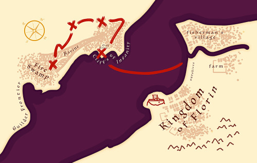
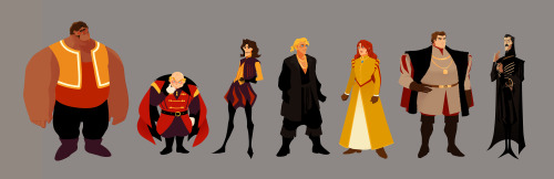
Part 6/6 - The Kingdom of Florin
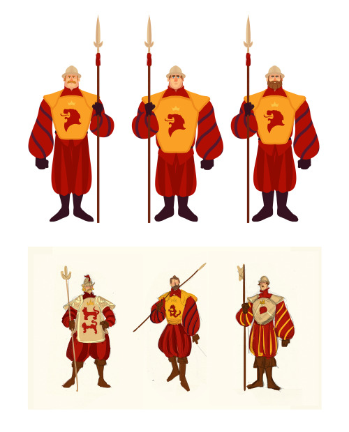
Part 1 - The Family | 2 - Style | 3 - The Sicilian Assassins | 4 - Buttercup and Westley | 5 - The Prince and the Count
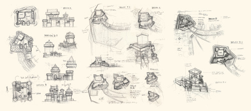
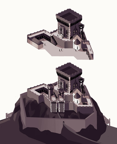
The seat of power for the Kingdom of Florin is a Military Fortress built on top of a seaside cliff.
Instead of elegant Gothic spires which was popular during the 15th and 16th century, Florin Castle is a bulky and imposing fortress reflecting the Military nature of the country, its simple people, Buttercup’s prison-like experience, and its ruler — Prince Humperdinck.
One of the challenges I encountered for the castle design was keeping the colours saturated enough to match the palette of the project while keeping the emotional geography of “prison” in tact. Although a violet palette was explored, the red brick that is common in Northern European architecture gave a more militaristic no frills impression that is more in line with the Kingdom and its Prince.
After many sketches, I realised that a country celebrating its 500th anniversary would probably have a castle built far before the current century. So incorporating a bulkier Romanesque style Keep as the castle’s foundation is what finally made things come together and give it a solid direction. Since Florin is a Militaristic state, it would make sense for them to continually be making Military advances, so one of the Castle’s most recent evolution/natural progression is a towards a very early prototype of a Bastion Fort. This makes Florin castle the most advanced, secure, and fortified structures in the land while upping the stakes for the infiltration during the near end of the series.
Fun Fact! While looking for references of Danish Castles, I came across an old map of Kronborg Castle. (Just google "old map of Kronborg castle", you'll see it right away) I thought it looked super familiar and I realised that it actually looked very similar to the layout of the Map of Florin and Guilder! So I included the bonus map I was required to submit.


Aki
Outfits, turnarounds, and sketches.

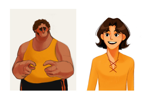
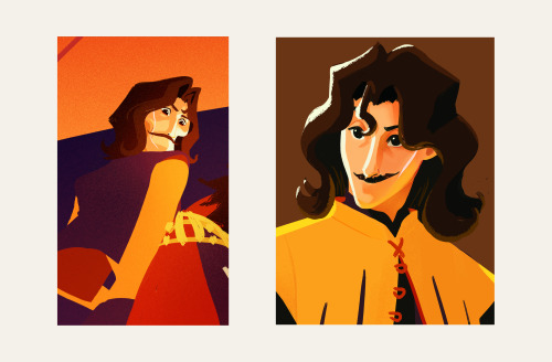
Coffee Shop sketch dump (Epic) — 15.05.31

Coffee shop sketch dump
Drew these various drawings on various days throughout the past few months.

Goodbye old friend this is the end of the man I used to be. For there's been a strange and welcome change in me...
(For Once in my Life - Dean Martin’s version)

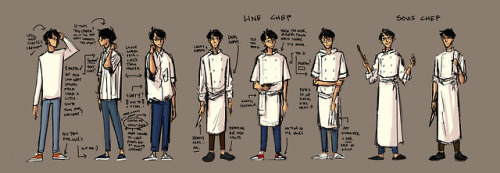
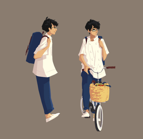


Jiro.
As I continue to get to know Jiro over the past few months, I continually discover more and more wonderful things about him and so I’m very excited to finally get to fully share such a wonderful person with everyone. I hope you find him as interesting as I find him wonderful.
Jiro’s story is the story of the supporting character in everyone else’s.
One of the most defining characteristics of Jiro, and one of the things I admire most about him, is how great of a support he is to those around him. He may seem scatter-brained and out of it most of the time so he doesn’t come across as reliable (in fact he’s probably coming across as the character, the child, who has to be taken cared of). Jiro isn’t an unyielding rock in the face of adversity. Jiro is the kind of person that spend every moment feeling his surroundings, the sunshine, the flowers, the trees, the air, the heat of the kitchen - everything. He has an almost childlike wonder about the beauty of the world around him and because of his curiosity and awe, he is actually very much in tune with everything that flows around him. His reliability comes from how he has learned to bend with the energy around him.
Jiro’s earnestness, consistent work-ethic, and humble countenance is what opened doors for him as the perfect supportive member everyone would want on their team. He is subtle and sometimes unnoticeable but the presence that elevates everyone in the team. His personality (and lack of ANY male arrogance) is what allows him to be a wonderful life partner to someone as bright as Danielle and the perfect Sous Chef/Creative partner with a visionary Thai Chef I have yet to name.
I love talking about my characters so ask me anything about them. I’m afraid to put too much here that it would bore people to death but I have various word files dedicated to each character and their relationships with everyone in their lives when I’m working on them so sharing whatever it is anyone is curious about them is fun.

She. A super quick lighting exercise that went well probably because I was listening to She by Charles Aznavour. This is also how I would imagine Fleur Delacour. Bill Weasley you lucky dog.

Li was a Philosophy student who became a figurehead of one faction of the Equalist movement in Republic City before 169 AG.
This is the initial concept portrait of Li Yang (temporary/working name)


Two variant designs I made of Nikolai from last year. The one above is him as the Grand Duke (after abdicating the throne) and ambassador to the throne, while the second is of him as a reluctant emperor.
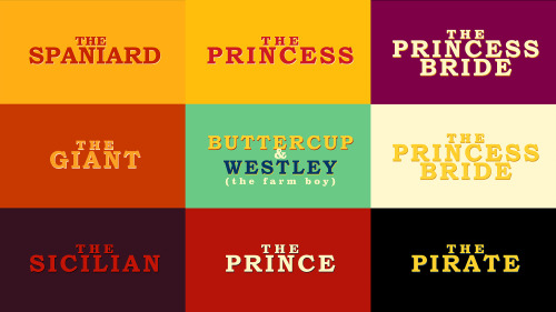
Part 2/6 - Adapting a Classic (Style)
Part 1 - The Family | 3 - The Sicilian Assassins | 4 - Buttercup and Westley | 5 - The Prince and the Count | 6 - Florin Castle
One of the ideas behind this project was about bridging the gap between the old and the new. I wanted to express the vibrance and colourful quality of a medieval (nearing renaissance) setting while using contemporary techniques, to appeal to a modern audience, with a nostalgic undertone.
Adding some browns to the palette also helped pushed it towards that slightly nostalgic direction. I shifted the other colours slightly, like using mustard or yellow-orange instead of just yellow, vermillion instead of just orange, and throwing in some violets, all to add that dash of quirky-ness to reflect the fun and witty tone of both the movie and the book.
Another idea is that this version would be a series. This gives us time and opportunity to see and experience the characters' past, like in the book.
I was figuring out how light would interact with the characters while pushing the role of line. I did studies on how to make a line express form, colour, and light. From afar, the line can be reflected light, but up close the "line" expressing reflected light would spread in a stylized manner. This creates the feeling of an increase of detail when we look at something up close all while strengthening the colourful quality of the project throughout.
-
 aaclysm reblogged this · 6 years ago
 -
 gnth0101 liked this · 7 years ago
 -
 1bjavier reblogged this · 7 years ago
