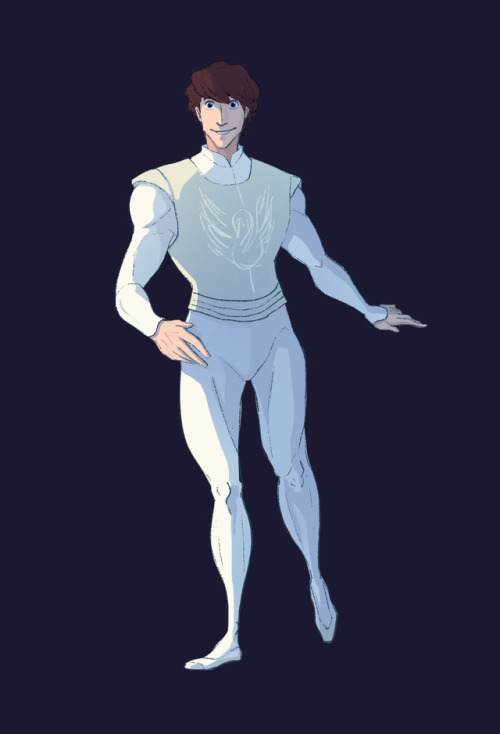
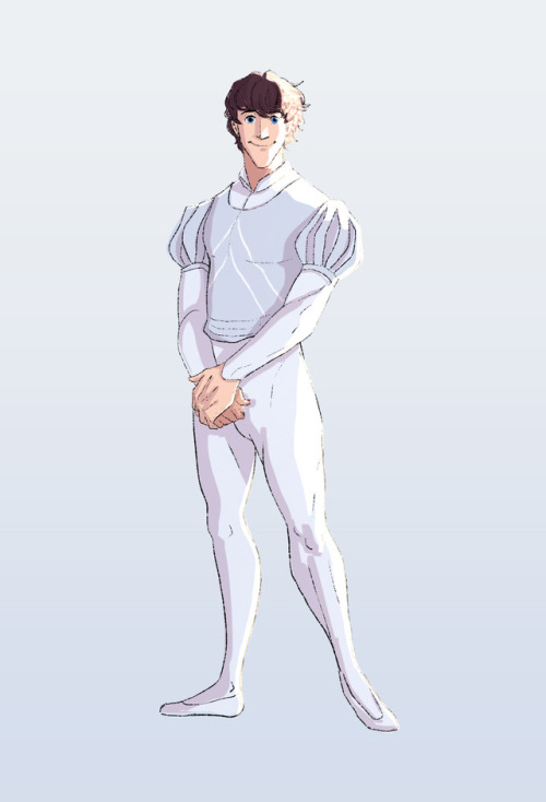
Part 2/6 - Adapting A Classic (Style)
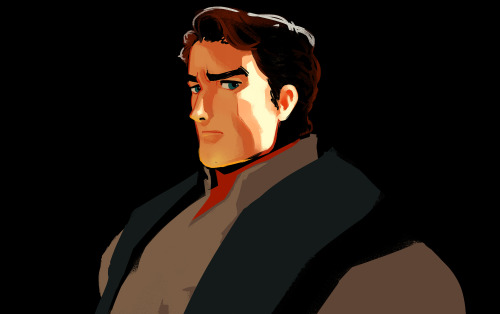
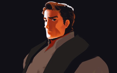
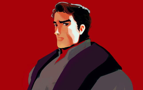
Part 2/6 - Adapting a Classic (Style)
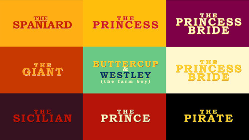
Part 1 - The Family | 3 - The Sicilian Assassins | 4 - Buttercup and Westley | 5 - The Prince and the Count | 6 - Florin Castle
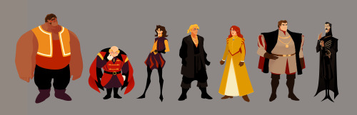
One of the ideas behind this project was about bridging the gap between the old and the new. I wanted to express the vibrance and colourful quality of a medieval (nearing renaissance) setting while using contemporary techniques, to appeal to a modern audience, with a nostalgic undertone.
Adding some browns to the palette also helped pushed it towards that slightly nostalgic direction. I shifted the other colours slightly, like using mustard or yellow-orange instead of just yellow, vermillion instead of just orange, and throwing in some violets, all to add that dash of quirky-ness to reflect the fun and witty tone of both the movie and the book.
Another idea is that this version would be a series. This gives us time and opportunity to see and experience the characters' past, like in the book.
I was figuring out how light would interact with the characters while pushing the role of line. I did studies on how to make a line express form, colour, and light. From afar, the line can be reflected light, but up close the "line" expressing reflected light would spread in a stylized manner. This creates the feeling of an increase of detail when we look at something up close all while strengthening the colourful quality of the project throughout.
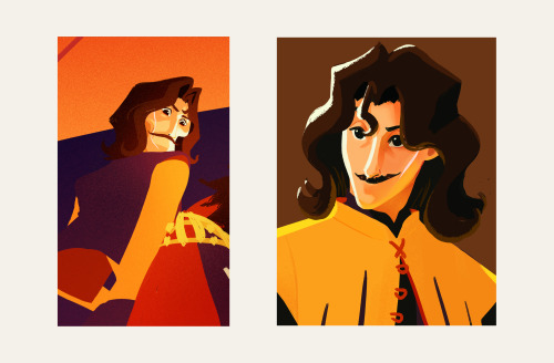
More Posts from 1bjavier and Others


2015.09.04
Sketches from Aventine, a gig I went to with some friends a few weeks ago. It was really fun.

Egyptian-Mesopotamian inspired dress concept for one of the characters I'm making right now.

This is a study I made while I was on my flight to the US. It was the longest day ever mostly because I'm pretty sure my April 19, 2014 lasted for more than 24 hours.
Lately I've been practicing drawing from life. Before, I was a little scared because i didn't like making mistakes, but I realized that it's okay to ale mistakes because later on I'll be able to correct them. And as I drew from life, it has been excellent practice.
I wanted to draw the guy beside me across the aisle (because he had a nice blazer on and very very nice brogues) but unfortunately he kept noticing me looking at him so I couldn't draw him... The other people I drew didn't notice (when you see the drawings I guess you can tell why).
My favorite drawing here is definitely the mom and her daughter (mother and child jk). It was very very cute and it was great seeing that. The man in the middle left (no, not the one who is sleeping funnily) seemed to be quite nostalgic and a lot of people get sentimental or think while on modes of transportation for a long time. The man on the lower right, I'm guessing is purser of the plane, he seemed to be quite happy with how the people were doing when one of the meals were served.
I rarely get to go on vacation or travel, but I love it. Seeing all sorts of different people, and thinking of the many things that they have gone through or the kind of people they are. People are interesting.
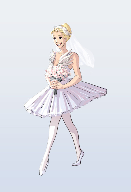

A mini project I did based on a wedding I attended in a dream 😁
The Knight’s final design is a combination of the two versions I uploaded 😊
Although I’m not very satisfied with how I painted the illustration, I learned a lot and the app werble is pretty awesome.

Cloé.
Here’s a quickie of one of the characters I’ve been working on for the past month.

Some messy sketches of Severa and my original character, Oliver.
I’m a huge fan of Cordelia and Stahl so that’s how Oliver happened. I figured it would be a good contributing reason for why Severa acts so tough all the time (I mean, come on, a war with a younger sibling by your side, got to seem like everything is fine even when all hell is breaking loose) and really cute if her younger sibling was super affectionate and Severa secretly likes his hugs.
I have a bunch more drawings/illustrations of him, that I will post when I finish (not as sketchy as these hehe)
He’s around 5 years younger than Severa and I thought it would be funny if when they traveled to the past, he would arrive many years earlier, so by the time the other children arrived, He would be as old as Lucina and Laurent. Severa would be very confused about seeing her not-so-little brother again and would find it awkward to have her now very tall brother hug her. She's also kind of sad that she wasn't there as he grew up to his current age.
I figured he’d be as easy-going as his dad, and have naturally messy hair too, but because he’s such a momma’s boy he’d try his best to keep it neat, because that's how Cordelia liked it (in the short period he knew her before she died).
Unlike Severa, he’d be good with people because he’s relaxed and empathetic like his dad. He’d also be unafraid to show how much he admired his parents and how he wants to be knights just like them. (He dreams of flying on a pegasus like his mom, but he is not a pure hearted maiden) He is horrible at wielding every weapon except the bow and arrow. Although he idolizes his parents, His sister is his ultimate hero. He thinks she is the most awesome person and warrior ever.
Also, I kind of thought of Cordelia and Stahl as another red and green knight in a way. I know the red and green knights are Stahl and Sully respectively but since Cordelia is also a Knight and has the red colour scheme going on, I kind of see them as another version of the red and green knight thing.

Made a sketch of bearded glasses guy from this coloured study.


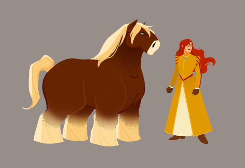

Part 4/6 - Buttercup and Westley
Part 1 - The Family | 2 - Style | 3 - The Sicilian Assassins | 5 - The Prince and the Count | 6 - Florin Castle
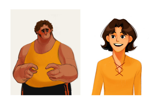
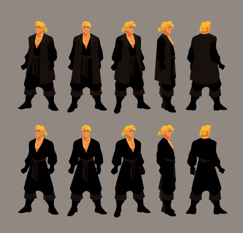
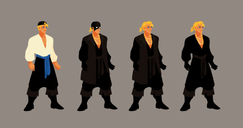
I wanted to make it very clear that the man in black / Westley is a pirate. So I used loose billowy clothes that also made him feel bigger and intimidating.
Horse is a Jutland horse, native to Denmark (which is what’s in between Sweden and Germany). It’s a draft horse, so good for farming, which is where Buttercup grew up, on a farm. I also wanted Horse and Westley’s design to somewhat mirror each other. Since Buttercup grew up on a farm, I did not want her to look dainty.
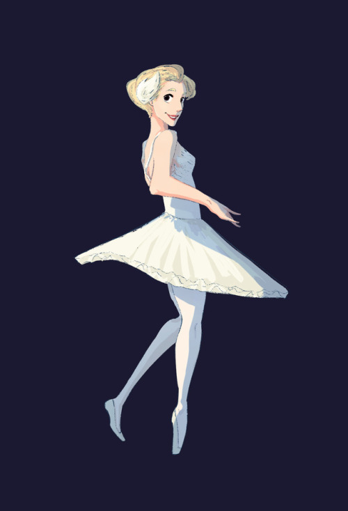
Buttercup’s story is more than just about love, it’s also about freedom. I realised that freedom was the core to her character. Her horse riding, doesn’t care what others think, and wild personality is all about freedom. I wanted her hair to flow with the wind, for her and her hair feel full of life. In the book, Buttercup had red hair. For her to have such a bold hair colour, especially one that in Europe during the medieval period was not considered desirable, felt right. Her hair and her personality is a defiance to the standard of beauty and of how a woman “should” be. That someone as bold as her would be considered the most beautiful woman in the world felt pretty badass. Having red hair (kinda vermillion) also provided opportunity to work with Humperdinck’s more blood red. When wearing her presentation dress as Princess of Hammersmith (despite the title of Princess, it is a title that does not sound dainty), Humperdinck’s red on her dress subdues the boldness of Buttercup’s red hair. Combining this with a restrictive design for her presentation dress and of her hairstyle, her design become reflective of her situation as a prisoner.
But when on her daily ride her dress can flow and her bright, bold, red hair is free.


Aki
Outfits, turnarounds, and sketches.

-
 pomegranate-aka-stupid-fruit liked this · 1 year ago
 -
 1bjavier liked this · 1 year ago
 -
 flyingsassysaddles reblogged this · 1 year ago
 -
 xemylixa reblogged this · 1 year ago
 -
 spooky-scary-bumblebees liked this · 2 years ago
 -
 staringatthesky11 liked this · 2 years ago
 -
 bellasbookclub reblogged this · 2 years ago
 -
 ajstudio reblogged this · 2 years ago
 -
 artsy-jandi liked this · 2 years ago
 -
 mostlynobutalittlemaybe liked this · 2 years ago
 -
 pyrose-the-flame liked this · 2 years ago
 -
 thenorthernlytes liked this · 2 years ago
 -
 sirnightdamaxan liked this · 2 years ago
 -
 jlucha liked this · 2 years ago
 -
 anishkastdyblr liked this · 2 years ago
 -
 puphug liked this · 3 years ago
 -
 echonvoid liked this · 3 years ago
 -
 vespastingz liked this · 3 years ago
 -
 savingthegeneration liked this · 3 years ago
 -
 scaled-queen liked this · 3 years ago
 -
 sharkviolet liked this · 3 years ago
 -
 grahoria liked this · 3 years ago
 -
 constellationspath liked this · 3 years ago
 -
 sweetymutant liked this · 3 years ago
 -
 tierse liked this · 3 years ago
 -
 lazyotakuandfangirl liked this · 3 years ago
 -
1bjavier reblogged this · 3 years ago
