Copic Marker Walkthrough
Copic Marker Walkthrough
Lately many people have been asking me how to create a space nebula effect with markers. The process is relatively simple, but it’s not easy to explain simply with words alone. So in this walkthrough I’m going to show step by step how it’s done.

First things first. This is the list of supplies I used. -Strathmore Mixed Media 5.5 x 8.5 sketchbook-Pink and White Colored Pencil-White Gel Pen-13 Copic Marlers (12 colors and a colorless blender, which I’ll explain how to use later.) I should point out now that you aren’t required to use the exact brands I used to create the drawing. I use these materials because they’re what I’m most accustomed to.The techniques I demonstrate can be done with whatever markers and paper you’re comfortable using. What matters is that you understand the technique because when you do you can apply it to anything.

I begin by making some abstract cloud-like shapes with E50 (Eggshell), which is a very faint yellow. There’s no pencil sketch here because space nebula (as well as atmospheres and natural landscapes) can be easily created by layering abstract shapes on top of each other.

Using Y21 (Buttercup Yellow) and G20 (Wax White) I basically repeat the first step. Still working very light. I realized after the fact that Buttercup Yellow was a bit too intense for this drawing so I stopped using it there. This is why it’s important to have a sheet of scratch paper nearby to test out colors before you apply them. Because once they’re down, they’re DOWN.

Next I use R20 (Blush) to start defining the shapes of the gases in the nebula. Then I go back to Eggshell. It’s probably hard to see what I did here, but I used the brush tip end (on its side) to swipe inward, from all sides, towards the center of the nebula. The reason being is that the brush tip is more saturated than the chisel tip. This helps intensify the lighter shade of yellow that’s already on the paper. If also makes crossfading colors easier because the sideways swipe motion creates a soft gradient that tapers towards the edge. I’ll use this technique multiple times throughout the drawing..

Now with B000 (Pale Porcelain Blue) I layer over the gases in the center while working my way outwards. Again I’m pulling my strokes inward because I know the surrounding space will be deep blue and I want the transition to be a smooth one.

With E04 (Lipstick Natural) I’m finally beginning to put in some of the darker colors. At this point the drawing sill looks like a random mess. Sometimes you’ll get the urge to rush and make the drawing look like something, but you have to be patient and take your time.

Using B32 (Pale Blue) and R20 again, I’m going around the nebula detailing and adding layers of color. I’m also leaving some white spaces which will later become stars. My Pale Blue is actually beginning to dry out, but here in able to make that work to my advantage because it streaks from the chisel end create a dry brush effect which helps add to the glow. The nebula portion of the drawing is beginning to take shape.

Working my way around the perimeter with Pale Blue. From here you can see the importance of working light to dark. Build your colors gradually and avoid the urge to go too dark too early. You want to have room for error and you don’t want create more work for yourself.

With B04 (Tahitian Blue) I fill the surrounding space completely. I’m not too concerned with trying to get an even layer because I know that I’m going to add darker shades of blue next.

Here I used B00 (Frost Blue) to start cleaning up some of the edges around the nebula. I also used BG15 (Aqua) to add some pockets of color in the surrounding space.

Adding darker layers to surrounding space with B14 (Light Blue), which surprisingly a pretty dark shade of blue. Then I used B97 (Night Blue) to add the last layer, which is the darkest layer in this drawing.

Now it’s time for the final details. 0 is the Colorless Blender. But it’s not necessarily used to blend. Instead it almost acts like an eraser because the ink pushes colors away when you put it down. Because of this I generally don’t use it. But it works great for things like water, landscapes and atmospheres. Or in this case, space in which I used it to pull out highlights in and around the nebula. The colorless blender is odd, but it occasionally has its uses.

This is the final step and my personal favorite. Highlights and small details. I used the pink and white pencils to color around the edges of the brightest stars to make them look as if they’re glowing. Then I used the a white gel pen to color inside those stars to make them shine and pop off the page.

And here’s the finished drawing. This was hastily put together, but hope y'all found this to be informative and easy to follow. I’ll try to do more marker walkthroughs on different subjects in the future. Until then thanks for all your support and encouragement!
More Posts from Artrefforsteph and Others
Hi! I love your art of various fanlands and i was wondering, would you ever do a tutorial on how you draw them or the process of how you draw them? Or perhaps have any tip or tricks?
sure.
there are certain things/tricks I do almost every time, so here we go.
pick colors for the sky and the ground.

Keep reading


I’ve been seeing a lot of Big Hero 6 concept art and I wanted to set a brush to kind of mimic the graphite style of some of the sketches. I don’t have a “fully functional” version of SAI, so I tried to make this as simple as possible.
HOLY FREE ART PROGRAMS BATMAN
I’ve had this list sitting around for a while (in case I ever want to try something new) and I thought I’d share it, because why the hell not, everybody loves free stuff. I’ve only used a couple, so for all I know these could be complete shit. BUT YOU NEVER KNOW, RIGHT?
*= available for both windows and mac os
GIMP * - Does a lot of the same stuff as Photoshop.
FireAlpaca * - Similar to Paint Tool Sai, so it’s a good alternative for Mac users.
Autodesk Sketchbook Copic Edition * - Simulates the look of copic markers.
MyPaint * - Basic stuff, nothing fancy.
Pinta * - Drawing program modeled after paint.NET.
Inkscape * - Vector/drawing program meant to be similar to Illustrator.
ArtRage * - Digital painting program; you can get the trimmed down version for free or buy the full version with more features.
Sumo Paint * - In-browser drawing app.
DAZ Studio * - Some sort of 3D model poser thing.
Pencil * - Software for animating.
SketchUp * - Tool for making 3D models. Looks handy for stuff like architectural drawings.
Blender * - Pretty popular 3D software.
escape motions * - Some browser apps, fun to fiddle with when you’re bored (the fluid fire simulation is pretty cool imo).
Twistedbrush (Pixarra) - Seems to be meant for replicating the look of traditional media.
Pixia/Phierha - A popular program in Japan, according to the website.
Krita - This was originally made for Linux and it looks like the developers haven’t ironed out all of the kinks in the Windows installer.
Artweaver - Another trimmed down free thing if you don’t want to buy the full program.
paint.NET - Pretty basic kit, probably good for simple stuff.
Project Dogwaffle - I’m not sure what this one is all about because I couldn’t stop laughing at the terrible website.
Speedy Painter - Lightweight digital painting program.
mtPaint - Originally made for pixel art; simple enough to run on older computers.
Chasys Draw IES - Supposed to be some sort of drawing+image editor thing.
PaintRibbon - Seems to be another plain old basic image editor.
DrawPlus - Looks like it’s made for graphic design and vector stuff.
SmoothDraw - I’m guessing this is a basic thing for people who don’t want to bother with complicated stuff.
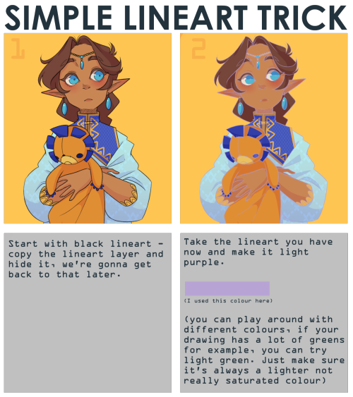
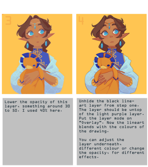
note that it works best with thin lineart (I used SAI2 for this, but I think you can use any art program with a overlay layer mode)
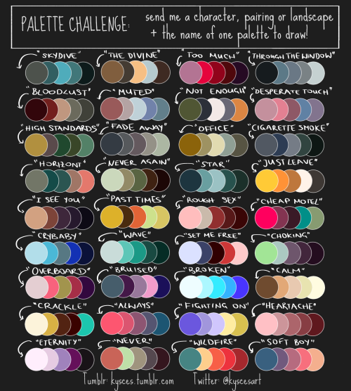
I finally made my own palette challenge! Send me, or the artist who reblogs this, a character, pairing or landscape + the name of one palettte to draw!
Problem with drawing your OC?
There is a 3D program where you can set everything.. i mean EVERYTHING on your character! And it’s free!
It’s called FUSE
http://store.steampowered.com/app/257400


you can pick between realistic and anime style… But most important: you can ANIMATE THEM!
how do i learn how to storyboard comics
1. set the panels

the first version is the easier but also boring for the eye, the sequence rectangular-square-square and repetitive, try to use diagonal cut, open space and vertical cut to help the movement of the story and action.2. use movement to tell the story

3. Pose, Perspective and Line density
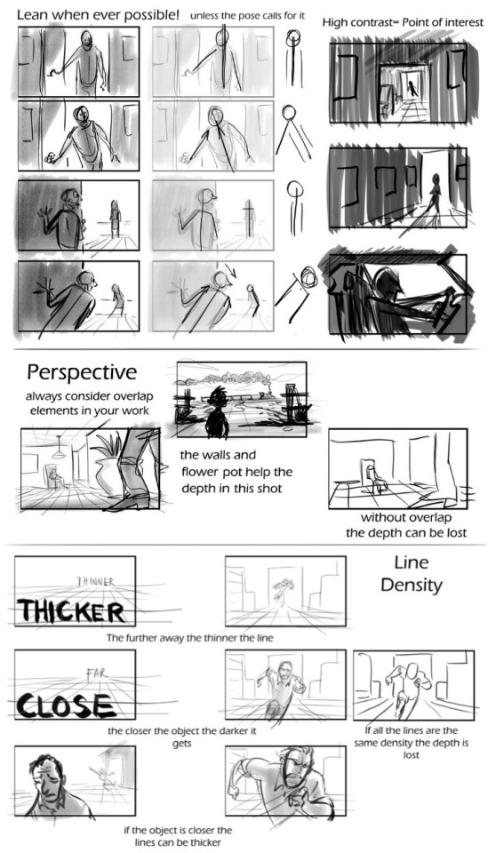
4. Framing and Silhouettebeing the file too big it’s a link format
In my opinion, those are the main rules to make a good storyboard. If you need more help ask awayMOD.gif

i saw a post on my dash with image sites that basically was like “it’s okay to use pictures off pinterest etc. for your edits because it’ll be hard for the original photographer to find and sue you,” which, um, made me a bit annoyed, so here is a list of 100% free stock photo sites, many of which have quite aesthetic-y photos! please do not steal photos in your work, guys!
freeimages
pixabay
pexels
publicdomainarchive
gratisography
picography
stocksnap.io
unsplash
everystockphoto
morguefile
flickr commons
deviantart’s resources section (check creators’ pages for specific terms of use)
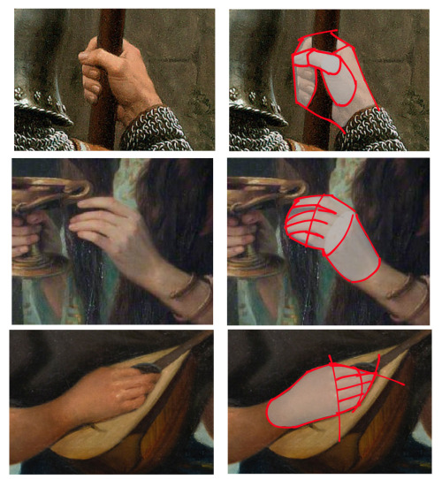
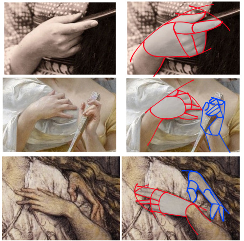
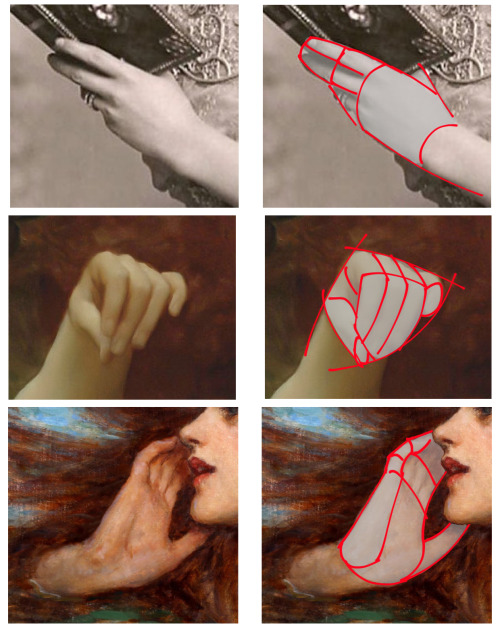
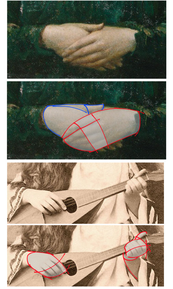

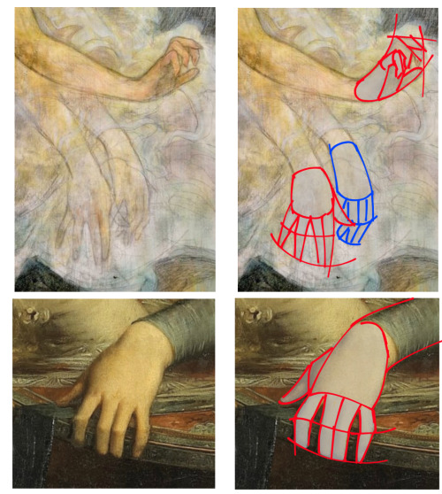
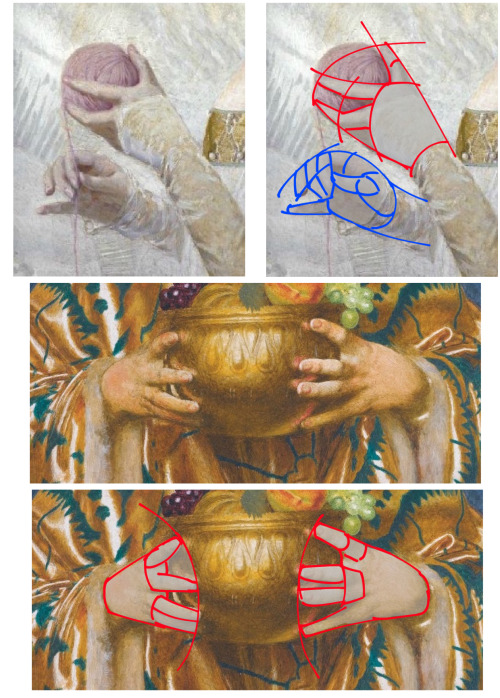
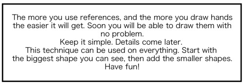
This is how I draw hands. I simplify the shape and then later I will add the necessary details. It makes it easier to get them right. But the only way to learn how to draw hands is to just keep drawing them.
-
 sorisanam liked this · 4 months ago
 -
 xexisdrawinghelpblog reblogged this · 8 months ago
 -
 attilol liked this · 1 year ago
 -
 heavyblue-blizzard liked this · 1 year ago
 -
 cluelesswonder reblogged this · 1 year ago
 -
 iviriis liked this · 1 year ago
 -
 levencamthenone liked this · 1 year ago
 -
 demutaro liked this · 2 years ago
 -
demutaro reblogged this · 2 years ago
-
 adridne reblogged this · 2 years ago
 -
 punkcake666 reblogged this · 2 years ago
 -
 themarshallrabbit liked this · 2 years ago
 -
 starzwave liked this · 2 years ago
 -
 et-noire liked this · 2 years ago
 -
 fun-ishtimes liked this · 2 years ago
 -
 0ouroboros liked this · 3 years ago
 -
 espyvart liked this · 3 years ago
 -
 kaijutegu liked this · 3 years ago
 -
 lazypinecone liked this · 4 years ago
 -
 mistyshadeofred liked this · 4 years ago
 -
 greeneyedreader liked this · 4 years ago
 -
 cloudy-sink liked this · 4 years ago
 -
 ass1ya liked this · 4 years ago
 -
 starieldreamer reblogged this · 5 years ago
 -
 bronawinter liked this · 5 years ago
 -
 superpurplehippo liked this · 5 years ago
 -
 an-abundance-of-hannahs reblogged this · 5 years ago
 -
an-abundance-of-hannahs liked this · 5 years ago
-
night-wolf90 liked this · 5 years ago
-
 borderlinehannibal reblogged this · 5 years ago
 -
 choke-on-ink liked this · 5 years ago
 -
 sarchasmus reblogged this · 5 years ago
 -
sarchasmus liked this · 5 years ago
-
 janoha liked this · 5 years ago
 -
 serendipidiest liked this · 5 years ago
 -
 gerbalmeister liked this · 5 years ago
 -
 sigma-100001 liked this · 5 years ago
 -
 moveaimlessley liked this · 5 years ago
 -
 lovelessblade liked this · 5 years ago
 -
 franciscosexto liked this · 5 years ago
 -
 xconfusingmelody liked this · 5 years ago
NSFW because there will probably be nude refs | this is a side blog to sort all of the art stuff I need | none of it is mine
151 posts