A Couple Art Tips I Wish Someone Had Told Me When I Was Starting Out:
A couple art tips I wish someone had told me when I was starting out:
FOR ALL AGES BECAUSE YOU CAN START ART WHENEVER YOU WANT AND YOU DON'T HAVE TO BE YOUNG
If you want to draw people then one of the best ways to improve is to become a little narcissistic and repeatedly draw yourself. You are someone that you'll always have reference to and don't need to feel bad about lacking skill when drawing.
If you want to draw in a cartoon or anime style then first draw realistically so you can form a better understanding of proportions, movement, and perspective. This may not be true for or helpful to everyone but I know many that it has been helpful for.
Quit looking up poses on the internet and model your own poses, you coward! You can choose the angle of the camera and the exact position you want each piece of your body in!
Don't fully render an image in your mind. Think of one or two elements of the piece and let the rest flow for best results. Not many people can replicate what was in their head, you'll be less upset if you keep your ideas and inspiration vague.
More Posts from Basket-of-references and Others


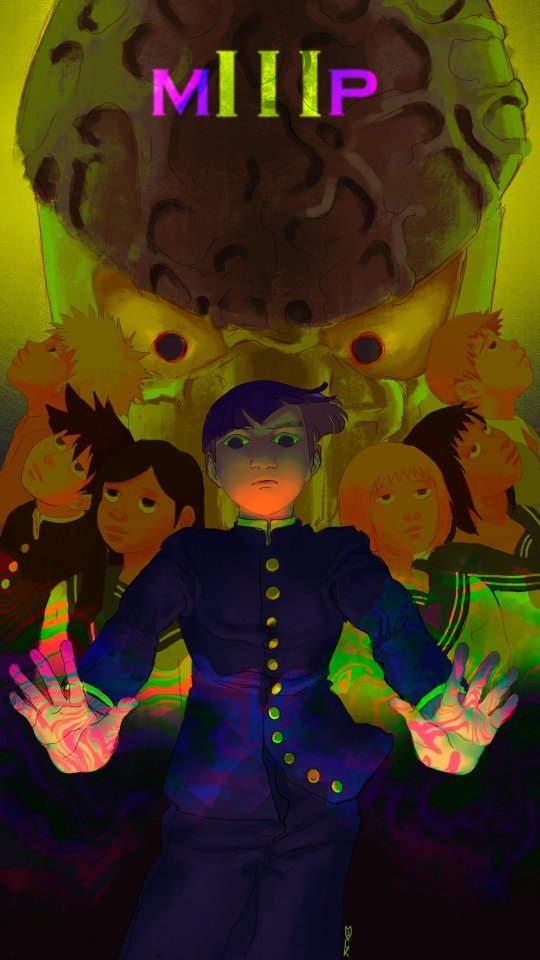
I am sad and I want to make you sad. I don’t know why but I love herm’s expression here. so much

So you might be saying: Lion why a guide on drawing black people? Well young blood it’s because a lot of people cant…seem…to draw…black people..Amazing I know.

Racist (caricatures) portrayals of black people have been around forever, and to this day people can’t seem to draw black people like they are human. If your artwork resembles any of the above even remotely your artwork is racist and offensive. If you try to excuse that as a stylistic choice you’re not only a terrible artist, but racist too!!! Congrats.

Whitewashing is also a problem. A lot of people refuse to draw black features on canonly black characters. While this example isn’t colored, lightening the skin-tone of a character is also considered whitewashing. So lets start with features!

Now all black people have different noses thats a no-brainer, but black noses tend to have flatter bridges, and wider nostrils. Please stay from triangular anime noses and small button noses. Your drawings should not depict black people with abnormally large noses. (Especially if you do not draw other characters this way)

If you feel like the way you draw lips on black characters is offensive or resembles a caricature,it probably does and you should change it. ABSOLUTELY AVOID PLACING LIPS AT THE BOTTOM OF THE FACE.

Hair is so diverse! Please get used to drawing braids, locs,kinks and coils! If you can learn to draw ringlets and long waves you can learn how to draw black hairstyles.

Add clips! Learn how to draw baby-hairs and never be afraid to add color Pinterest and Google are free my dudes! Also try using square brushes for blocking in coils.
OK THAT’S ALL YOU GUYS

i watched one (1) video on how to draw hands that changed my life forever. like. i can suddenly draw hands again

these were all drawn without reference btw. i can just. Understand Hands now (for the most part, im sure theres definitely inaccuracies). im a little baffled


U use colors in such a enrichening way, how do you do that may I ask??
thank you so much! 💕
this answer is going to be a little long.
the first thing, i think, is that it's very common to think of color as a means to an end, as just another type of information about a drawing: i'm using brown on the hair to show that the hair is brown, i'm using green to show that the characters are standing in grass.
but if color is information, then we can use it to say a lot more than just the basic facts of a drawing!
if you love drawing but want to get better with color, you have to learn to love color, too.
to want to know everything about how color works, to explore what different colors mean to you, to try and try and try again.
because, and this is the kicker:
ALL COLORS ARE RELATED TO EACH OTHER!

[from this post about how to use a color wheel]
i think it's common for people to talk about complementary colors and that's helpful when you're starting out with coloring, but i feel that it can become very limiting when it's treated like a rule and can obscure the fact that all colors are related to each other. it's called a color wheel because there is no beginning or end!

for example, take this drawing:

in this drawing, i'm using colors from all over:

but by just rearranging them slightly and throwing them against a black background like in the drawing, you can see how they're actually relating to each other and not nearly as random as they may seem at first glance!

[these notes are from this post where i break down how muted or "ugly" colors pull an image together] all colors are related to each other in some way, and that means that
YOU MUST DETERMINE WHAT EACH COLOR MEANS TO YOU, AND IT IS YOUR RESPONSIBILITY TO CONVEY THAT MEANING TO YOUR AUDIENCE.


for example, to me green can be uncomfortable and overwhelming, energetic and edgy, calm and natural, or fearful and tense. but no matter how it makes me feel, it's my responsibility to convey my relationship to green to whoever even glances at my drawing.
sure you can use commonly held ideas about colors [red = angry, blue = sad], but this shorthand is also limiting. if everyone used these commonly held ideas about color, there would be no room for experimentation or interesting, wild color choices! and colors mean different things to everyone-- that's what makes everyone's colorful art so different and so cool!!
another thing to note about those green drawings: each one is using a specific type of green.
the one with reigen leans blue-green, which creates a cool-colored image. meanwhile, reigen is warmer tones, which almost makes it seem like he's overheating when he's thrown against such a cool-toned background, which further expresses his discomfort!
the dimple!mob drawing is like a sprite or mountain dew-green, which encourages the feeling of electricity or energy. it's a cool yellowish-green.
the one of mob floating is a warmer yellowish-green, to suggest sunny warmth without drawing sun rays.
the divine tree arc drawing is a lot of reddish-greens, which can suggest a sickliness.
experiment with color combinations and different shades and hues! explore what these different types of colors mean to you!
so now let's get into the nitty gritty of color choice. the following images are from my free pdf about color, composition, and intuitive drawing:


the main takeaways from these pages are:
consider simplifying your colors! more colors does not necessarily equal a better drawing.
see how much a single color can do! can you use it in multiple places on your drawing? what meaning can you ascribe to the colors you're using?
consider creating a concept for your colors and a few rules to guide your piece! a lot of great drawings can fall apart because the coloring concept was too vague or because there weren't enough rules or guidelines to keep the image coherent.
are your colors saturated enough? are the different colors you're using fighting for the viewer's attention? do you have focal points in your art, and if so, are the colors you're using reinforcing those focal points?
use the tools at your disposal! color-picking, color balance, overlay layers. it can feel important to try to prove something by hand-picking every color, but even when i hand-pick my colors i almost always check them with color balance anyway to make sure i'm picking the best colors possible.
YOU DO NOT HAVE TO SUFFER FOR ART. PLEASE use everything that is available to you, and make sure that you are aligned with what brings you joy when you're making art!
i wanted to show an example of a drawing i've done that is doing way too much vs a drawing that is simpler but more balanced:


on the left, the colors are interesting but the background is too strong and is competing with the actual drawing for attention. on the right, the clear background and simple coloring create a cute, easy to read, successful image! this is what i mean when i say that colors can fight for the viewer's attention and mess up a good drawing.
my final secret is that i rarely shade with or use white, black, or grays. i don't think this is a rule that you have to follow, but i like it because it pushes me to figure out what colors will go best with each other, and i think this single tip has strengthened my understanding of color immensely. however, there are a lot of beautiful art styles that shade with and use pure white, black, and gray. you have to decide what you love!
and
STUDY!!!
look at other people's art, color pick it, and make a palette based on their art! look at how they represent values through color, how they shade, etc. study your favorite artists' work!! you will learn so much!!
i hope this was helpful! if you have any more follow-up questions or if there's something that you want to know that i didn't explain here, please don't hesitate to ask!
did you know moa (the hatoful boyfriend creator) has a blog page solely for references of hands?
well now you do, and here it is!
I feel stupid for asking this so im using anon, but how do you draw the hijab? Whenever I try it looks like an egg www
also, Ramadan Mubarak! May Allah bless you
Don’t feel stupid for asking! Drawing is hard no matter what you’re drawing, so don’t be afraid to ask for help^^ But honestly even I feel like the best of my hijabis look a little egg-like, and that’s okay!


This tutorial is already taking so goddamn long, so I’m just gonna link my coloring and shading tutorial I did a month ago 😭😭

Gosh, I hope what I wrote made sense 😅 But thank you so much for the well wishes! Happy Ramadan (Eid Mubarak at this point WAHHH), and the same to you, may you and your loved ones have many blessings!!
ADDITIONAL REFERENCES
Winchester Meg's Hijab Drawing Tutorial
Souratgar's Hijab Drawing Tutorial
General Tips for Drawing and Shading Fabrics


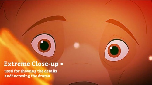
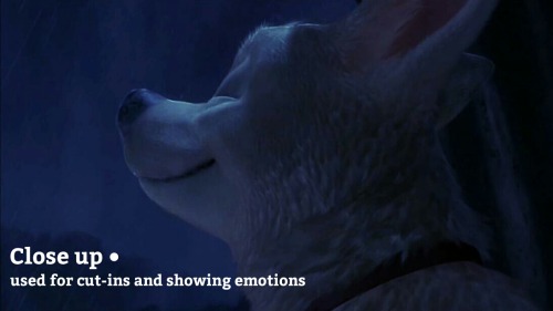
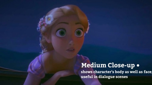
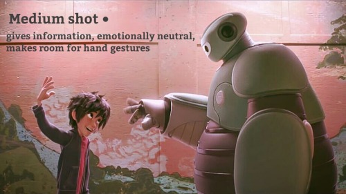
HOW TO TRANSFORMER: Part 1
Trust me, I'm a professional designer :)
Artist, please feel free to add your favorite details that I missed. I'm working on an illustrated/art tutorial version.
PART 2 UP NOW!!
-
 basket-of-references reblogged this · 1 year ago
 -
 mysteriouslybluepirate liked this · 1 year ago
 -
 oddoin liked this · 2 years ago
 -
 traciarts liked this · 3 years ago
 -
 intheotherworld liked this · 3 years ago
 -
 sinonymous-story-ideas reblogged this · 3 years ago
 -
sinonymous-story-ideas liked this · 3 years ago
-
 spoiler-warning liked this · 3 years ago
 -
 sorryicantquitequeeryou reblogged this · 3 years ago
