WHY YOU SHOULD WRITE HORRIBLY:
WHY YOU SHOULD WRITE HORRIBLY:
1. You’ll never write anything if you don’t
More Posts from Basket-of-references and Others

Repeat after me:
The first draft just needs to exist
The second draft needs to be functional
The third draft needs to be effective
The first draft just needs to exist
The second draft needs to be functional
The third draft needs to be effective
The first draft just needs to exist
The second draft needs to be functional
The third draft needs to be effective
Remember, the second and third can't happen if you don't have something to work with. Your first draft will always be shit compared to your third, but at least it exists. The worst first draft is an unfinished one. The best first draft is a just completed one.
You read books/stories not in their first draft form-- only in their finished form (third, fourth, sometimes fifteenth draft). So stop comparing your first draft with a final one.
So, just write--you can make it better later. Perfectionism is the greatest weight a creator can carry.
Holt shit your art is amazing, whered you learn to do backgrounds? Any tips?
Thanks! I just love how Kaye_bin and Vasili Zorin draw backgrounds. Wish one day I'll do something like them and will understand colors as they do. In almost all artworks recently posted, I just tried to draw as many details as I can in a sketch or line work stages. Then prayed to all Gods it will work in a color stage and used a lot adjustment layers :D Right now I am trying to change this workflow and do a little color sketch before start to work with lines. I think all next artwork will be done this way, I'll try to save some steps or timelapse. These are some quick studies I did from games, artists, photos, just to make myself used to draw color sketch first.

Then I tried to use this pipeline on some fast doodles, like this one:


And right now I wanna try to draw something bigger and detailed with this method. Will see how it goes :3
Digital Painting: tips for beginners
Heyo! I got asked if I could make a tutorial on digital painting so I’m gonna throw together some advice meant for people who are starting out and want to figure out exactly how this stuff all works. Because it’s hard! What I hope to accomplish here is to make painting more approachable for you.
Firstly, I have put together something like this before, so for archival purposes here it is: http://holy-quinity.tumblr.com/post/89594801811/i-dont-know-how-much-of-this-kind-of-thing-you
For those of you who don’t wanna bother reading that, here are the main points:
1. Learn your program and its tools, from brush properties to layer styles. And I mean learn them. Make a cheatsheet that shows you exactly what each button and scale does, both in isolation and in conjunction with other buttons and scales. Refer to this as much as possible until it is intuitive. The end goal is to know exactly what to do to your brush’s settings to achieve a given effect.
2. It’s perfectly okay to use your sketches, linearts, and other forms of line in your paintings. They can help guide the form and there’s no need to make something fully “lineless”! I never make things “lineless.”
3. Study other people’s art and try to think how they could have possibly achieved the effects they did. You can learn a lot just by observing and mentally recreating the process stroke by stroke—muscle memory is a powerful tool at your disposal. This becomes easier to do once you’ve started doing item 1 above.
OKAY!
So where the heck do you even begin?
What I’m gonna do is try to make digital painting as approachable as possible for someone who’s never really done it. The main idea here is that digital painting is just like real painting. So if you’ve ever done real painting, you already kinda know what’s coming.
I’m gonna assume you know the basics of digital art: you can sketch, line those sketches using layers and opacity changes, and fill the lines with color, maybe even opting to add some shading…and you’ll get something like this:

You know, cell-shaded, or maybe the shading’s blended, but you’ve still obviously a line drawing with color put down on layers beneath the lines.
The next intuitive step is to try going “lineless”…but when you remove the lines you get this:

idk about you but I’m laughing at how stupid this looks
When I was first teaching myself to paint digitally, I didn’t really know how to deal with this. Without lines, the form of the subject vanished or became a mess like the above. Even if I was meticulous and careful about placing down the color such that without the lines layer turned on, the shapes fit together, it didn’t look quite right. There’d be gaps, I wouldn’t know how to incorporate the subject into a background, the contrast wouldn’t be high enough, or it’d just in general look too much like a screenshot from Super Mario 64.
Painting requires a different process than the above. You’ll have to let go of some of your habits and conventions. Such as staying in the lines. Such as fully relying on the lines. Like, I love my lines, I love my sketches—but in painting, they are guides for form, and are not the form itself. So let me go through how I approach a given painting:

My painting process starts with a sketch (here a boring portrait for demonstrative purposes). I make the opacity of the sketch layer something like 30%, and then throw down my base colors on a new layer underneath. I’m not being meticulous about the sketch itself, because again it’s just meant to guide my placement of color. I’m also not meticulous about my placement of the color.
We’re essentially sketching with color. Because ultimately what we want is for the color to take on the form and shapes conveyed by the sketch.
There’s a lot going into this about how to use value, how to shade, how to use color, etc. that I’m kinda skipping over because it takes a lot of time to explain…but there are hundreds of tutorials out there on those topics so please, google around! I found some helpful tuts that way when I was starting out.
Something I find v useful is to keep selecting colors that already exist in your image for shading and hue adjustment. This is why I start with really blendy, low-opacity brushes when throwing down color on top of the background. I can then select colors within there that are a mix of the two.
For instance, I’ll select the color of the lines here:

…and use that to shade:

And maybe I’ll select one of the darker shades around his eye, but not the darkest, to make the shading a smoother gradient…and so on.
What I do in general at this point is go over the shapes and lines of the sketch. Such that I can turn off the sketch layer and see this:

I’m replacing the lines with shading and value. I’ll continue to do this as I keep adding color.

This is all super loose. I am not dedicated to any particular stroke. I just want the colors and shading and light source to be right. I’ll use overlay layers to boost contrast or add a hue.
Here are other examples where I used this process:


I am constantly changing brushes and brush settings as I paint. It really depends on what effect I want where. I am also constantly selecting new colors and applying or blending those in. I don’t believe in having some uniformly applied base color and then shading with only one or two…that’s what I’d do if I was cell-shading like the first drawing I showed you here, but painting should be about messing with color and opacity and blending to make millions of hues!
Good rule of thumb: Hard, opaque brushes for applying color. Soft, dilute brushes for blending colors. Sometimes hard, dilute brushes can make some cool blending effects! I personally prefer harder edges on my shading so that’s a brush I use often.
This is getting a bit long so I’m gonna split it up into multiple parts, but really what I want you to get from this is:
1. learn the tools at your disposal until they are intuitive
2. sketch and line are guides for form, not the form itself
3. rather, hue and value will produce the form
And of course, practice makes perfect!!! Every drawing you make, every painting you make, will bring you one step closer to the artist you want to be, and thus every drawing and every painting, no matter what, is a success.
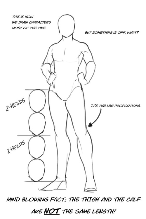
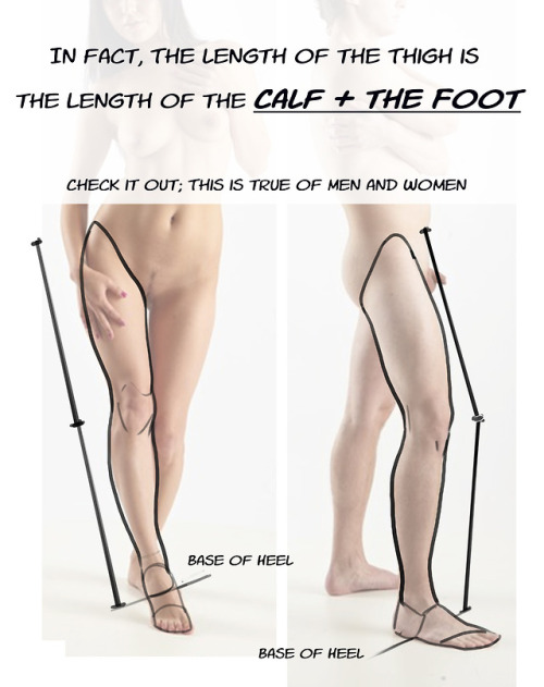
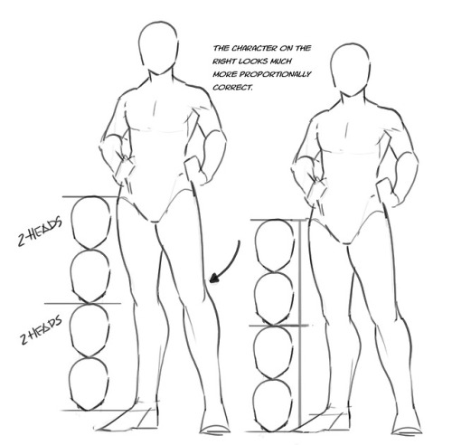
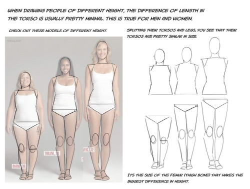
Just a quick thing I put together. This blew my fucking MIND when my anatomy teacher pointed it out. My drawings instantly got better. You might know it (good for you, I wish I knew it before too T_T) or you might not and it might help you get better.


🌸Describing Scents For Writers 🌸| List of Scents
Describing aromas can add a whole new layer to your storytelling, immersing your readers in the atmosphere of your scenes. Here's a categorized list of different words to help you describe scents in your writing.
🌿 Fresh & Clean Scents
Crisp
Clean
Pure
Refreshing
Invigorating
Bright
Zesty
Airy
Dewy
Herbal
Minty
Oceanic
Morning breeze
Green grass
Rain-kissed
🌼 Floral Scents
Fragrant
Sweet
Floral
Delicate
Perfumed
Lush
Blooming
Petaled
Jasmine
Rose-scented
Lavender
Hibiscus
Gardenia
Lilac
Wildflower
🍏 Fruity Scents
Juicy
Tangy
Sweet
Citrusy
Tropical
Ripe
Pungent
Tart
Berry-like
Melon-scented
Apple-blossom
Peachy
Grape-like
Banana-esque
Citrus burst
🍂 Earthy & Woody Scents
Musky
Earthy
Woody
Grounded
Rich
Smoky
Resinous
Pine-scented
Oak-like
Cedarwood
Amber
Mossy
Soil-rich
Sandalwood
Forest floor
☕ Spicy & Warm Scents
Spiced
Warm
Cozy
Inviting
Cinnamon-like
Clove-scented
Nutmeg
Ginger
Cardamom
Coffee-infused
Chocolatey
Vanilla-sweet
Toasted
Roasted
Hearth-like
🏭 Industrial & Chemical Scents
Metallic
Oily
Chemical
Synthetic
Acrid
Pungent
Foul
Musty
Smoky
Rubber-like
Diesel-scented
Gasoline
Paint-thinner
Industrial
Sharp
🍃 Natural & Herbal Scents
Herbal
Aromatic
Earthy
Leafy
Grass-like
Sage-scented
Basil-like
Thyme-infused
Rosemary
Chamomile
Green tea
Wild mint
Eucalyptus
Cinnamon-bark
Clary sage
🎉 Unique & Uncommon Scents
Antique
Nostalgic
Ethereal
Enigmatic
Exotic
Haunted
Mysterious
Eerie
Poignant
Dreamlike
Surreal
Enveloping
Mesmerizing
Captivating
Transcendent
I hope this list can help you with your writing. 🌷✨
Feel free to share your favorite scent descriptions in the replies below! What scents do you love to incorporate into your stories?
Happy Writing! - Rin T.
A couple art tips I wish someone had told me when I was starting out:
FOR ALL AGES BECAUSE YOU CAN START ART WHENEVER YOU WANT AND YOU DON'T HAVE TO BE YOUNG
If you want to draw people then one of the best ways to improve is to become a little narcissistic and repeatedly draw yourself. You are someone that you'll always have reference to and don't need to feel bad about lacking skill when drawing.
If you want to draw in a cartoon or anime style then first draw realistically so you can form a better understanding of proportions, movement, and perspective. This may not be true for or helpful to everyone but I know many that it has been helpful for.
Quit looking up poses on the internet and model your own poses, you coward! You can choose the angle of the camera and the exact position you want each piece of your body in!
Don't fully render an image in your mind. Think of one or two elements of the piece and let the rest flow for best results. Not many people can replicate what was in their head, you'll be less upset if you keep your ideas and inspiration vague.
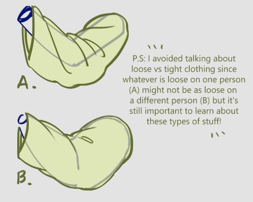
I forgot I have to be active here so here’s my Twitter tutorial on how to draw folds I made a while back to help a friend!


HELP TO MY BELOVED ARTISTS
References is the artist best friend!!!
so here it is some resources for you to use! Please share, so you can help more artist uwu.
i can update this post if i find new things.
LAY FIGURE:
JustSketchMe
Magic Poser Web
Design Doll (this one isn't online, and you have to download)
Easy Pose on Steam (this one isn't a free app, and is more focused on "anime art style")
3D MODEL:
Female body - Sketchfab
Male body - Sketchfab
a lot of poses - POSEMANIACS
Reference Angle
Head Construction - guidelines - by Marc Brunet.
BACKGROUND:
Room Sketcher
SketchUp
BLOGS THAT HELP A LOT:
this amazing post made by starrify-everything
Pose Reference
BONUS:
this amazing hands brushes made by poxamarquinhos
a lot of pinterest bases
-
 vampirevatican reblogged this · 3 days ago
 -
 asterias-daughter reblogged this · 3 days ago
 -
asterias-daughter liked this · 3 days ago
-
 strawberryteddybear reblogged this · 3 days ago
 -
strawberryteddybear liked this · 3 days ago
-
 what-if-i-just-did reblogged this · 3 days ago
 -
 deadgaywizards-4-life reblogged this · 3 days ago
 -
deadgaywizards-4-life liked this · 3 days ago
-
 prince-of-syne reblogged this · 3 days ago
 -
prince-of-syne liked this · 3 days ago
-
 kasarian reblogged this · 3 days ago
 -
 silliestflowergirl reblogged this · 3 days ago
 -
 theeccentricwritter liked this · 3 days ago
 -
 crypticw00rm liked this · 3 days ago
 -
 rosslynpaladin reblogged this · 3 days ago
 -
 thebrandywine reblogged this · 3 days ago
 -
 le-scenariste liked this · 3 days ago
 -
 anekochan reblogged this · 3 days ago
 -
anekochan liked this · 3 days ago
-
 failedelectrocution reblogged this · 3 days ago
 -
 zakizendetandi reblogged this · 3 days ago
 -
 rovpars reblogged this · 3 days ago
 -
 thesaltysagittarious reblogged this · 3 days ago
 -
 thegreatducktective reblogged this · 3 days ago
 -
thegreatducktective liked this · 3 days ago
-
 superbcandyangel reblogged this · 3 days ago
 -
 tenasilvertear reblogged this · 3 days ago
 -
 lizardsraccoon reblogged this · 3 days ago
 -
lizardsraccoon liked this · 3 days ago
-
 invincible-atlas reblogged this · 3 days ago
 -
invincible-atlas liked this · 3 days ago
-
 st4rwrd reblogged this · 3 days ago
 -
st4rwrd liked this · 3 days ago
-
 applescats reblogged this · 3 days ago
 -
 themongosianhorse liked this · 3 days ago
 -
 c10wnrat liked this · 3 days ago
 -
 spookylolbit liked this · 3 days ago
 -
 legalownerofufoemoji reblogged this · 3 days ago
 -
 the-other-will-graham reblogged this · 3 days ago
 -
 sadieb798 reblogged this · 3 days ago
 -
 croissainy liked this · 3 days ago
 -
 finleycannotdraw reblogged this · 3 days ago
 -
 brekkingin reblogged this · 3 days ago
 -
 absolutely-existing reblogged this · 3 days ago
 -
 tellynoise liked this · 3 days ago
 -
 winghimself liked this · 3 days ago
 -
 district-thirteen-intern liked this · 3 days ago
 -
 temple-of-mars-ultor reblogged this · 3 days ago
 -
 lady-stardust-sang liked this · 3 days ago
 -
 these-trans-hands reblogged this · 3 days ago
