Oh My God I Hate Mattel So Much.
Oh my god I hate Mattel so much.
They took the American Girl brand and gave it a lobotomy.
I was going to make a very very very very bad joke about one of the 90s girls getting an eating disorder after watching Britney Spears, BUT DECIDED AGAINST IT because eating disorders are something you don’t joke about, BUT. HERE’S THE THING.
Here’s the thing. Being a tween-to-teen-age girl in the late 90s early 2000s was BULLSHIT. You had 16-year-old Britney Spears singing “Hit me baby one more time” in her Lolita schoolgirl miniskirt and crop top showing off her perfectly flat abs, and then you went to school and had abstinence-only sex ed mandated by the evangelical right wing who gave out purity rings and told you that only sluts had sex before marriage. And then there was the issue of being a fat girl trying to find jeans that met her school’s dress code the days of low-rise jeans and belly button rings.
I ended up adoring Linkin Park because their music gave voice to the rage that I had inside of me because of all that. I wore men’s pants from Hot Topic not only because I thought they were cool, but they actually fucking fit and they covered my ass crack. I wore black because I didn’t fit in to the ultra-skinny, ultra cool kid Abercrombie aesthetic. And THAT is what growing up in the 90s and coming of age in the 2000s was like.
“Nicki Hoffman is a nine going on ten year old girl living in Seattle, Washington just before the year 2000 (the turn of the millennium). She is six minutes older than her fraternal twin sister, Isabel, but one inch shorter. Nicki prefers grunge, ska music, rock, alternative, and skating; she is the “grunge” to Isabel’s glitter. She does not like eating raw fish and sushi; her father teases that they can’s spell “finicky” without Nicki. She likes sour candy–the more sour, the better. She’s known to be shy, to the point Isabel points this out; she initially doesn’t have other friends than Isabel. She’s very anxious about the Y2K problem and the risks and worries that have been circulating, so Isabel and her create a list to take her mind off her worries of things to do before New Year’s.Her favorite color is purple, her favorite animal is a dog (she adopts her puppy, Blossom, as a Hanukkah gift), her favorite band is No Doubt, and her favorite show is The Powerpuff Girls (her favorite character being Blossom). She likes to snack on Wild Berry Pop tarts. She does not like her middle name, Pearl.The family is interfaith and celebrates both Hanukkah and Christmas. “

It’s a sterilized and dumbed-down version of growing up in the 90s, one where they only real problem facing girls is the y2k bug. It’s about the aesthetic but not the experience. Honestly the girls of today deserve to see that their moms had it difficult, too, and that the pressure to grow up incredibly quickly and be beautiful and flawless and instantly become a woman is nothing new, now it’s just on TikTok instead of MTV.
It’s the trap of nostalgia. Just because you were younger and not as aware of the issues going on in the world doesn’t mean the world was better.
More Posts from Jerichos-reblog-repository and Others
weirdly specific and unrelated asks to know someone well:
chipotle order?
thoughts on veganism?
a specific color that gives you the ick?
mythical creature you think/believe is real?
favorite form of potato?
do you use a watch?
what animal do you look forward to seeing when you visit an aquarium?
do you change into specific clothes for the house when you get home?
do you have a skincare routine (and how many steps is it)?
on a plane, do you ask for apple or orange juice?
anything from your childhood you’ve held on to?
brand of haircare/bodycare/skincare that you trust 100%?
first thing you’re doing in the purge?
do you think you’re dehydrated?
rank the methods of death: freezing, burning, drowning
thoughts on mint chocolate chip?
an anxious compulsion you do everyday?
your boba/tea order?
the veggie you dislike the most?
favorite disney princess movie?
a number that weirds you out?
do you have an emotional support water bottle?
do you wear jewelry?
which do you find yourself using, american or british english?
would you say you have good taste in music?
how’s your spice tolerance?
what’s your favorite or go-to outfit?
last meal on earth?
preferred pasta noodle?
ask me anything !
leave an ask for the person you reblog it from!
"There's no hope for the future." And that's how they felt during the Atomic Age, during the World Wars, during the Enlightenment Revolutions, during thr plagues, during the Viking raids, during the fall of Rome.
Yet, we persisted.


in what order do you think it’s best to read dostoyevsky’s novels?
hey so this is a question i get asked quite often, so you know what? i made yall a handy chart

fat bodies tutorial!
ALRIGHT SO my pal @kalreyno wanted help with drawing fat characters and as a fat artist i felt like i could give a bit of helpful insight on that. there’s also been a lot of complaining about “boo hoo fat characters are hard to draw so i can’t include them in my work Ever” goin on lately so if that’s your case then this is for you too!! and also just for anyone who would like help with fat bodies in general, ofc. anyway, let’s get this show on the road!!

let’s start with some common misconceptions. these are the two main attempts at chubby bodies i run into, so i’ll focus on them.
the Anime Chubby i see everywhere, and it’s just……so wrong in many ways. first of all, there is almost no additional body fat compared to your average thin character - except for where it’s added in “attractive” places (breasts, hips, thighs). the breasts are way too perky, and don’t have the realistic shape fat would give them (though how to draw accurate breasts is another tutorial all on its own lmao). there is still a thigh gap, which usually only happens in very thin people, and bones are still visible on the surface of the skin, which also rarely happens in fat people.
the Michelin Man is better in some ways, but still not that great. it’s a slightly better attempt, but basically all that’s done there is taking a thin character and blowing them up, while giving no thought to fat distribution. the thigh gap is usually still present, and they look a lot more hard than soft - and fat is very soft and pliable.
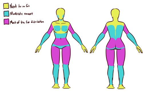
here’s a chart on how fat usually distributes (if you can’t read my messy writing, “1. next to no fat, 2. moderate amount, 3. most of the fat distribution”). basically, the more muscle an area has, the more prone it is to develop fat, such as the abdomen, thighs, and upper arms. it’s important to note that fat sits on top of muscle, and that it does distribute in different levels, and not evenly across the body as shown in the Michelin Man.
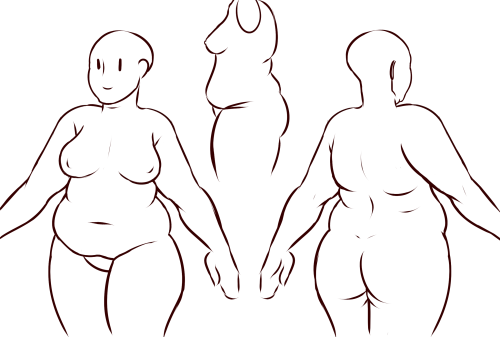
now, here’s an accurate fat body with all of that kept in mind!! notice how the fat isn’t only kept to aesthetically pleasing areas, and how it sits realistically on the character’s body. their breasts sag a lot more, which happens even in thin people with larger breasts, and the nipples are pointing more downwards than straight out. there is no thigh gap in sight, there are no bones in sight, and most importantly, they have fat rolls, which are very important in drawing a convincing fat character!! as far as i know i’ve never met a single person with no rolls at all, and everyone has them, whether thin or fat - they’re just more prominent and more consistently present in fat people. pay close attention to where they are and how they’re shaped.

here are a couple of drawings showing how fat is affected when sitting vs stretching. as seen in the first, the fat specifically on the stomach is distributed a lot more evenly and stretched out, so it becomes “flatter”. the love handles are still pretty visible, though, as well as the fat on the thighs and arms. the breasts are raised with the shoulders, and the fat on the shoulders and near the neck forms rolls as it’s being pushed together.
in the second, there is a lot less room for distribution, so the fat is all pushed together. the breasts sag and the stomach forms rolls and spills into the lap. a good analogy for the way fat works is to liken it to a water balloon, and thinking of how its shape would change when resting flat on a surface, hanging off of a ledge, held upright, etc.

here are a few extra tips i find a lot of people miss!
first on the top is the hip/pubic region. the first circle is showing the way the bellybutton is folded in fat people, as opposed to stretched out in thinner people. the second is the stomach fat spilling over onto the pubic region and creating a separation in the two areas, which is something that’s missing in a lot of art. in addition, the pubic mound also gains fat, making it round as seen in the profile drawing i did up there (i’ve heard people refer to it as fupa?). the last in the hip region is the lack of a thigh gap. i can’t stress this enough!!!! if you’re trying to draw a convincing fat character, make sure their thighs are pretty much always touching!! for reference, mine literally don’t separate until my feet are about 2ft from each other.
the bottom right is showing the double chin, which a lot of people are afraid to draw!! fat does distribute itself here too, and there’s nothing wrong with it, so don’t feel like you shouldn’t give fat characters a double chin in your work for fear of it looking like a caricature.
in the bottom middle, it’s showing how fat affects different types of breasts with the presence of more or less breast tissue.
lastly, at the very right are stretch marks with their usual locations and directions, which i also can’t stress enough!!!!! i sometimes forget to add them honestly, but they’re so important in accurately portraying fat characters, as they literally come from the skin being stretched from fat being gained (and they’re also just rlly neat lookin like why wouldn’t you lmao). some people have less and some people have more, feel free to experiment with them!

the last thing is body types!! there isn’t one single way for a person to be fat, so feel free to experiment with shapes once you’ve learned the basics!!
so there you have it, a tutorial on how to draw chubs!! now go forth and make some accurate fanart or some rad fat characters, because the world could always use more of both. hmu if you have any questions or concerns, and thanks for reading!!
EDIT: someone pointed out the bad wording in the tutorial. thank you for bringing it to my attention and sorry for offending anybody. i’ve updated the tut, so please reblog this one!

Calling all grapheme-color synesthetes!!
I made a spreadsheet to compare all of out alphabet's colors! If you have colors for letters, chose a row and add your alphabet in. This is entirely non-scientific, it's just fun to see all the colors!
https://docs.google.com/spreadsheets/d/1k49odT3L986otANtsX73VQY6cNc9940b0IJp_NuVjb4/edit?usp=sharing
I’d like to share this Tumblr tool with everyone. You give it a Tumblr URL, and it identifies the most popular posts (by note count) for each month in your history. It was quite useful for determining which comics to reblog for a “best of” week.
Note: To have it also include posts from 2013, click ‘advanced options’ and use the checkbox for 2013. It’s an old tool, which is a bit embarassing for Tumblr. Why isn’t this functionality built into the Tumblr interface?
-
 jerichos-reblog-repository reblogged this · 2 months ago
 -
 alligatorman liked this · 10 months ago
 -
 anomalys-bane liked this · 1 year ago
 -
 secluded-gorgon reblogged this · 1 year ago
 -
 samantha-and-nellie liked this · 1 year ago
 -
 chrissamaxwell reblogged this · 1 year ago
 -
 panicsun liked this · 1 year ago
 -
 hufflepuffbadgerpotato liked this · 1 year ago
 -
 nymphtingz liked this · 1 year ago
 -
 agfanforever liked this · 1 year ago
 -
 brutalyoyo78 liked this · 2 years ago
 -
 mossnmoss liked this · 2 years ago
 -
 thepurplesombrero reblogged this · 2 years ago
 -
 xcsthctiics liked this · 2 years ago
 -
 betsybaby reblogged this · 2 years ago
 -
betsybaby liked this · 2 years ago
-
 i-wake-up-smiling reblogged this · 2 years ago
 -
 musicaldeductions liked this · 2 years ago
 -
 jay42 reblogged this · 2 years ago
 -
 gripies liked this · 2 years ago
 -
 weirdnoisen reblogged this · 2 years ago
 -
weirdnoisen liked this · 2 years ago
-
 suddenorgans liked this · 2 years ago
 -
 arecipeforfeels liked this · 2 years ago
 -
 runforthehills8 liked this · 2 years ago
 -
 faerietcles liked this · 2 years ago
 -
 andthentheywilleatthestars reblogged this · 2 years ago
 -
 garbageboy-stinkman liked this · 2 years ago
 -
 haveievermentioned reblogged this · 2 years ago
 -
 iamdeltas reblogged this · 2 years ago
 -
 cohues liked this · 2 years ago
 -
 fantasycantasy liked this · 2 years ago
 -
 fakehouseresident liked this · 2 years ago
 -
 synthwwavve liked this · 2 years ago
 -
 gotta-have-faye reblogged this · 2 years ago
 -
 capnportofficial liked this · 2 years ago
 -
 wistelligence liked this · 2 years ago
 -
 fandom-fae liked this · 2 years ago
 -
 monokumasego liked this · 2 years ago
 -
 raysforsunlight reblogged this · 2 years ago
 -
raysforsunlight liked this · 2 years ago
-
 anotsosecretdreamer liked this · 2 years ago
 -
 xccentriktigress liked this · 2 years ago
