FACES
FACES
Drawing a face (the circle thing)
How to draw faces
Heads in profile
Drawing heads
A face tutorial
Avoid same facing
Diversify your faces
Face shapes
To make your drawing look like the person you’re drawing
Make your faces look like the person
Expressions
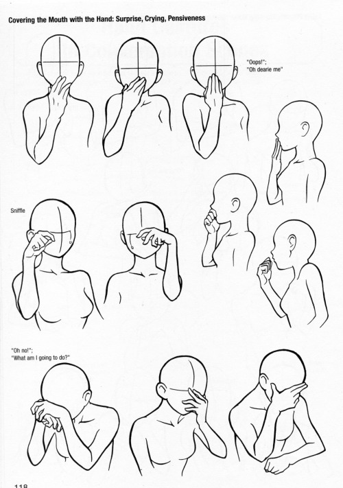
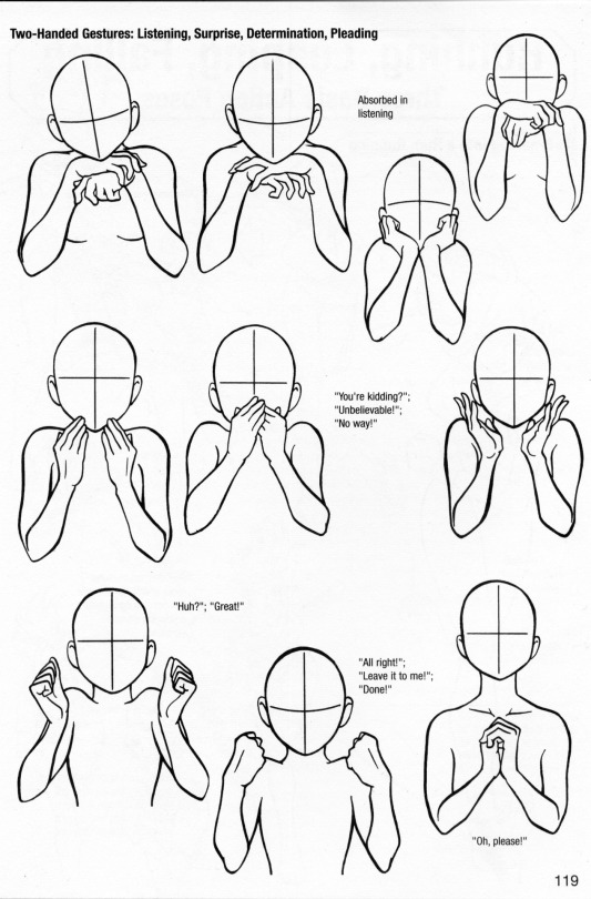
More about expressions
Drawing lips
Lip tutorial
Drawing ears
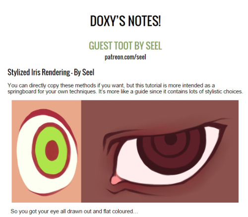
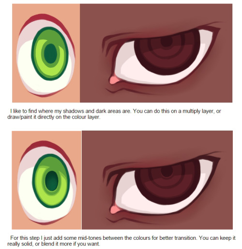
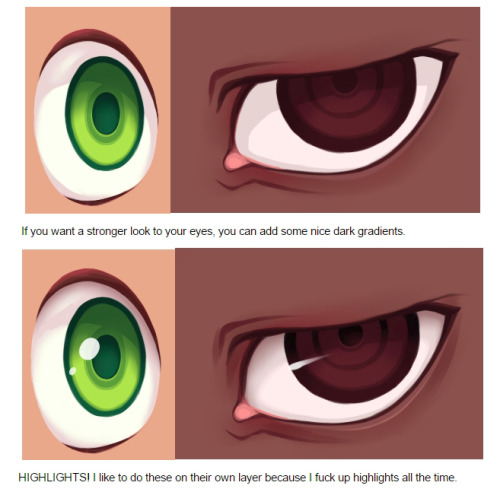
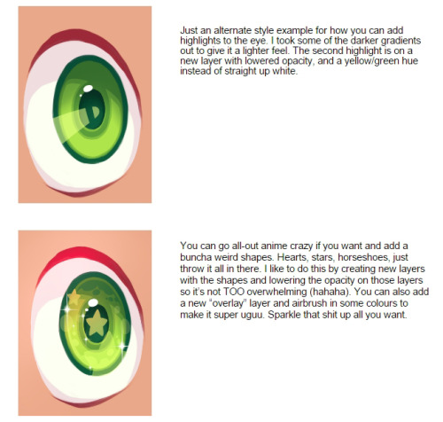
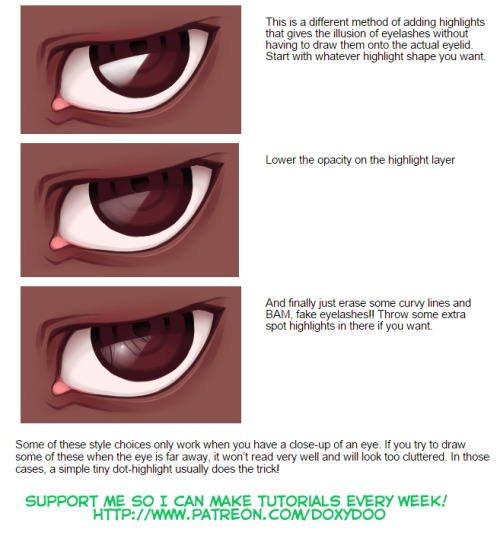
Drawing eyes
Realistic eyes
Drawing a nose
Drawing kisses
Drawing glasses
Drawing hoods
BODIES
Guide to human types part 1
Guide to human types part 2
Guide to human types part 3
Different kinds of athletic body types
Ladies tutorial (nudity)
Fellas tutorial
Curves on girls tutorial
How to draw necks
Drawing shoulders
Drawing arms
Drawing hands
Hand tips
More hands
Hands tips and techniques
Hands, arms, legs and feet
Legs, torso and expressions
Drawing boobs
How to boob
Boobs and hips
Drawing abs
Beer belly tutorial
Drawing backs
How to draw back views
Legs reference
Drawing knees
How to draw butts
Penis tutorial (nsfw)
Drawing feet and shoes
Sitting reference
Realistic woman body shape chart
Hair
Drawing hair
Hair tutorial
Drawing curls
Drawing braids
ANIMALS & CREATURES
Canines vs felines
Drawing cats
Drawing cats tips
How to draw big cats
Drawing rats
Basic deer tutorial
Deer sketching
Dog anatomy
Dog anatomy tutorial
Dog nose tutorial
Dog paw tutorial
Basic wolf tutorial
Horse tutorial
Sheep vs goats
Drawing giraffes
Basic owl tutorial
Bird wing tutorial
Drawing bird beaks and faces
Butterfly tutorial
Drawing animal legs on humans
Winged people anatomy
Dragon tutorial
Drawing dragons
Dragon wing tutorial
Fur tutorial
Drawing sharp teeth
OTHERS
Drawing clothes
Clothing folds tutorial
Collars, vests and pants reference
Hats reference
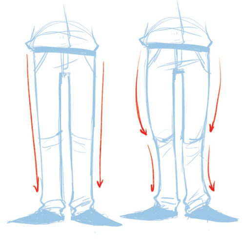
Drawing jeans
Drawing bows
Drawing trees
Tree tutorial
Drawing water
Water tutorial
Drawing crystals
Ice
Clouds
Creating form
Perspective tricks
Character design reference
How to draw better (video)
Learn how to draw better
Art reference & tutorials blog
Tutorial masterpost
How to draw anything
More Posts from Artrefforsteph and Others


the single greatest cloud brush I've worked with so far oh my god
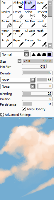
just adjust opacity and size depending on how crisp lines you want
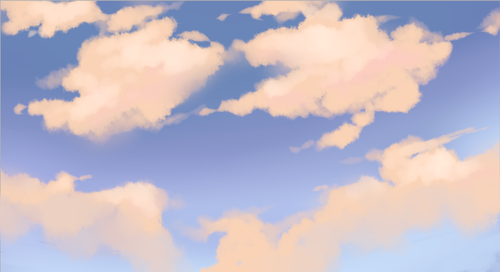
this shit took like 10 minutes
Space Brush
Just a quick brush / texture I put together to learn how to make Sai brushes.
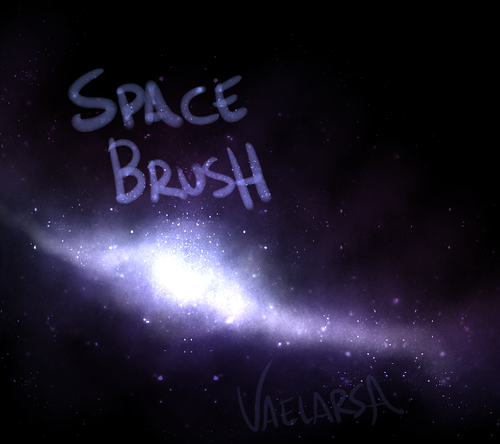
You can get the space texture here. SET THE BRUSH LAYER ON LUMINOSITY.


HIIRAREFS: Basic and Intermidiate guide to colouring in
What better day to end the year then with a basic guide to colouring- This is for beginners or intermediate artists. Colouring is a big part to an art piece, whether you decide to use colours or not, that’s up to you, but for the most part, having some knowledge on appliance of colour will really help you out!
____________________________________________
ARTISTS WITH AN INSPIRING KNOWLEDGE OF COLOUR APPLICATION! Please take the time to have a look at other artists work so that you ca research and get inspired!
Gullacass: Uses brights, dulls and pastels to create brilliant guro, pop and macabre pieces| DA + TUMBLR
TinyCalcium: Old friend of mine who explores brights and mustard colours and places them as a foundation for their work | TUMBLR
BeastPop: Talented with opposing and Triwheel colours. Outstanding cell-shading, and knows how to flexibly bend colour form to their will in popart. | DA
H0stel: Fantastic composition of light direction and applies colour to bodies based on ambient occlusion. | TUMBLR
_____________________________________________
COLOUR SLANG: I use some strange slang to express colour types and shades as well as groups. Although they may not be canonically correct, I will use these terms to describe colour palates to the best of my ability! Analogous: Colours that are near or adjacent to each other on the colour wheel, EG: Red and Orange
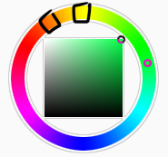
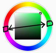
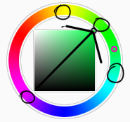
Oppositional/complimentary: Colours that are opposed or opposite from each other on the colour wheel, EG: Cherry and Green
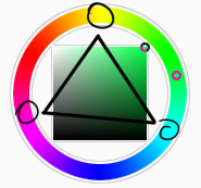
Triadic: Colours that form a triangle on the Colour wheel, EG: Cyan, Magenta and Yellow. These three colours when mixed together will make black.
Arrowtype/Quadcolour: Four colours, that generally form an arrow shape on the colour wheel.
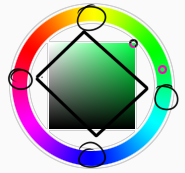
Tetradic: Colours that form a rectangle or square in the colour wheel
Neons: The very brightest you can get a colour, be careful where you use them as they can look ugly together at the most. Try to use neons when you are adding bright glowing objects to your piece. Neons are great for highlights.

Brights: Slightly washed Neons. Appropriate if you have characters that are colourful.

Washed: Very washed brights with a hint of grey. These are also useful for colourful characters.

Pastels: Colour with white in them to make them seem light.
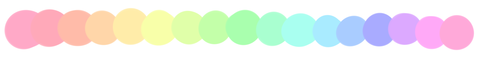
Baby Pastel: Pastel with even more white in them, good for subtle highlights.

Darks: Colour with black added to them. Used mostly for lineart.

Mustards: Colours with dark grey added to them

Earthen: Colours with brown added to them

Warm and Cool colours: Warm colours are colours that range fromMagenta to Yellow. Cool ones range from Lime to Fuchsia.

Straight tones: A greyscale palate. or a straight scale of one colour from black to it’s neon form.

Warm and cool tones: Warm tones are a greyscale mixed with warm colours and cool tones are greyscale mixed with cool colours.

Skintones: Warm washed or pastel colours generally used to colour in skin, but they don’t have to be warm at all! ( I will not show you a palate for this however)
______________________________________________
WHAT TO AVOID WHEN COLOURING: beginner artists, tend to go ahead and start by colouring their line art with neon and mustard colours. Neons are not necessarily good for base colours unless the character has a glow.
I often see lazy attempts to shade, often a beginner artist with use an airbrush and use black and white to shade and highlight their piece. This is not very effective, and I’m sorry to say… It’s kind of gross as well. Try to avoid being lazy. If you have a piece that has bold black lines, avoid using soft shading and airbrushing at this point of time.
Black and white isn’t always the best option when colouring in your piece, but it also depends on the style you are trying to convey. If you plan on only using straight tones to colour in a piece, black and white is good.

A GOOD BASIC WAY TO COLOUR For this basic tutorial I will show you a nice way to colour in a piece with bold lines. I will be using Minty’s Classic character as an example.
Begin with using brights that have been washed down a little and washed skin tones if your character is human based. Avoid using neons or mustards if you are able. If there is white on the character, such as the white on an eyeball or the teeth, consider using baby pastels. For Minty’s eyeballs I have used a baby pastel blue. I have chosen to use a darker and more washed version for her Irises.

With you foundation colours placed down, use a washed warm colour for the skin tone, such as a salmon. If the character’s hair or fur is warm coloured, use a pink or red orange to shade that as well. Use the cell shading technique. This may mean you will have to erase some of your shading so be sure to do this on another layer. For your baby pastels, you can use a regular pastel to shade it. For Minty’s eyes I have used pastel blue and lowered the opacity by a little.

For Highlights, I have chosen to use baby pastel yellow. I wanted the piece to be warm.

Applying a light airbrush over the top of the piece makes it feel a little softer. I have also applied the airbrush over the initial borders to create colour bleed, giving a very subtle reflective approach.
Colouring your line art layer, particularly if you have bold lines, can really make a piece look more interesting! I like to leave the overall outline black. You can gradient and bleed colour in your line art as well

Light tracing is a technique lots of artist’s use, where they run a sharp line of highlight next to line art to divide borders.

This looks a lot nicer than the black and white shading, doesn’t it!? __________________________________________
This is a very very simple guide to applying colour to your piece! If This helped, please reblog and share this guide around!
If you have any questions or feedback, don’t be afraid to send me a message!
how do you draw hair in your syle?
how do i draw hair in my style* i think thats what you mean right? Okay hair is seriously my favorite things to draw because its super fun and its really not that difficult once you get the hang of it. You need to understand how hair works though, that is very important!!!
you need to know the ‘flow’ of the hair. seriosuly. understanding how this works makes your life so much easier because then you dont need to copy EXACTLY how the characters hair looks like (if you are drawing fanart or something) and you can just make up your own way of drawing the persons hair (following the flow) and it still looks great! Yes even the crazy bedheads like kuroo has flow and parting. i hope i made sense, im terrible at explaining.

now that you know the flow, did you notice that the arrows all come from one point? That is where the hair is parted usually. I often start off where it parts and follow along the ‘arrows’.
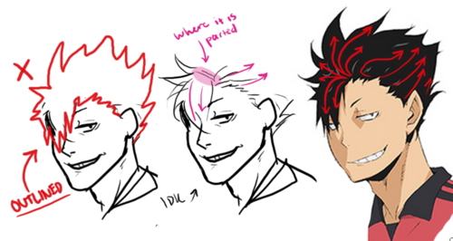
dont draw the ‘outline’ of the hair only (meaning you dont draw what is happenig inside of the hair), there is no flow and it looks really choppy and its super difficult (unless you are really good at it go ahead idk). see how in the middle kuroo, I start with where it is parted? SO MUCH EASIER TRUST ME!!! So remember, always always always know the flow and the where the hair parts!!!
as for my style, i dont know i just draw hair and boom. style? here are a bunch of habits i do when i draw hair:

look at the very left side where it shows how I draw hair strands. remember to start with simple lines or big shapes and then gradually break it down smaller and smaller and you should be good! hope it this was helpful in some way :)
-
 w-starshine liked this · 1 month ago
 -
 spec1f1c0cean reblogged this · 2 months ago
 -
 gravitylock liked this · 2 months ago
 -
 the-awesomeness-of-randomness liked this · 2 months ago
 -
 boudicca-of-iceni liked this · 2 months ago
 -
 donkeykongclassifiedsecrets reblogged this · 2 months ago
 -
 beatsthingies liked this · 2 months ago
 -
 planetamarte reblogged this · 2 months ago
 -
 00ff00dreams reblogged this · 2 months ago
 -
 sapphicchako liked this · 2 months ago
 -
 miss-shell20 liked this · 2 months ago
 -
 prism-tears liked this · 2 months ago
 -
 ratxxxpasta liked this · 3 months ago
 -
 silent-hound liked this · 3 months ago
 -
 x-kaitlyn-x reblogged this · 3 months ago
 -
 raspberrycrown-bitch reblogged this · 3 months ago
 -
 shirestrawberry144 liked this · 3 months ago
 -
 flowermance liked this · 3 months ago
 -
 furfox liked this · 3 months ago
 -
 watermelonduchess liked this · 3 months ago
 -
 aliceunderlines liked this · 3 months ago
 -
 queencantaloupe reblogged this · 4 months ago
 -
queencantaloupe liked this · 4 months ago
-
 thiago0021 liked this · 4 months ago
 -
 natterss reblogged this · 4 months ago
 -
 smbdymiau reblogged this · 4 months ago
 -
smbdymiau liked this · 4 months ago
-
 haunteddeerearthquake reblogged this · 4 months ago
 -
haunteddeerearthquake liked this · 4 months ago
-
 bambamboozles liked this · 4 months ago
 -
 crabanaut liked this · 4 months ago
 -
 yute15 liked this · 4 months ago
 -
 sweettoothbadger liked this · 4 months ago
 -
 duck-with-scissors liked this · 4 months ago
 -
 miguelofasshai reblogged this · 4 months ago
 -
miguelofasshai liked this · 4 months ago
-
 henrytanael19 liked this · 4 months ago
 -
 sleepabyss liked this · 4 months ago
 -
 archtech-fox reblogged this · 5 months ago
 -
archtech-fox liked this · 5 months ago
-
 that-shy-fanfic-writer reblogged this · 5 months ago
 -
 starryknight565 reblogged this · 5 months ago
 -
starryknight565 liked this · 5 months ago
-
 ironwolf-gone reblogged this · 5 months ago
 -
 lemondropsandstars reblogged this · 5 months ago
 -
lemondropsandstars liked this · 5 months ago
-
 techtainia reblogged this · 5 months ago
 -
techtainia liked this · 5 months ago
-
 let-them-eat-c4k3 reblogged this · 5 months ago
NSFW because there will probably be nude refs | this is a side blog to sort all of the art stuff I need | none of it is mine
151 posts