Art Tutorials By Disney Artists Griz And Norm Lemay
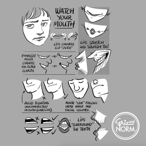
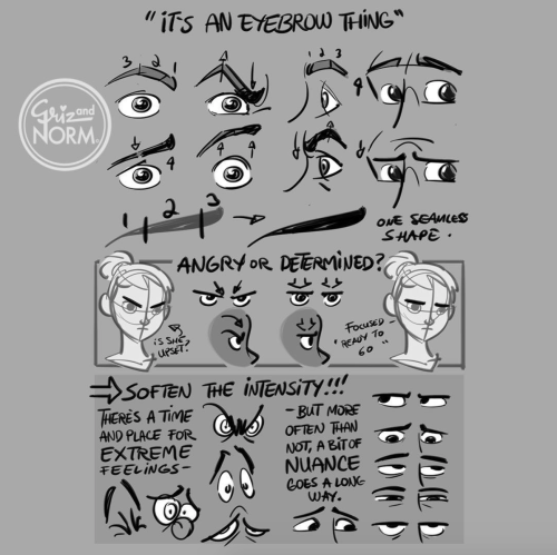
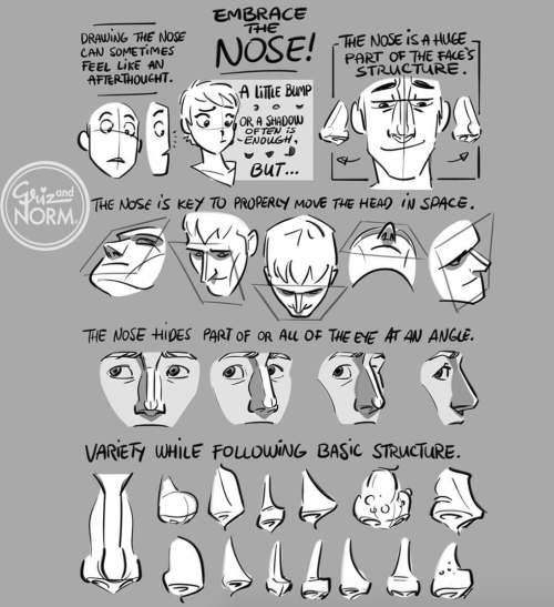
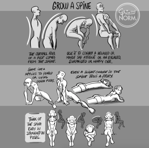
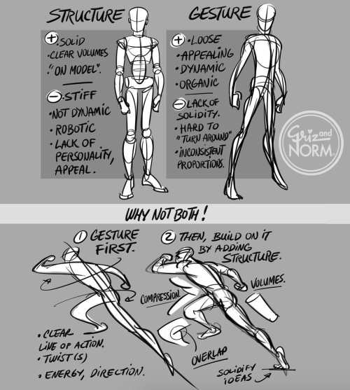
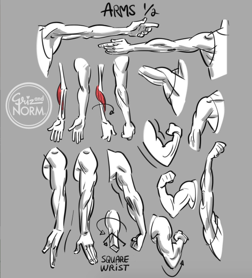
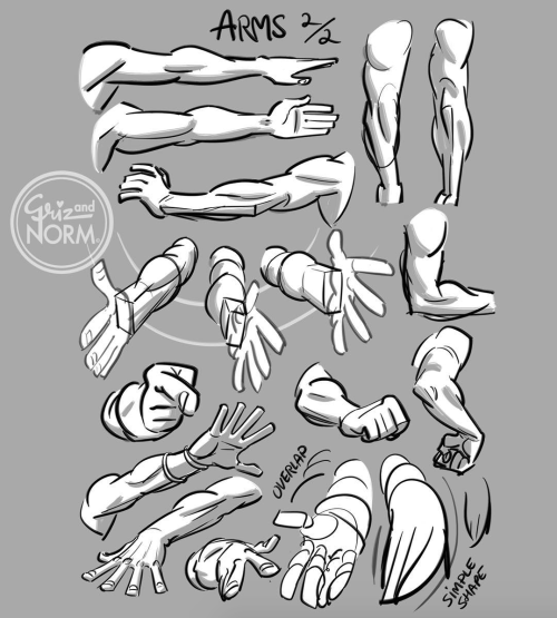
Art tutorials by Disney artists Griz and Norm Lemay
More Posts from Basket-of-references and Others
i hate that every time i look for color studies and tips to improve my art and make it more dynamic and interesting all that comes up are rudimentary explanations of the color wheel that explain it to me like im in 1st grade and just now discovering my primary colors
U use colors in such a enrichening way, how do you do that may I ask??
thank you so much! 💕
this answer is going to be a little long.
the first thing, i think, is that it's very common to think of color as a means to an end, as just another type of information about a drawing: i'm using brown on the hair to show that the hair is brown, i'm using green to show that the characters are standing in grass.
but if color is information, then we can use it to say a lot more than just the basic facts of a drawing!
if you love drawing but want to get better with color, you have to learn to love color, too.
to want to know everything about how color works, to explore what different colors mean to you, to try and try and try again.
because, and this is the kicker:
ALL COLORS ARE RELATED TO EACH OTHER!

[from this post about how to use a color wheel]
i think it's common for people to talk about complementary colors and that's helpful when you're starting out with coloring, but i feel that it can become very limiting when it's treated like a rule and can obscure the fact that all colors are related to each other. it's called a color wheel because there is no beginning or end!

for example, take this drawing:

in this drawing, i'm using colors from all over:

but by just rearranging them slightly and throwing them against a black background like in the drawing, you can see how they're actually relating to each other and not nearly as random as they may seem at first glance!

[these notes are from this post where i break down how muted or "ugly" colors pull an image together] all colors are related to each other in some way, and that means that
YOU MUST DETERMINE WHAT EACH COLOR MEANS TO YOU, AND IT IS YOUR RESPONSIBILITY TO CONVEY THAT MEANING TO YOUR AUDIENCE.


for example, to me green can be uncomfortable and overwhelming, energetic and edgy, calm and natural, or fearful and tense. but no matter how it makes me feel, it's my responsibility to convey my relationship to green to whoever even glances at my drawing.
sure you can use commonly held ideas about colors [red = angry, blue = sad], but this shorthand is also limiting. if everyone used these commonly held ideas about color, there would be no room for experimentation or interesting, wild color choices! and colors mean different things to everyone-- that's what makes everyone's colorful art so different and so cool!!
another thing to note about those green drawings: each one is using a specific type of green.
the one with reigen leans blue-green, which creates a cool-colored image. meanwhile, reigen is warmer tones, which almost makes it seem like he's overheating when he's thrown against such a cool-toned background, which further expresses his discomfort!
the dimple!mob drawing is like a sprite or mountain dew-green, which encourages the feeling of electricity or energy. it's a cool yellowish-green.
the one of mob floating is a warmer yellowish-green, to suggest sunny warmth without drawing sun rays.
the divine tree arc drawing is a lot of reddish-greens, which can suggest a sickliness.
experiment with color combinations and different shades and hues! explore what these different types of colors mean to you!
so now let's get into the nitty gritty of color choice. the following images are from my free pdf about color, composition, and intuitive drawing:


the main takeaways from these pages are:
consider simplifying your colors! more colors does not necessarily equal a better drawing.
see how much a single color can do! can you use it in multiple places on your drawing? what meaning can you ascribe to the colors you're using?
consider creating a concept for your colors and a few rules to guide your piece! a lot of great drawings can fall apart because the coloring concept was too vague or because there weren't enough rules or guidelines to keep the image coherent.
are your colors saturated enough? are the different colors you're using fighting for the viewer's attention? do you have focal points in your art, and if so, are the colors you're using reinforcing those focal points?
use the tools at your disposal! color-picking, color balance, overlay layers. it can feel important to try to prove something by hand-picking every color, but even when i hand-pick my colors i almost always check them with color balance anyway to make sure i'm picking the best colors possible.
YOU DO NOT HAVE TO SUFFER FOR ART. PLEASE use everything that is available to you, and make sure that you are aligned with what brings you joy when you're making art!
i wanted to show an example of a drawing i've done that is doing way too much vs a drawing that is simpler but more balanced:


on the left, the colors are interesting but the background is too strong and is competing with the actual drawing for attention. on the right, the clear background and simple coloring create a cute, easy to read, successful image! this is what i mean when i say that colors can fight for the viewer's attention and mess up a good drawing.
my final secret is that i rarely shade with or use white, black, or grays. i don't think this is a rule that you have to follow, but i like it because it pushes me to figure out what colors will go best with each other, and i think this single tip has strengthened my understanding of color immensely. however, there are a lot of beautiful art styles that shade with and use pure white, black, and gray. you have to decide what you love!
and
STUDY!!!
look at other people's art, color pick it, and make a palette based on their art! look at how they represent values through color, how they shade, etc. study your favorite artists' work!! you will learn so much!!
i hope this was helpful! if you have any more follow-up questions or if there's something that you want to know that i didn't explain here, please don't hesitate to ask!


The thing with a “main character”, is that the reader see the story/world from that characters point of view - we can often read the characters thoughts and feelings more than other characters in the story. You can also use the perspective to increase this “effect”.
You can use the eye-level to display the world seen from the main character. Look at the two pictures above, the characters have the same size on both pictures - the only difference I’ve made is to switch eye-level. And by just doing this, we switch between the adult and the kids point of view - even though they both look at the same thing.
So, when you are doing a perspective, FIRST decide the eye-level and after that start placing out all those annoying guidelines.


Some of my writer’s block cures:
Handwrite. (If you already are, write in a different coloured pen.)
Write outside or at a different location.
Read.
Look up some writing prompts.
Take a break. Do something different. Comeback to it later.
Write something else. (A different WIP, a poem, a quick short story, etc.)
Find inspiring writing music playlists on YouTube. (Themed music, POV playlists, ambient music, etc.)
Do some character or story prompts/questions to get a better idea of who or what you’re writing.
Word sprints. Set a timer and write as much as you can. Not a lot of time to overthink things.
Set your own goals and deadlines.
Write another scene from your WIP. (You don’t have to write in order.) Write a scene you want to write, or the ending. (You can change it or scrap it if it doesn’t fit into your story later.)
Write a scene for your WIP that you will never post/add to your story. A prologue, a different P.O.V., how your characters would react in a situation that’s not in your story, a flashback, etc.
Write down a bunch of ideas. Things that could happen, thing that will never happen, good things, bad things.
Change the weather (in the story of course.)
Feel free to add your own.

Well it being black history month is reminding me how I wanted to doodle something like this down for a while. Since it’s been a lil detail I always take notice of in drawings. These are very simple depictions but I hope it’s enough to give the general idea! Feel free to reblog


Very happy to finally post my second tutorial ! You guys have been so kind the last time and I really hope this helps some of you in your art path 🙇♀️
being a self-taught artist with no formal training is having done art seriously since you were a young teenager and only finding out that you’re supposed to do warm up sketches every time you’re about to work on serious art when you’re fuckin twenty-five
Writing advice from my uni teachers:
If your dialog feels flat, rewrite the scene pretending the characters cannot at any cost say exactly what they mean. No one says “I’m mad” but they can say it in 100 other ways.
Wrote a chapter but you dislike it? Rewrite it again from memory. That way you’re only remembering the main parts and can fill in extra details. My teacher who was a playwright literally writes every single script twice because of this.
Don’t overuse metaphors, or they lose their potency. Limit yourself.
Before you write your novel, write a page of anything from your characters POV so you can get their voice right. Do this for every main character introduced.
-
 uhhh-hi-there-i-am-nervous reblogged this · 1 week ago
 -
uhhh-hi-there-i-am-nervous liked this · 1 week ago
-
 radioactive-dazey liked this · 1 week ago
 -
 glacierruler reblogged this · 1 week ago
 -
 pancakewithamace reblogged this · 1 week ago
 -
pancakewithamace liked this · 1 week ago
-
 one-thirdhuman liked this · 2 weeks ago
 -
 ffriendshapedd liked this · 2 weeks ago
 -
 michel200803 liked this · 2 weeks ago
 -
 whywalkwhenyoucanjump liked this · 2 weeks ago
 -
 flyinggabriela liked this · 3 weeks ago
 -
 jeneco liked this · 3 weeks ago
 -
 mortallytransparenthideout liked this · 3 weeks ago
 -
 drawingrefsforme reblogged this · 4 weeks ago
 -
 static-abyss liked this · 4 weeks ago
 -
 frankennsfw reblogged this · 4 weeks ago
 -
 hikegrncleyrbgmsldht liked this · 4 weeks ago
 -
 ladyofthecreeddraws reblogged this · 4 weeks ago
 -
 one-eyed-imp liked this · 1 month ago
 -
 subw00f3r liked this · 1 month ago
 -
 ventealeaf reblogged this · 1 month ago
 -
ventealeaf liked this · 1 month ago
-
 zombiefingers liked this · 1 month ago
 -
 ed0gaw-a liked this · 1 month ago
 -
 git-guud-kid reblogged this · 1 month ago
 -
 one-poor-life-decision-later liked this · 1 month ago
 -
 cyvera liked this · 1 month ago
 -
 birdletss liked this · 1 month ago
 -
 onelittleornotthing liked this · 1 month ago
 -
 sunako-chan22 liked this · 1 month ago
 -
 alexthebordercollie liked this · 1 month ago
 -
 clockworkambigram liked this · 1 month ago
 -
 sunspot-syzygy liked this · 1 month ago
 -
 cenobitic-anchorite liked this · 1 month ago
 -
 clarisimart reblogged this · 1 month ago
 -
wertyso liked this · 1 month ago
-
 ankewehner liked this · 1 month ago
 -
 magic-and-moonlit-wings reblogged this · 1 month ago
 -
 lonnnysillysally liked this · 1 month ago
 -
 greenteagobr reblogged this · 1 month ago
 -
greenteagobr liked this · 1 month ago
-
 nebulabunnyarts liked this · 1 month ago
 -
 wolf--rot reblogged this · 1 month ago
 -
 tryingtolearnartsob reblogged this · 1 month ago
 -
 professorpet reblogged this · 1 month ago
 -
 mommy-mortis liked this · 1 month ago
 -
 aimless-passerby liked this · 1 month ago
 -
 bozhemwah-blog liked this · 1 month ago
 -
 mscocotrini liked this · 1 month ago
