
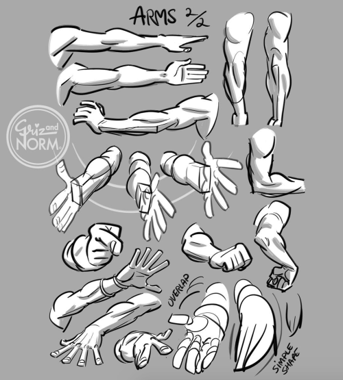
Latest Posts by basket-of-references - Page 4


A master post of Thomas Romain’s art tutorials.
There’s not enough space to post all of them, SO here’s links to everything he has posted (on twitter) so far : 1 2 3 4 5 6 7 8 9 10 11 12.
Now that new semesters have started, I thought people might need these. Enjoy your lessons!

Digital Painting: tips for beginners
Heyo! I got asked if I could make a tutorial on digital painting so I’m gonna throw together some advice meant for people who are starting out and want to figure out exactly how this stuff all works. Because it’s hard! What I hope to accomplish here is to make painting more approachable for you.
Firstly, I have put together something like this before, so for archival purposes here it is: http://holy-quinity.tumblr.com/post/89594801811/i-dont-know-how-much-of-this-kind-of-thing-you
For those of you who don’t wanna bother reading that, here are the main points:
1. Learn your program and its tools, from brush properties to layer styles. And I mean learn them. Make a cheatsheet that shows you exactly what each button and scale does, both in isolation and in conjunction with other buttons and scales. Refer to this as much as possible until it is intuitive. The end goal is to know exactly what to do to your brush’s settings to achieve a given effect.
2. It’s perfectly okay to use your sketches, linearts, and other forms of line in your paintings. They can help guide the form and there’s no need to make something fully “lineless”! I never make things “lineless.”
3. Study other people’s art and try to think how they could have possibly achieved the effects they did. You can learn a lot just by observing and mentally recreating the process stroke by stroke—muscle memory is a powerful tool at your disposal. This becomes easier to do once you’ve started doing item 1 above.
OKAY!
So where the heck do you even begin?
What I’m gonna do is try to make digital painting as approachable as possible for someone who’s never really done it. The main idea here is that digital painting is just like real painting. So if you’ve ever done real painting, you already kinda know what’s coming.
I’m gonna assume you know the basics of digital art: you can sketch, line those sketches using layers and opacity changes, and fill the lines with color, maybe even opting to add some shading…and you’ll get something like this:

You know, cell-shaded, or maybe the shading’s blended, but you’ve still obviously a line drawing with color put down on layers beneath the lines.
The next intuitive step is to try going “lineless”…but when you remove the lines you get this:

idk about you but I’m laughing at how stupid this looks
When I was first teaching myself to paint digitally, I didn’t really know how to deal with this. Without lines, the form of the subject vanished or became a mess like the above. Even if I was meticulous and careful about placing down the color such that without the lines layer turned on, the shapes fit together, it didn’t look quite right. There’d be gaps, I wouldn’t know how to incorporate the subject into a background, the contrast wouldn’t be high enough, or it’d just in general look too much like a screenshot from Super Mario 64.
Painting requires a different process than the above. You’ll have to let go of some of your habits and conventions. Such as staying in the lines. Such as fully relying on the lines. Like, I love my lines, I love my sketches—but in painting, they are guides for form, and are not the form itself. So let me go through how I approach a given painting:

My painting process starts with a sketch (here a boring portrait for demonstrative purposes). I make the opacity of the sketch layer something like 30%, and then throw down my base colors on a new layer underneath. I’m not being meticulous about the sketch itself, because again it’s just meant to guide my placement of color. I’m also not meticulous about my placement of the color.
We’re essentially sketching with color. Because ultimately what we want is for the color to take on the form and shapes conveyed by the sketch.
There’s a lot going into this about how to use value, how to shade, how to use color, etc. that I’m kinda skipping over because it takes a lot of time to explain…but there are hundreds of tutorials out there on those topics so please, google around! I found some helpful tuts that way when I was starting out.
Something I find v useful is to keep selecting colors that already exist in your image for shading and hue adjustment. This is why I start with really blendy, low-opacity brushes when throwing down color on top of the background. I can then select colors within there that are a mix of the two.
For instance, I’ll select the color of the lines here:

…and use that to shade:

And maybe I’ll select one of the darker shades around his eye, but not the darkest, to make the shading a smoother gradient…and so on.
What I do in general at this point is go over the shapes and lines of the sketch. Such that I can turn off the sketch layer and see this:

I’m replacing the lines with shading and value. I’ll continue to do this as I keep adding color.

This is all super loose. I am not dedicated to any particular stroke. I just want the colors and shading and light source to be right. I’ll use overlay layers to boost contrast or add a hue.
Here are other examples where I used this process:


I am constantly changing brushes and brush settings as I paint. It really depends on what effect I want where. I am also constantly selecting new colors and applying or blending those in. I don’t believe in having some uniformly applied base color and then shading with only one or two…that’s what I’d do if I was cell-shading like the first drawing I showed you here, but painting should be about messing with color and opacity and blending to make millions of hues!
Good rule of thumb: Hard, opaque brushes for applying color. Soft, dilute brushes for blending colors. Sometimes hard, dilute brushes can make some cool blending effects! I personally prefer harder edges on my shading so that’s a brush I use often.
This is getting a bit long so I’m gonna split it up into multiple parts, but really what I want you to get from this is:
1. learn the tools at your disposal until they are intuitive
2. sketch and line are guides for form, not the form itself
3. rather, hue and value will produce the form
And of course, practice makes perfect!!! Every drawing you make, every painting you make, will bring you one step closer to the artist you want to be, and thus every drawing and every painting, no matter what, is a success.


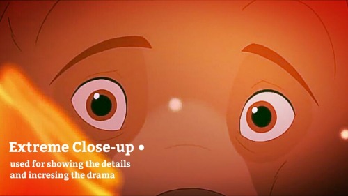
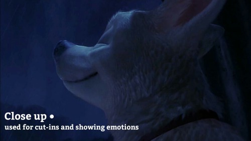
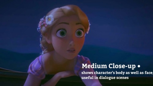
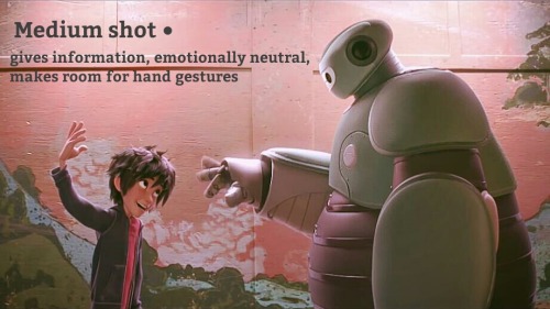
The thing with a “main character”, is that the reader see the story/world from that characters point of view - we can often read the characters thoughts and feelings more than other characters in the story. You can also use the perspective to increase this “effect”.
You can use the eye-level to display the world seen from the main character. Look at the two pictures above, the characters have the same size on both pictures - the only difference I’ve made is to switch eye-level. And by just doing this, we switch between the adult and the kids point of view - even though they both look at the same thing.
So, when you are doing a perspective, FIRST decide the eye-level and after that start placing out all those annoying guidelines.


got a couple of questions on ig about how i choose colors and i spent way too long putting these together so!! here’s a small color picking guide 🎨✨
hopefully this’ll be helpful to someone, but really i think the most important thing is having fun and experimenting to find what you like best!
Wdym by distinctive nose?
(this was what i said was one of my "signature" OC traits in some tags awhile back)
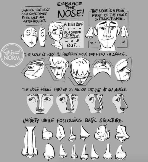
noses are one of my favorite features to draw, so i put all my Best Shapes in the nose. i try to give each character a different one (unless they're related), because it's fun!

noses (੭ ˊᵕˋ)੭
Hello! I hope you dont mind me asking, but how do you draw those amazing black and white comics? (Coffee and The Goddess comics come to mind!) I love the way you do them and would love to know the process you go thru!
this is a pretty broad question and im guessing/hoping you meant “how do you color in black and white in your comics” so have a few random tips about values and paneling and stuff i guess


thank you
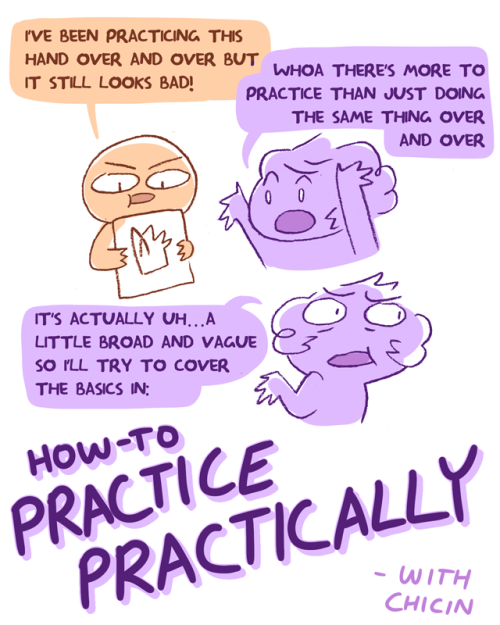
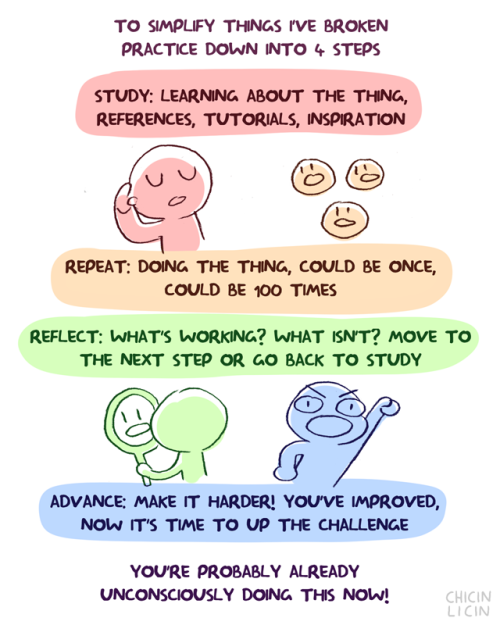


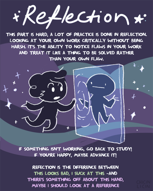
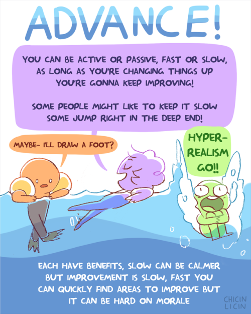
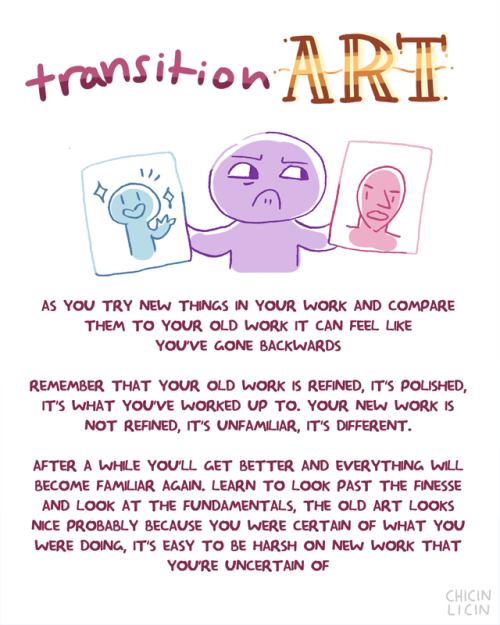
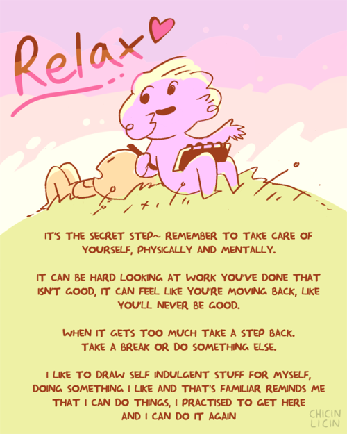
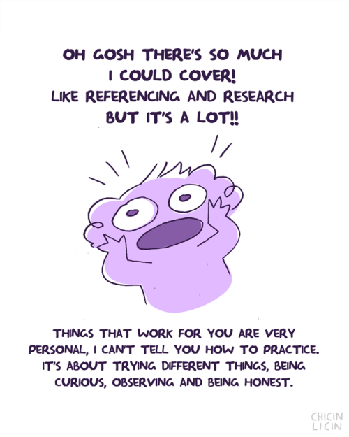
oh hey new guide thinggg~ some basics on how to practice! there’s SO much I could add to this, so it’s just the basics :O
short (kind of): there’s more to practice than doing something repeatedly, it’s also learning new things, problem solving, and honest critique. Each of those is its own skill…also be nice to yourself!
HELP TO MY BELOVED ARTISTS
References is the artist best friend!!!
so here it is some resources for you to use! Please share, so you can help more artist uwu.
i can update this post if i find new things.
LAY FIGURE:
JustSketchMe
Magic Poser Web
Design Doll (this one isn't online, and you have to download)
Easy Pose on Steam (this one isn't a free app, and is more focused on "anime art style")
3D MODEL:
Female body - Sketchfab
Male body - Sketchfab
a lot of poses - POSEMANIACS
Reference Angle
Head Construction - guidelines - by Marc Brunet.
BACKGROUND:
Room Sketcher
SketchUp
BLOGS THAT HELP A LOT:
this amazing post made by starrify-everything
Pose Reference
BONUS:
this amazing hands brushes made by poxamarquinhos
a lot of pinterest bases
Heres a MEGA folder filled with art book pdfs, if anyone has some others that you'd like me to add to it thats missing, please let me know and send me the link
EDIT 1: If you're a bit new to art and you're super overwhelmed by the options and you don't know where to start, I highly recommend the morpho series of books
Edit 2:No more Google Drive, just the MEGA folder now, so don't panic if the stuff on Google ain't there no more, its still up, just in a different location

These are taken directly from the concept art. May not be the same as what was used in the shows.
I will edit post with hexcodes.
Hey guys, you know about the Same Energy website right? has someone made a post about that? Cuz otherwise im gonna sing its praises to high heaven for its artistic references


I made an extensive pinterest board of fat and plus size body and pose reference for artists.

It's organized loosely by how dynamic the poses are. I've tried to make sure the pins aren't triggering as long as you stay on pinterest.
Its a work in progress so I would be happy to get any feedback y'all have. Also any suggestions for specific types of ref is great.


I don’t know if I even did this right it seems too complicated lmao
Anyways a couple of of you guys have asked me for help on drawing robot bodies cause your confused on mechs a femmes I guess I’ll call them. I used Transformers Prime robots cause they’re not too blocky but not too human looking either. This isn’t a tutorial on how to detail them just how to draw the basic shapes. I hope this at least helps a little bit. sorry for my awful handwriting lol. my text thing doesn’t work on my photoshop