
232 posts
Latest Posts by silvariations - Page 4
AFAB?
AMAB?
No, me gender was taken by the same devil whale that took me leg. I be AHAB.
reading moby dick:

“ugh why is moby-dick so long”
ishmael is telling you a story about how all his friends died and how he was the sole survivor of the disaster, why wouldn't he want to delay getting to that point of the story as long as possible?
the odyssey
the length of the book parallels the long amounts of time that whalers were away from home with long periods of boredom punctuated few and far between by brief bouts of frenzied action
you don't like cetology? whalelore? kys
since when have you ever complained about a dick being long. ungrateful
Pick ur poison,,, (click here to choose these lil critters fate!)

🌹Jesus wasn't white🌹

redraw lel


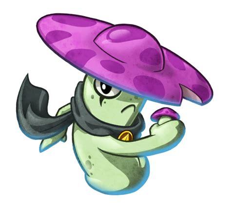
plants vs zombies is unironically my favourite zombie story ever. original concept. no dumb apocalypse plot. no asshole human characters. zombies that actually do cool stuff other than walk around biting people. walking dead can't compete with this
Der Freischütz and Funeral of dead butterflies have made out once, I was there

This needs a caption
I'm sorry, but if you think Hunchback of Notre Dame is blasphemous, you either weren't paying attention, or are exactly the kind of Christian that the movie was calling out


Ghost Rain, Ch.20 Preview
I would say I made previews for the chapter 20, but this ONE LINE made me want to draw this instead...
Go read my comic ‘Ghost Rain’ on Webtoons!
A (Somewhat Incomplete) Guide on How to Fake Sinner Profiles


LIMBUSIFY YOUR ARTSTYLE (optional)
The core components of limbus companies artstyle are as follows:
Textured, ink pen like lineart
Desaturated colours leaning towards the outermost area of the colour square
Cell shading with some texture
lots and lots of visual effects. God have mercy
Keep references around while drawing, as there are often lots of small details and these will be your guide for not going too crazy with your noise effects.
2. BACKGROUNDS
In the interest of saving time, here’s a free template for you to use. Feel free to change up the background colour however
Key notes:
The background colour loosely matches to the sinner’s eye colour, however usually slightly more saturated.
the outer border is lined thinly by black. This also covers the limbus logo section.
3. TEXT
The font for the light yellow text for your sinners weapon is Futura Condensed Medium. There’s a slight black backdrop to it you can get from duplicating the text and lowering it slightly.

4. EFFECTS
Sharpen, noise and blur will be your best friends here. Too high quality of a character sprite can make it not mesh with the background, and look odd when matched with canon portraits. Here’s a step by step process:
Add wear to the portrait with textured brushes, low opacity and blending modes. I’d generally suggest using gouache or watercolour brushes very lightly to establish texture, then going back in more strongly to indicate dirt and grime. Always use a coloured shadow.
using a blur filter, blur your character on the lowest setting possible, to the point it’s almost unnoticeable.
If your program has a layer texture filter, switch to the noise option and lightly cover the portrait with a thin layer of noise texture. If not, use your pen’s texture settings OR download a png of noise texture and set the layer it’s on to multiply, then lowering the opacity to around %5-10.
Apply a sharpening filter very lightly, only to the point where when zoomed in light colour separation and grain from the lineart can be seen.
aside from that, I’d always recommend playing around with colours, light and textures to make the portrait fit closer.
In the end, it can look something like this!

To conclude this, have fun, go crazy, and suggestions on how to improve this guide are very much encouraged.
it's not "x (formerly known as twitter)". it's just twitter. fuck off


I will not elaborate
(BTW: this was made MEBI's reblogs 👍)
AU where everyday you meet a different version of ayin instead of only on the last 4 days
and all of them become librarians when lor happens so instead of having nuggets it’s all just. different ayins
That rabbit/hare post is messing me up. I’d thought they were synonyms. Their development and social behavior are all different. They can’t even interbreed. They don’t have the same number of chromosomes. Dogs, wolves, jackals, and coyotes can mate with each other and have fertile offspring but rabbits and hares cant even make infertile ones bc they just die in the womb. Wack.
reblog if you're a fucked up creature 👍🏾
men love being tied to chairs and gagged it makes them feel masculine it's the same as working in an office
Reblog if you're not homophobic
Every url that reblog’s will be written in a book and shown to my homophobic dad.
Limbus Company and its visual portrayal of female characters, an essay
Limbus Company, and by extent, Project Moon has been a great example of how female characters are visually portrayed. In this article, I’ll try to dissect why and how, focusing on Limbus Company as it has by far the largest amount of images I can talk about. Let’s dive in.
Disclaimer: I'm by no means a professional so please, PLEASE don't clown on this. I know it's practically impossible to ask from tumblr, but still.
Visually portraying a subject
Where to start? At the very beginning, of course. Portraying a subject visually (not talking about female characters in specific yet) has a number of things attached to it. Perhaps the first question one can ask themselves is this:
Where do I want the focus to be?
Now, you can be short and say ‘the subject, of course’, but even then, that won’t often be precise enough. Let’s say you have a butterfly as your subject. Do you want the focus to be on its beautiful wings? Or its curious multi-faceted eyes, or its roll-up tongue? What do you want the viewer to notice immediately?
Arguably, even photos of landscapes have at least one point of focus. The pretty waterfall, the vast mountains, the green pastures or the starry sky. Some have the focus split up in two, where both the lake and the mountains are to be spotted immediately.
How focus can be created
There are multiple ways focus can be drawn to a specific part or to a specific subject.
One way is to simply make everything but your point of focus uninteresting. A common effect used is the Bokeh, which blurs out the background so that it will automatically appear as less interesting and more as a faded bunch of colors that contrasts with the point of focus which is sharply shot in HD. You can also make the background to be a flat color, like black or white. Some pieces of art additionally add colored shapes or lines behind the subject as to accentuate it further.

(an example of Bokeh. In addition, the direction in which another character looks shows what our main subject is, who is actually positioned off-center.)
You can also just…fill the space with the subject, as in a close-up of the thing in question. Following the previous butterfly example, it’s like only showing a small part of its wings, enlarged to comparatively huge proportions. This is also seen in portraits and to a lesser extent, similar art like waist-ups.

The eye is immediately drawn to what we should look at, which is the character who’s front and center in the image. Secondarily the blood. Her hair also uses the next point below: color.
If you’re working with color, then color is an excellent way to bring the focus to a subject. Bright colors and contrasts can be used, like what’s done here:

The bright red forms a direct contrast to the green that dominates the color pallette. It thus leads the eye to the red areas - aka the blood the character is spilling as well as her face, which is technically a tint of red. The red returning in her eyes which have a small trail, and on her bloodied face, as well as the yellow of her tie, further help to bring focus to her face and her expression. (Other than that, this image also has classic cartoon speed lines, which are minor but do help).
Light is also something I should mention. Using the image from above, the character is actually rushing towards the darker areas of the image. The light is coming from where she seemed to come from, judging by the speed lines and the trail of red we just saw in all its glory. The light forms a line around the subject which keeps said subject’s green uniform from blending into the darkness and the green of the image.
There is a specific technique called chiaroscuro (lit. ‘light-dark’) which is totally a real thing that even old masters like Rembrandt have used to bring focus. The gist of it is that the painting has very bright areas which is the subject, surrounded by dark areas, with not much in between. This technique is often used to make scenes more dramatic, and to immediately show us what the artist wants us to see, without any possible doubt. It’s like putting a spotlight on your head in a dark room. Chiaroscuro is also seen in Limbus:

You can’t actually see much of the room our subject is in. The only light is coming from the candles, illuminating the top part of our subject. The other, darker half is much harder to see the details of. This makes it so that the eye is led from either the character towards the source of the light (the candles) or in reverse, both of which are possible and valid because in both cases, we ignore the pitch black part of the artwork.
How to create focus with characters (in specific)
Now, humans and humanoids are fascinating subjects to focus on, because there are so many situations a person can be in, and so much stuff a person can be. Are they the commander of a spaceship? A medieval ruler? An overworked office clerk? There are specific things that more or less pertain to humanoid characters more. I’m going into two aspects, clothing and posing - I’m aware there’s more, but for the sake of making this not longer than it is I’m going into only those two.
1. Clothing
What someone wears makes up a considerable part of how they’re seen and what they are presumed to be. This is also a large part of stereotyping. If you're wearing a t-shirt with pants, sunglasses, and have a camera around your neck, chances are people think you’re a tourist. To them, it likely won’t matter if you are, they will perceive you as one anyway. This is also important here: you might want to pretend you don’t know anything about the portrayed character or show their image to an unknowing friend and see what they think that the character is.
And that brings me to this point that I have seen so many times with female characters: their description/role not directly matching with how they are supposed to look if that were true. I’m talking about the battle-hardened veteran without muscles or scars of both kinds (even if adequate healing/scar removal is available in the setting). I’m talking about the scientist with a leotard under their lab coat. However, I’m not saying they should look a certain way or be the same - that’d be boring - I’m saying that…hey, it might make the viewer not take the character as serious as you want them to be.
The way clothing is built up can also serve as a way to bring focus to a specific aspect. Which will most often be either the boobs or the butt (or both) in the case of female characters. Look at this (non-Project Moon) example.

The woman in the front (obviously the focus due to the place she is standing in being squarely in the middle, and her red hair standing out) is the leader of that squad…as well as the strongest in battle. Without any protection of vital organs. With a shape under her boobs that would stab her fatally in the liver if she does as little as bend over.
The way her clothing is built up also brings the focus to her boobs - not only with how they’re prominently on display, but also with the shape the top and the fabric covering her shoulders makes. In a similar vein, her ‘pants’ and the belt all lead the eye downwards to her crotch as well. Furthermore, her thigh highs look skin-tight, bringing secondary focus to her legs, of course.
And last but not least. The guys behind her are actually properly armored from the neck down, making them somewhat more of a homogenous whole… in theory. The different body types, hair, and colors of the armor of the right and left dude make them stand out slightly more, which in turn only accentuates this ridiculous difference.
I don’t really have many Project Moon-originating images on hand that are similar to this. Every time we’ve had an ID with a female character being the leader of their group (of which we’ve had surprisingly many, actually - Don has two Section Director IDs to boot) they have usually been posing alone, or well, posing…their full uptie art normally shows a moment when they’re beating their enemy into a pulp instead of posing for the camera like in the above image. This is really consistent with the other half of the playable characters, who are male.
I want to give a special mention to two characters despite that. Faust and Rodion are both known as the more well-endowed characters, but from their IDs and E.G.O it is treated as something that’s there rather than something to be exploited.

The blue glint is the highlight here, illuminating her blood-stained clothing but also finding its equal in her small, blue eyes. I have found eyes like this and expressions like this to be quite rare on female characters. Just look at her and her face. She’s completely lost it, wrapped in twisted and warped euphoria of the moment of ‘purging’ another ‘heretic’ - and from the looks of it, the last one on the scene. She’s not even trying to clean her own clothing or face, or expose her boobs. That’s not what matters to her image, showing any kind of skin doesn’t add to her character. She’s caught in this violent moment, having her victim completely in her literal grip - not even her eyes are looking at the camera. This image showcases the violent and sadistic nature of the character.

I find this art to be a curious thing. The background is actually rather bright, making the inverse true: the character is dressed in dark clothing, so that’s what the focus is on instead. Her coat flared out in such a way it can almost be mistaken for the underside of her long hair, making her seem even larger (something certain animals use when threatened to scare others into leaving). Her actual figure is thus more obscured, it only being a few tones darker. The thing that keeps her from being a dark blob in the foreground is her sword, large enough to be an odachi. Because she’s unsheathing it, the glint that comes from the blade immediately draws attention - arguably away from her partially unbuttoned top. The animation of this in the game supports this: no boob jiggle, just her standing calmly in the moment she’s just about to unsheathe her sword.
Because I’m going to use this example further in this thing, keep this one on hand.

An image that’s again in the middle of the action. Rosespanner Workshop Director Rodion is right now turning an enemy into an unrecognizable stain on the pavement with her huge weapon. The highlight is her weapon again, but this time it actually serves as a secondary source of light, illuminating her face. The yellow coloration of this secondary light source also makes the whole thing more interesting than if it just had the background light that serves a similar purpose as it did in the first image of this post. Even though the image has a heavy pinkish tint, the red that splatters all over the scene is still very much present and they draw the eye back to the yellow light. While her pose is ambiguous, it keeps things vague by not putting any sort of focus on her lower body. In any other piece of media this pose would be viewed from another angle, as to profit from as much of her body’s curves. Not here. Her killing an enemy with visible ease is important. Not her pose. This sounds logical, doesn’t it?
2. Posing
Which brings me to this. The way a character is posed also plays a part in their portrayal. It is possible to accentuate certain body parts with this - like when a character brings their hand to their chin, or the way their legs are posed. No matter the actual scene that’s meant, the way the character is posed is a factor that decides how it’s viewed and where the focus lies. Most often I’ve found this to be when a character is shown wielding a weapon, but their ‘battle pose’ being rather something that accentuates their bare skin, or their little clothing that does the same thing.
Is your character actually showing that they’re dangerous through being shown fighting…or are they just sexily posing with a weapon in their hands to add a sense of ‘danger’? Some can be highly difficult to distinguish. Some CGs can show the middle of the action yet the way the character is posed still brings the focus away from the violence or brings a secondary focus to it. Unfortunately I don’t have examples of those on hand but I know they exist.
A character just posing with a weapon isn’t wrong - I draw that all the time - but when the focus is brought to a character’s boobs and/or butt with the pose the character is in, it will be kind of obvious (even if it isn’t true) that sexualizing those features of the character what the artist is really intending to do instead of showing how dangerous she is with the weapon.
I’m going to use this image from Echocalypse as an example. I regularly take poses like this as a reference point and then attempt to make them more realistic, or, funnily, point out their weirdness by putting a male character in it. Often I do this by using them for a different, more appropriately clothed character. This goes to show that clothing can already decide a lot in posing itself.

This character is posing with a weapon, a…particularly huge odachi in this case (I thought it was a staff at first until I saw the hilt). Which is exactly the same what Rodion is doing up there in the image we already handled. Yet, there are subtle differences between that image and this one, and it’s actually more minor than you think it is (disregarding the thematics of the pieces). Both characters…
are posing with an odachi of similar size (assuming that both characters are of similar height for ease of comparison) as opposed to being locked in battle; theoretically making the focus more on how pretty they look
have long hair (that, minus the bun and the bangs, have a similar cut) that makes their silhouette appear larger than it is
do have a relatively bright and sort-of detailed background going on
have large boobs
are unsheathing their weapon just slightly
However, to get to our first difference, we need to get back to point 1: clothing. Using the same two images, the largest difference is clothing. Kurokumo Rodion is wearing all-black clothing that covers her from the head down except for the unbuttoned top. If I had to describe what the other girl is wearing, I’d say she’s wearing a piece of armor on one of her arms, a flowered collar, thigh highs but no footwear otherwise, and something…obviously lingerie/bikini derived. I’m actually not sure if that’s a tail or part of the clothing.
But to return to our point: posing. The pose of Kurokumo Rodion is actually fairly neutral. She’s just standing there, menacingly! (I should note that their normal character talksprites are also just standing there neutrally) No, literally. Anyone with working legs and arms, can reproduce that. Just give them a sword prop and you’re done. Coat cape optional. The way she is standing does convey some sort of subtle confidence, however, just like the way she is actually looking down (at the viewer). It’s likely you’ll see the sword first for the reasons I mentioned when first discussing the piece above and then look at her from top to bottom as usual.
The way our other girl is posed…is a little harder to replicate in real life to say the least. Not only is this a floating pose (i.e you’d need support), the way her body is bent sharply brings the focus upon her boobs and butt. The human body is actually rather flexible, depending on how you’re built of course, but even so I do doubt whether anyone can do this pose even if they could somehow float in mid-air. Or do this lying down. I (someone with joints that are a little too flexible for my own good) haven’t tried and highkey don’t want to. The thigh and upper leg that is prominently on display, along with the way her body curves leads the eye to her butt or downwards towards her legs and feet.
Her facial expression is neutral, but I get some sort of… ‘dreamy’ vibe from it from the traditional anime-like proportions (huge eyes, tiny nose and mouth). Almost as if she’s doing puppy-eyes to beg for candy or something. It’s, well, what most people call to be a ‘babyface’. Kurokumo Rodion is also in ‘anime-style’ and her facial proportions are still a little bit unrealistic, but I do dare to say they’re more realistic than those of the other girl.
Also, small sidepath. What do you think the second girl is based off? One would judge from her tail that it must be some sort of water creature but whether she’s a shark or any other kind of sea creature isn’t really obvious. Would it surprise you if I told you she’s based on a bake-kujira, a SKELETON-whale (which sounds cool as all hell)? Without any kind of skeleton-parts worked into her design? To be fair, I wouldn’t have guessed it either if it were not for her canonical description.
Also, one last note about that latter image. I think that an odachi of that format would be extremely tricky to unsheathe in such a pose, because of the distance between your arms. Her arm that actually unsheathes the thing is also obviously reaching out, so she’d need more strength to do that than what the look of her arms suggest.
Speaking about arms…
On paper, our Limbus girls would have all the reason to have twig arms. After all, the City allows one to get stronger without visually changing their physique much. One can carry around huge weapons like chainsaws, lances and zweihanders without visible muscles. And yet. And yet.

One of the few times bare arms are seen (most art prefers to cover them up - for Limbus standards, this would be the ultimate fanservice thing), it becomes very clear that they at least have a basic tone. Like, the basicest of basic efforts is done to make them not look malnourished. Even if this girl above is not like, the strongest of the world (for as far as we know...) the muscles she does have are very lovingly shaded and detailed.
To end this, I’ll showcase something one last time with a funny in-game example: Roseate Desire. Roseate Desire is an E.G.O which wraps the wearer in pink ribbons and is highly implied to especially speak to the sin of Lust (which is the affinity of the attack). In the game, this E.G.O is given to two characters, a girl and a guy. In any other gacha game, it would only be given to girls.

While bent over and with a happy expression, she’s still coming to get you. How can you tell? For one, the huge anchor she has with her is within her hand (i.e opposed to it being tied up next to her or something like that), and the shield that’s tied to her arm. Despite being wrapped up, she does still look as if a portion of her is still in control, and her attack suggests the same.

Hong Lu wearing it always makes me grin. He does wear clawed gloves and his fingers are arched, that’s true, but the way he’s strung up like a puppet makes it so that he can’t even get you with those. The manner in which he is posed and his head is tilted is highly reminiscent of how one would pose a marionette. And ingame properly he doesn’t even use these claws in close combat! He wraps up the enemy in the pink ribbons with doll-like movement. Even the way he’s covered evokes a sense of powerlessness, like he’s led on by the ribbons instead of controlling them.
I think this example, along with the others, is implicative of how Project Moon’s visual portrayal of female characters is done so well. They’re equally portrayed as the male characters, if not arguably more powerful, and there’s an equal roster of 6 to 6. They’re not overtly sexualized by bare skin or impossible poses while the men are covered up in a sensible pose. These are characters designed for their personality and role first, not with fanservice or money in mind first. Even the female NPCs fit within this rule, even though they have less art to go from. When you have a game which had 97% completion on the story and a mere 64% on the systems (i.e monetization) it would kind of figure that character designs fall in line with the role the character fulfills, is it not?
(A conversation between me and my cousin, I am convincing him to play Ruina)
Cousin: So how does this game play?
Me: Basically it's one of those rpg dungeon games
Cousin: Okay, how many floors are there?
Me: 10
Cousin: That's not a lot-
Me: Nonono, see, the thing is.
Me: You're not fighting the dungeon
Me: You are the dungeon.

This is the Tiphereth of Ad Hating, reblog to have Tiphereth show up on your computer and punch every ad you may have seen into dust.
Can Frankenstein’s monster kill MacBeth?
Yes, Frankenstein's Monster from Mary Shelley's Frankenstein could kill Macbeth!

He is a being made by Victor Frankenstein out of various dead body parts and then reanimated, applying him for the Unconventional Birth Clause and Birth Parent Clause!
Thank you for your submission!

When you're writing and you suddenly realize you don't know what happens next

Why do so many people make tiktoks while they're clearly driving. What the fuck. Stop that shit, you're gonna kill someone.
Imagine Ben messing with a laser pointer and Rook tries to catch the red dot.


rook is never beating the cat allegations


Wall-E ends up in Lobotomy Corp