Curate, connect, and discover
Art Tips - Blog Posts
may i ask how do you come up with your characters designs and outfits??? i have such trouble thinking up functional costumes for my characters and i admire yours so much omg
ofc ofc!! I’ll try to keep this short n simple so there are pretty much just three steps in costume creation, compiling reference, sketching, and creating the final piece!!
Compiling reference is pretty self-explanatory! I recommend having a folder in your computer to save costume design to, or pinterest bcos pinterest is a fucking gem. Just. Hoard all the armor/clothing you can get your hands on. even if the only part of a design you like is the shape of some coat buttons. stash that shit away man. Here are some references I used while designing armor for Rato!!

The next step (and also the lengthiest step, at least for me) is sketching!! This can be………intimidating to get into, but it’s not that bad once you dive in!! Just think of it as tossing all your reference pictures into a giant melting pot and then throwin a bunch a your own personal flavor in there too for good measure.
I super duper recommend sketching outfits in a paper doll sort of way, with shapes instead of lines, and in greyscale! Good outfit design depends 90% on shapes imo, and blocking out clothing forms makes the entire process much much faster and easier to think about. The greyscale is so you don’t have to distract yourself by thinking about colors just yet B^) for example:

when Im designing outfits I like to lay out a bunch of sketches of the character naked/in underwear/w/e and then just go down the line blocking different chunks of the armor out. Each different shade of grey is a different layer so I can easily add stuff on top of or underneath other clothing pieces. It really helps to have a bunch of sketches on one page so you can recycle pieces of different mock-ups you’ve done!! Im sure you can see that a lot of the Rato sketches up there have the same boots/coats/chestpieces :~) its honestly just throwing shit at a wall and seein what sticks
and then you just gotta finalize it!! think of colors and materials and all that good stuff. Im not sure what else to write without making this obnoxiously long, so hmu if you have any other questions!!
An artist : Aw man! I saw my arts were reposted on Instagram. I’ve asked them to take my arts down but they ignored me.
Me : Say no more! Click this link, then click ‘fill out this form’. Fill the form and wait for about 1-2 days, the staffs will remove the image you were reporting from the reposter’s account :^)
What brush do you use for your linework? I love your art 💚💚💚
Thank you! ♥ I primarily work in Procreate and usually use Tara's Oval Sketch NK for lines - it's a little pricey at $10, but I had shopped around a lot to find something that worked well for me and it's been worth the purchase for me. I use it for shading as well, I'd say 80% of a drawing is done with that - I'm especially fond of tilting the pen and getting some texture that way.
I always turn stabilization completely off for any brush I'm using, as I prefer to have more control over the flow : >
My other go-to's for shading is procreate's own Soft Brush (airbrush), Spectra and Round Brush (painting) - Spectra is really good for adding some texture :)

THANK YOU
I stumbled upon a website that allows you to blend any colors evenly no matter how opposite on the spectrum they are.
sharing the knowledge

very helpful art resource
how do draw good
fill 14 sketch book
bad stuff is good stuff bc you made stuff
do you like sparkle???? draw sparkle
draw what make your heart do the smiley emote
member to drink lotsa agua or else bad time
d ont stress friend all is well
your art is hot like potato crisps
don’t let anyone piss on your good mood amigo
if they do
eat
them

For artists whose face expressions look like trash

For anyone who needs it
I am not a pro at this, just randomly used 100% of my brain while drawing gold once
How do I art?
This is a difficult question and I'm gonna give a basic bitch answer, but practice.
-Try to draw a little bit every day (if you can't, at least a couple times a week)
Don't go for realism right off the bat. You're not going to be able to draw a perfect human face or anything when you first start
Draw cartoons. For you, I'd recommend Owl House, Amphibia, Gravity Falls, or Hazbin Hotel/Helluva Boss characters. That way you can get used to drawing without it being to challenging
VERY light sketches. You're going to want to brush the pencil across your paper in a feathery motion. Pushing too hard is very difficult to erase
Don't use a mechanical pencil eraser. A mechanical pencil is fine, but the eraser tends to smear and smudge instead of just erasing (a pink eraser's perfect)
Use a reference picture. Drawing from your mind is a lot harder than drawing from a pic. You also don't have to be creative in order to draw
(this one's really cringe but) Don't give up or throw your art away. Your art's gonna be bad at first, but if you give up, you'll never get better
how you get that paper-y texture/filter on your artworks???
It is prolly the effect of smoothly-applied grain on pictures and, with that, the tool that helps me to get that look is Glow Action by Studio 2am for Photoshop (i hate adobe, dont get me wrong!!)


I'm usually putting Lighten or Soft Light overlay mode for this "glow" layer to lay smooth and get that "Polaroid photo" effect, but always depends on context of the poster I'm editing! Plus, before the Glow action im fixing colors (especially midtones) with Camera Raw filter.
If needed - I'm adding another layer full of noise and setting it on Soft Light overlay mode, for 2%-8% opacity. However, it's not what I'm doin' often since it's gains image's size and I'm always going for <=5 MB (bc of Steam's restriction), but anyway.

"Limerence" was the first artwork where I've used this thingie, which was quite recently, but that got me to the point how my arts look like rn.

lil tut I did cuz someone asked!
(if you can't read it, open the image in a new tab ^^)
RELATED TUTORIAL (it's about how to know where to add shadow and light :>)
If you have any questions, ask! and if you have any suggestions for tutorials you want me to make in the future, lmk and i might get around to it! X3
✨reblogs greatly apricated✨
And i know! there's gonna be a massive amount of spelling mistakes TwT I'll try and fix them!
weirdest art trick i have is that sketching limbs is easier and neater if you slice em at the joints instead of using those little circles


here is how I draw leg
step 1: draw circle
step 2: add a rectangle at kinda forward angle
step 3: another rectangle but angled backwards
step 4: last rectangle this time forward again and longer than the last two
step 5: add lines to bulk up your leg where needed, this prevents it from being overly skinny compared to your characters body
step 6: add paws/talons and bulk up any extra areas as you see fit
step 7: use last step as a sketch, add any details like fur or scales as needed

Simple wing tutorial, I made. I love simplifying wings. But sometimes if I want a realistic approach I get stuck, so I stared at a picture of a bat for reference and doodled this
step 1: draw curved line
step 2: draw several curved lines where the original peaks, these will be the wing fingers later
step 3: make archs between each line to create wing membrane
step 4: use previous step as a sketch and line over it on a separate layer
Hey everyone, just a friendly reminder that I have a Patreon where I share exclusive content! I post all sorts of cool stuff like sketches, unfinished art, character concepts, animatic progress, art tips, and art style advice! You'll also find storyboarding and animatic tips, plus updates on upcoming merch. If you're interested in getting a behind-the-scenes look at my creative process and supporting my work, check out the link below:

I also have a Patreon where I'll start posting art tips, art style tips, art WIPs, and animatic progress!
(also here's some more lmk au art)


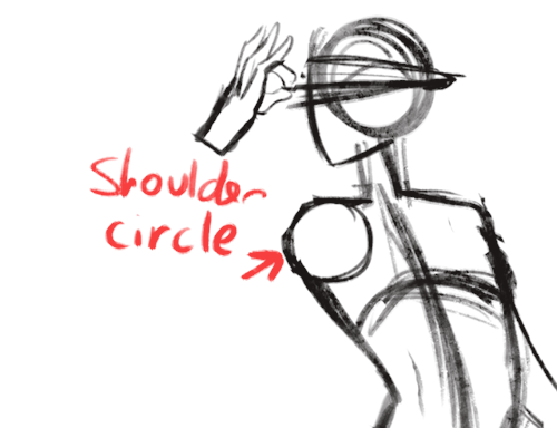
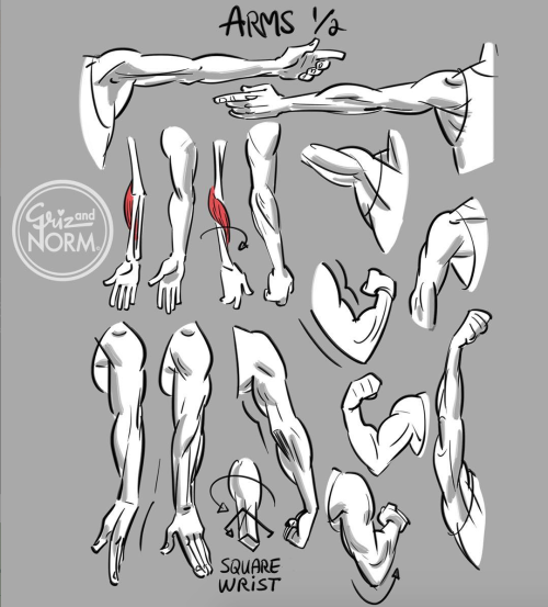
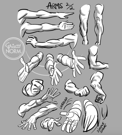
My first anatomy tutorial! How I connect arms to the torso. Simplified the muscles for better comprehension
PS. Pectoral is misspelled as “pectorial” in the picture! Don’t make that mistake haha


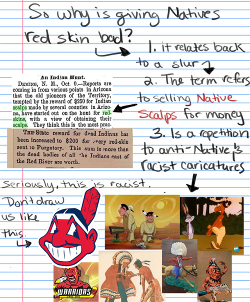
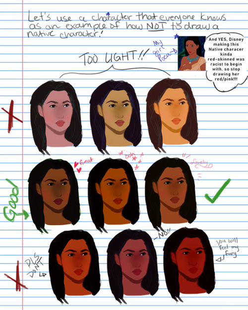
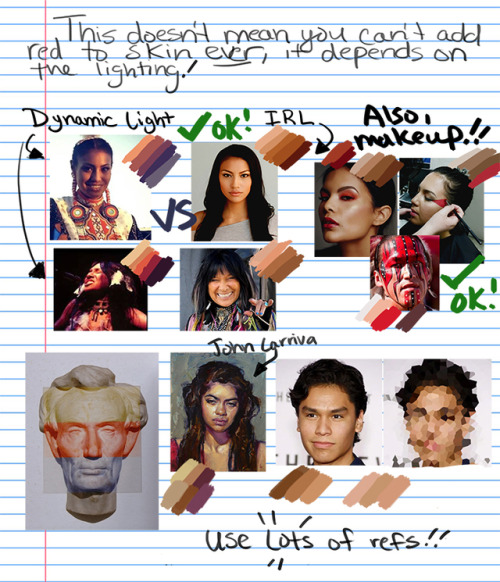
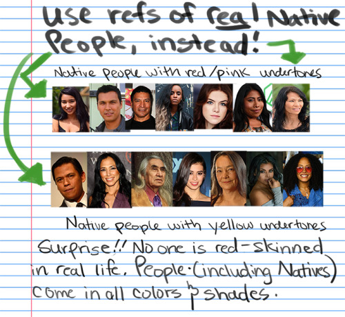
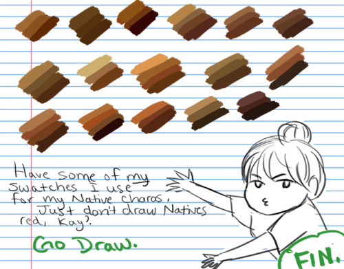
How I draw skin Part 2: DON”T DRAW NATIVE PEOPLE WITH RED SKIN!!!! A tutorial
For the first tutorial on how I draw skin, see the post here.
But seriously, I’ve seen too many drawings of Native characters with literal red/pink skin to count so just in case some of you are having troubles with drawing Native people, I’ve provided a guide for you. Please take my swatches if it helps!! and no more red skinned people, please
Disclaimer: this tutorial is mainly about the artistic depictions of Indigenous Peoples in North America, where the slur and redskin caricature originated, but it would still be racist to draw other non-North/Central/South American Indigenous groups like this so…..don’t.
Edit: please stop telling me about how Native people can be pale, I’m a whitepassing & pale Native myself and nowhere do I say people shouldn’t draw Natives pale at all. The “too light” section is about whitewashing Pocahontas specifically. Don’t whitewash brown characters, but don’t draw Natives red either.
For writers: historical women’s clothing
Those who have been with me for a while know that although I’m not an expert, I’m super enthusiastic historical clothing. Which means I also notice when it’s totally butchered in writing (I’m looking expecially at you, smut fics). So here are some pointers for your historical/fantasy lady’s clothing, for my peace of mind:
Not everything with laces is a corset. Although terms overlap, we mostly only talk about corsets from mid-19th century. Before that you have stays or bodies, maybe even jumps (unboned, quilted garment). You’re pretty safe with simply saying stays.
Stays cannot be tight-laced! You can only tight-lace if your garment has metal eyelets (otherwise the lacing would tear the fabric, ruining the garment), and those only came in mid-19th century. Your 18th century lady won’t be gasping for air (I’m looking at you, PotC)
That being said, even tight-laced ladies are unlikely to gasp for breath.
Your character won’t be wearing a corset/super structured stays under an empire gown/Regency style dress. That would be totally unnecessary (looking at you, Bridgerton). Character instead would be wearing “transitional stays”–a short, boned garment somewhere between a modern bra and a corset–, or lightly boned/unboned stays. The point of these is to push the boobs up, not to slim down the waist/create a silhouette.
Instead of stays, your early 16th century/fantasy character can wear a boned kirtle–in this case, the bodice and the skirt are made up of one garment.
Stays/corsets can be back laced (mostly earlier stuff), front/front-and-back laced (a bit later), back laced with clasps at the front (Victorian)
Some stays can be worn as outerwear. They can be colorful and intricately decorated.
Gentlemen can and will help their lovers dress; they know how women’s clothing works.
There is always a chemise/shift under the stays! (looking at you, The Tudors.) That is your first layer–it protects the character’s skin from chafing and the character’s clothes from sweat.
Stockings are held just under the knee/mid-thigh with garters/ribbons.
No panties! No underwear, whatsoever. Ruck up those skirts and the banging can commence
There’s such a thing as split drawers (19th century)–which is like a pair of knee-lenght underpants, only the two legs are not connected at the groin area.
Ladies can have pockets–they are basically big pouches that can be tied around the waist with a string. They can be worn over or under the overskirt.
If the pockets are worn under the skirt, then they can be accessed via slits on the sides. This happens when the skirt has a kind of “apron like” fastening: basically, the top of the skirt is made of two rectangular pieces, both of them having their own ties. You first tie the back part on the front, then the front part in the back. And voila! Slits on the sides.
Those were just from the top of my head. If you have any question, feel free to ask*–or better yet, look up ladies on the internet who know more than me on this topic, like Bernadette Banner, Karolina Zebrowska, or Abby Cox.
Also feel free to correct me if I said something stupid
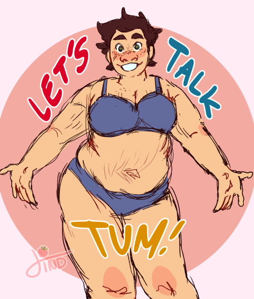


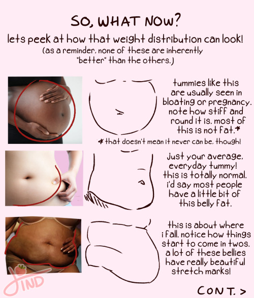


as requested- my zine about fat and plus size body types from instagram!💖 happy drawing everyone!
genuine art advice:
put as least amount of time into the face as possible
try not to rely too heavily on digital art "tricks"
never hone in on one area until youre almost done
if youre not having fun drawing, ask yourself why and find a solution
kill the ogre before it can get inside your house
always consider where a technique would and wouldnt work
Know what I’m salty about?
In all my art classes, I was never taught HOW to use the various tools of art.
Like yes, form, and shape and space and color theory and figure drawing is important, but so is KNOWING what different tools do.
I’m 29 and I JUST learned this past month that India Ink is fucking waterproof when it dries. Why is this important? Because I can line something in India Ink and then go over it with watercolors. And that has CHANGED the ENTIRE way I art and the ease I can create with.
tldr: Art Teachers: teach your students what different tools do. PLEASE.


A quick history of Vietnamese women’s fashion (part 2: 16th-18th century North Vietnam)
Before we dive in, please note that Hanoi (and by extension North Vietnam) at that time was called Tonkin (東京).
During 16th century, the fashion of North Vietnamese women was similar to that of South Vietnamese women as recorded in Boxer Codex (see Part 1). Below is the relief of the Mạc dynasty’s Dowager Empress Vũ Thị Ngọc Toàn, dated 1562, a National Treasure at Trà Phương pagoda in Hải Phòng province. In the relief, she is wearing an yếm undergarment, with thường skirt and đối khâm coat.

(Image source)
Moving on to the 17th century, in Vietnam Museum of Fine Arts, we can find the statue of Ducchess Nguyen The My dated 1632 depicting noble North Vietnamese women’s fashion. She wore her hair long, with yếm undergarment and đối khâm coat, but in between the layers she also wore a giao lĩnh cross collar robe. Her clothes are richly trimmed with gold decorations.

(Image source)
How about the common North Vietnamese (Tonkin, 東京) woman? The earliest illustration of them I can find is in the Japanese book “Vạn quốc nhân vật đồ thuyết” (Illustrations and explanations about characters from 10,000 countries, 1720). If you are asking yourself if this illustration could instead be about Tokyo (as its Chinese character is also 東京) woman, this could not be the case. In 1720, Tokyo was known as Edo (江戸). It was only in 1868 during the Meiji Restoration that Edo was renamed to Tokyo. Back to the illustration, we can see that during this time North Vietnamese common women wore a giao lĩnh cross collar robe outside, with two layers of thường skirts, with the outer layer shorter than the inner layer.

(Image source)
Illustration of North Vietnamese women in “Hải ngoại chư đảo đồ thuyết” (Illustrations of foreign islands) is also similar. This book is dated to the 18th century too, but I cannot find the exact year.

(Image source)
There is a wide-ranging variety of patterns possible on the giao lĩnh cross collar robe, as can be seen in the below tố nữ đồ (素女圖) also from the 18th century. These women wear their robes loosely so that the top part of yếm undergarment is shown like the statue of Duchess Nguyen The My and their robes is long enough to cover their thường skirts.

(Image source)
The same North Vietnamese women’s fashion style is also recorded in Qing dynasty’s imperial book Hoàng Thanh chức cống đồ (皇清職貢圖) created in mid-18th century, with the noble lady (left) wearing more layers than the common woman (right).

(Image source)
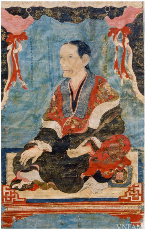
North Vietnamese noble ladies layered multiple giao lĩnh cross collar robe in early 19th century too. Painted in 1804, the below portrait of Lady Minh Nhẫn at the Vietnam Museum of Fine Arts shows that they wore at least 3 layers.
(Image source)
The viên lĩnh round collar robe can also be found in North Vietnamese women’s fashion during this era, as can be seen in the extracts from 18th century paintings “Võ quan vinh quy đồ” and “Văn quan vinh quy đồ” (Celebrated return of the martial/civil mandarin) belonging to the Vietnam Museum of Fine Arts. The robes can either be tucked inside or cover the thường skirt.

(Image source)
By early 19th century, Tonkin (North Vietnam) and Caupchy (South Vietnam) was unified under the rule of Nguyễn dynasty. The new dynasty implemented many changes, including naming the country “Viet Nam” and the former capital city Tonkin (東京) into “Hanoi”. As Nguyễn dynasty emperors are the descendants of the Nguyễn lords who used to rule Caupchy, they continue to enforce the clothings reform started by Lord Nguyễn Phúc Khoát in 1744. The emperors were persistent despite the push back from former Tonkin population. Their numerous decrees about Tonkin clothings reform are recorded in the book “Khâm định Đại Nam hội điển sự lệ” (Collected statutes of the Nguyễn dynasty, 欽定大南會典事例, 1843 – 1914). The women’s reluctance to change was humorously reflected in the following folk rhyme (apologies that my translation has no rhyme):
“In August, the emperor decreed
Banning bottomless pants, making us so fearful
If all of us stay at home, the market will be empty
But if we go, we must robe our husbands of their pants!
If you have pants, go and sell your produces at the market
If not, go to the village gate and watch out for the inspector.”
Tháng tám có chiếu vua ra
Cấm quần không đáy người ta hãi hùng
Không đi thì chợ không đông
Đi thì phải lột quần chồng sao đang!
Có quần ra quán bán hàng
Không quần ra đứng đầu làng trông quan.
(Source)
Although women in North Vietnam gradual accepted to wear the same áo ngũ thân five-panel robe as their sisters in the South, they had a distinct fashion that call back to their favourite giao lĩnh cross collar robe and đối khâm coat. I will explore more on that in Part 3 of this series.
1700's medical illustrators be like "hey boss can I put a rhinoceros behind this anotomically correct sketch of the human skeleton" and the boss be like "only for the books being published in these specific european countries" and then they high-five and go out for drinks

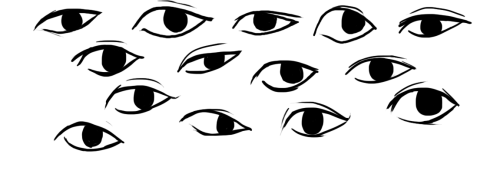
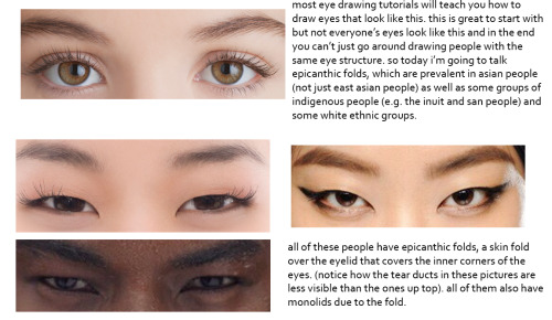
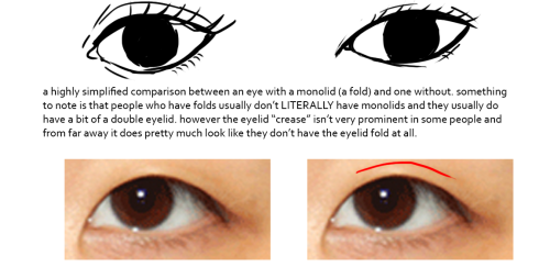

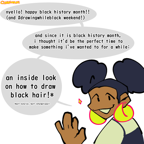
this was gonna be a tutorial and i guess it still is but if anything it’s just a really long and drawn out “essay” on drawing people with epicanthic folds. one of my biggest pet peeves is people drawing asian people exclusively with the same type of eye they’d give white people or anyone else who typically doesn’t have the fold! however i know that most people are taught with the standard white person eye (google image search for “eye” and it’ll all be pictures of white people’s eyes) so learning to draw epicanthic folds is a consciously learned thing.
therefore i bring you this, which attempts to break the mechanics of epicanthic folds down into something that’s a bit easier to digest and implement in your own art!
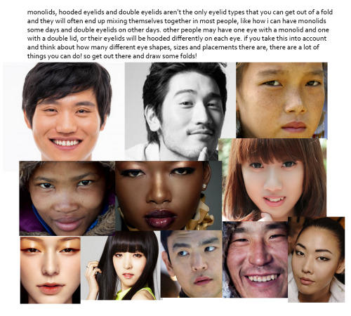
style can be argued i guess but it’s not that hard to stylize eyes with folds if you do proper observation and research. eyes with epicanthic folds are as diverse as eyes without so it’s not like you have to adhere to a strict model for them (although many people think that you have to) and all it takes to distinguish the two in stylized art (and even in semi/realism once you think about it) is a few lines! like i said this is a learned process but it’ll make your asian characters (and characters of other races even) a bit more interesting and believable.
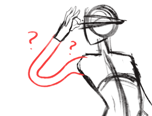


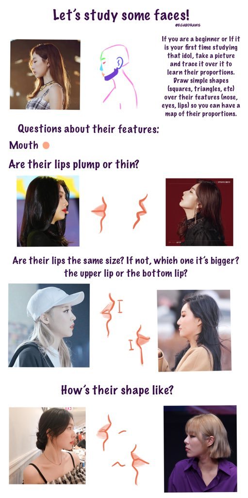

So here are my tips for drawing side profile views and study people’s faces! I wish I could explain more but I’m all over the place I’m sorry ㅠㅠㅠㅠ but well, I hope this can be useful for someone!